On Words

Is all this really necessary? For everyone? All the time? Microsoft Word 2003 window, new document; shown approx. 50% actual size
For something with such a simple purpose, and an even simpler name, Microsoft Word sure does seem complicated. From the moment a user opens a new document until they finish—a three-word note or a three-thousand page novel—they are surrounded by an acerbic cadre of mismatched toolbars, icons and menu options. The vast majority of these are never used. Many of these never should be used. Most people using Word don’t need to do complex math equations or manage mail-merge settings, they don’t need hundreds of oddly-colored warped lettering options and they don’t need to create a web page; they need to write a paper.
As part of a cooperative workshop one of the Visual Communication Design professors at the University of Washington set up with one of Microsoft’s design leaders, the few of us who chose to participate were asked, “What should Word be like?”
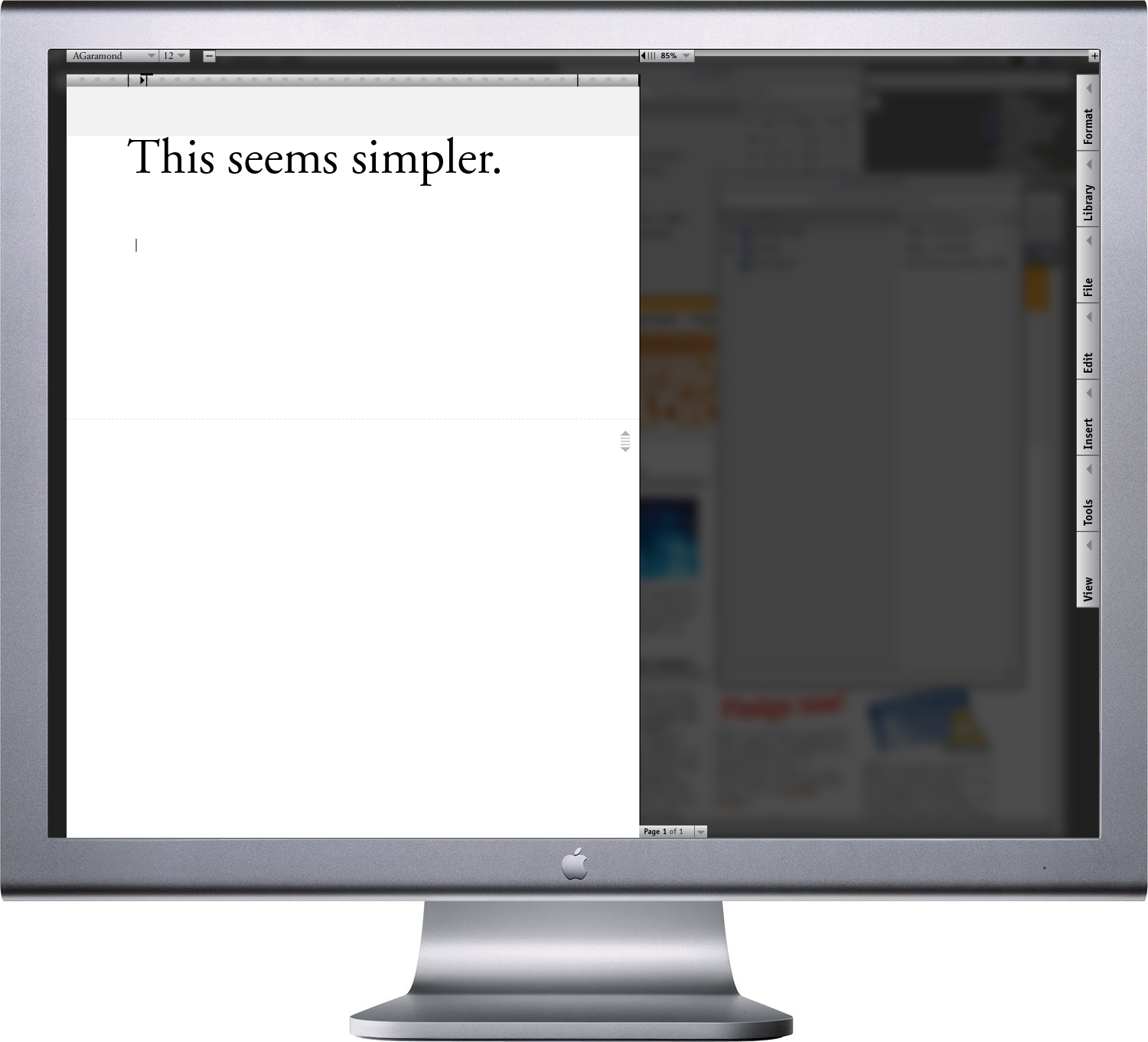
DPJ Word interface mockup, new document; 1024 x 768px + / 2004
Writing often requires intense focus. The primary goal of my prototype was to provide the least distracting, most intuitive and flexible interface for paper writing, editing and reading, while integrating simpler navigation of documents large and small… Read the rest of this entry »
Filed under Content / Architecture, Interactive / Web
Permalink
Comments