Building, A Brand
April 11, 2010 at 9:56 pm · Filed under Copy / Writing, Identity / Systems, Industrial / Product, Interactive / Web, Signage / Display
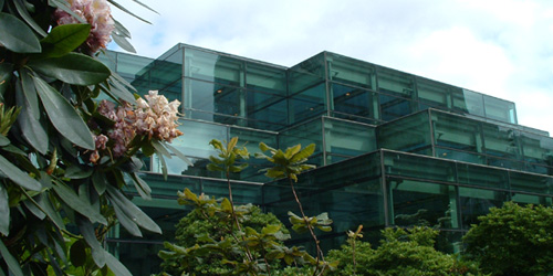
Washington State Convention and Trade Center building (back/garden) / photo taken 2003
Sometime in the 1940s or ’50s (I’m not sure of the exact year), the term “corporate identity” was coined by Lippincott & Margulies—one of the first major design firms in the world—to describe both the idea that even large businesses have inherent, relatable characteristics, not unlike human beings, and the practice that could express their character through a fitting, comprehensive and consistent design program. An organization’s identity is expressed in every way they communicate, from their name and logo to their brochures and web site, to the way they answer the phone—whether those “touchpoints” are designed by professionals or not—so this was an important “call-to-action” (to use another industry term) for organizations to pay attention to everything they were communicating, and, ideally, to pay top-notch professionals like L&M to help them make sure they were doing so effectively.
Sometime in the 1990s, the term “brand” began to take over as more formal business strategy was becoming more prominently integrated into large-scale identity design programs, and it quickly went from buzz word to industry category, on which uncounted firms jumped. I have always found this nomenclature shift ironic. “Branding,” literally translated, is the superficial process of stamping a logo on your property (livestock, originally); this superficial logo stamping is exactly the perception that the “new” practice of “branding” was supposed to be rising above. Meanwhile, the word “identity” could already encompass every aspect what an entity is, from what they do to how they express it. But like many P/C nomenclature shifts of late, whether rational or not, “branding” has taken hold, and “identity” (preceded by “corporate” or not), has been deprecated.
Whatever it’s called, my formal introduction to the process of figuring out what an organization stands for and expressing it in a fitting design program was in a class called Identity Systems in the Visual Communication Design program at the University of Washington, sometime in 2003. Like a few other courses in the program, this one was broken into collaborative group and individual phases. Three-person groups were assigned one of four or five major local entities and tasked with research and analysis of the entity, en-route to the creation of a strategic brand platform. Based on this platform, we were then set about designing a fitting logo and building a supporting visual identity system, individually…
Working as a team, Jesse Graupmann, Tim Turner and I made many important discoveries in the course of our research of our assigned entity: The Washington State Convention and Trade Center (WSCTC). Through web exploration, personal interviews with convention center officials, several reconnaissance missions and the study of official documentation, we assessed strengths and weaknesses of its services, location, architecture, transportation integration, primary and secondary local and regional competition, primary and tertiary channels of communication, and its integration with the community, and we determined the primary, secondary and tertiary audiences to whom these mattered. We found that the Washington State Convention and Trade Center offers profound and unique benefits to its constituents that other entities could not match. We also came to the conclusion that their actual visual identity, emanating from the wheat stalk mark in their logo, did little to convey anything about the Center.
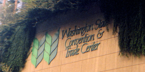
The actual Washington State Convention and Trade Center logo is a mash-up of heavy, stylized wheat stalks and stringy typography that does little if anything to express either what the WSCTC is, what it does, or how it does it; rumor had it that, as a state-funded but Seattle-located entity, this was an attempt to appeal to / appease agriculturally-focused Eastern Washingtonians / photo taken 2003
Primary among the WSCTC’s unique and defining aspects is the actual facility. By scale alone, the Center is unmissable, and has some beautiful features, even if it suffers from a somewhat disparate kit of parts. Half of the main façade is laid with flat, earth-tone blocks of stone while the other half has angular full-height windows jutting out into the street. This front meets with blocky glass walls which stair-step their way out the back of the building.
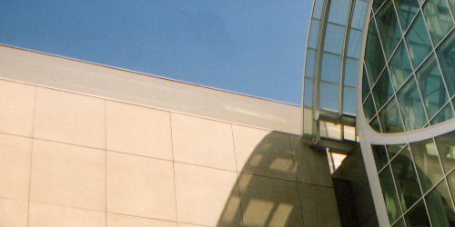
detail of theWashington State Convention and Trade Center’s contrasting stone and glass structure / photo taken 2003
As part of its 2000 expansion, A huge glass and steel arched bridge with a built-in meeting room overhangs Pike Street—a major downtown thoroughfare—bridging the two buildings of the WSCTC complex. This feature won little favor with locals who often express disdain for the sheer imposition, but serves as a nice metaphor for the connections made at the Center (and, it has a pretty great view).
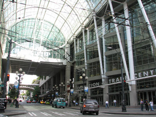
view of theWashington State Convention and Trade Center’s enormous bridge and glass arcade, which actually encloses a block of Pike Street; photographer unknown
The structure is within walking proximity of myriad hotels, shops, restaurants, businesses, and residential complexes, and is connected to Freeway Park, a rich maze of concrete pathways and lush foliage that and ambles upward from Downtown up to culturally-rich Capitol Hill and First Hill neighborhoods.

detail of Freeway Park, an extension of the Washington State Convention and Trade Center; photo taken 2003
Access to the Center could hardly be easier. It has its own freeway exit, it’s own parking garage, it’s own shuttle and taxi dropoff, and its own station integrated into the Metro Bus Tunnel. There is also a car rental agency just across the street.
The Washington State Convention and Trade Center caters to three separate but related audiences. Those having primary business interaction with WSCTC representatives are professional event planners in charge of scheduling and coordinating events large and small for businesses, political entities and other organizations. Secondary audience members are the actual exhibitors and attendees of these events. There is also a tertiary audience served by the facility in the general community, who come to attend public exhibitions, meet friends or business contacts, enjoy the many pieces of artwork on display throughout the building, and/or patronize one or more of the many small businesses and shops within the Center.
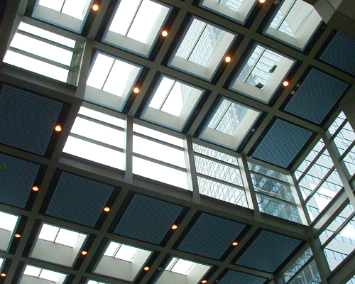
view looking up from the interior of theWashington State Convention and Trade Center’s main hall / photo taken 2003
Like all major convention centers, the WSCTC provides accommodations for various sizes and types of events. Unlike most other such venues, however, the Washington State Convention and Trade Center has an extremely broad range of capability and the highest levels of service. Different room capacities and modular exhibition space can accommodate anywhere between two and twenty thousand attendees comfortably. In addition, the Center offers state-of-the-art technological services. Great pride is also taken in their award-winning catering service that’s second to none in the industry.
Being a tax supported state entity, the WSCTC is deeply involved in the interests of the general public. This was expressed most prominently in its expansion, which not only provided a convenient walking path between downtown and Capitol Hill and First Hill, but also afforded a significant increase in the abundance of publicly-funded low-income housing in the area. The building itself also showcases the work of numerous local, national and international artists and provides informal seating and gathering space, all free to the public every day of the week. In addition, the revenue earned by the Center contributes significantly to the state’s budget, leading to greater support of public programs.
Considering these factors and a wealth of information we had accumulated to support them, Jesse, Tim and I went to work synthesizing our findings and teasing out a simple strategic foundation.
We created a basic brand positioning framework, based on what the WSCTC offers its audiences, in terms of three “B”s…
The Business
Providing dependable facilities and services for event planners
The Benefit
Peace of mind that important experiences will be hosted adeptly
What’s Better
Premier location
Internationally-renowned service
Flexibility of space
Ability to host large-scale or complex events
Community integration and accessibility
And we decided upon five characteristics that best captured the personality of the organization…
Personality Attributes
Professional dependable; focused; orderly
Accommodating intimate; pleasurable; flexible; inviting
Metropolitan urban mystique; downtown; major city
Connected access to resources, people and technology/connectivity
Progressive fresh; up to date; constantly evolving
As we wove these facets together, we began to recognize a powerful thread that ran seamlessly through: Indeed, this idea in and of itself, was basically it! Something special happens when things come together. This is what the Washington State Convention and Trade Center is all about. When event planners work with hosts, or attendees and visitors experience an event, or each other, or the city, valuable experiences are created. The WSCTC is the venue, the forum, the intersection and the enabler of these powerful moments.
And so was born our interpretation of the heart of the WSCTC, meant to elegantly encapsulate the motivating factor behind everything the Washington State Convention and Trade Center did, and, in two words, captured both the importance of the physical venue and the service…
Brand Essence
Facilitating connections
From here, we developed a positioning/style matrix as a tool to visually aid us as designers, as well as the client (theoretically in this case) to ensure our intentions for the direction of the ensuing identity design was aligned, as well as solidifying previously synthesized brand elements. We chose the two most powerful, yet disparate personality traits of the brand, namely “professional” and “accommodating” as the top and bottom points on the vertical axis, while stylistic differences were opposed laterally between “representational” on the left, which would likely lead to a system based on physical features and “abstract” on the right, which would likely be more focused on qualitative interpretations of benefits. Scattered on the plot were logos of other organizations, both in and out of category, for reference.
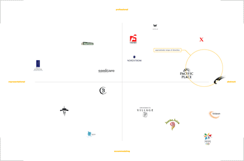
Washington State Convention and Trade Center logo positioning/style matrix; vertical axis: “professional” (top) and “accommodating” (bottom), horizontal axis: “representational” (left) and “abstract” (right); initial area of focus for the WSCTC logo exploration circled; 17 x 11in. / 2003
It was soon after this point that each group member would take the research as they saw it and begin creating identity design individually. It is this matrix, then, that would provide the jumping-off point for each member’s design direction and process. Based on such, I made the rough determination that my direction would fall somewhere toward the “professional” end of the personality spectrum, and would likely be executed in a relatively abstract manner (as designated by the circle in the matrix above). As it happened, the logo and ensuing visual identity system was rather abstract, but referenced the actual building enough that it would probably be plotted a bit to the left of this initial focus.
Armed with the results of all of the preceding research (and then some), the sketch book was cracked open and ideas were turned into marks on paper. The scope of exploration was kept as broad as possible without straying from the brand platform. Of paramount importance was in expressing the brand promise, as a product of the personality traits of the organization. Several concepts were explored in a variety of ways, but the idea of “facilitating connections” drove the creative process from beginning to end.

Conception
Initial sketches utilized the arch as a reference to the building’s prominent architecture as well as a strong metaphor for bridging gaps and making connections. The letter W was integrated into some of these sketches as a connection to “Washington,” which could aid name recognition, but the center’s “Washington-ness” wasn’t a primary communication objective, so pursuing this was not of high importance (the WSCTC doesn’t compete much nationally, and Seattle is really the draw, anyway). Purely typographic solutions were also explored, utilizing custom ligatures within the logotype to convey the idea of connections. Also referencing the building’s architecture were sketches based on stair-stepped block devices:
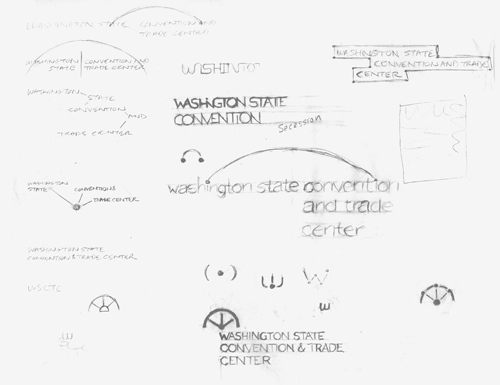
Washington State Convention and Trade Center logo exploration; pencil on paper; 11 x 8.5in. / 2003

Continuation
At this point, several more abstract marks were considered in addition to refinement of previous ideas. Ideally, the mark would encompass all of the traits of the brand. Differing sizes of squares were used as primary elements as they offered reference to building architecture, event space, metropolitan grid system and so on. Various combinations and compositions were explored in an effort to convey not only connections being made but also a sense of flexibility of space and service:
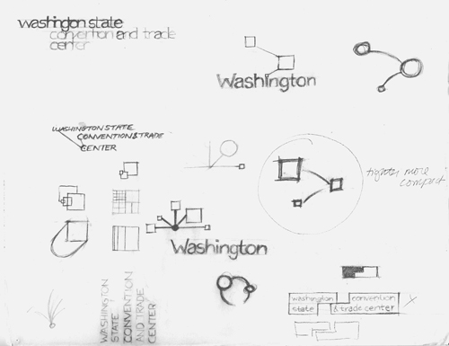

Washington State Convention and Trade Center logo exploration; pencil on paper; full sheet and detail of mark studies; 11 x 8.5in. / 2003

Confirmation
Once the potential of these elements was recognized, the process of digital translation and refinement of various aspects of both the typography and the mark began to ensure they could translate properly to the final state:
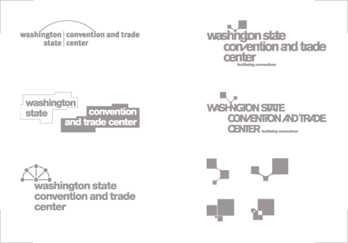
Washington State Convention and Trade Center logo exploration; digital sketches / 2003

Coloration
Moving along further in the design process, color was introduced as an element while the final mark and typography were still being honed. Initially, just blues and yellows were considered as a professional yet lively palette.
The typography, too, was making progress. While myriad ligature-based options were explored to various degrees, they competed with the mark and cut down on legibility, so I eventually just cleaned up the type in favor of conceptual simplicity and compositional elegance.

Washington State Convention and Trade Center logo exploration / 2003

Convergence
While refining the overall composition of the mark and logotype, the possibility of the color blocks creating a third color at their intersection presented a very intriguing option. That the third color just so happened to be green, the perfect descriptor for Washington (it is “The Evergreen State,” after all) was too enticing to resist, and the mark decision had been made. Soon thereafter, the logotype was finalized and all that was left was to choose the exact color values, which only a comprehensive study could decide:
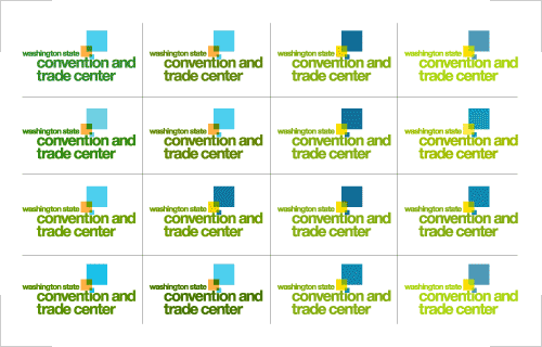
Washington State Convention and Trade Center logo color study / 2003

Completion
Everything has come together in the final logo. The simple, lowercase typography is inviting, but also has serious presence. The mark references the facility architecture and services, being created of connections between different elements; that it also dots the “i” in “convention” is a nod to the attention to detail of their acclaimed service. The composition is dynamic but balanced, crisp and clean.

Washington State Convention and Trade Center logo / 2003

Color Concessions
The mark and logotype have been designed to work well within the confines of any color space. Ideally, the three or four-color version is to be used whenever possible, but grayscale, spot-color and black-only versions have also been created so that the new identity may be used in any application.
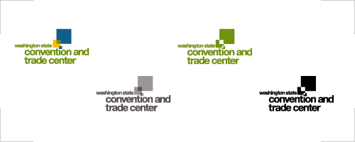
Washington State Convention and Trade Center logo color variations: (from left to right) 3 or 4-color version, grayscale version, one color version, black only version / 2003

Contextualization
As the logo was being finalized, the visual system, or “kit-of-parts” of standard design elements and usage began. This ended up being incredibly close-in to the logo, which I now find unnecessarily constricted, as well as a bit stifling of the logo, itself. However, as a starting point for a completely new identity, it certainly would have reinforced recognition much more quickly and could have been built upon later.
The color palette is just swatch for swatch with the logo, with the cool, marine blue and vibrant yellow, which combine to create a crisp Washington apple green. The sizes of the swatches represent the relative intended usage, with the blue and the green most pervasive, for their strength of value, with the yellow being used for occasional highlights. Throwing in an even gray for a neutral was a bit default, but its recessive elegance does work. If I were to update this system, one of the first things I would look at would be to add a secondary palette of color triads, potentially related to some organizational structure (i.e., color-coding).

Washington State Convention and Trade Center color palette / 2003

Typefacial Expression
Any written communication must not only convey what needs to be said, but also express the tone in which it should be understood. For an organization with such a broad range of potential recipients of written communication, a font family with extensive versatility and clarity is crucial, but the brand must also be considered in this decision. With these factors in mind, three weights of Helvetica Neue were chosen for their tonal neutrality, maximum legibility and professional demeanor. Normal weights of standard format body copy is efficient and easily read, while bold, often colored lowercase titles and headings serve to keep the message friendly and contemporary.
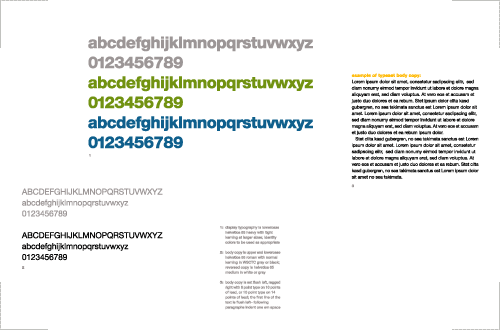
Washington State Convention and Trade Center type system specimen; 17 x 11in. / 2003
As rational as all that may sound, this type spec is probably my least favorite aspect of this program, looking back on it. My primary dislike is not that it’s based on Helvetica, which I feel absolutely no shame in using under the right circumstances. The unfortunate thing is that it’s based on the exact same typeface as the logotype, which dilutes the logo’s impact and (especially since it’s Helvetica), makes the design system seem overly minimalist. I think a more traditional serif family actually could have easily given the applications a more sophisticated voice and added richness to the overall visual texture.

Multiplying the Message
Nothing makes an identity campaign more powerful than broad and cohesive usage thereof throughout an organization’s vast array of communications. Whether it’s the color of the dinner napkins or the tone of the copy writing on the web site, staying true to the brand is essential. A strong identity system makes it clear just who the organization are to everyone who encounters it.
Stationery has been the cornerstone of identity systems since I-don’t-know-when, though this era seems to be coming to an end. However, as archaic as it may seem these days, press-printed stationery is still used by organizations, especially by executives for formal correspondence, so it remains an important touchpoint to execute adroitly.
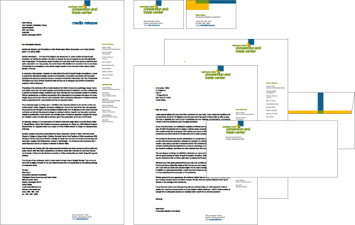
Washington State Convention and Trade Center stationery; standard U.S. dimensions / 2003
More specifically relevant for the Convention and Trade Center were name badges for visitors and staff.
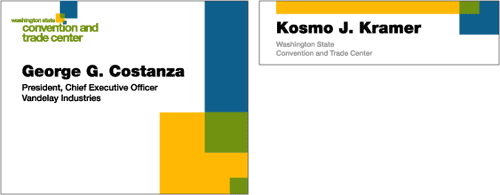
Washington State Convention and Trade Center name badges for attendees (left) and staff (right); 4 x 3.25in. and 4 x 1.125in., respectively / 2003
In the above applications, you can start to see the how intersecting blocks are used as a tertiary design system element. Here, again, the idea seems solid, but way too close to the logo; this is where some of those secondary color triads could come into play to separate and add visual texture to the visual identity. I’m also not sure that every shape would have to be a rectangle. Perhaps arcs could come in, referencing the arches of the architecture and the idea of bridging, in general.
Like press-printed stationery, press-printed annual reports (and the design firms that focused on them so heavily) are becoming more and more rare, but this, too, is an incredibly important communication vehicle, and one of the few pieces of graphic design to which executives tend to pay any mind (since the primary audience is shareholders). In my exhibit below, I again reference the logo heavily, though I actually don’t mind it here, because of how it is used and the context: assuming this was the year the new brand identity was introduced, this could reinforce recognition and meaning by using the mark to highlight the actual facility and connections alluded to by the bridge. The only thing I really dislike about this exhibit is that it seems to imply that the annual report covers two years, which just doesn’t make sense.
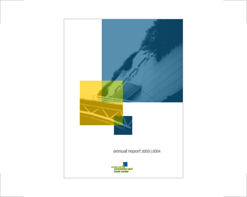
Washington State Convention and Trade Center 2003 | 2004 Annual Report cover; 8.5 x 11in. / 2003
Sometime in the early- to mid-2000s, the web site took over as the most important touchpoint of almost every brand in the world. Toward the beginning of that range, many of these began with some sort of Flash animated “intro,” which were almost invariably the most frivolous wastes of the medium. Being 2003, I created a basic web site “look and feel,” duly preceded it by a frivolous (though mercifully short) Flash intro. I don’t actually mind the basic idea of the animation—of the three logo blocks coming together to create the logo (though, again, it could use modulation of different colors or other means of activating it). I just think it should have been thought of as an sequence for digital event screen backdrops for conference rooms or something equally meaningful for the WSCTC instead of a throwaway on the web site.
Aside from some system monotony and the difficult small type, I think the web site page design is pretty good; it certainly has a lot more potential than the actual WSCTC site design.
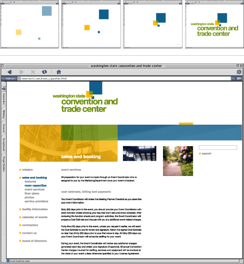
Washington State Convention and Trade Center web site; logo animation, home page; 800 x 600px.+ / 2003
There are few more satisfying feelings than seeing your logo built into a sign. When your design is measured in feet, is made out of metal, weighs hundreds of pounds and requires a small crane to put it in place, you know the client is proud. You can also be pretty sure they aren’t going to change the logo anytime soon, since the time, logistic and monetary costs of sign implementation are formidable, and not something any organization wants to do very often. For the WSCTC, seeing my logo actually put up on the main façade would have been pretty satiating, indeed—especially since the facility more or less is the brand. Of course, this didn’t happen since this was just a school project, but I did do a sketch of how it might have looked if it had.
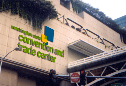
Washington State Convention and Trade Center façade sign; approx. 35 x 20ft. / 2003
While seeing my logo as shown would have been cool, I must admit that I’m not completely satisfied with this exhibit, either. I like the simplicity of it, but I think some subtle plane shifts in the mark and more consideration of materials, dimensionality and possibly even lighting could have really brought the sign to the next level, so to speak.
On a more functional level, I also designed some examples of interior signage. Even though these are based straight off the logo mark—certainly another example of the very close-in approach to the visual identity system—the addition of different levels of informational iconography set on the different levels of the marks helps support the meaning of the identity, rather than clash therewith.

Washington State Convention and Trade Center interior signs; approx. 12 x 12in. (each); vinyl on acrylic / 2003
top row: room signs (two sections of the same room) | men’s room | ladies room
middle row: bus transportation | taxi transportation | food/restaurant | coffee shop
bottom row: elevators | public telephones | information desk
Below, you can see how some of this and other signage could be implemented on the interior. If given another chance at this, I would strongly consider another color for the walls, or at least an accent here and there. The digital sign could use some TLC, as well. And, in a perfect world, I would commission custom carpeting that could incorporate a unique, WSCTC identity system pattern.
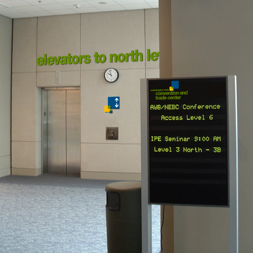
Washington State Convention and Trade Centerinterior signage / 2003
Back outside, then, are a couple tertiary sign locations, where just the mark would be sufficient, as well as temporary event banners (the signs outside the WSCTC were already this angled shape). Here, like the interior signs, the overlapping color system helps differentiate levels of information hierarchy. Though in this case, when used as visual texture, I again would likely assign these an appropriate secondary color triad that would allow the logo to stand out more prominently.
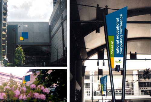
Washington State Convention and Trade Center tertiary signs and event banner signs; approx. 12 x 12ft., 6 x 6ft. and 3 x 9ft., ccw from upper left / 2003
Perhaps the most interesting extension of the identity system I designed was a sculpture intended for the back garden/park. In this piece, translucent blue and yellow lucite blocks would stack into each other, with the apple green naturally being created at the intersections between them. As a three-dimensional expression of the mark and its references to different spaces, places, and unique connections, it could also become known as landmark meeting point, in and of itself.

Washington State Convention and Trade Center park sculpture; approx. 6 x 6 x 6ft.; translucent lucite / 2003
I’m not sure whether this class project opened me up to it, but, I have since gone on to spend the majority of my (still rather young) career helping shape the identities of corporations and other organizations (rather than, say, designing annual reports). I’ve even gotten used to referring to clients’ identities as “brands,” though I still bristle at the superficial connotations of the term “branding” to describe the work, as the strategic depth and spectrum of expression of the design work brings real value to clients.
Sometime in 2007, I actually started working at Lippincott (the name has been shortened from the original Lippincott & Margulies, but it’s still the same company). Though the nomenclature may be different, the core idea the firm brought to light 50 or 60-some years ago still holds true. Organizations, corporate or otherwise, are like people, and in each is an opportunity to awaken their senses from the inside out, to help them discover who they are, what makes them unlike any other, and to help them express their unique character in every way they are met. I don’t think that will ever change.
