Moontalking
December 28, 2008 at 9:20 pm · Filed under Naming / Words, Type / Fonts

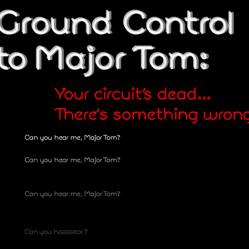
Moon typeface / 2002 (setting of lyrics excerpted from “Space Oddity” by David Bowie)
Spacey, technical, open and angular, functional close or far, and emotionally open, Moon is a typeface for the future. Or at least for writing about it. Although its geometry makes it modern and compelling in display setting, the strategically placed serif bits (technically, Moon would fall into the “semi-sans” category) flow together even dense columns of communiqué. Special touches and extras give this face an alluring Hal-like techno-emotional identity complex…
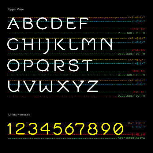
When it comes to delivering critical messages, capital letters have long stood at the top of the world. Letter for letter, no other case brings more urgent credibility to your message than the cap. The more caps, the more determined. But, in so many faces, cap settings become such a bore in all their rectilinear monotony, like so much parental lecturing. Moon’s caps know what’s right and are not afraid to tell you what’s wrong, but the organic distribution of rounded and open forms, interacting with angular legs and serifs, allow enough engagement to discuss the matter:

Moon font: capital letters and lining numerals / 2002
Lining numerals allow for proof to be delivered confidently as top-level information, but are open enough to persuade the cautiously skeptical.
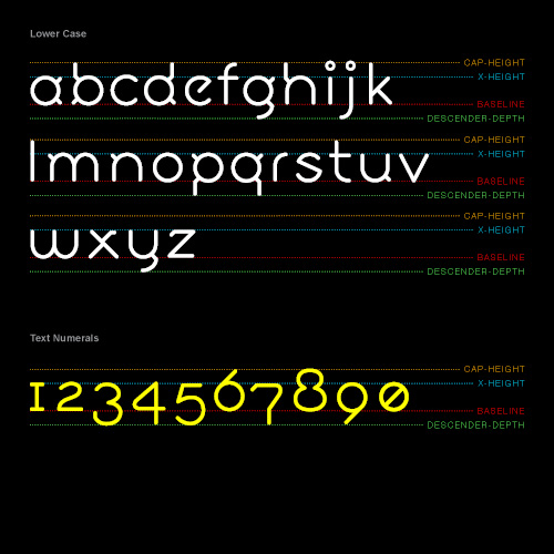
The lower case continues where the caps leave off, delivering the bulk of most standard communication with a rarified combination of technical precision and airy—dare I say, “friendly”?—humanity:

Moon font: lower case letters and text numerals / 2002, 2008
The lines between computation and digression are further blurred by the choice of classically-inspired text numerals as an option for setting in prose.
Speaking of digression… As typeface communication continues its rise to supremacy over human face communication, the fonts of today reveal themselves to be increasingly threadbare in their attempt to keep up. While great writers can pull the most powerful emotional strings with an Apollo-era typewriter and a cerebral hand, this is not the mindset of the majority of today’s typists. The new communicator places a premium on expediency and response, and relies heavily on hopelessly inadequate typographic patches like emoticons to express their slashed words for them (and, by the way, how many people were really aching for a quicker way to express “Vampire bat”?).
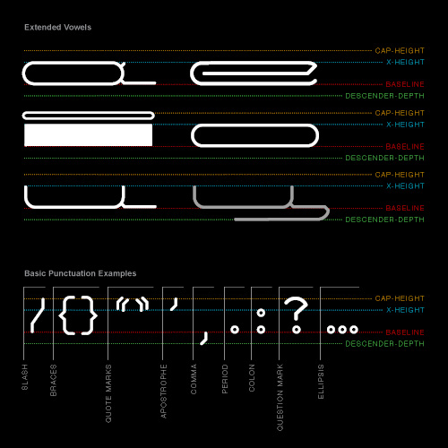
What if the typeface, itself, was more expressive? Though, presently, there is only one weight of Moon (Roman Moon), other weights were always part of the plan for the future (Half Moon, Full Moon, etc.), and would be essential tools to express emphasis or restraint. But what if temporal strain, too, could be captured in the extension of a letter-sound? As an additional spacey touch, super extended vowel forms allow for such techno-humanist expression:

Moon font: special extended vowels and standard punctuation / 2002
This is, of course, one small step for typeface exploration. The possibilities to realize key-borne expression for the mankind of tomorrow are galactic. The centuries-old groundwork of typography is absolutely still relevant, but the needs of type are evolving. Current standards are being necessarily co-opted by a new world order of communicators, a practice quietly being ignored by typographers (guilty, but aware). Moon may just be another typeface, but I’d suggest its future is wide open.
