Design for Art’s Sake
October 5, 2010 at 8:53 pm · Filed under Identity / Systems, Signage / Display

University of Washington School of Art, Sand Point studio door window sign concept; approx. 3.25 x 6n.; plotted output on foamcore / 2003
In my younger scholastic career, I often charged headfirst through the parametric walls of an assignment to ensure that my work would be noticed. In a drawing class I took early on at university, the professor told me that the way I worked was like writing an English paper in Russian. I chalked up experiences like this to standard-fare artist plight and soldiered on. Ironically, my head full of steam soon chugged me right on out of the School of Art. Upon my return some years later, I had a clearer head, but I also had a much keener sense of the power of boundaries. I understood that it was actually keeping the rules recognizable that revealed the cleverness of their kneading, pushing or rearranging.
As I was making my comeback into the University of Washington, the School of Art was pushing its own boundaries, acquiring gallery and studio space for select students and faculty in a building of the former Sand Point Naval Base in Seattle. Then edging myself toward the sharp end of the student body, I was commissioned to design a way-finding sign system for the building.
Sign systems are often droll affairs, so bound by their function that they are stiff and invisible. There are good reasons for not getting too editorial in this discipline, of course: you don’t want anyone to get lost in the cleverness of the sign before they find where they’re going, especially in emergency situations where one might need to know exactly how to get to the bathroom, or worse, get the hell out of the building.
Overseen by School of Art Director and Visual Communication Design Professor Chris Ozubko, I came up with a few concepts that I was pretty confident would get people into the restrooms and out of the building as necessary, but also expressed a bit of the unique personality of what was going on in the space while they could appreciate it…
The first idea was perhaps the most basic tangible expression of art and its process: a tacit blob waiting for interpretation: a splat of paint, a daub of putty, a raw edge—the remnants of creation or the subject of an observation.
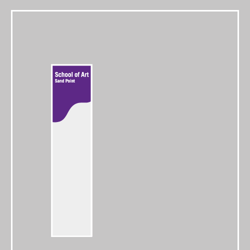
University of Washington School of Art, Sand Point studio door window sign concept placement; approx. 3.25 x 6in.; plotted output on foamcore / 2003

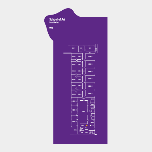
University of Washington School of Art, Sand Point studio map sign concept; approx. 7 x 15in.; plotted output on foamcore / 2003

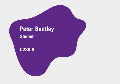

University of Washington School of Art, Sand Point studio room signs; approx. 5 x 4in. (each); plotted output on foamcore / 2003


University of Washington School of Art, Sand Point studio room sign (placement); approx. 5 x 4in.; plotted output on foamcore / 2003

The next concept took inspiration from the heritage of the building and the honor of its boarders. This space was not for just anyone. Artists and faculty were granted temporary stays based on the hard-won merit judged by their superiors, much like the honors symbolized by the ribbons of the naval officers before them.

reference: U.S. Naval ribbons and badges (detail of left breast, partially obscured by lapel); source

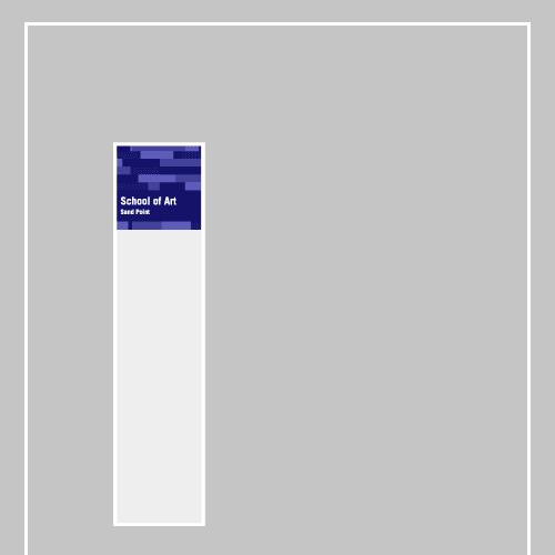
University of Washington School of Art, Sand Point studio door window sign concept placement; approx. 3.25 x 3.25in.; plotted output on foamcore / 2003

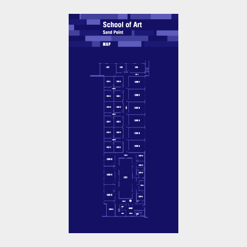
University of Washington School of Art, Sand Point studio map sign concept; approx. 6 x 15in.; plotted output on foamcore / 2003


University of Washington School of Art, Sand Point studio room sign concepts; approx. 8 x 2.5in. (each); plotted output on foamcore / 2003

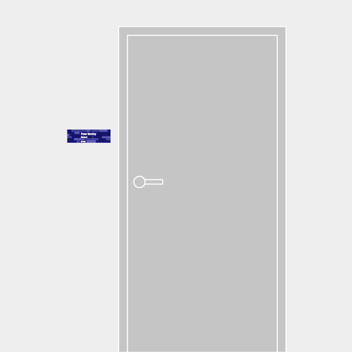
University of Washington School of Art, Sand Point studio room sign concepts; approx. 8 x 2.5in. (each); plotted output on foamcore / 2003

The final, chosen and implemented direction did no such metaphoric nudging. Rather, it punctuated the functional humdrum so brutally so as to disquiet. Discreet bits of information were forced apart and stamped into individually assigned planes of a particular shape, size, rotation and color. The stark economy of visual language gave it a deliberate chord that echoed the very tenor of spacial volume, itself.
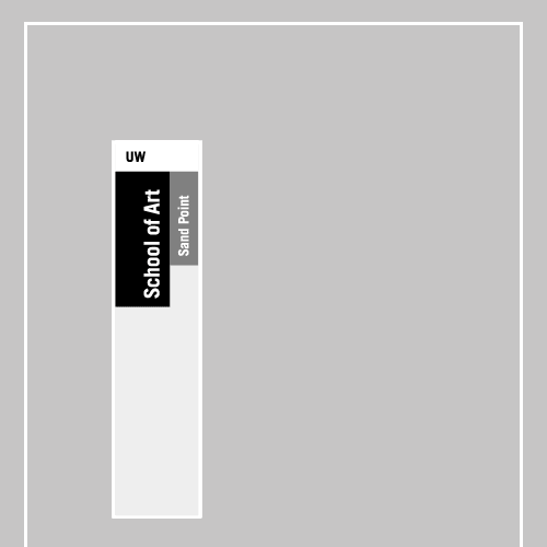
University of Washington School of Art, Sand Point studio door window sign; approx. 3.25 x 6.5in.; plotted output on foamcore / 2003

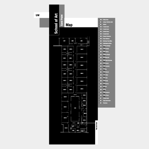
University of Washington School of Art, Sand Point studio map sign; 10.5 x 18in.; plotted output on foamcore / 2003

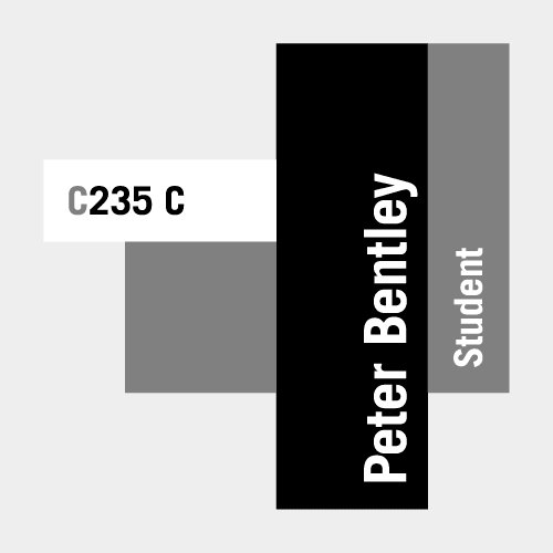

University of Washington School of Art, Sand Point studio room signs; 5 x 5in. (each); plotted output on foamcore / 2003

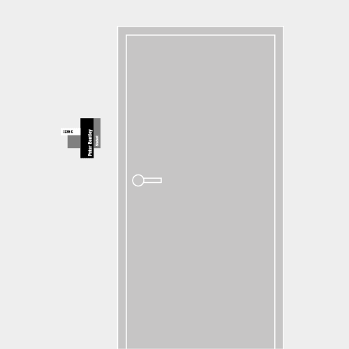
University of Washington School of Art, Sand Point studio room sign (placement); 5 x 5in.; plotted output on foamcore / 2003

I sometimes wonder what that drawing professor would have thought of this system had we ever had the occasion to rap about it (or anything else after I left his class some years before). Would he have been proud of my efforts? Had I learned to visualize in a language he felt appropriate? I can’t say. At least I spelled his name correctly.
