Let Me Introduce You To…
September 14, 2010 at 10:04 pm · Filed under Content / Architecture, Copy / Writing, Interactive / Web

No matter how long it lasts and what happens along the way, the most fascinating aspect of any relationship is almost always the beginning. When was the last time you met someone new? When was the last time you met someone that made you feel new? How did it go down? Can you believe it happened? A proper introduction isn’t just an exchange of information; it’s a chemically transformative event that forever changes the course of your life. In 2003, the heads of state at the University of Washington engaged our team at the Design+Innovation Lab to help them properly introduce the school to the world wide web.
As a great ad man (or woman—I’m not sure) once warned on behalf of a deodorant: “You never get a second chance to make a first impression.” Well, leading up to our project, more and more people were getting their first impression of the University of Washington from its web site and, frankly, it stank. The UW is an expansive, influential institution of over 50,000 students, faculty and staff that has been an established leader in many academic and athletic programs for well over a century, and it’s Seattle setting is one of the most beautiful cities in the world. It had the brains, the brawn, the experience and a pretty sweet place. But then was a transitional era in the understanding of communication and media, and web site design was oft-still an afterthought doled out to reluctant comp-sci geeks. As such, the UW’s site betrayed a persona that was uncharacteristically inscrutable, unsightly and unwelcoming; you probably would want to steer clear of interacting with this one.
By the end of this summer-long project, our team—comprising myself, then fellow Visual Communication Design (VCD) undergrad student Jim Nesbitt and then VCD grad student Jason Tselentis, and directed by Doug Wadden, then Chair of the UW Division of Design and now Executive Vice Provost of the entire University—had redesigned the UW web site; a not-inconsiderable feat. However, we initially were not charged with doing anything with the actual site; we were only supposed to design an introduction to it…
Flash intros may be terribly passé now, but the project seemed perfectly viable at the time. More importantly, it was a great exercise for us to think about what it was about the school that made it interesting, and how to articulate that compellingly.
Was it in the volumes of prestigious opportunities, accomplishments and awards of this “public ivy” weaving together a dynamic equation that resulted in one amazing experience?

University of Washington web site Flash intro sketch (animated storyboard) / 2003
Maybe, but nobody wants to get stuck with a braggart. It’s always best to keep some levity in an introduction, even if the recipient is deep as the Pacific. In another approach, the school is referred to in a dry, almost self-deprecatory manner, but just enough is revealed to let you know it’s serious—and it has the student body to back it up. The yellow square slides left and right to reveal a selection of word-image juxtapositions that hinted at some of the more compelling aspects of the University: A top-ranked medical school, connections to study-abroad programs in some of the world’s most exotic locations, a critically-acclaimed performing arts program, and, of course, a location that no comparable university could match.

University of Washington Flash intro mockup; 800 x 600px.+ / 2003
But some thought this tact too passive and preferred to show and tell. In a variation on the above introduction, the following uses more conventional but all-too-generic language to describe the institution. With no twist of tongue, the introduction became little more than a simplistic shell game. (Below is an actual Flash movie variation of the above pulled out of the background and shrunk to fit here.)
dpj_uww_intro_a_c_startbutton
University of Washington Flash intro mockup; 800 x 600px.+ / 2003
Of course, if you haven’t much original to say, you should at least have some nice moves.
dpj_uww_intro_b_startbutton
University of Washington Flash intro mockup; 800 x 700px.+ / 2003
(There were other interesting options, as well, but I didn’t work on them directly and I unfortunately don’t have files.)
But it really didn’t matter. Even in the early 2000s, the UW site got thousands of unique hits every day and could not support the server load of any sort of Flash intro. Not to mention the contingencies that would have been necessary for those who couldn’t support, had disabled, or just could not stand any sort of Flashiness.
The important outcome of this was that our introductions had made quite the impression and our clients wanted to get to know our work a little better. We got to skip to the home page. Once we got there, it was easy to understand the want for an endearing intro, as the site, itself, was basically hiding itself in a corner.

before: The University of Washington web site before our project began / 2001-2003
In terms of logical hierarchy, established usability conventions and pleasing aesthetic composition, almost everything on the old site was in the wrong place. The most prominent element was a spatially and contextually degaged photograph of the campus. The primary navigation—pushed over to the right for some reason—had too many nonequivalent items, listed in order of monetary potential instead of by actual usage (e.g., students, faculty and staff needed the site most but were last on the list because they were already on the books). Secondary elements included a tiny non-sequitur news story, a seemingly random litany of “quick links,” and an unexplained image from one of the museums that resided on campus. Hidden in there somewhere were links to “Search,” “Directories” and “Reference Tools” (such as a dictionary). Elements were literally scattered up, down, left, right and center with nary a single alignment among them, type treatment varied unnecessarily and link cues were inconsistent. For what seemed at first blush to be pretty simple, the UW home page interface was actually a bit of a mess. We took no choice but to strip the existing site down to it’s tags and redress it completely.
The first order of business was to fix the scurvy architecture, beginning with the primary navigation. We debated huge sheets of paper on a wall with markers until we had culled the seven existing links down to just four real and equivalent areas of interest: “About the UW,” “Academic Programs,” “Students, Faculty and Staff” and “News and Events.” (We were later implored to add “UW Medicine” to the list, which is not exactly equivalent to the others, but, as one of the foremost such programs/hospitals in the world, it was a great source of funding and prestige). We then devised a list of just four relevant quick links in “Admissions,” “Directories,” “Libraries” and “Employment,” as well anticipating a single additional rotating link that could capture a temporary item of interest about the University (such as their search for a new president at the time). From here, we just needed to stand the site up straight and dress it appropriately.
We started very simply and, though we went through a few iterations, the layout actually didn’t change much from the first sketches.

draft: an early coded mockup of the UW home page, featuring an introductory statement of the site in the central “hero” space; 800 x 600px.+ / 2004
Putting the page on white enlightened and visually broadened its presence, while a receding image of the campus’s iconic Suzallo Library lent visual depth and academic gravitas. (The original plan was for this background image to be drawn randomly from a bank of similarly iconic campus highlights on refresh, though this was never realized. Looking back on it now, some color could have been added into this element, as well.) The University logo (featuring “the Tooth” as we liked to call it, which had recently been done by an outside design firm and has since been dismissed) was put in the upper left, where logos generally should go on web sites. In this initial sketch/mockup, a small strip for quick links and search were put into a footer band. Directly below the logo were the five primary navigation bands. In the above sketch, a brief introductory note was put in directly to the right of these, giving visitors an idea of what the UW was about, with a small photo of George, himself (an iconic campus sculpture); Rolling over a primary nav item exposed a related list of sub-links and image over these.
The best sites in the web offer an experience that modulates seamlessly from the home page on in; interior pages should not only look related to the home page and each other, they should support the overall identity of the entity. But this was an especially difficult task for this project, as the University had literally hundreds if not thousands of pages that spanned an incredible array of different types of content and represented any of hundreds of sub-entities within the university. Despite their incredible variety, pages were all created with a single aging template that was nothing more than header and footer bands and white space in between. Sometimes, they didn’t even use the template. Compounding this was the fact that most of the pages were created by professors and students that didn’t necessarily know anything about web design or care about consistency with other areas of the site.
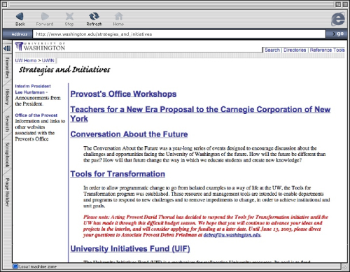
before: old interior page / 2003
We had neither the time nor resources to audit the entire landscape of washington.edu and figure out a template system that was streamlined in variations, comprehensive in ability to show different types of content and still was easy to create and edit by the technology-lay scholar. Aside from the aforementioned extensive research to determine what types of content would need to be accommodated, doing this properly would involve creating a flexible skin options based on a consistent gridded structure, an extended color palette, style specifications around type at different points of hierarchy, imagery and charts and graphs, an automated page generation tool and guidelines that made the implementation of all of these things simple. So, we did the next best thing: We updated the header and footer bands so they at least had some relationship to the new home page. A space In the header allowed sub-entities to be identified consistency. We also created a very rudimentary grid and type specifications to at least hint at consistency in the open space betwixt.
after: University of Washington web site basic interior page design; 800 x 600px.+ / 2004
Even this compromise was unfortunately but understandably never implemented. (Since this transition could not be automated, doing just this would have taken a monumental collective effort from the myriad professor and student authors of the original pages—who were afforded neither time nor money to do so.)
At the same time, though, the home page had progressed nicely, and was soon launched. In the actual site, the quick links and search were brought up from a footer into a dynamic header band and the space initially given to a short description of the school was given over to an image that linked to a rotating feature in “DiscoverUW,” an online magazine covering some of the more interesting happenings of the University.


after: the actual launched site, featuring “discoverUW” article links; 800 x 600px.+ / 2004
Though never completely resolved or fully implemented, this site design was a huge icebreaker for the University. The new home page served as the digital face of the UW for quite some time before being struck by a rather unfortunate jaundice rash, which thankfully has broken to reveal the current, much more palatable—if still not completely put together—site experience.
I would like to think that, at the very least, we helped the UW come out of a dim corner and gave it the strength to join the conversation befitting its stature. Of course, it would be uncouth to brag about numbers, but I’m pretty sure some we helped the UW get a lot of interesting people to come over.
