Wanna Make Something of It?
October 24, 2009 at 11:02 am · Filed under Copy / Writing, Identity / Systems, Packaging / 3-Dimensional, Photography / Film, Signage / Display
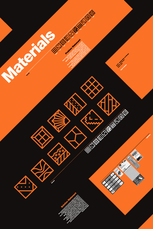
Materials symbol set promotional poster; 20 x 30in. / 2002
There is something very primal and essential about building things. Behind our most basic needs is the need to build something to facilitate it. Before we can put food on the table, someone has to put the table together. Before we can sleep under anyone’s roof, someone has to put that roof over our heads. And, in order to afford such things these days, most of us need to go to work, which, more than likely, is in a building.
But modern technology and evolving divisions of labor have rendered the notion of building even the most trifling gaff foreign and anxiety-filling to most. Hardware stores (big-box and corner-shop alike) are stocked floor to ceiling with too many confusing answers to even the most basic questions. For our Marks and Symbols class in the Visual Communication Design (VCD) program at the University of Washington, we were set out to develop a universal language of icons that would help de-mystify this environment and enable people to fulfill their basic need to put stuff together.
The class was divided into two phases: research and development. In the research phase, we worked in groups to look into issues facing the hardware customer, decide upon the problem we felt had the most potential for amelioration by a concise set of symbols (ten or so), and present our process and findings to the rest of the class. In the second phase, we each developed symbol sets on our own to respond to this problem.
Our research group, comprising mates Devon DeLapp, Jesse Graupmann, Narith Hoc, Sarah LaMont, Shaun Tungseth and myself, began by thinking of and assessing the potential (and drawbacks) of six possible options: A set of symbols for connectors, which could help people figure out what fit with what else (but seemed too broad to spawn a useful set of just ten symbols), electricity symbols, which could help people figure out the ins and outs of amps and volts (but we couldn’t figure out how to boil this subject down to ten symbols, either), how-to symbols, which could help people with standard tasks like building a deck or installing a light fixture (but, we quickly realized, would be nearly impossible to describe in mere icons), function/action symbols, which could help explain what a particular tool might do, such as “twist” or “strike” and might have made for a cool set of symbols (but seemed too basic a concept to actually be of any use to any adult not born on Mars—”a hammer is for hitting; fancy that!”), or warning symbols, which could help deter someone from doing stupid things with those tools—like strike themselves with a hammer (but had already been done to death, so to speak).
After much debate, we decided that materials had the most potential for new exploration of symbols that could enjoy real utility, potentially touching a range of applications within the context of hardware, such as way-finding (“Where is the wood?”), contents listing (“Is this made with wood?”), and proper use of tools (“Can I use this on wood?”)…
Once we had decided on our topic to develop, we halfheartedly debated the merits of different ways to present our preliminary investigation and the resultant “problem statement” to the class. We could have done a simple verbal presentation supported by material objects, poster boards, handouts and/or a slide show. In reality, though, having Devon in our group set the foregone expectation among us and the rest of the class that we would do some sort of film (Devon somehow found time to be a Film Studies major in addition to being a Visual Communication Design major, while most of us were killing ourselves just to hold down VCD). And so we made a film.
The film begins with us visiting a hardware store and shopping around as a metaphor for our exploration of ideas. Each of the members discuss one of the original six directions briefly, culminating with materials. We then find examples of the materials for which we had decided to symbolize in the store and load them onto our cart. The film then moves on to vignettes of our photographic research of our chosen materials with as the supporting soundtrack intensifies. Finally, we review previous such symbol programs and speak to intentions of improvement thereof as we check out of the store, idea in hand (or, rather, on big cart thing).

Materials presentation video (stills); written, directed, acted and narrated by Devon DeLapp, Jesse Graupmann, Narith Hoc, Sarah LaMont, Shaun Tungseth and myself; DV / 2003
Recently re-viewing this film was a bit painful. It’s amateurish, we’re all terrible on screen and it was embellished with plenty of juvenile flourishes (highlights include Eric Clapton’s “Cocaine” playing while showing our semiotic exploration of plaster—which is generally made from a white powder—and the film closing with the obligatory toilet flush out-take—from our discussion of ceramic materials). But it sharpened some great memories of having fun with a project, and reinforced in me the idea that irreverence can be a great vehicle to engage an audience, even if you’re trying to convey that a lot of work went into something, which it had. I don’t remember any other groups’ presentations, though I’m sure they were all solidly delivered. I’m guessing people remember ours.
As the credits rolled on our presentation, phase one faded to black and we were off on our own to start creating appropriate symbol sets. With photographic research and general knowledge to draw from, I began my symbol design process by making cursory lists of the semiotic relationships to each material, looking for overlaps between them that would give me a solid base from which to draft a set of ten equivalent marks.
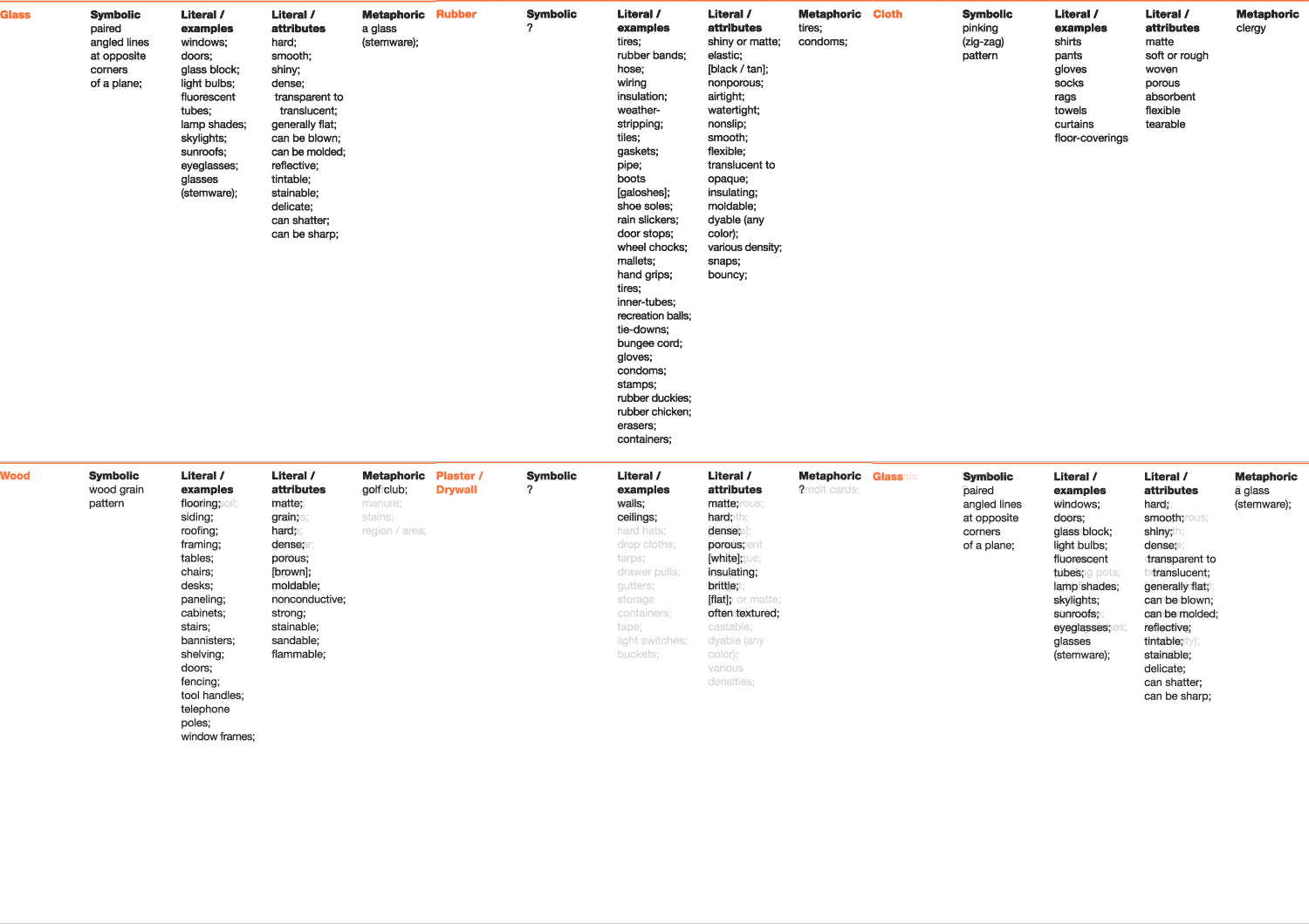
Materials semiotic relationships study / 2003
These lists were in no way exhaustive, but they were effective in helping me figure out routes that had the most or least potential. Only a few of the materials were referenced by commonly known symbolism or metaphor. The greatest potential, therefore, seemed to lay in literal representation stemming from either attributes or examples of the respective materials.
Then, at last… I began sketching to test different visual language. To begin, I worked with the three most vastly different materials (glass, metal and rubber) so I could try a range of execution while hopefully ensuring the approach would translate to the other seven. My initial exercises were highly literal representations of canonical objects that were tied visually by a strong common shape, though I soon abandoned this, as the symbols would have been too specific and not thus not necessarily be effective in representing the range of a particular material.
From this, my next tactic involved slightly more abstract detail views of pattern. I tested different scale to determine optimal overall color, or visual density of the marks.
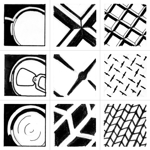
Materials symbol set study; pencil and marker on paper / 2003
top row: glass
middle row: metal
bottom row: rubber
Though simple pattern looked as if it could be successfully carried over to the entire range of materials and make for a relatively effective symbol set, the depth of impact of these marks was relatively shallow. In search of a more sophisticated result, I drew more abstract marks based on interaction. In this system, the materials relate with a common element (a black square) in a unique way, based on the material’s characteristics. For example, the box shows through the glass, it is welded or riveted to the metal, and the rubber stretches over it.
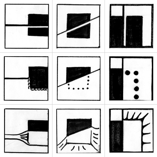
Materials symbol set study; pencil and marker on paper / 2003
top row: glass
middle row: metal
bottom row: rubber
Intellectually stimulating as it was, the idea of ten different materials interacting with one formal element in ten different and relevant ways was more or less doomed to failure. In an effort to create an interesting and sophisticated set that would also be truly usable, I realized a balance needed to be struck between literal and abstract. My first attempt at this approach combined solid shapes and lines. Initial experimentation with a three-by-three grid also began at this stage and, while the solid shapes were not working well with the linear elements, I felt like the solution was close at hand.
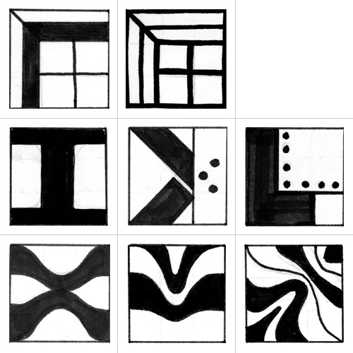
Materials symbol set study; pencil and marker on paper / 2003
top row: glass
middle row: metal
bottom row: rubber
From this point, the challenge was in formulating an elegant and cohesive set that would perform at many levels of display. This process led to the foundation of the final solution: a set of square marks comprising geometric line drawing based on a three-by-three grid.
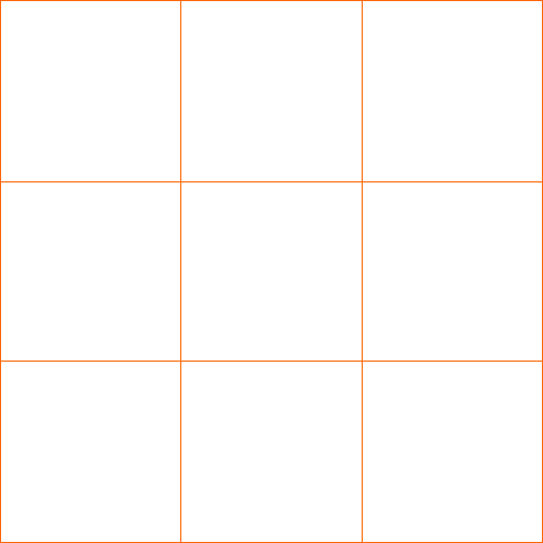
Materials symbol set study; structural grid / 2003
More for facility of quick rendering than any conceptual theme, I had been working within the confines of a square containing shape without much deviation from the very beginning of my process, so this was the last nail in the coffin of any other shape exploration. Looking back, the symbols do seem somewhat artless and rigid for the box, but I’m not ashamed or regretful. These marks are for the most basic inanimate objects in the context of hardware; it seems quite appropriate. The structural grid made them feel even more solidly built and made for a very legible system with nearly limitless potential for application and extension to additional materials.
Once the formal method had been established, it was applied to other elements of the set. Care had to be taken to maintain the balance between the literal and abstract; utility and interest.
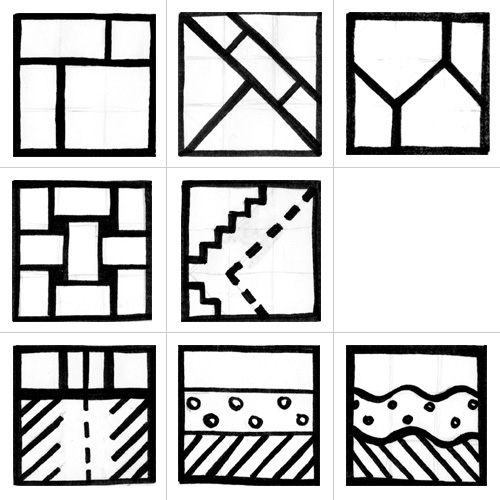
Materials symbol set study; pencil and marker on paper / 2003
top row: stone
middle row: cloth
bottom row: soil
Some materials took to the system quite readily while others required many iterations and changes of focus. Plastic, for example, can be made into almost any form imaginable, so establishing one mark to represent it in its entirety required extensive exploration.
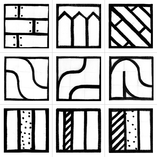
Materials symbol set study; pencil and marker on paper / 2003
top row: wood
middle row: plastic
bottom row: drywall
One great thing about geometrically drawn symbols based on a grid is that they are extremely easy to render digitally. This allowed for even more extensive exploration and variation once the marks were translated to the computer.
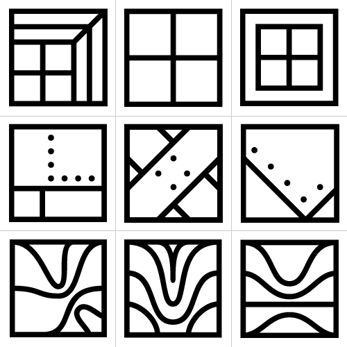
Materials symbol set study; digital sketches / 2003
top row: glass
middle row: metal
bottom row: rubber
Since different iterations could be generated quickly and accurately, creating and evaluating variations went quite smoothly for most of the set. The ceramic symbol serendipitously benefited from a perfect relationship with the grid and required only one take.
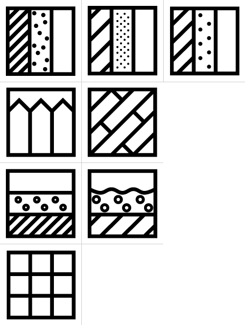
Materials symbol set study; digital sketches / 2003
top row: drywall
second row: wood
third row: soil
bottom row: ceramic
Unlike the ceramic mark, some of the materials required significant trial and error to perform at a similar level functionally and formally. Plastic called for many different sources of inspiration (and, I must say, I’m least pleased with its final mark), while other materials, such as cloth, necessitated numerous formal interpretations. However, a complete final set was well within view at this point.
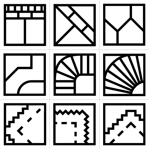
Materials symbol set; color, positive and reverse flexibility / 2003
top row: stone
middle row: plastic
bottom row: cloth
Soon enough, the complete set came together, and was put through its paces to see if the symbols could answer their duty. Could they reverse out?
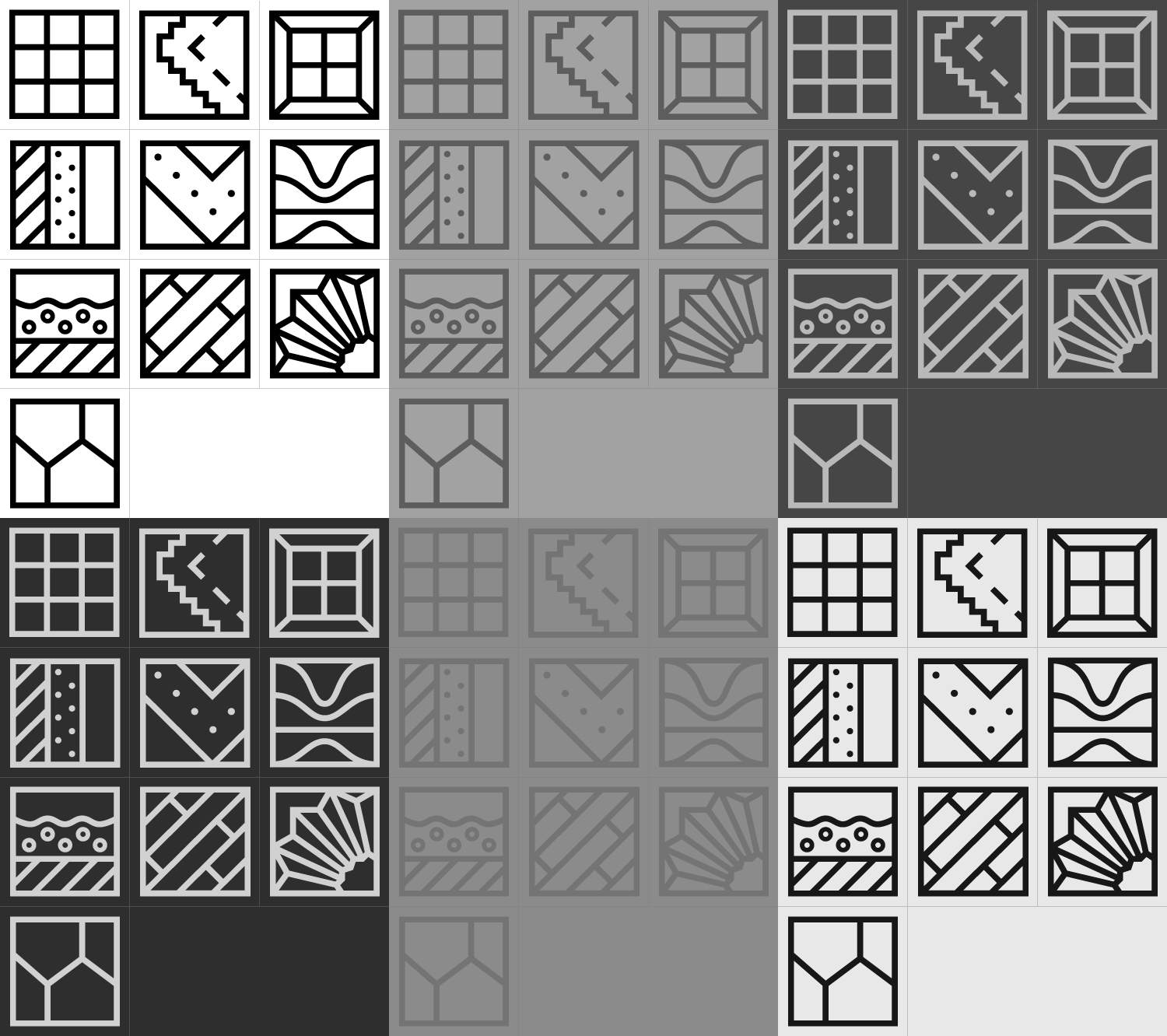
Materials symbol set; positive and reverse / 2003
top row: ceramic | cloth | glass
second row: drywall | metal | rubber
third row: soil | wood | plastic
bottom row: stone
Could they be color coded? And what about that linear execution; what if that were reversed?
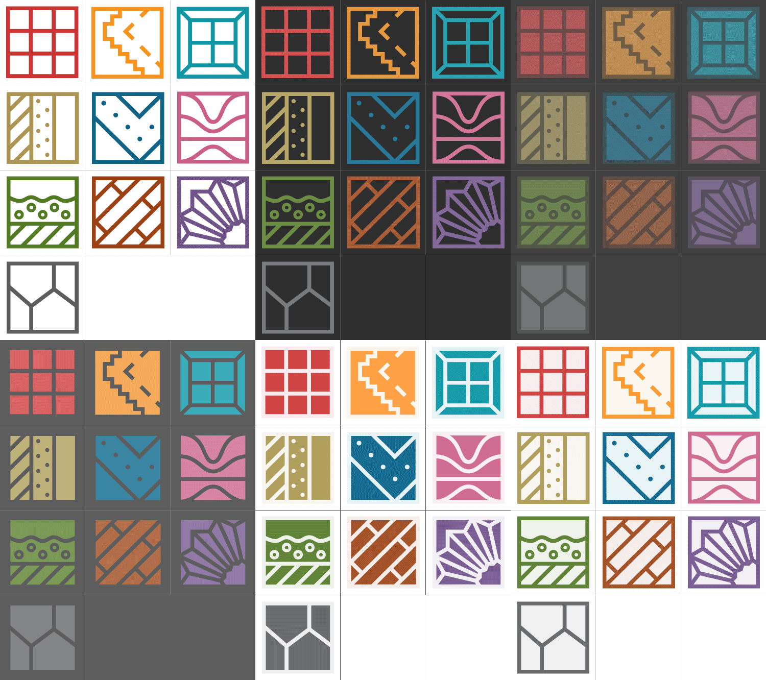
Materials symbol set; color, positive and reverse flexibility / 2003
top row: ceramic | cloth | glass
second row: drywall | metal | rubber
third row: soil | wood | plastic
bottom row: stone
But the most important question for any design, especially in a hardware store, is: Does it work? The following is but a brief study of applications, but shows how they could be useful for proper use of hardware or tools.
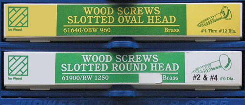
wood symbol application; proper use of hardware / 2003
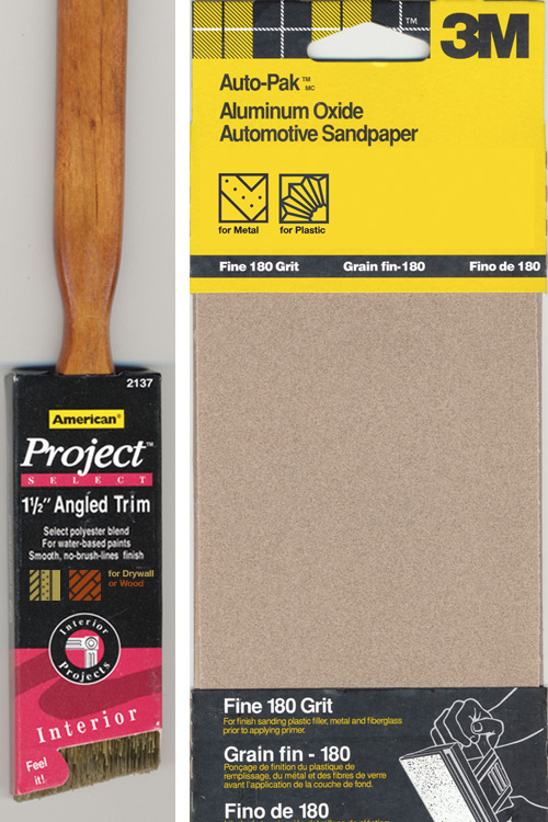
drywall, wood, metal and plastic symbol application; proper use of tools / 2003
As mentioned above, the standardization of material symbols could not only help people determine whether something should or should not be used on a particular material, it could also help people quickly identify whether a pipe was plastic or rubber, or where to find glass or wood, and so on. With smart implementation, the potential utility of the system is quite vast. Someone just has to build it.

Devon said,
March 12, 2010 at 5:14 pm
Great write-up, Dan! It brought back a lot of fun memories. I completely forgot we used “Cocaine” in the video — classy.
Daniel P. Johnston said,
March 13, 2010 at 10:55 am
Thanks, Devon! And thanks for helping make it worth writing about! There are so many hilarious gems in that film…