Prosophobia
September 29, 2009 at 9:48 pm · Filed under Content / Architecture, Copy / Writing, Identity / Systems, Industrial / Product, Interactive / Web, Naming / Words, Print / Editorial, Signage / Display

Prosophobia promotional poster; 24 x 36in. / 2002
The most celebrated role of the designer has always been that of creator of positive change through innovation, but battling the public’s inclination to treasure the old and suspect the new has historically been tough going. The current of ominous world events (especially at the time of this project’s conception, painfully close to 9/11) only serves to shore up such public reservation. For many people, the comfort of the familiar is too valuable to risk on new ideas. This promotes a homogeneous, retro-centric design market in which the new is often merely another iteration of the old.
Prosophobia (“fear of progress”) was a concept for an international design conference that would explore why many of these constructs exist and how we as designers can continue to champion progress in this environment. Featured presentations were to be given by historians, behaviorists and economists, as well as a diverse range of design leaders successfully implementing progressive work, despite this prosophobic culture.
Being a design event (and a design school project, no less), a promotional / informational poster was a critical application, and set the visual theme for the balance of the comprehensive identification and communication suite. After several dramatic, antagonistic early concepts, including a God-like hand pushing down the sunrise, a Volkswagen “New Beetle” reversing into the viewer and even a revolver loaded with antiquities and ready to fire, an approach more considerate of both sides of the matter prevailed. The front presents the issue in a re-contextualized image reminiscent of the silent film era, showing a figure literally hanging onto the past for dear life, while the flip-side speaks to the present (signified by digital visual language) offering information on the voices on offer in the conference, and an invitation to participate in the future…
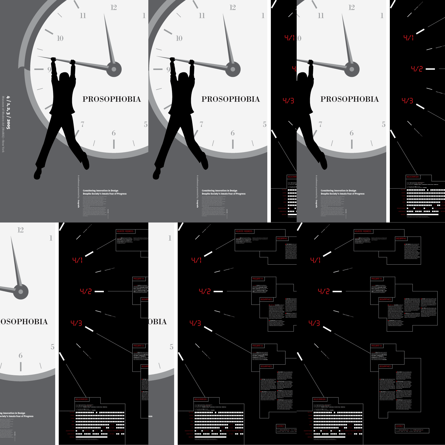
Prosophobia promotional poster (back); 24 x 36in. / 2002
When discussing professional issues of the times, designers love trading between roles of preacher and choir, probably more than any other group of people in the world. Such is the nature of a profession that practitioners find unequivocally noble but cannot hope to defend quantitatively, and thus can only be explained to those who “get it,” thus, ensuring that those who don’t get it never will. While there is no denying that Prosophobia would primarily be an event by and for designers, the issue at hand is societal, so a widespread awareness campaign was designed to stimulate dialogue in the greater human community about the conference, its premise and what it means to them.
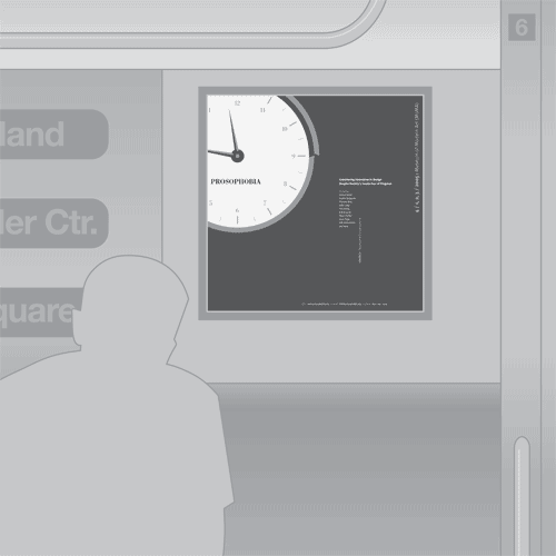
Prosophobia subway poster; 22 x 22in. / 2002
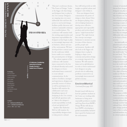
Prosophobia magazine sidebar ad; 3.25 x 9.5in. / 2002
Of course, the best way to reach someone is to talk to them directly, which this contact card was designed to help facilitate.
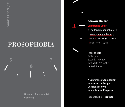
Prosophobia contact card (front and back); 2 x 3.5in. (each) / 2002
In order to reach specific audiences, it’s crucial to influence the influencers in prominent media of such respects. That’s where the letterhead and media release come in, as vehicles for formal correspondence and PR. With proper information and prodding, people would have been compelled to bring their influence and the rest of their bodies to the actual event, which is made simple with a sharp registration form.
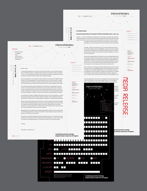
Prosophobia letterhead, media release and registration form; 8.5 x 11in., 8.5 x 14in. and 8.5 x 11in., respectively / 2002
Envelopes make such correspondence much easier to mail.
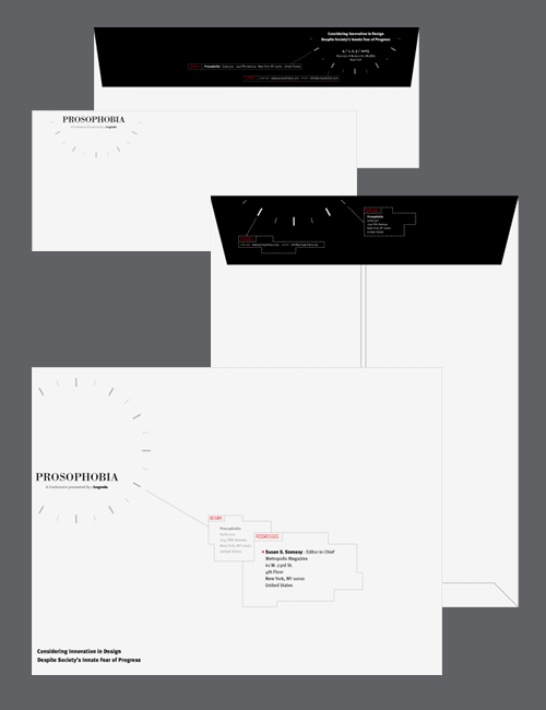
Prosophobia No.10 commercial envelope (back / flap and front) and No.10 catalog envelope (back / flap and front with die-cut, crack-and-peel address label) / 2002
Once the audiences’ attention has been captured for a minute, they are directed to a promotional / informational web site, where the minute quickly disappears (and then so does more and more time). This flash of loss animates into the the primary content, where visitors could gain knowledge of the event, such as speaker bios, accommodations, and features, as well as register for the conference.
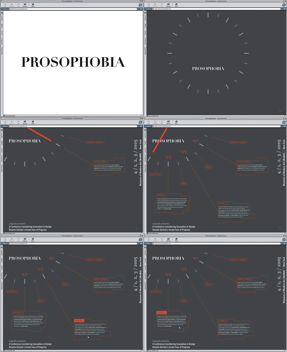
Prosophobia web site; 1024 x 768px.+; interactive Flash interface (shown here in an animated storyboard) / 2002
As a symbolic celebration of Modernity’s rare but powerful triumphs, the conference was to be held in conjunction with the grand re-opening of the MoMA in New York after Yoshio Taniguchi’s architectural expansion / remodel in 2005. (Taniguchi was also to give the keynote address.) Seen here is a detail of way-finding signage in-situ.
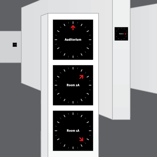
Prosophobia directional signage; vinyl on Plexiglas; 10 x 10 x .25in. (each) / 2002
Once at the conference, attendees would be provided a number of things to help them kick the Prosophobia: A time table of all of the events they could plug into…
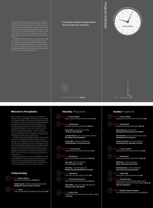
Prosophobia program schedule tri-fold brochure (outside spread / inside spread); 3 x 6in. (finished), 9 x 6in. (flat) / 2002
A DVD documenting the feature presentations, breakout sessions and round-table discussions…
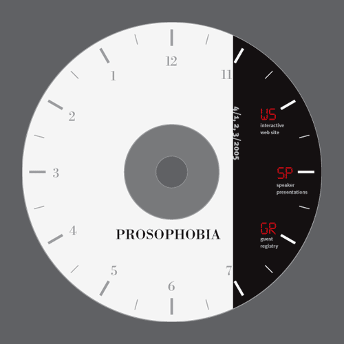
Prosophobia documentary DVD; standard dimensions / 2002
And, of course, a commemorative watch, so attendees could always have the public interest at hand (it runs backwards).
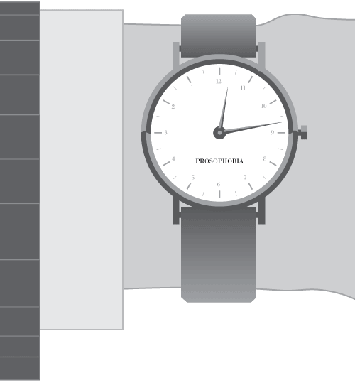
Prosophobia commemorative wrist watch; reverse movement / 2002
Don’t be late!
