Tall, Stark and Handsome
January 29, 2009 at 10:19 pm · Filed under Naming / Words, Type / Fonts
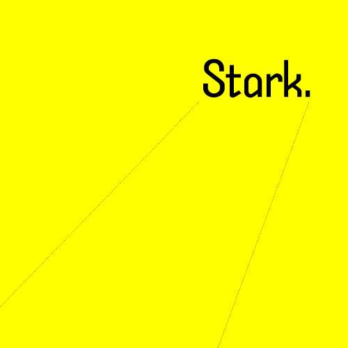
Stark original typeface design / 2002
Ignore the Din and find a new Trade. Here comes another lean, monosyllabic hero of noir typography. He takes his briefcase locked, his drinks neat and his checks made out to “cash.” He takes wise guys to the cleaners and the birds take him just the way he is. He’s got a hardboiled manner and doesn’t care for idle banter, thank you, so you can keep the jibber-jabber to yourself. He’ll tell you what you need to know and nothing more. But he’s not just another working stiff. He’s got working class.
He’s got a cleft chin and a sordid past with which you need not concern yourself. All that matters is on the dotted lines. He stands tall but keeps a low profile. He’s sharp as nails and almost as kind. He doesn’t want to be your best friend but he’s probably the man you want on the case. He’s Stark…
Stark is a long drink of water with a shadow to match. He stands up straight and keeps his cards sewn to his chest. He’ll light a cigarette in your office and wear it low on his lip as he tells your rags right from wrong. You can put this on the record because it’s official business of capital import:
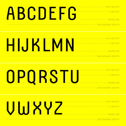
Stark caps / 2002
Well, if you’re going to stick around, you may as well take a seat, but don’t get too comfortable. After a long headline and a night-cap, Stark still wears his gaze under a slanted brim and he isn’t afraid to give a wink in casual setting. But if you give him the jumble, he’ll give you the hook. Pay attention, kid, because he’s never without a clipped counter in any exchange and he’s already seen plenty other pretty faces:
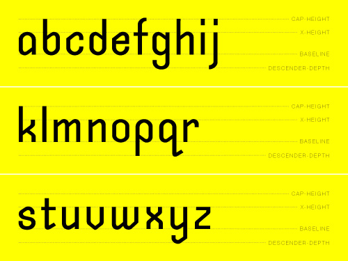
Stark lower case / 2002
Stark just deals in the facts, ma’am, and he’ll break the numbers to you—good or bad—with the same stamps of authority:
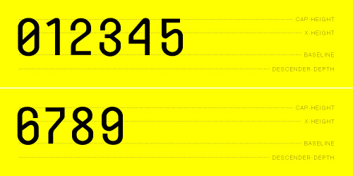
Stark numerals / 2002
When it comes to the end of the line, you can rest assured knowing Stark gave you a piece of his mind. Chances are, he’ll leave your punctuation hanging (but don’t quote me on that):
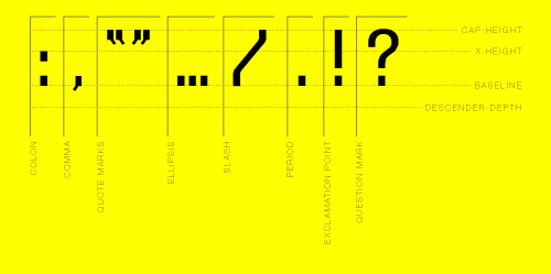
Stark selected punctuation / 2002
Well, it looks like that’s another one for the books. Best to just keep on moving before you get yourself into trouble. Forget everything you just saw. But if you’ve got a tough file that you need straightened out, you know where to look. You’d better watch closely, though, sport; Stark may just have designs on your desk.
The End

Behind the Scenes
Some early sketches for Stark were published in Designing Type by Karen Cheng (the Professor under whom I studied type design at the University of Washington). You might want to do yourself a favor and pick up a copy. He’s on page 155. And the rest of the book is pretty good, too:
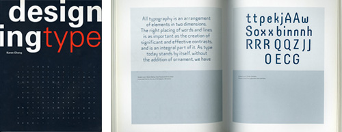
Designing Type by Karen Cheng; cover and inside spread showing early sketches for Stark (on the right page); Yale University Press / 2006
