The Logical Type
December 4, 2008 at 11:33 pm · Filed under Naming / Words, Type / Fonts

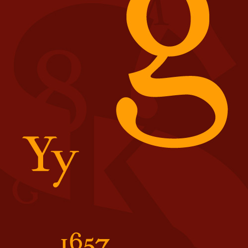
Sylloge typeface (promotional collage) / 2002
All type says something more than that which has been written. Some writing is logical. Therefore, some typefaces can make prose seem more logical than it actually is. This is an example of syllogistic reasoning. This is Sylloge, an original typeface design…
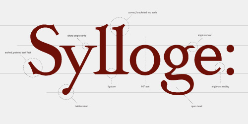
Sylloge typeface (elements) / 2002
(+) Click to enlarge and see complete character set.
Its character is wise; believable; stable in its bracketed, serifed footing; distinguished by graceful nuance; considered in its humanistic stroke weight variation; resolute in its straight stance. This is the perfect face to put forth for one’s most ardent case.

Sylloge typeface (text numerals) / 2002
(+) Click to enlarge and see complete character set.
Numbers like this don’t lie. Just think how comfortably they would sit even in the thick of the discussion. Not like those ruffian lining numerals that shout so inappropriately at cap height all the time.
But the designer must always be conscientious. One should never use a pretty face to say something disingenuous. What is written is still far more important than the typeface in which it is spelled. Syllogistic fallacies are not uncommon, and they still pass for logic.
So here is Sylloge. Type carefully.

