Cracking the Code
November 22, 2008 at 2:00 pm · Filed under Content / Architecture, Copy / Writing, Industrial / Product, Packaging / 3-Dimensional, Photography / Film, Print / Editorial

one of two entrances to room 247—the Visual Communication Design major studio in the University of Washington School of Art—both are locked at all times / photo taken 2008
A terrible economy. Personal pride. Do or die time. A real studio environment. Some brilliant competition. Real work experience. Real failure experience. Real life experience. An utterly unforgiving professor. A strong sense of potential. Total commitment.
I’m not sure exactly what the most motivating factor was for me as I went through “206,” the second of two screening classes the University of Washington Visual Communication Design program, used to select who could complete the next two-and-a-half years of the VCD program in 2001/2002. Whatever it was, that class marked a tectonic shift in my approach to design work. It was the second time I had made it into 206, and, likely, my last chance to make the final cut into the VCD major. In contrast to the first attempt, I felt no self-satisfaction in the step—just an unflinching focus on the next…
The first project was quite familiar: Design a postage stamp to celebrate something about one of the United States. I was assigned Florida. I’ve never been to Florida. Of course, I know a thing or two about it, but I wasn’t satisfied with just my anecdotal perceptions; I read books on the state and tangential topics to ensure total confidence in whatever direction I chose to pursue.
While I think that NASCAR has grown into a fat, ugly, dumb, deceitful and thoroughly boring scourge on the culture of motor sports, I watched the Daytona 500 quite faithfully as a youngster and used this as inspiration for one concept:

Florida postage stamp sketch: Daytona 500 / 2002
Can’t you just hear the big block V-8 revs roaring through the state?
Another concept, which I ended up moving forward with, was that of the splendidly-restored and preserved historic Art Deco hotel district in Miami. For this concept, I studied a plethora of tourism and architecture books for reference, but my approach wasn’t just to recreate the X hotel on Y street; I painstakingly created my own architectural amalgams that would capture the essence of the area:

Florida postage stamp sketches: Art Deco Historic Distric / 2002
These studies allowed me to delve into some of the different iconic elements of the period: streamlined façades, bright pastels, rounded corners, chrome runners, large clocks, glass block, heavy eyebrows, neon back-lighting, stepped levels.
From this foundation, I built my final solution: A heroic destination with hand-drawn Deco type stacked on a railed sign tower:

Florida Art Deco District postage stamp; 1 x 1.125in. / 2002
The second project was to create a package for a first aid kit. There are thousands of different kinds of first aid kits in the world. I did not want to just make one more. I knew a lot about bike riding by this point, having worked at a shop for four years and having ridden endless miles with hundreds of different people for fun and/or training, and I knew well the two worst things that could happen on a ride: a “mechanical” (something bad happens to your bike), or a crash (something bad happens to you). So, I designed a first aid kit for bike rides, comprising a roadside repair kit for your bike and an injury kit for you, taking the shape of a bifurcated water bottle that would fit in any standard water bottle cage on almost any kind of bike.
I explored approximately one million different ways to synthesize and separate the two components visually with the exterior graphic design (here are a few):

First Aid kit package graphics sketches / 2002
But before I could apply any kind of graphics to the package, I had to actually make the package. I ordered about a dozen bottles that I figured would serve as the best platform for my mockup. I cut them apart and glued different pieces together to make two halves that would screw into each other. I chopped the cap to get rid of the nozzle and made a flat top from sheet vinyl. I filled beveled insets with putty and sanded off any external textural elements for a good base. I then glued ultra-thin sheet vinyl around the forms for a perfectly smooth exterior.
After final sanding and priming, I painted the two halves and applied the exterior type and graphic elements. I had eventually decided on a simple solution that cleverly speaks to both purposes of the tool, dynamically formated for the cylindrical surface: a red cross is created optically by the composition of the title, the brand name (Cannondale, fictitiously), the components and two yellow road stripes that angle up and around the kit, all of which I had had custom made as dry-transfer rub-downs:

First Aid injury kit / roadside repair kit / 2002
I was terrified that this thing would come flying apart before I could even submit it for class, but I must have done something right because I still have this eight years on and it’s still perfectly intact.
The final project was a poster-mailer for Seattle’s Museum of Flight. After some initial research, I packed the family heirloom WWII-era Leica and journeyed down to the museum with two concepts already in mind for this informative self-mailer/poster.
The first idea was based on the vast range of exhibits in the the Museum’s collection, from an centuries-old Asian hang glider to a NASA lunar module, and quite a bit in-between. The concept was The Evolution of Aviation:

The Evolution of Aviation Seattle Museum of Flight poster-mailer sketch; 30 x 20in. / 2002
I think the idea is valid and compelling (if the initial design concept rather clunky), but it didn’t capture the essential attraction of the Seattle Museum of Flight.
Perhaps the most striking aspect of this Seattle mainstay is that the majority of the aircraft are set not out on some abandoned airfield, but in a constellation of smartly appropriate structures, from the Red Barn, housing vintage prop planes from the early twentieth century, to the control tower, where kids young and old can practice pushing tin, to the pinnacle of the Museum: The Great Gallery, a giant hangar of glass and steel in which some of the most remarkable feats of modern aviation are showcased. These spaces are powerful attractions, in themselves. I worked on a concept that would speak to both the fascinating details one could learn at the museum and the structures in which they were showcased. I titled these pieces Aviation from the Inside. I developed two executions within this theme:

Aviation from the Inside Seattle Museum of Flight poster-mailer sketch; 30 x 20in. / 2002
The first idea offered a view from inside the American Airlines 737 section one can enter from the second floor, which serves as a theater for films, and a window seat to the Gallery where real jets hang like rubber-band-prop toys from the ceiling.
But the way to get the real inside story at the Museum is by just walking the ramps, pathways and landings that meander (very) closely around, over, under (and, in some cases, into) some of the world’s most exotic marvels of aeronautical design. Like the M-21 (a variant of the SR-71) Blackbird spy plane, which has a huge, breathtakingly sculptural fuselage, a cramped, angular cockpit, and gaping titanium ramjet exhaust cowlings that could swallow you whole:
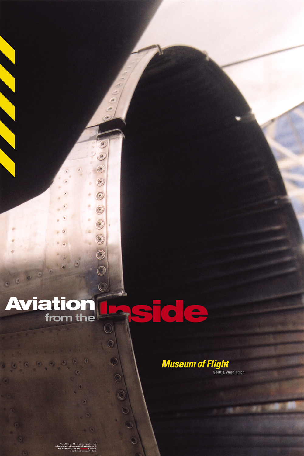
Aviation from the Inside poster-mailer (front); 20 x 30in. / 2002 (original photograph also from 2002)
I was quite pleased with this photograph, and was so satisfied to let it be the hero of composition, bled full and even stealing part of the title. Caution stripes that complement the Museum type complete the tantalization.
The flip-side spoke to the different experiences one could get inside: the gallery, the machinery, the cockpit and the control tower, and, of course, it also offered inside information for visiting the Museum. The front and back complement each other through the cautionary visual language, the typographic system, conceptual messaging and a shared sense of visual play between foreground and background:
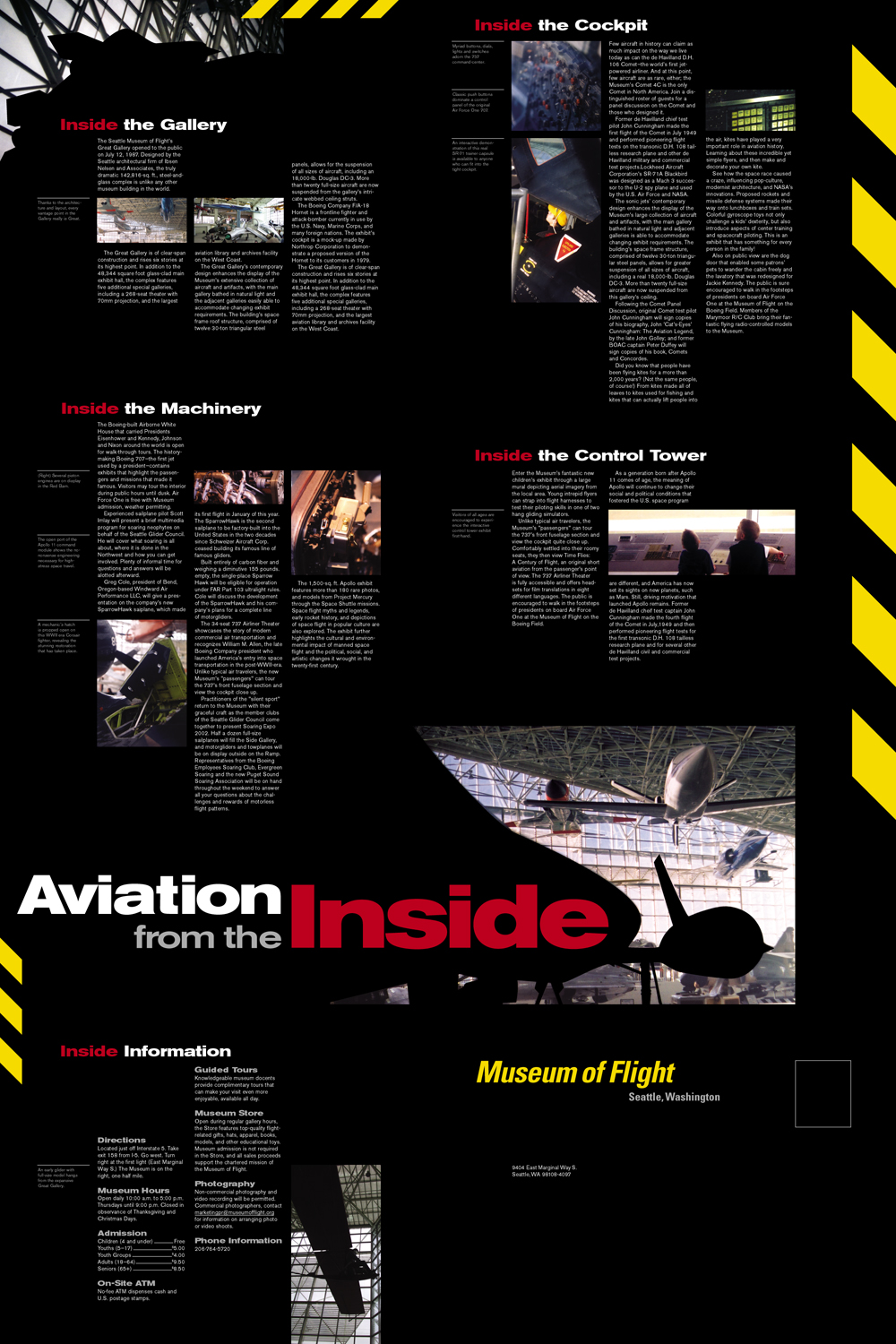
Aviation from the Inside poster-mailer (back); 20 x 30in. (open), 10 x 6in. (folded for mailing) / 2002 (original photography also from 2002)
This remains one of my all-time favorite design projects.
As the quarter’s end drew near, I had a distinctly new feeling. After three years of absence, I was again engaged. I was interested to see what I could do next. Though I would never admit it to myself, I was certain that I would not only make it into the VCD major, but that I could more than make up for lost time. So did the faculty. I was finally in.
