Back to School Time
September 14, 2008 at 1:27 pm · Filed under Identity / Systems, Print / Editorial, Type / Fonts
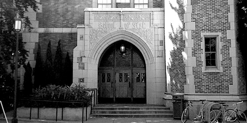
University of Washington School of Art, main entrance / photo taken 2008
Like most epiphanies, one of my most life-changing ideas came to me suddenly when I was in the bathroom. It was September 2nd, 2001. I had been working full-time as a designer since 1999. In July of that year, I had indulged in a very expensive but amazing vacation, following the Tour de France. Three days after my trip, I returned to work to rumors of massive layoffs. Within a week, tours of the company’s one-year-new building revealed empty desks that quickly multiplied into empty floors. By August 20th, it was clear that the in-house design department, too, was going dark. September 14th was going to be my last day. I had no idea what I was going to do, and then I did.
Two years and change earlier, I had made a rather precarious exit from the Visual Communication Design (VCD) program at the University of Washington. I was disheartened for a while, then embittered, then dismissive, then all-but-forgetful of the whole experience. And then, on that day in September, it came to me: I would go back and finish school. Or, rather, I would try to finish school. After all, I was going straight back to the horse that threw me, and, if anything, it was more fierce than ever (bad economies feed schools with lots of accomplished and motivated applicants). Any prior thoughts of repeating this wicked roulette were momentary lapses in sanity. But, upon my decision that day, my resolve was unshakable.
About a week and a half after my decision, I took one of my final vacation days. An hour or so after I woke up, I checked my personal email program, which showed news stories in one of the frames. The Twin Towers and half of the Pentagon had been obliterated within the span of a few hours. Luckily, I did not know anyone personally who was involved in these catastrophes but it seems strange to tell a story about that time without mentioning it. To be honest, it was all quite disaffecting considering the ever more improbable absurdity the country had been subjected to in the year or so leading up to the events. It was all just more impervious steel turned to dust. My decision was unmoved…
Back to school, then. I had paid approximately zero attention to the VCD program in my absence, but, ostensibly, the program turned out to be the same two years on. One still had to make it through two screening classes, still called 205 and 206 (even if one had made it through 205 before, as I had, to try again required repeating the entire process). The classes still had three projects each, which were essentially the same as before. But the truth of the initial screening had become exposed, to the bone. The first time I went through, the competitive aspect was localized, as the class was broken into small studios and that never intertwined, and it was usually only spoken about vaguely (“a lot of applicants”). This time, they corralled the 200 candidates (up from about 150 my first time through) into a 200-seat lecture hall two days a week. About three weeks into the class, the professor asked how many people were aiming to make it into the 20 spots in the program (as opposed to just taking the class as an elective). I saw everyone raise their hand and look around, eyes wide. The professor knew that would be the result of the poll, and told us so. I sat in the very back row and spoke to no one. I didn’t even raise my hand. I still cannot believe my ensuing experience at the UW when I think of that day.
Now, back to dust. I was living very temporarily on severance, then on meager unemployment benefits while enrolled in a formidable three-month-long test to see if I could get into another, more formidable three-month-long test, to see if I could go back to school full-time. If I didn’t look for a job, I would lose my benefits. If I got a job, I wouldn’t be able to focus on school. If I didn’t focus on school, I wouldn’t get into the next class, let alone the program. The only logical plan was to focus on school and casually apply only for fantasy jobs, like Global Creative Director for Cannondale or something, preferably in some exotic city, like Zürich (nicht wahrscheinlich). If I got one of those, then screw school. If I got into the program, I would go for student loans and/or scholarships because, when I finished the screening process, I would be completely broke. If I didn’t get into the program, then, well…
Now, back to school. The first project of 2001’s 205 class was almost identical to the first project of 205 from 1999: Create a letter mark that represented some sort of action. The only difference is that they chose the word for you this time, which was probably a good thing, since I, like most of the students, spent way too much time coming up with crappy words before. My word this time was “Repel.”
I sketched lots of options that showed the letter R repelling itself somehow:

Repel mark sketches / 2001
My breakthrough, so to speak, came in chopping the top of the capitol R letter form. This allowed the static, upright stem to be acted upon more overtly by the much more dynamic curve of the bowl and angular leg while still reading as a single character that pretty clearly represented the physical act of repelling (as in mountaineering). The arrow is a bit of a crutch, but it’s not too egregious. Sketches of the idea seemed to get a decent nod from the professor in critiques (no mean feat), so I figured I was in good shape:

Repel letter mark / 2001
About a week after turning our work in, we got a generic email telling us to pick up our projects. The class collected randomly in a cold room with only a series of alphanumerically-coded bins. Each project was graded with a simple check (fine), check-minus (bad), or check-plus (good). My R got a check-minus. I was devastated. I instantly and deeply regretted my attempt to redress VCD. My attention span ran in 3-second intervals. My steel resolve was ripped to ribbons in the stroke of a pencil and it was all I could do to stay standing.
The next day, I went to office hours to ask the professor how or if there was any way I could “save” this broken project for re-submission before our final deadline at the end of the quarter. Ironically, my enervation was assuaged by his mild amusement at this state, and his (equally mild) surprise at my grade. Apparently, the work had been reviewed by some mystery panel, whose makeup I never learned. At any rate, he suggested that the mark would be better if it were more geometric, so I made it more geometric:

Repel letter mark (revision) / 2001
I still think the original is better.
The next project was unconventional and provocative, as it charged the students with conceptualizing an editorial perspective based on the interpretation of a given word, which would also serve as the title for the piece. My given word was “space.” My editorial perspective sparked by the word was that cyberspace was an unnatural, blocky layer inserted into the space of human interaction. I think I was onto something with this:
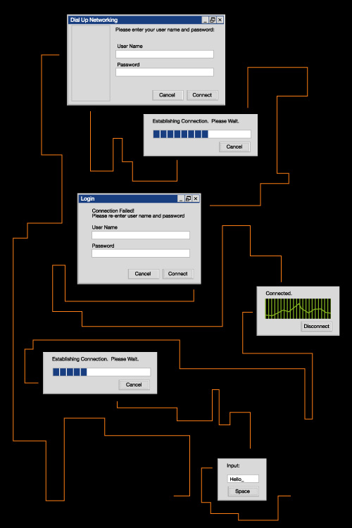
Space mini-poster sketch / 6in. x 9in.
The angular computation of personal communication is kind of amusing, and it is pretty easy to get as a concept. Somehow I lost confidence in the idea, though, and I ended up with this:
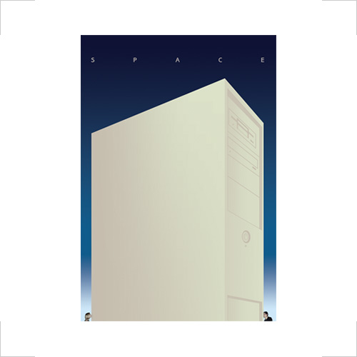
Space mini-poster, 6in. x 9in. / 2001
I really don’t like this solution at all (despite featuring my good friend Joel and his wife). It just doesn’t explain itself very well, even if you think about it for a while. I almost like it formally, but not really.
I think the last project was billed as a poster for a conference, but it was really much more like a book cover, since the only type on it was only to be the name of a particular academic subject (have you ever seen a poster that just said “Math” on it?… that wasn’t for a band called “Math”?). After my dubious “Genetics” book cover experiment from three years prior, I was now on to “Biology.” There was an oddly un-intellectual requirement added to the set of parameters around the project: It had to have at least one circle, one line, and one rectangle in the composition (The students assigned “Geometry” were either really lucky or really stifled, depending on their perspective).
I hit the books, myself, ransacking the University’s incredibly diverse and widespread array of science libraries for what I figured would be a goldmine of visual source material for reference and inspiration: specialized photography, process diagrams, illustrations, etc. The big surprise was that, either I didn’t look hard enough, or there wasn’t much to be had. This was perhaps the most interesting lesson of the project: Graphic design is a powerful means to express an idea, be it commercial, political, scientific, or otherwise, but it is terribly under-appreciated and/or under-utilized by all but those that are savvy enough to realize this and also have the means to engage the process (read: big business). It is a shame that designers are not well enough represented in the academic world to make the subject matter more engaging and easier to understand for more people, thus advancing research that much faster. Alas, if the interest is there (from either side of the fence), the money is not, so most scientific research is confined within black walls of dense paragraphs, built with sesquipedalian jargon. On a tangential note, the understanding of national politics, too, could be greatly enhanced by a few well-considered charts and graphs, but, although the money is there, the desire to clarify situations, positions, and plans has never seemed to be the most striking idea to those in or seeking political office.
Now back to my book. I decided that, if this book were to be used to take a closer look at biology, it should get really close. I did find some decent microscopy images of varying magnification and scientific colorization that I set in a molecular composition with abstracted slides that together juxtaposed the organic subject matter and the scientific study thereof:

Biology book cover, 10in. x 16in. / 2001
Compared my Genetics book cover, it’s still a bit frightening, but more intriguing and straightforward, as opposed to sinister and political.
Another element of the new screening process was that, in addition to the final projects and any revisions one may have made thereto, every student was to also compile a process book that showed the different iterations they had gone through to arrive at their final solutions. Some things never change, though, and I was at one of the two industrial print shops in the city that Wire-O bound books within the hour all materials were due. Luckily, I didn’t get a flat on my time trial back to school.
The icing on the cold cake of the new process was that they had replaced the “interviews,” in which two professors would call students in one at a time to explain how they had or had not passed into 206, and offer at least a modicum of praise, encouragement, or consolation, as appropriate. In 2001, one of two form letters were mailed to the student’s officially recorded home address. About a week after my final submissions were left on the table in room ART 230, I received my letter. I stared at the envelope for a few minutes before I opened it, and then I did.
I had made it into 206—for the second time. I exhaled for about seven seconds.

Joel Brazil said,
September 15, 2008 at 2:24 am
Nice post Daniel P., love that one of your projects featured me and the missus, think our CD is still on of the great designs of all time. It was good to catch up in Seattle, only wish we had more time. I just bought this bike by the way – http://www.pashley.co.uk/guvnor/
Keep in touch eh?
Joel
Daniel P. Johnston said,
September 15, 2008 at 12:18 pm
Joelbr,
Thanks for the comment. That is a beauty of a bicycle; I do hope you were able to go for the double top tube, 3-speed model. Speaking of gubernatorial greatness, you might want to do yourself a favor and check out Guv’ner, the band. I have “She’s Evil” on an old tape of KCMU programming (now KEXP) that never disappoints.
I definitely look forward to catching up again in person when we have more time. In the meantime, don’t worry; the Amy + Joel project is soon up in the queue.