There is No “Inc.” in “Team”
July 6, 2008 at 9:49 pm · Filed under Content / Architecture, Copy / Writing, Identity / Systems, Interactive / Web, Packaging / 3-Dimensional, Print / Editorial, Uniforms / Apparel

UBC monogram mark for Union Bay Cycling / 2001
A competitive cycling team, like all other kinds of teams, is a of a group of people with a similar interest; in this case, the team’s chief objective is to win bike races. The primary vehicle of a cycling team’s identity is the uniform that team members wear out racing and training. This identity is complicated, however, by the fact that competitive cycling is one of the very few sports in the world based on a sponsorship model, whereby commercial interests pay for some aspect of team operations in return for visible recognition on these uniforms. Almost invariably, this leads to a team’s identity being inextricably intertwined with the identity of their lead sponsors, which can change relatively frequently.
For example, most people would say that Lance Armstrong raced the last season of his career with the Discovery Channel team, and that, before that, he was on the U.S. Postal Service team for six years or so, even though these were, for all intents and purposes, the exact same team, managed by Tailwind Sports.
Union Bay Cycling (UBC) is a large Northwest cycling organization built around an elite-level team that races in local, regional, and national events at the pro/am level. UBC has been around, with the same leadership and core group of riders, for over a decade, but major sponsorship changes had made it seem like three or four disparate and relatively short-lived teams. For UBC, I worked with the team director to develop a long-term solution: a core identity system that accommodates prominent and unique recognition for lead sponsors, but embodies the unique heritage and dynamism of the team riders and stays consistent even with major sponsor changes.
I began with the UBC monogram mark (above) that would immediately identify all communication touchpoints of the team: stationery for proposals, press releases and other correspondence, the web site, T-shirts, gear bags, and so on, and, of course, the all-important team kit, including jerseys, shorts, socks, water bottles, gloves, helmet graphics, and several other tertiary clothing articles.
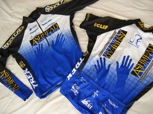
Union Bay Cycling jerseys (long-sleeve front | short-sleeve back) / 2003; I also happened to have designed the Holcam logo on the jersey shoulders (but not their web site) / 2001
The blue grid, an established device of the team, was reworked and became the foundation of this flexible system. The title sponsor was rewarded not only with the most prominent logo presence, but also with an expressive element emerging from the grid (in this case, the hands of Ashmead College, School of Massage), and other sponsors fit into pre-established hierarchical slots based on their respective levels of contribution…
Just behind the team uniforms, the next most critical touchpoint of the organization’s identity was the team web site, which I also designed and coded. As it was my first major foray into Flash, the concept of the site probably outshone the rather clunky execution. I know enough about Flash to elucidate an idea, but not enough to “optimize” the experience as specialist programmers can. The layout is a bit dodgy in some regards as well. Nevertheless, the site brought the dynamism and personality of the team to the Internet within the context of the sponsored team identity concept.
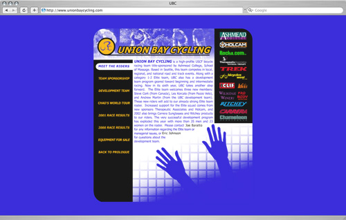
Union Bay Cycling web site / 2002
Here, too, the hands of Ashmead College emerged from the grid. The dynamic visual hook here was that the hands would actually move across the screen to “massage” the site from one page to the next.
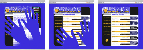
the Ashmead hands in action, transitioning from the home page to the “Meet the Riders” landing page
In addition to the layout and interactive execution, I also developed and wrote most of the content, including pithy, spirited interviews of team members that brought the individual personalities out of the uniforms.
Over the years, the team identity concept was indeed tested, as other lead sponsors were considered—everything from wineries to gyms to car dealerships—and we illustrated these possibilities in various mockup sketches as part of the proposals. I won’t show these online, as I wouldn’t want to jeopardize these professional relationships. Imagine, though, for instance, in the case of the winery, vines of grapes or a hand toasting a goblet emerging from the grid; web pages being poured into the site. The possibilities, as they say, are endless.
But, as long as I was involved with the team, the Ashmead massage school (and their hands) remained committed to the team, which was great, as they were more than just a name on the jersey; they were highly engaged in realizing the mutual promotional and educational potential of the partnership. As a case in point, one element of the relationship provided for the racers to be worked on weekly by the massage trainees, which, in itself, proved to be valuable experience for both groups. Moreover, the Ashmead jersey is probably the only racing uniform that allows racers to raise more than just two hands after a well-deserved victory.
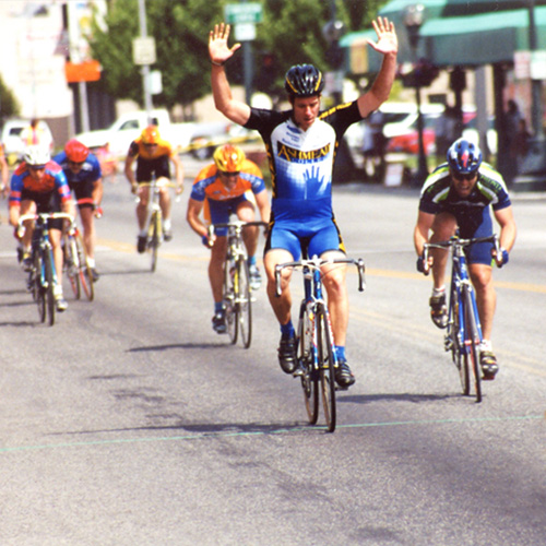
team rider Ingy taking one of many team victories (photographer unknown) / 2001

James D. Nesbitt said,
July 8, 2008 at 11:51 am
This was quite interesting, especially the info on how sponsors fit within a pre-established grid based upon their commitment to the team. I always wondered how that worked. I suppose NASCAR has a similar grid-based structure.
I have to comment on the hands however. Its just my sense of humor, but it seems as if a poor soul is desperately trying to escape the vacuum of the rider’s biker shorts. LOL
Now that you’ve lived in NYC for a few years, have you finally joined up with another racing team yet?
Daniel P. Johnston said,
July 13, 2008 at 8:32 pm
Thanks for the comment, Jim,
Indeed, NASCAR (and motor racing in general) is another sport based on the sponsorship model. I think the origin of these relationships probably had a lot to do with the equipment factor; race cars and bikes are really expensive and, of course, integral to the respective sports, and, if you look in the archives, you’ll see that most teams were originally based solely on their equipment suppliers. Of course, the sponsorship requirements of both sports have expanded and diversified immensely since their simple dawns. And, yes, I’m sure you can bet your bottom sponsor (the one with the 2 inch decal just behind the rear fender) that NASCAR teams have every micron of those cars spec’d out for exact pricing.
The hands moving across the jerseys are obviously meant to represent the massaging hands of the sponsor’s academy. The grid, too, can be read as the Japanese-style screens common in the massage studio. Or, maybe it’s just a poor soul in a grid.
And, as you allude to, I was not only the designer, I was also a member. And, yes, I ended up racing with a really great team here for a couple seasons. But, sadly, I haven’t had much time or interest in the atrocious NYC racing scene lately.