Fat and Invisible at the Same Time
June 8, 2008 at 3:12 pm · Filed under Identity / Systems, Print / Editorial, Signage / Display, Uniforms / Apparel
![]()
FatPort logo / 2001, 2008
Though the Internet has been around, in one form or another, for many decades, it had little public awareness until about twenty years ago. By the mid 1990s, the World Wide Web had been plotted by a smattering of amateur “home pages,” which generally consisted of some “lite” personal information about the site’s owner (or “webmaster”) and their hobbies (one of those invariably being “the Internet”). By the late 1990s, these folksy homes were being overwhelmed by the sprawl of “dot-coms” from corporate startups and stalwarts flocking to the new marketplace, and Internet tools like email were beginning to make their way into everyday practice. But, until the early 2000s, the only place in the whole wide world that one would likely experience these sites and services was from the office, or through their droolingly slow modem at home, which made anything but the most formal or mundane tasks a bit difficult for most folks.
Soon enough, though, many public establishments started offering wireless Internet service, enabling the populace to get out into the world and peruse the Web at office-like speeds from their own laptops at places that they already liked going, like coffee shops or bookstores. This service is often referred to casually as “Wi-Fi,” which is a contraction of ‘Wireless’… um…’Fidelity’??, a name created by those wacky kids over at Interbrand for an actual alliance supporting the “IEEE 802.11b Direct Sequence” specifications (I’m not making this stuff up).
Whatever the protocol may be named (or numbered, or whatever), one of the first Wi-Fi service providers primarily for consumer usage in public establishments was FatPort, a Vancouver, B.C. startup established by a few programmers, including my good friend Ingy, who hired me to help develop the venture’s visual identity (but left a relatively short time thereafter).
Before I was brought in, the name of this service had been established by the founders. A “fat port” is sort of programmer-slang for a good, wide-open connection. Ingy actually had the idea for a ‘fat’ radio tower mark, which I thought was good, so I basically just did it. I then set the type in “fat” and “open” weights to reinforce the idea in a distinctive word-mark. The strong, simple palette of red, white and black hints at the Canadian roots of the program and is highly versatile for any number of applications…
This is one of only a few projects that I feel compelled to show a revision of, as I can’t figure out why I did what I did initially. Above, I show how the logo would look if the radio tower mark (unchanged from my initial design) was paired with type set in the quintessential Modern, geometric, sans-serif Futura, which echoes the weight and geometric nature of the radio tower quite nicely, if I do say so, myself. However, the original logo was set with modified weights of Hoefler Text, which is a perfectly fine serif face (particularly suited to lengths of copy, as the name suggests), but has very little correlation with the mark, and whose “fat” modification here borders on the comical. This didn’t come totally out of the blue, as the founders were not of the MBA set; they were an enterprising mix of fringe programmers (they called their mass consumer-facing business FatPort, after all). Their quirky quality is reflected in this setting, but the lockup is somewhat disjointed for the cause.
![]()
This is the original FatPort logo. The type on its own is actually pretty strong, overall, and works well with identity extensions like the ‘Network’ logo below. It’s just that it clashes with and overwhelms the tower mark, which is the hero of the lockup. / 2001
![]()
FatPort Network lockup (reversed out of black). Here is an example of the flexible modularity of color usage between black, red and white.
Nevertheless, the logo, even with the original type, was a powerful signal to the strength of the offering and the resolve of the entrepreneurs’ belief in its market potential. It was also instantly meaningful and unique. (This came well before T-Mobile’s comparably weak wordmark for it’s “HotSpot” service and countless other emanating wave marks for other such services since).
Applications of the identity in signage, equipment badges and representative identification provided a clear beacon for business and retail consumers alike:
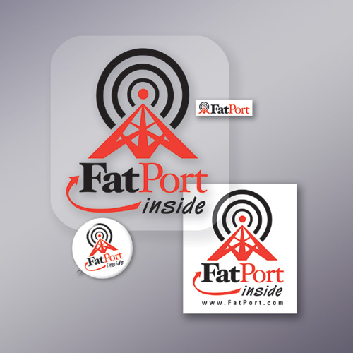
clockwise from top-left: FatPort inside clear window decal for service providers like coffee shops, bookstores, libraries, etc., 6in. x 8in.; small FatPort equipment label, 2in. x .5in.; alternate FatPort inside window decal, 4in. x 5.5in.; Fatport inside representative button, 2in.ø
And, it also happened to look tough as crap on a T-shirt:
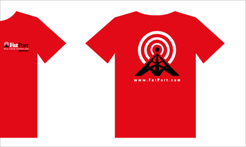
FatPort T-Shirt; [cropped] front and full back
And it worked! The business was a huge success from the very start and has grown dramatically since, now serving as the leading wireless Internet service provider in Canada and spreading. I hear the sunset calling (or is it emailing?)…
But, alas, as any bookworm knows (remember books?), happy endings are for kids, and we’re all adults here. FatPort changed their logo a few years ago—and not just the typography; we’re talking full-on throw-out-the-baby redesign. I must say, I admire them for wanting to be different from the growing ranks of look-a-like logos for Wi-Fi service, but the new logo just doesn’t make sense: Why are they working so hard to keep the doors closed on the fat port? And if the original typography was not perfect, at least it had character (so to speak), as opposed to their anemic usage of Helvetica. On top of all that, the new mark looks like it belongs in a kid’s book, which just doesn’t go with the plot of this story.

James D. Nesbitt said,
June 28, 2008 at 12:42 pm
I share your sense of loss, for lack of a better descriptor, when it comes to such situations. Once the identity, or carefully-crafted brand for that matter, are handed off to the client you simply have to hope for the best. Since such disappointing outcomes can be quite common, an increasing number of firms try to cultivate a continuous working relationship with clients. This way, they can help shepard the brand or identity’s use during the initial, bumpy ride of applying it in all areas of media such as print, motion, user experience, signage, and and apparel.
In the end, however, its up to the guy who paid for the work. If he decides that fuzzy bunnies are a better visual cue for his international shipping company, fuzzy bunnies it is.