The Perfect Job
December 18, 2007 at 11:21 pm · Filed under Identity / Systems, Interactive / Web, Signage / Display, Type / Fonts
Sometime between the day I decided that I needed to get a real design job and the day that that happened, I realized that I should probably build some kind of portfolio. I picked up just about any project I could get my hands on and basically hoped for the best, since my relative inexperience denied any assurance of success (or financial compensation)…
My good friend Ingy was a great resource for me because he was always coming up with ideas for all kinds of new groups or products or businesses that needed some sort of design work. In the coffee-and-internet-crazed Seattle of the late ’90s, eBarista (.com), a coffee delivery service based on web-ordering sure seemed like a winner. This is the mark I created for the identity:
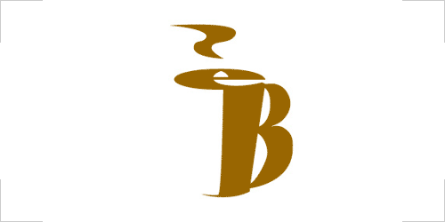
eBarista monogram mark / 1999
I really wanted to tweak this thing before posting it, as it has some serious formal issues that wouldn’t be hard to fix, but I resisted. This is the mark as I drew it originally: an “eB” monogram abstracted into a two-finger-handled paper coffee cup with a froth swirl and a bit of steam. I also set an accompanying logotype and even a cute animated version where the steam rose, dissolved, and started over again ad infinitum, but I can’t find them.
Unfortunately, eBarista never actually made it out of the starting gate. It may have had something to do with the fact that, if it had run, there’s no way that the supplier (a guy who sold Americanos out of the van he lived in) could have kept up with demand. Or maybe it was something else; I couldn’t say for sure.
Another identity I worked on for Ingy was for one of his self-initiated computer programming projects, InLine, which (as I understand it) allows programmers to write modules of Perl, a relatively simple but limited programming language inline with other languages, like C++ that are more cumbersome to deal with but better for more complex operations, resulting in a best-of-both-worlds comprehensive program that can be both powerful and efficient.
![]()
InLine logo / 1999
I believe the InLine project has actually been pretty successful (in fact, I think Ingy has spoken about it all over the world and its international following of hardcore programmers continues to grow). Moreover, I like the logo. I had it in my portfolio for a while and it was always met with positive remarks. Ironically, I’m not sure the logo has ever actually been used to identify the program.
Like most of the projects I’ve done for/with Ingy (there have been many over the years), I took payment for the eBarista and InLine identity work in the form of rides to bike races, a good barbecue dinner out on his patio, some New Wave cassette tapes, or whatever else I might have needed at the time.
I went to a cool little salon pretty regularly at this time, and I had developed some rapport with my hair stylist (the owner’s daughter). At a certain point, she asked me what I did, and I told her that I was a graphic designer. She then inquired (quite seriously): “Are you any good?” This is a surprisingly common reaction, so I had a pretty standard retort on hand: “Depends on who you ask.” I don’t think she ever actually asked anyone else, but she had me do their visual identity and business cards anyway – in exchange for a couple free haircuts:
![]()
Raleigh’s Salon logo / 1999
I drew the custom Raleigh’s logotype in reference to high-style Art Deco letterforms, with the lowercase “g” doubling as an abstracted pair of scissors.
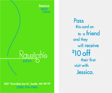
Raleigh’s Salon business card (front | back); 2 x 3.5 in. (each) / 1999
In applications, the g-scissors extend to clip a supergraphic R-waved hair. My hairdresser was insistent on the promo message on the back of the business card.
As I noted in an earlier post, I had also begun developing an identity for a prominent new bike company, but it was never used after the client (not the person for whom the company is named) decided to go with something his girlfriend came up with while I was out of town. I believe this was a huge missed opportunity for both myself and the new company. I won’t say what company this was, which means that I can’t show you the full logo or explain any of the strategy behind any of the work, but I will show you this:
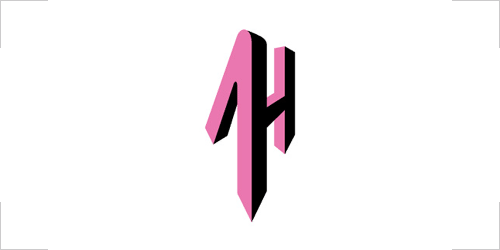
?? monogram mark / headtube badge / 1999
Can you guess who this could be for? I spent about a month working and meeting with the client about this project before having it pulled out from under me (there’s a lot more work that I’m not showing). Needless to say, I never got paid anything for any of it.
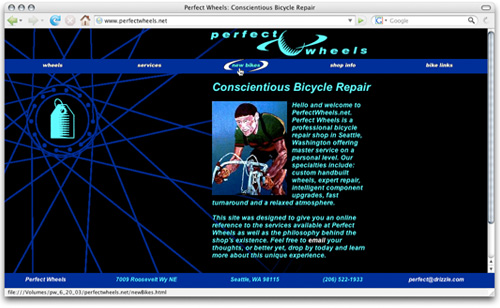
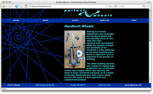
One of my best patrons in my freewheeling freelance days was Larry Naylor, the proprietor of Perfect Wheels, a local bike shop he had started in place of another shop that had called it quits. Shortly after establishing his shop, I somehow persuaded him to let me design, code, maintain, troubleshoot IT problems, and do whatever else might have needed to be done with the shop’s web site. Considering that I was relatively uneducated (or just totally winging it) in every one of these disciplines, the site worked pretty well for quite a while.

PerfectWheels.net home page / 1999
PerfectWheels.net home page (rollover state of “New Bikes”) / 1999
PerfectWheels.net interior page: Wheels / 1999
The primary hook of the site was a background of a spoked bicycle wheel whose hub also served as a framing device for icons I created to illustrate the various topics/pages covered within the site. I also shot much of the photography and wrote a lot of the content. While I think this site was unique and useful as it was, it did end up looking dated after some time (as most web sites from the late ’90s did), so actually don’t mind that he has since updated it (even if the new version isn’t exactly how I would have designed it). I’m also glad that he has replaced his very 90’s Saturn-like logo (I designed neither the old nor the new logo).
I ended up being the sort-of de-facto design consultant for the shop for a couple years after the initial web site project. Over the course of our collaboration, Larry and I discussed and worked on a number of other projects, both large and small, as he continued to refine the Perfect experience.
For a while, Larry was selling his own version of high-end, pre-built road wheels, similar to those popularized by Mavic and other major players in the wheels game (except that all of Larry’s wheels were guaranteed to be be built by hand – by Larry, himself). He came up with two (well-named) models: the Grüner, a lightweight set for fast recreational use or possibly racing, and the Grizzly, a beefier set for pounding out the everyday miles. I designed the logos for both, as well as hub and rim decals and in-shop displays.
![]()
Grüner wheel logo (hub decal); 3 x 1.5 in. / 2001
Grüner was the name of one of Larry’s friends, a slim, cute hipster girl of some sort (from what I remember from brief accounts and a picture; I never actually met her). The lightweight type and tweak of the “u” with the umlaut was a nod to this chic, cheeky sensibility. By the way, I have used a set of these wheels for five or six straight years of hard winter riding – that’s when the long, cold, wet, rocky miles come in – and they’re still just about as good as they were new; I can’t imagine what one could do with the Grizzlys:
![]()
Grizzly wheel logo (hub decal); 3 x 1.25in. / 2001
Grizzly was the name of Larry’s (rather aggressive) black cat. The extra-bold weight and cropping reference these characteristics. The two wheel identities, while expressing different qualities, were meant to be of a family. In addition to being based on the same font (different weights of Futura), both logos played off the theme of faces (since they were named after representative beings). The Grizzly logo, then, is dotted by the cat’s eyes.
I also designed decals for the rims of each wheel:

Here is how the rim decals looked applied (side view of Grizzly and Grüner rims) / 2001

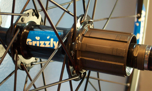
Here is a shot of a Grizzly wheel on display at Perfect Wheels (photo by Larry Naylor) / 2001
I also made some wall display signs that looked something like this (the signs were made and displayed in the shop, but I never got a real picture, so this mock-up will have to suffice):
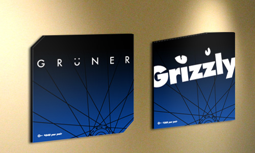
Grüner and Grizzly in-store signage; digital output on foam-core; 8 x 8 x .25 in. (each) / 2001
Larry and I worked on a few other projects together as the years added up, including various photo shoots, bike repair and upgrade case studies, a shop brochure (conceived but never quite born), a couple newspaper ads, some other little stickers and things, and innumerable philosophical discussions on topics that only involved the shop about half of the time. The best part of the whole process was that Larry was ever-committed to making Perfect Wheels the best shop he could imagine, and, indeed, the Perfect bike shop experience gets better and better every time I go back. I haven’t worked with Larry for a number of years now, but I feel proud to have been involved as that process began.
Like most of the projects I have discussed in this post, the Perfect Wheels “account” allowed me to collaborate directly with the visionary of his own business. Of course, working with the top gun doesn’t necessarily guarantee success in any project, just as working with less than the boss does not ensure failure. But passion is contagious, and with no committees, no project managers, no “brand ambassadors,” or any other layers of filtration between ideas and realization, the most powerful work often has the greatest potential to fly. And for two determined individuals anxious to get their new careers off the ground, what could be more perfect than that?
James D. Nesbitt said,
January 21, 2008 at 9:49 pm
Even after having done design, specifically identity design, I find it all comes down to not passion, but trust. The client must trust that you are working toward their goals and aspirations. and you must trust that they know more about their business than you do. Having a spirited debate between two individuals open to ideas contrary to their own, as well as a firm bond of trust, is where the magic happens. Passion, while an igniter of ideas can quickly die out. Trust will last a far longer time.
Nice post!
Daniel P. Johnston said,
January 22, 2008 at 11:05 am
Thanks for the comment, Jim. Your point of the importance of trust in a designer / client relationship is a very good one, and a particularly interesting aspect to this story. I agree that, while designers can add significant strategic insight into the potential of an organization, they should not pretend to know more about their client’s business than the client (If they actually do, then the project is probably not worthwhile).
Equally important is the notion that clients should be well-engaged in the design process, but should trust the professional competence of their designer. This trust can be difficult to attain and maintain even for the biggest and best firms with world-class portfolios and common design fees in the hundreds of thousands of dollars. So imagine me, at 20 or so, without a portfolio of any consequence, not charging anything for my services…
At that time, my passion for design and for the success of a project was—for all intents and purposes—my only proof of trustworthiness. This provided only a tenuous grip; sometimes the elastic stretched, and and sometimes the elastic broke (like in the mystery project above). But the clients who harnessed that passion ended up getting a very good return on their investment in the long haul—and so did I.
Nina said,
January 24, 2008 at 2:12 pm
Hey Dan,
Have you seen this posting by Michael Bierut of his first portfolio?
http://www.designobserver.com/archives/027553.html
Nina
Daniel P. Johnston said,
January 24, 2008 at 10:39 pm
Yeah, I saw it. That dude ain’t got shit on the portfolio I took to New York!