“206”
November 19, 2007 at 11:41 pm · Filed under Industrial / Product, Print / Editorial
I felt pretty proud of myself as I took my seat at the table of Art 206, the second of two screening classes for the Visual Communication Design major at the University of Washington. I was still cagey and wary of my new competitors—er, classmates—but my confidence was at the apex of an upswing after a final-project rally in 205 had put me on the list of 40-or-so students chosen to continue the screening process (from around 150 initial applicants in the previous class).
Art 206 was set up very similarly to Art 205, in that there were three consecutive projects, each having their own deadlines and a final submission requirement, and that the exact same three projects had been assigned for many, many years prior. The only ostensible difference between this class and its predecessor was that we were allowed to use computers for our projects if we so chose (which, as any designer or educator knows – even today – is more often a curse than a blessing).
The projects for 206 were also more complex than those of 205. The first, in the tradition of great European civic programs, was a postage stamp that was to showcase some aspect of an assigned state of the U.S. The second project delved into the third dimension, as we were to create a unique packaging solution for 24 Berol colored pencils. The third was to be a poster / informational mailer for the Burke Museum, conveniently located right on the UW campus…
I was assigned the state of Hawaii for the stamp project, and what I wanted to highlight of the island-chain came quickly to me. As I have noted on this site previously, I was well-into bicycle racing at this point in my life. I had also swam competitively for a number of years. And – little known fact – I was also a member of my high school track team for a year (the worst member of my high school track team, if not the entire metro-area – hence, only one year, but still). The triathlon it was, then; as Hawaii boasts the grandaddy of them all, the original Ironman: A 2.4-mile swim in the ocean, 100 miles of time-trial cycling, and a marathon 26.2 mile run to top it off, all in the sweltering heat and humidity of Kona.
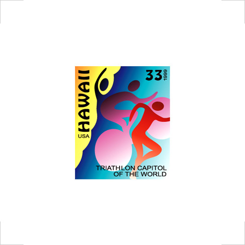
Hawaii Triathlon postage stamp; 1 x 1.25in.; digital output / 1999
This seemed like a pretty good solution to me. The swimmer gives way to the rider who is then overshadowed by the runner. The form language, while not perfect, is roughly equivalent for the three bodies. There’s some nice movement and progression, and the tiny canvas has not been totally obliterated by too much detail. Right out of the gate, though, I had committed a cardinal sin of VCD and I didn’t even know it! Despite some gentle prodding along the way, I decided to keep “HAWAII” and “33” (the price of the stamp) set in a typeface called “Hobo” (although, in my defense, I actually had a knock-off that was named something completely different). I thought that it seemed Hawaiian in its kitchy Tiki-ness. I would later come to find out that around 40% of the VCD faculty jokes were punch-lined by the word “Hobo.”
After the stamp, we moved on to the Berol pencil-box (ironic side-note: I would later go on to work for the company that had created the original Berol identity and colored-pencil packaging in the early 1970s – this project was not in my portfolio when I got hired).
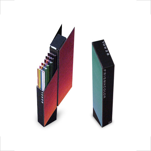
Berol 24 Colored Pencils package; approx. 1.5 x 2 x 10in.; railroad-board, Bristol board, Color-Aid paper side-panels (colored with pencils), plastic model hinge, rubber cement, electrical tape, and press type. / 1999
My package cut a tall figure, whose parallelogram cover opened in a grand arc over the top and behind the box, where it would rest and complete the angled forms of the interior. The pencils (whose blending prowess is displayed on the side-panels of the box) stood on a stadium-style interior base that allowed them to follow the angle of their sheath. The white pencil was placed strategically to line up with the white type on the black package front. This may not be the most pragmatic solution, as its slim height would require a fair amount of ballast at the base to prevent tipping, but I still enjoy its sharp elegance. Much to my delight, I was not alone in this sentiment.
But what mattered more than anything in 206, similar to 205, was the final project.
(Enter: Chernobyl-Like Graphic Design Student Meltdown)
The subject of this double-sided poster, the Burke Museum, is a small, folksy kind of place that specializes in skimming the surface of Native Northwest art and history. In the broad landscape of museums, the Burke is moderately educational and mildly entertaining. It has a naïve quality that I imagine does well with the young kids who are often required to visit by schools and parents. This is a characteristic that might have been interesting to play up in a concept for this project, now that I think of it. But, I didn’t think of it when the project was on my desk. In fact, I couldn’t really think of anything.

Burke Museum Informational Poster-Mailer (front); 36 x 24in. (I have completely blocked the front my poster from my memory and any kind of archive system.)
Burke Museum Informational Poster-Mailer (back); 36 x 24in. (I have completely blocked the back of my poster from my memory and any kind of archive system, too.)
I don’t remember exactly what I did come up with for this project (on purpose), but I do have the sinking sensation that it was probably the worst piece of design I have ever executed. I never found a conceptual hook, or created engaging graphic language, or even just made something pretty to look at, despite many attempts. About halfway through this project, I realized that I was skating on ever-thinning ice and the room was only getting hotter. My future was in trouble.
As I slid nearer to the final “interview,” where I was to learn whether or not I would make the final cut of the 20-strong VCD class of 2001, I had a rather nihilistic notion that I had a 0/0 chance: I could imagine neither getting in nor not getting in; neither seemed possible. Of course, the decision had to be made, and, as the one to sign up for the first interview’s time-slot, I was the first to know that I would not be in that class.
(Exit: Graphic Design Student, Stage Right)

Devon said,
March 27, 2008 at 1:33 pm
I had no idea you used Hobo on your stamp project. Ah, the foibles of youth, no?
And the punchline for the other 60% of VCD jokes?
“…and then Doug Wadden walked in.”
Daniel P. Johnston said,
March 28, 2008 at 1:49 pm
Well, it was before your time (in the VCD program), Devon. I’d smartened up a bit by the time you rolled around. It was also before Doug Wadden walked in.