Team Player
November 14, 2007 at 11:37 pm · Filed under Identity / Systems, Uniforms / Apparel

cycling teams I have been on, by jersey: Liquid Sun (Perpetual Motion) / 1994-1995 and again in 1996 | Seattle Express / half of 1996 | Recycled Cycles (this is the original jersey) / 1997-1999 | University of Washington (my collegiate team) / 1998 | Ashmead College (not a collegiate team – confusing, I know) / 2000-2003 | Broadmark / 2004 – all in Seattle | Re/Max / 2006-2007 – New York
In the span of about a dozen years racing bikes, I have been on a total of seven different teams (seems like a lot, now that I think of it). Each team had its benefits and drawbacks, but perhaps the coolest team I ever raced with was Recycled Cycles in the late ’90s.
The team represented the eponymous local used bike shop, whose two owners truly loved the sport, sponsoring the team almost entirely themselves, and quite generously so. While I was on the team, it was comprised of just five to ten members who were all working class heroes of the bike world in the Clark Kent hours; most of us were either messengers or mechanics, and some were both. But, for the most part, and to varying degrees, we were also talented racers, who cared deeply for our competitive image.
Perhaps the highest compliment one can pay an American bike racer is to refer to them as “Euro.” Although this is in reference to the still-dominant homeland of professional cycling, it is is much more a point of style than results. And that Recycled team was most certainly Euro (although the results weren’t bad, either). We were built for it – wiry but tough, with narrow, chiseled features and sunken chests. We acted it, too. We wore expensive couture eyeglasses out on the bike. We spent our bottom dollars on the latest gear for our pristinely-maintained machines, but uttered nary a word on the subject. Our pedal strokes flowed like an orchestra of harpists, and our smart, contemplative gazes never wavered, even in the deepest bouts of oxygen debt. I was one of the only riders that would ever wear a helmet out training; the rest didn’t want to risk their perfect cycling cap placement (I did wear my caps out on dates, though). We had philosophical discussions about the latest Euro-pro dispatches from Cycle Sport magazine (back when it was eight bucks an issue, specially-imported from the UK, and you could only find it at one boutique bookstore in the greater metro-area). Around this time, Cannondale, an all-American bike builder, was really embracing its recent entrance into the European peloton with brilliant advertising that showed its star riders from the Italian dream-team Saeco visiting the bike factory dressed in tailored three-piece suits in a gritty, black-and-white, documentary-style print campaign (way, way pre-Sopranos). We were so inspired that several members showered, groomed and dressed in formal-wear to travel to races…
Needless to say, image was important to the team. I took on the role of kit-designer to make sure our elegant-outsider identity came through on our backs out on the road, and hopefully, on our chests at the finish lines. In many cases, the simpler the bike jersey, the better it looks. What really helps with this is when you don’t have to pile on too many logos from bit-part sponsors. Luckily, Recycled really only had one sponsor, which left the canvas relatively open (although there was one small contributor who had to be recognized on the back pocket). I floated a few ideas for jersey design to the other team members and the owners, but this was a clear favorite:
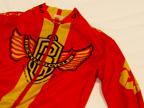
Recycled Cycles Racing jersey (front) / 1998
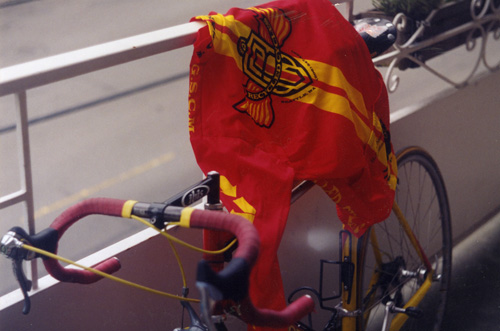
Recycled Cycles Racing jersey (back) (on my matching Cannondale) / 1998
Pretty simple: the logo, big, with racing stripes (both front and back). This isn’t my favorite logo of all time, but there is something quite empowering about wearing wings on your back, so I enjoyed this quite a bit. The stripes were a classic touch that duly accentuated our Euro builds, especially since we got them custom tailored to be slim-fit, with longer sleeves to cover our rangy arms. I also got the team then-brand-new red Giro Boreas helmets through the shop where I worked, and adorned them with matching yellow racing stripes for everyone (you have to wear a helmet when you race). I even put stripes on the frames of my Italian racing glasses. Indeed, my initial vision was that the stripes continue down the legs of the shorts and then pick up again around the feet on custom booties (“spoiler-to-spoiler” as one team-member noted), but vision and realization cannot always meet.
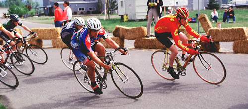
Here’s me racing in the Enumclaw Stage Race criterium. Photographer unknown / 1998
I left the Recycled boys at some point, for various reasons, and the team, itself, has grown and changed dramatically since my departure. But I definitely miss the spirit of that particular Recycled Cycles team. On no other squad have I been around the same living, breathing passion for bike racing and all of its transcendent potential. I referred to it earlier as cool, but perhaps a better description comes straight from the Euro-pros: class.


Special Note
I hope this isn’t too trivial a forum to express this, but I would like to dedicate this post to one of my old Recycled Cycles teammates, Brad Lewis. Brad, like most of the early Recycled crew, devoted his life to bikes. He had been a messenger and held a few different positions in Northwest bike-industry companies. He was also a family man, with a wife that raced professionally. He was a talented racer, himself, consistently competitive in regional pro-am races. More importantly, he was one of the most genuine guys I have ever met, his sly introversion and sharp wit balanced with an incredibly open friendliness. Brad was truly a class act.
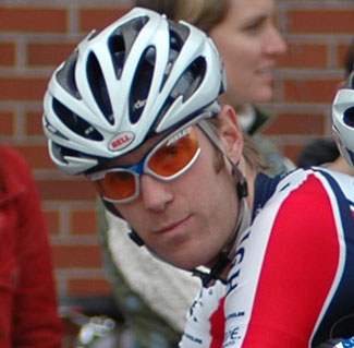
Brad Lewis / 2006 (photo from BikeCafe.net)
In a poetic but shocking and utterly tragic turn of events, Brad had a heart attack while racing in the Recycled Cycles Boat Street Criterium race almost two years ago and died very shortly thereafter. He was 38.
Here’s to you, Brad.
Ingy döt Net said,
November 14, 2007 at 11:59 pm
You forgot Team Johnston. The years in (all) white.
Daniel P. Johnston said,
November 15, 2007 at 12:11 am
I could never forget the white season. There will be more on that later; I guarantee it. But one man does not a team make, as much as I enjoyed toying with the notion.
nigel said,
October 29, 2008 at 4:28 am
3 comments, first I actually love the jersey design because it is clean, simple, and elegant. Great job. I would be proud to wear it were I good enough to race as part of a team or even buy the thing from a store. Second, what is up with cycling jerseys? They are nothing more than a gaudy billboard/shill for sponsors that end up looking like an explosion in a Letraset type factory. If Graphic designers of the world were to do us all one grand service it would be to overhaul the whole cycling jersey industry. Looks like you were about to start that. Third, please describe exactly what you mean by the perfect cycling cap placement. Please I must know how to place my cap lest I appear part of the egregiously un-hip.
Daniel P. Johnston said,
November 1, 2008 at 1:39 pm
Thanks for the comments, Nigel,
First of all, thanks for the compliment on the jerseys. Since I left that team, they’ve gone through several iterations of jersey designs, but most were actually based on the one above, so you must not be the only one who liked it. I imagine Recycled Cycles could even make a buck or two if they sold them in their store (if the team members would let them).
Regarding the general state of contemporary cycling team jerseys, they’re definitely an acquired taste. I don’t think it’s just the graphic designers that are to blame for the sponsor cacophony, though. Bike racing is expensive and few single companies are willing to put up enough money to pay for an entire team. That Recycled Cycles team was small and the shop owners were generous, which was what allowed us to have such a simple jersey. On the other hand, I think a lot of people DO like wearing jerseys with lots of sponsors on them because A. They think it makes them look more important or something, and B. People like logos (You might have noticed that logos are getting bigger on everything, from sweatshirts to sunglasses).
Now, to the very important topic of how to wear a cycling cap like a pro. First, you need to get a cap from some obscure European professional team (don’t worry, they’re all obscure to most people). Second, you need to make sure that it has a tiny little bill and plenty of volume in the head area. When you wear it, it should be perched as high on your head as possible without falling off; it should be at least 90% full of air. Then tip it down far enough in the front so that little bill actually hinders your vision.Voila! Euro. Note: only crisp, perfectly clean caps look pro, and you can’t wash them, so you should have a good stock on hand should you run into a spot of weather.
Good luck.