“205”
October 31, 2007 at 11:12 pm · Filed under Identity / Systems, Print / Editorial, Type / Fonts
Going to college straight out of high school is something that you’re either supposed to do or not supposed to do, depending on who you ask. Most high school counselors want their charges to apply to every extant school they can think of and get one—any one—locked-down well before graduation, lest the youngsters dizzy themselves at their flying mortarboards, wander off, and never find their way back on track. Everyone else with an opinion says that high school grads should travel the world. (It’s always “travel,” and always “the world.” Never mind traveling to just one place, or just somewhere one isn’t from, even if it’s in the same country. And don’t even think of getting a job or building a boat – it’s travel, son.)
But I’ve only gained these insights secondhand or after the fact, because I never asked anyone in my time. I just went – 25 minutes away from my house – to the University of Washington.
I think I was too close to my new school cartographically to be so far away cognitively; it was a neurological short-circuit: How could I ride my bike straight through an intersection I only three months before had used to turn left and, eight minutes later, land on another planet? I began to dislike my UW experience very shortly after it started. It felt big, cold, and impersonal, and, while I could at least appreciate the esteem of the faculty (from afar), I was surprised at how unimpressive my classmates seemed to be. Most of my friends from high school had indeed either gone to some obscure university, or some obscure country, or they had completely lost their way. My only extracurricular activity was a disappointment. My brain and my mind were at odds with each other. These were the first two years of my college experience.
It wasn’t until I finally began the screening classes for the Visual Communication Design major (VCD) that I really began to see the potential of the school. These classes, used to fish out the top-20-or-so design candidates from a pool of 150 – 200 applicants every year, were brutally competitive but highly intriguing. They were a window into how the program would be (if one made it in), and the view looked pretty interesting. The major, established decades before “design” fell simplistically into the lexicon of quotidian banter, was a pioneering force that had created a self-perpetuating standard of excellence. The faculty were not only esteemed, they were uncompromising, and the best students were no less than inspiring…
The first of the two screening courses – cataloged as “ART 205” but referred to reverently by students and faculty alike as just “205” – tasked three successive projects: a letter-mark, a book cover, and a poster. These exact same projects had been assigned every single year for at least a decade before I entered the fray. Each project had it’s own deadline, but all had to be submitted at the end of the quarter in order for the student to be considered for entry into the next screening class: “206.”
The alphabetical letter for the mark was assigned, but what it was to represent was up to the student. Very simply, though, it had to represent a verb of some sort that started with the assigned letter. I was assigned the letter “M,” and, with that, I dipped my toe into a number of words until finally landing on “merge” – no, “move” – no, “merge” (I was terribly indecisive, so it was sort of supposed to be either, or both).

Move (or Merge) letter mark; hand-cut Color-Aid paper on illustration board / 1998
This mark is strange. Conceptually, it doesn’t really convey the idea of “merging.” In fact, anyone willing to merge in traffic based on the graphic language of this mark is suicidal. The mark does convey “movement”, but “moving” is such a vague idea that it doesn’t take much to make it work, especially when crutched so heavily on arrows and italics. Formally, the arrows burrow themselves forcefully into the brutish outer block of the letterform, and the mark’s most interesting quality is its awkwardness.
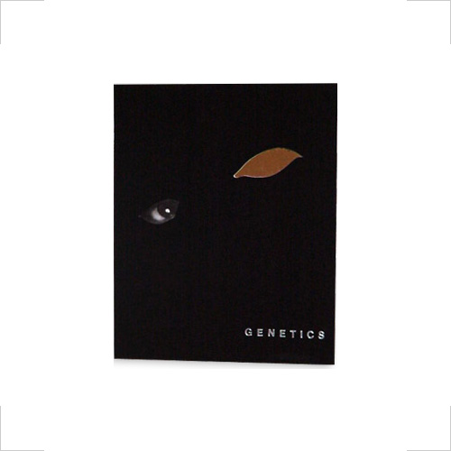
Next up was a book cover, specifically for a textbook on Genetics. I immediately got the idea to base the cover on a mirror: My first concept was just a big thumbprint on an 8 x 10-inch bathroom mirror tile. I think the mirror was a reaction to cloning, although I honestly don’t remember for sure. What I do remember is arguing extensively with my professor and the rest of the class about whether a mirror was appropriate media for a book cover. If anyone thought my concept was bad, they never convinced me of it, so I continued basing subsequent iterations on mirrors (I’m still not sure why this was such a point of contention). As it happened, my high school textbook cover turned into more than a reflection of the weird science of the day; it became more and more reflective of my mood, as well. The final submission is so sinister looking that it wouldn’t make it past one PTA meeting in a real high school before being burned in a pile of its peers.

Genetics text book cover; 8 x 10in.; magazine clipping, mirror-finish adhesive-type, and hand-cut Color-Aid paper on mirror / 1998
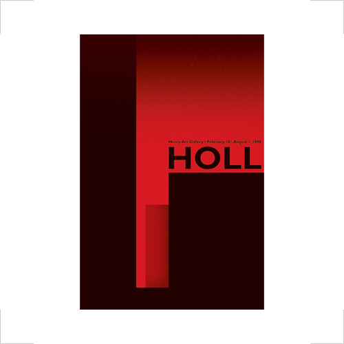
The last project of 205 was to be a poster promoting the work of a prominent architect in a gallery. I was lucky enough to be assigned Steven Holl, who, among other prominent works, designed the St. Ignatious Chapel on Seattle University’s campus. This is one of the most entrancing buildings I have ever witnessed. If I couldn’t make something interesting out of this, I really didn’t deserve to graduate to the next class. I visited the chapel on several occasions, during brilliant sunshine, pale cloudiness, and rich darkness – each experience more inspiring than the last. I shot rolls and rolls of film, outside and in, and nearly based my poster on one of those shots, alone. After many “close-but-not-quite”s in class critiques, I let it all ride on my final concept, which I finished in my garage not more than an hour before having to leave it to its fate on the final submission table at high-noon on the last day of class. An abstraction of Holl’s shaping and colorization of light through masterful glazing and sculptural baffles, the simplicity of the poster belies its executional exigency, as I could afford neither to second-guess nor first-mistake any maneuver during my 11th-hour operation:

Holl, Henry Art Gallery show poster; 20 x 30in.; hand-cut Color-Aid Paper, press-type, and spray-paint on foam-core / 1998
The dramatic climax (and potentially crushing letdown) of 205 came in the form of an “interview,” scheduled during finals week. These were really less interviews than simple “Yes.” or “No.” declarations to the question almost 200 kids dared to ask the faculty every year: Am I good enough to do this all over again in 206? The answer for me (paraphrased): “Yes. Your final poster put you on the list. But you are an unknown-quantity at best. You had better read up, buck up, and get ready, because things are about to get serious.”
Translation? Yes.
