Who Am I, Anyway?
October 7, 2007 at 5:37 pm · Filed under Identity / Systems
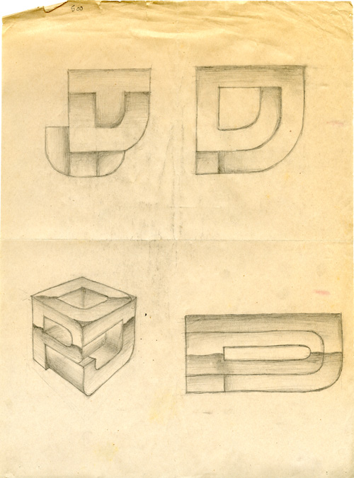
DPJ monogram studies, pencil on newsprint / 1993
Perhaps the most difficult task for any designer is to create their own “identity,” which, in common design terminology, is usually defined by a logo and some consistent “visual system” that unifies any and all communications and media within some sort of graphic motif. (An actual identity for any entity involves far more than a logo and visual system, but that’s another topic.)
While most designers have created scads of logos for clients, or at least for school projects, there are several factors which make designing one’s own logo a challenging prospect: You don’t want to look too specialized or hung up on one particular aspect of design or a particular type of business (lest you be seen as ignorant of everything else), you don’t want to base your identity on a rising trend (as they almost always fall faster and more explosively than they grew), you don’t want to seem gimmicky, AND, you don’t want to look stupid in front of all of your design colleagues…
Some design firms don’t even have a formal visual identity. Open and 2×4 both do great identity work for clients, but don’t seem to have any kind of logo for themselves. Many of the most prominent design firms just spell out their name in a nice typeface with a strong color (often red or black): Pentagram, Landor, and Interbrand are prime examples of this. Sometimes, firms will do some kind of monogram mark in addition to their logotype. These are usually superfluous, but some are nice, like Hornall Anderson‘s. Occasionally, you will see firms with an iconic mark that is supposed to represent their practice, but these are usually so vague and abstract that they are meaningless.
As a project for a high school art class, I created my own monogram, which ended up being my de-facto logo for several years thereafter. In my case, the monogram turned out to be useful, as I actually applied it to products that I designed. The formal idea is pretty simple: A “D,” a “P,” and a “J” interwoven with each other, but I experimented with various rendering possibilities over the years. The original was airbrushed watercolor with gradients emphasizing the lattice-like construction (it was also red and black). I had one version filled with dashed lines (like a DPJ roadway system, in reference to the bikes on which it would be emblazoned). I made several other minor modifications over the years and different applications. Eventually, the mark evolved into a solid/line-art version that I duly italicized for impact and dynamism.
![]()
final DPJ monogram / 2000
This monogram mark served its various purposes, but I haven’t used any variation of it for anything in quite a while. It’s not that I don’t like it, because I actually do. It’s simple and geometric without being simplistic, it’s bold, dynamic, and dimensional without using any kind of filters or software tricks, and it’s also perfectly legible. But, I haven’t designed anything that needed a badge of this sort in years (most client design work goes completely uncredited). Maybe that is a problem – and I should do more self-initiated, badge-craving work. But I’m not sure that that is the problem. Despite all of the nice qualities of the mark, there is some reason why I just don’t feel like it is quite me anymore.

Tselentis said,
October 10, 2007 at 9:20 pm
Awesome. I love the ‘shading’ from your 95 logo above!
Daniel P. Johnston said,
October 10, 2007 at 10:24 pm
Thanks. Yeah, I was way into ‘shading’ and ‘chrome’ at the time.
jen said,
October 13, 2007 at 12:58 am
I think your shit is brilliant. Ever since your UBC logo, I’ve looked at suspicious logos more carefully, often finding similarly creative stuff. Your style has always impressed me. So it’s interesting to read this entry, never considered that a designer would have such a problem, but it’s obvious once you described it.
Lucky for me, I’m a biologist and don’t require a logo. But even luckier for me, I have a genetic preference for 5-pointed stars. That’s a pretty great logo, because it is not stylistic, it rhymes with my name, and they can get tucked in places without making a scene.
I bet you wish you had something great like that. Maybe a circle, or a hexagram. Nah, nothing as cool as a star.
At least you’ve got style :)
jen said,
October 13, 2007 at 12:58 am
That smiley face is pretty obnoxious :(
jen said,
October 13, 2007 at 12:59 am
:0
Daniel P. Johnston said,
October 13, 2007 at 1:14 pm
Thanks Jen. Sorry about the hyper emoticons– I’ll have to see if I can tone those things down somehow (I didn’t design them or even know that they would show up on the site). Anyway, I wouldn’t count out a logo for yourself just yet. Few industries invest more deeply in their corporate identities (some say “branding”) than biotech…
Joel Brazil said,
November 24, 2007 at 6:37 am
The CD cover/liner notes you did for me still stands as one of your greatest achievements.
Daniel P. Johnston said,
November 24, 2007 at 10:55 am
Duly noted Joel, thanks. There will be more on that project later. Stay tuned.