Posted: 15 Oct / 2007 at 8:37 pm

Nathan Hale Class of ’96 Raiders proposal for commemorative T-shirt design; pencil and pen on notebook paper; 8.5 x 11in. / 1996
In his song Life, Jeffrey Lewis, one of my favorite musical artists, relates each major defining factor of life (friends, love, global cultural differences, God, etc.) with a pithy verse each. The whole song is probably about two-and-a-half minutes long, and, even though it is sung of his own experience, it captures the entirety of modern life more eloquently than anything else I’ve ever heard or read at any word count. In his verse about school, he shares:
School is the place where I did my growing
They fill your brain to overflowing
They tell you this is all stuff you need to be knowing
School is the place where I did my growing
Just when I got to like it, it was time to be going
I could certainly see my entire scholastic experience in this light, but my high school days in particular are what this conjures most. Coming from middle school, which I only got to like when it was time never to have to come back, high school barely outperformed my then deflated expectations at the beginning. I was processed by generic classes and distracted teachers. The halls sucked me from one hour of it to the next until it was over for the day. The mile and a half commute passed under me each day until the week was over.
But as those weeks turned into months and and quarters, glimmers of hope began to energize my steps, and vice-versa. I was exposed to the potential of my experience, and I began to gain confidence and venture into it… Read the rest of this entry »
Filed under Identity / Systems, Type / Fonts, Uniforms / Apparel
Permalink
Posted: 14 Oct / 2007 at 7:36 pm
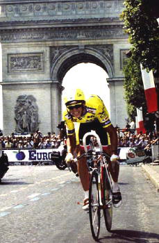
The ultimate inspiration: Greg LeMond (here on his way to winning the 1989 Tour de France). photo by Cor Vos
I’ve always been interested in cycling to some extent. I always rode bikes, and even before my teens, I watched big races like the Tour de France when they were on TV, and I spent my fair share of time staring at the top shelves of local bike shops and fogging up their display cases. This—unlike most—was an interest that grew steadily stronger with age. But it was an ironic turn of events that launched me into a full-blown obsession with cycling: I got hit by a car while riding my bike.
I was commuting to high school sophomore year on my Specialized CrossRoads Cruz hybrid bike (about $250 new, then) and, as I rode across a busy intersection, I was struck by a Volkswagen Scirocco (one of my favorite cars at the time), whose driver had run a red light in the rush of the hour. The impact instantly broke both of the bones in my lower left leg (although I didn’t realize this until I tried—and failed—to walk away from the scene). It’s said that people can’t recall the actual sensation of pain, but I can say with absolute certainty that having to move my broken leg into several different positions on the X-Ray table later that day was the most excruciatingly painful experience of my life. The breaks also ran perilously close to the bones’ growth plates and, if they had been damaged, this situation would have been even worse, as I still had a good six or seven inches to grow. This was not the last time that I would get hit by a car, and it’s not an experience that I would recommend to anyone, but there is usually one considerable upside: the insurance settlement. On top of paying for all of my medical bills, the sum allowed for the purchase of my first bona-fide road-racing bike: a Cannondale R900 (about $1,800 new, then).
Since they are so expensive and complex (especially compared to, say, a basketball), just getting a good bike can be a hurdle high enough to trip up a considerable percentage of potential racers and enthusiasts. Clearing this hurdle allowed me to start racing, and it was also a huge factor in the procurement of my job at a prominent local bike shop. By the time I hit senior year, I was in cycling up to my eyeballs. I rode everywhere, all the time; I was on a team; I raced as often as possible (about 50 – 60 races per year); I worked on bikes with other racers and cycling aficionados at the shop; I read every magazine and brochure cover-to-cover; I watched video tapes of every European road race fit to be filmed; I went to bike shows and bike parties… Cycling had basically permeated every aspect of my life. It didn’t take me long, then, to figure out what I was going to do for my high school Senior Project.
The parameters of this assignment were relatively broad and simple: write something, do some community service, or create some kind of artwork. The project was to take at least 40 hours (all outside of school), and it would count for approximately half of that year’s grade for my two most important classes. The goal was equally simple and daunting, as laid out by my professor—a quite scholarly Scott who had been a quadruple-major university graduate, among many other improbable accomplishments: “Impress me.” I figured that there was no way I was going to impress anyone without at least impressing myself, and the most impressive thing I could think of was to build a bike… Read the rest of this entry »
Filed under Identity / Systems, Industrial / Product, Type / Fonts
Permalink
Posted: 10 Oct / 2007 at 2:13 pm

Nathan Hale (NH) High School Swim Team logo; spray paint stenciled on paper / 1994
When I got to high school, it wasn’t a very good scene: I was short, fat, slow, uncoordinated and keenly aware of all of these things. I was also overwhelmed by boredom with my classes and mates and hid myself as well as possible so as not to be dragged into the morass of class discussion. So, how does a chunky, nonathletic, awkward guy with an invisible personality play his cards in high school? That’s right, he straps on a Speedo and joins the swim team. I still remember those first steps out of the locker room onto the pool deck as some of the more terrifying of my life.
Somehow, though, over the next few years, I would get in deep with the team. Aside from the year my leg was broken, I swam in every single practice and every meet. I got into incredibly good physical condition (I grew about eight inches from freshman to senior year, but my body weight remained almost the exactly same throughout). I was even voted captain two years in a row, which probably said more about my personality than my swimming prowess, which was okay, but no match for the purebreds.
All this engendered in me a strange new feeling: school pride. Nathan Hale was home to the Raiders and, somewhere along the way, I actually considered myself as such. But if I was a Raider, I wasn’t one of those red-white-and-blue caricatures in skinny pants, piano coats and a funny hats, reduced to hokey cartoons in the halls. That scene was so far removed from the times that a teenager could barely imagine how or why it happened, not to mention understand what it meant. In a way, it seemed that it must have just been a tale meant to fulfill the requisite mascot needs of high schools around the country 200-some years later… Read the rest of this entry »
Filed under Identity / Systems, Signage / Display
Permalink
Posted: 07 Oct / 2007 at 5:37 pm
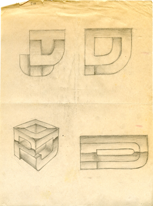
DPJ monogram studies, pencil on newsprint / 1993
Perhaps the most difficult task for any designer is to create their own “identity,” which, in common design terminology, is usually defined by a logo and some consistent “visual system” that unifies any and all communications and media within some sort of graphic motif. (An actual identity for any entity involves far more than a logo and visual system, but that’s another topic.)
While most designers have created scads of logos for clients, or at least for school projects, there are several factors which make designing one’s own logo a challenging prospect: You don’t want to look too specialized or hung up on one particular aspect of design or a particular type of business (lest you be seen as ignorant of everything else), you don’t want to base your identity on a rising trend (as they almost always fall faster and more explosively than they grew), you don’t want to seem gimmicky, AND, you don’t want to look stupid in front of all of your design colleagues… Read the rest of this entry »
Filed under Identity / Systems
Permalink
Posted: 02 Oct / 2007 at 10:25 pm
There are two types of competition: objective and subjective. Most sports and games are objective: Whoever goes the fastest / gets the farthest / scores the most points / captures the king wins; the rules are well-established, and, generally, blood simple and crystal clear. That’s why athlete interviews are so excruciating to watch: There’s nothing to talk about. They have to resort to a bunch of standardized, time-filling, nonsensical platitudes about how they took the football down the football field (obvious), how their coach, teammates and/or sponsors deserve most or all of the credit (unlikely), or about how they had to give 110% (not possible). Subjective competitions have parameters but no clear qualification for success; success is judged by somebody or a panel of somebodies deemed experts in the field. These make for much more interesting conversation, but the results are always biased and sometimes downright arbitrary.
In terms of competition, it doesn’t get more subjective than a juried art show. It also doesn’t get much more incomprehensible. The primary point of bother is that nobody can even agree on what art is. A lot of people confuse the medium with the message. Just because something is painted doesn’t make it art. Great art reveals before-unrecognized issues; the medium is just a way of delivering the message. To be clear, I also don’t believe design is art, and this is not to say that it is any more or less important. Design’s role is to reconcile the issues revealed by art with pragmatic needs of society.
So, how do you judge art? Assuming you can get beyond the initial hurdle of understanding what art is, it only becomes less simple, because great art breaks rules and redefines those pesky parameters. How can you say whether it has broken the rules and redefined parameters sufficiently? And how does someone become a recognized expert at determining that?
I’ve entered a few design contests (and been entered into many more by firms I’ve worked for), which have their own issues (design can rarely be judged objectively in common show formats because they never allow for enough context to be known). However, I’ve only ever entered one juried art show, and that was in high school. I submitted three pieces… Read the rest of this entry »
Filed under Drawing / Illustration
Permalink
Posted: 30 Sep / 2007 at 10:24 pm
This man is a professional athlete.
Let me just say this right off the bat (so to speak): I don’t much like baseball. I find it boring. For a professional sport, there are a disproportionate number of noticeably overweight players, and it’s not surprising why: it’s clearly not very challenging in terms of cardiovascular fitness requirements. In case you aren’t familiar with the game, here’s a snapshot of a typical play (one man on first, one on deck):
The batter walks casually to the plate.
The catcher and the umpire crouch down.
The batter takes a few very slow, deliberate practice swings, seemingly showing the pitcher exactly where he wants the ball to be thrown.
The catcher makes some hand signals in his crotch.
The pitcher watches these signals and very subtly shakes his head several times.
The catcher makes more hand signals in his crotch.
The pitcher very subtly nods his head.
The pitcher starts his windup.
The pitcher turns to his left and tosses the ball ever so gently to the first-baseman as the base-runner, who had been about six steps away from said base returns to his position actually on the base before the ball gets there.
The first baseman tosses the ball back to the pitcher.
The base runner resumes the exact same position six steps away from first base.
The pitcher returns his attention to the catcher.
The catcher makes more crotch signals.
The pitcher again refuses the vast majority of these signals, but finally lowers his head to confirm his intent to actually… pitch.
The pitcher winds up and throws the ball to the batter.
The batter does nothing.
This is an actual play! How can people watch this?!!
Depending on if and how the batter hits the ball during the rest of his “at-bat,” this basic process can literally go on forever (there is no limit to the number of mis-hits, or “balls,” allotted to the hitter). Multiply this play by whatever number you want (there is also no limit on how many runs can be scored in an inning) and then multiply that by at least nine innings – per team (but there is no limit on those, either, so if the game is tied, it can go 12 or 13 innings, easy).
However loooong the game ends up being, there are really only two or three players out of at least 10 on the field that are ever doing any kind of activity at the same time, and it’s very brief when it happens. The rest of them are just standing around. If the guy who hits the ball isn’t very good at running, it’s no problem; they just get a “pinch” runner to run for him. If the pitcher gets tired or starts pitching badly, they just bring in another one (no limit on those, either). And almost every position on the field has a specific “coach” in the game to consult on what a player should do there, so strategic thinking isn’t a necessary skill, either.
Let’s just get to the point: This has got to be the laziest sport in the world. How did this become our national pastime? Have any of these national pastime people ever seen a game of basketball? Or table tennis? Pac-Man? Anything?
Luckily, I once had an opportunity to turn my frustration for Major League Baseball into one of my favorite design projects… Read the rest of this entry »
Filed under Drawing / Illustration, Print / Editorial
Permalink
Posted: 22 Sep / 2007 at 8:53 pm
There are certain figures who are determined to have an impact on one’s life: Their parents, their teachers, their coach, their camp counselor; these are all people who essentially signed up to help shape a young person’s future—for better or worse—and their influence is usually quite compelling. But often, it seems the ones who just happen to be in a certain place at a certain time figure most in the development of another. This is the ground of peers: classmates, neighbors, friends. The most hallowed of this ground, of course, is that of the best friend.
My best friend growing up was a kid my age named Charley. We happened to go to the same (very good) inner-city elementary school, where we were not much more than acquaintances. But we also happened to go to the same (very mediocre) rich-yuppie middle school on the hill, which turned out to be a friendship-making fluke. Of course, we also happened to have a few similar interests and philosophies on the most important issues of our time (you can imagine what those might have been in seventh grade).
More than anything else, Charley was cool. He looked cool: tall and stately from the day he was born. He had cool clothes. He had cool things. He listened to cool music. He lived in a cool house in a cool neighborhood. He even had cool parents: His dad was a real, long-haired, tattooed biker who built and rode his own choppers, and his mom seemed straight out of a hip family TV show. He was funny and sharp, and he had cool stories that he knew exactly how to tell. Charley also seemed to do the coolest things. And, though I hardly noticed it at the time, these were an enormous influence on my life… Read the rest of this entry »
Filed under Identity / Systems, Type / Fonts
Permalink
Posted: 20 Sep / 2007 at 10:20 pm
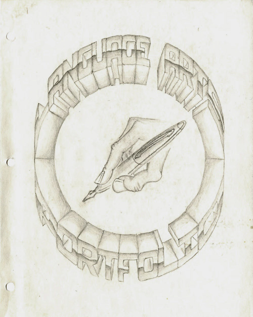
Language Arts Portfolio cover; pencil on paper; 8.5 x 11 in. / 1994
The importance of the portfolio, for any designer cannot be stressed enough. It is, quite seriously, proof of one’s worthiness in the craft. Design is one of the few professions where samples of work you have done in the past are supposed to speak for you.
Unless you have an “in,” many top design firms demand that you “drop off” your portfolio so they can take a look through it to see if they want to actually talk to you. I have never “dropped off” a portfolio anywhere (I understand the utility of the practice, but I find it superficial and demeaning). However, I have been in situations where an interviewer wanted nothing more than to just flip through “my book” without any interference from myself. Portfolios are like candy, and it’s hard for anyone not to just devour them. But if the candy isn’t balanced by the meat of the designer’s intelligence, personality, and presence, it can turn into a rather sickening experience. I’ve tried, with varying degrees of success, to break the predilection of portfolio interviews, but the bottom line is that the portfolio really must, as much as possible, speak for itself, and for the designer, too.
I have made several portfolios in my life in various formats, but I think this was the first thing I ever made that actually was called a portfolio. As you can probably tell by the title, this isn’t a collection of graphic design samples but, rather, a collection of writing and so on for a “Language Arts” class in high school. I drew everything on this sheet of paper by hand (with the help of a compass and a ruler), and flourished the mechanically rational, hyper-dimensional letterforms with a dash of chrome. It probably took me about three days or so to do it, and this was my only copy… Read the rest of this entry »
Filed under Print / Editorial, Type / Fonts
Permalink
Posted: 15 Sep / 2007 at 8:33 pm
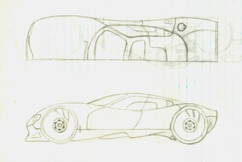
one of my later car drawings: a four-door sports car; half-top and side views; pencil on notebook paper / drawn age 12 or 13
I always knew that I was destined to be a designer, but not necessarily a graphic designer. In fact, I didn’t even know that graphic design was a “thing,” let alone a profession, until I was well into high school. My first love was with cars, and my dream job from as far back in life as I can remember – and for a very long time – was be the man behind their beautiful bodies.
There was no shortage of car-related excitement around my household growing up to keep me interested: There were all kinds of magazines about cars in the family room, meticulously-crafted plastic model cars on the mantle piece, the most important car races and movies about car races on the TV, posters of cars all over my room, radio-controlled cars that I drove out in the street or in the backyard, and spirited conversation about the latest car trends at the dining room table… Read the rest of this entry »
Filed under Industrial / Product
Permalink
Posted: 29 Aug / 2007 at 7:56 pm
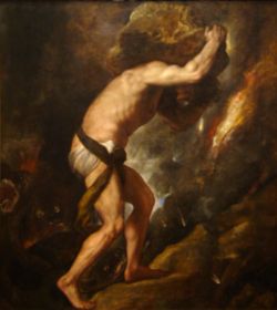
Sisyphus by Titian / 1549
Well, it’s finally happened: I have laid the groundwork to become yet another online asshole. Yes, now that I have joined the burgeoning ranks of the blogosphere, I, too, can make my opinion known to anyone in the world-wide-web with frightening ease and frequency.
Ironically, I used to publish opinion pieces about various personal and professional matters on my very first web site (then eurodan.net)—almost 10 years ago. However, at some point, I decided that my online presence should just be a relatively objective record of my graphic design work—basically, an online portfolio. I think this happened when I started becoming more concerned with seeming “professional” or something.
The pure portfolio sites (there have been several iterations) served me well, I suppose. In the late ’90s, the dot-com boom was deafening (especially in Seattle), and I knew that even my basic knowledge of digital media would give me an edge on my otherwise-more-qualified competition for design jobs, and I used it to good effect. Indeed, it was almost schtick: I wouldn’t bring anything to interviews—not even a resume; when they asked me if I had anything to show, I would casually mention “Oh, it’s all online,” as if anyone who had anything other than a web site for their portfolio was terribly passé. Keep in mind that hardly any of these jobs actually involved any digital media design. Nevertheless, my plan worked, for a while… Read the rest of this entry »
Filed under Interactive / Web
Permalink