Posted: 08 Jun / 2008 at 3:12 pm

FatPort logo / 2001, 2008
Though the Internet has been around, in one form or another, for many decades, it had little public awareness until about twenty years ago. By the mid 1990s, the World Wide Web had been plotted by a smattering of amateur “home pages,” which generally consisted of some “lite” personal information about the site’s owner (or “webmaster”) and their hobbies (one of those invariably being “the Internet”). By the late 1990s, these folksy homes were being overwhelmed by the sprawl of “dot-coms” from corporate startups and stalwarts flocking to the new marketplace, and Internet tools like email were beginning to make their way into everyday practice. But, until the early 2000s, the only place in the whole wide world that one would likely experience these sites and services was from the office, or through their droolingly slow modem at home, which made anything but the most formal or mundane tasks a bit difficult for most folks.
Soon enough, though, many public establishments started offering wireless Internet service, enabling the populace to get out into the world and peruse the Web at office-like speeds from their own laptops at places that they already liked going, like coffee shops or bookstores. This service is often referred to casually as “Wi-Fi,” which is a contraction of ‘Wireless’… um…’Fidelity’??, a name created by those wacky kids over at Interbrand for an actual alliance supporting the “IEEE 802.11b Direct Sequence” specifications (I’m not making this stuff up).
Whatever the protocol may be named (or numbered, or whatever), one of the first Wi-Fi service providers primarily for consumer usage in public establishments was FatPort, a Vancouver, B.C. startup established by a few programmers, including my good friend Ingy, who hired me to help develop the venture’s visual identity (but left a relatively short time thereafter).
Before I was brought in, the name of this service had been established by the founders. A “fat port” is sort of programmer-slang for a good, wide-open connection. Ingy actually had the idea for a ‘fat’ radio tower mark, which I thought was good, so I basically just did it. I then set the type in “fat” and “open” weights to reinforce the idea in a distinctive word-mark. The strong, simple palette of red, white and black hints at the Canadian roots of the program and is highly versatile for any number of applications… Read the rest of this entry »
Filed under Identity / Systems, Print / Editorial, Signage / Display, Uniforms / Apparel
Permalink
Posted: 02 Mar / 2008 at 1:57 pm

Coffee Table anticipatory web announcement; 500px. x 250px. + / 2001 (Click to see the announcement as it appeared on my web site.)
In my entire life, I have had the equivalent of about one cup of coffee, all before I was in high school. Lured by the sheer “adultness” of it, I wrapped paws around a few of those thick ceramic handles but my young palette was far too immature to appreciate the bittersweet complexity of the fabled bean and never did I finish a pour. I also have an annoyingly low tolerance for burning my mouth on hot things, which basically sealed that deal. When I was older and more likely to enjoy it (“coffee” had easily become my favorite flavor for anything that named it), I refrained from the temptation, prophesizing that it could become an unwieldy daily expense, and boy, would I have been right.
Nevertheless, there is something so damn cool about coffee that I could never deny. Luckily for me, it has very little to do with the drink, itself. Coffee’s transcendence from mere beverage to cultural phenomenon is perhaps superseded only by that of alcohol, but coffee’s affect (and effect) bears a decidedly more conscious flavor: an enduring symbol of learned European Modernity, a catalyst for artists and philosophers exchanging roles in Bohemian cultural movements, an enabler of late-night epiphanies and an antidote for the mornings after. A solitary indulgence or a shared experience for the aware.
The objective devotions to the ritual of coffee are as deliberate and rich as the blends. Enormous, industrial machines used to whistle down the most potent formulae at a preciously drizzling pace, sculptural carafes of glass, aluminum and plastic, and of course the myriad cups. But the piece most concretely symbolic of the dedication to all that coffee represents is its forum: the coffee table… Read the rest of this entry »
Filed under Industrial / Product
Permalink
Posted: 11 Feb / 2008 at 11:28 pm
I turned twenty-something once. Actually, I have turned twenty-something several times now. On some of these occasions, I have had parties (or get-togethers, as I like to call them). But once, I turned twenty-something and I had a get together and I decided to make kind of a big deal of it.
To build awareness of my upcoming event, I developed a whole campaign of advertisements that I ran on my web site (then eurodan.net), beginning about three weeks before the soirée, and sent “email-blasts” to all invitees with every new publishing. Seen below is the bulk of the series. (You can click on the images to see how they appeared on my site originally.)
I started with a very oblique teaser:
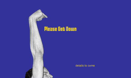
Please Get Down party announcement / teaser. (original photograph by Matt Johnson / 1995); I lifted the term “Please get down” from the most exasperated, impassioned plea in the jam-out-session of “Jolene,” probably the best song ever written/performed by Cake. | web site; 500 x 300px.+ / 2001
Read the rest of this entry »
Filed under Interactive / Web, Print / Editorial
Permalink
Posted: 29 Jan / 2008 at 10:48 pm

My first full-time desk job. Can you sense my enthusiasm? / 2001 (photograph by Lisa Torrence)
In order to engage context in a quotidian discussion about the various caste systems of ancient cultures, a feisty grad student T.A. in one of the many requisite Art History courses I have taken challenged our class section to define the contemporary stamp: “middle class.” Immediately, salaries rang out, one range louder and more determined than the last, until crescendoing in discordant numerical jangle; income could not objectively define it. Quietus gave way to a chorus of key possessions: Cars, houses. Okay, but what if the car is a Maserati? What if the house is a shack? Scenarios of familial constructs similarly swelled and crashed. These lines of criteria could not strike a clear chord of class definition.
The T.A. sat back and let the class caterwaul and self-dismiss various notions before bringing the struggling group back to cue. Coyly, he then rested the discussion by quoting a friend of his, who had jokingly defined a member of the middle class as anyone who “has a job.” The point of this was that such class distinctions are laughably vague and infinitely subjective (a job is not a job is not a job), but the passion with which people attempt to define them proved how deeply invested we are in socio-economic ranking.
While I had technically had three jobs prior, my quest for a “real,” middle-class-making job began sometime late in the Spring of 1999. I thought I had it in a full-time, long-term temp position “working with computers” that I had taken up after finally quitting my four-year run as a bike mechanic. Unfortunately, it wasn’t long before I realized that I wasn’t all that great at “computers” (at least, not in that context), and I let my hours decline steadily, until they were almost zero, and then they were zero. At that point, I had no income.
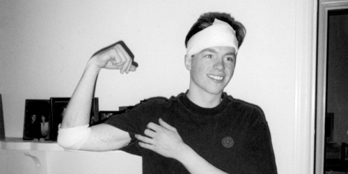
“Yo’ face is my case!” My head was barely scratched, but it did bleed a fair amount. Those scars on my arm are tire tracks, by the way. / 1999 (photograph by Ira Wamble)
As fortune would have it (if luck did not), I had been hit by a car that spring while riding my bike (two cars in the same accident, actually), which was an incredibly traumatic event that in turn paid me an agreeable insurance settlement. I ended up living on this modest reward, a tiny savings, and not much else for quite some time as my job search became more and more frenzied. By November, I paid rent by scrambling together the entirety of my bank account, the cash in my pockets, and loose change I had collected in a jar (seriously). The promise of middle class never tasted so sweet or came with such timely appreciation as when I was offered a job as an in-house “Junior Designer” at Sierra On-Line, Inc., just before Thanksgiving, 1999… Read the rest of this entry »
Filed under Interactive / Web, Packaging / 3-Dimensional, Print / Editorial, Type / Fonts
Permalink
Posted: 18 Dec / 2007 at 11:21 pm
Sometime between the day I decided that I needed to get a real design job and the day that that happened, I realized that I should probably build some kind of portfolio. I picked up just about any project I could get my hands on and basically hoped for the best, since my relative inexperience denied any assurance of success (or financial compensation)… Read the rest of this entry »
Filed under Identity / Systems, Interactive / Web, Signage / Display, Type / Fonts
Permalink
Posted: 23 Nov / 2007 at 12:45 pm
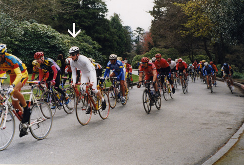
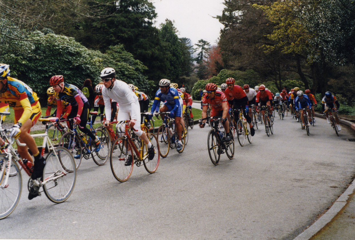
Here I am racing in “The Whites” at the Volunteer Park Criterium; Seattle / 1999 (photographer unknown)
In a lot of ways, 1999 was an awful year for our young Mr. Daniel P. Johnston. I had a steady job that I hated, basically because I had no idea what I was doing (this job will remain unnamed – it’s not on my résumé). My long-term girlfriend had left for another city. I had parted ways with the cycling team with which I had last raced, primarily because I felt that both my racing and managerial contributions had been under-appreciated. After quite a bit of initial work, I had lost a job to create the identity for a very prominent new bike company (to the client’s girlfriend – while I was on vacation). And, most unfathomably, I had dropped out of college after not being accepted to the Visual Communication Design major. I also got hit by a car (again).
About the only aspect of my life that hadn’t come crashing down on me (or into me) was my passion for bike racing. At this point, I was a precocious wheelman, racing in the top echelons of the northwest’s pro/am ranks, and I was getting faster by the minute – without hardly trying. The idea of going professional at some point even seemed possible to me. But I didn’t think any of the local teams could help me in this pursuit. Indeed, after taking such a hail of blows from so many different directions in such a short span of time, I felt like there was only one entity on which I could truly rely, and that was myself. So I set about creating my own team for the ’99 season, comprising just one member: me… Read the rest of this entry »
Filed under Identity / Systems, Uniforms / Apparel
Permalink
Posted: 19 Nov / 2007 at 11:41 pm
I felt pretty proud of myself as I took my seat at the table of Art 206, the second of two screening classes for the Visual Communication Design major at the University of Washington. I was still cagey and wary of my new competitors—er, classmates—but my confidence was at the apex of an upswing after a final-project rally in 205 had put me on the list of 40-or-so students chosen to continue the screening process (from around 150 initial applicants in the previous class).
Art 206 was set up very similarly to Art 205, in that there were three consecutive projects, each having their own deadlines and a final submission requirement, and that the exact same three projects had been assigned for many, many years prior. The only ostensible difference between this class and its predecessor was that we were allowed to use computers for our projects if we so chose (which, as any designer or educator knows – even today – is more often a curse than a blessing).
The projects for 206 were also more complex than those of 205. The first, in the tradition of great European civic programs, was a postage stamp that was to showcase some aspect of an assigned state of the U.S. The second project delved into the third dimension, as we were to create a unique packaging solution for 24 Berol colored pencils. The third was to be a poster / informational mailer for the Burke Museum, conveniently located right on the UW campus… Read the rest of this entry »
Filed under Industrial / Product, Print / Editorial
Permalink
Posted: 14 Nov / 2007 at 11:37 pm
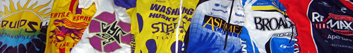
cycling teams I have been on, by jersey: Liquid Sun (Perpetual Motion) / 1994-1995 and again in 1996 | Seattle Express / half of 1996 | Recycled Cycles (this is the original jersey) / 1997-1999 | University of Washington (my collegiate team) / 1998 | Ashmead College (not a collegiate team – confusing, I know) / 2000-2003 | Broadmark / 2004 – all in Seattle | Re/Max / 2006-2007 – New York
In the span of about a dozen years racing bikes, I have been on a total of seven different teams (seems like a lot, now that I think of it). Each team had its benefits and drawbacks, but perhaps the coolest team I ever raced with was Recycled Cycles in the late ’90s.
The team represented the eponymous local used bike shop, whose two owners truly loved the sport, sponsoring the team almost entirely themselves, and quite generously so. While I was on the team, it was comprised of just five to ten members who were all working class heroes of the bike world in the Clark Kent hours; most of us were either messengers or mechanics, and some were both. But, for the most part, and to varying degrees, we were also talented racers, who cared deeply for our competitive image.
Perhaps the highest compliment one can pay an American bike racer is to refer to them as “Euro.” Although this is in reference to the still-dominant homeland of professional cycling, it is is much more a point of style than results. And that Recycled team was most certainly Euro (although the results weren’t bad, either). We were built for it – wiry but tough, with narrow, chiseled features and sunken chests. We acted it, too. We wore expensive couture eyeglasses out on the bike. We spent our bottom dollars on the latest gear for our pristinely-maintained machines, but uttered nary a word on the subject. Our pedal strokes flowed like an orchestra of harpists, and our smart, contemplative gazes never wavered, even in the deepest bouts of oxygen debt. I was one of the only riders that would ever wear a helmet out training; the rest didn’t want to risk their perfect cycling cap placement (I did wear my caps out on dates, though). We had philosophical discussions about the latest Euro-pro dispatches from Cycle Sport magazine (back when it was eight bucks an issue, specially-imported from the UK, and you could only find it at one boutique bookstore in the greater metro-area). Around this time, Cannondale, an all-American bike builder, was really embracing its recent entrance into the European peloton with brilliant advertising that showed its star riders from the Italian dream-team Saeco visiting the bike factory dressed in tailored three-piece suits in a gritty, black-and-white, documentary-style print campaign (way, way pre-Sopranos). We were so inspired that several members showered, groomed and dressed in formal-wear to travel to races… Read the rest of this entry »
Filed under Identity / Systems, Uniforms / Apparel
Permalink
Posted: 31 Oct / 2007 at 11:12 pm
Going to college straight out of high school is something that you’re either supposed to do or not supposed to do, depending on who you ask. Most high school counselors want their charges to apply to every extant school they can think of and get one—any one—locked-down well before graduation, lest the youngsters dizzy themselves at their flying mortarboards, wander off, and never find their way back on track. Everyone else with an opinion says that high school grads should travel the world. (It’s always “travel,” and always “the world.” Never mind traveling to just one place, or just somewhere one isn’t from, even if it’s in the same country. And don’t even think of getting a job or building a boat – it’s travel, son.)
But I’ve only gained these insights secondhand or after the fact, because I never asked anyone in my time. I just went – 25 minutes away from my house – to the University of Washington.
I think I was too close to my new school cartographically to be so far away cognitively; it was a neurological short-circuit: How could I ride my bike straight through an intersection I only three months before had used to turn left and, eight minutes later, land on another planet? I began to dislike my UW experience very shortly after it started. It felt big, cold, and impersonal, and, while I could at least appreciate the esteem of the faculty (from afar), I was surprised at how unimpressive my classmates seemed to be. Most of my friends from high school had indeed either gone to some obscure university, or some obscure country, or they had completely lost their way. My only extracurricular activity was a disappointment. My brain and my mind were at odds with each other. These were the first two years of my college experience.
It wasn’t until I finally began the screening classes for the Visual Communication Design major (VCD) that I really began to see the potential of the school. These classes, used to fish out the top-20-or-so design candidates from a pool of 150 – 200 applicants every year, were brutally competitive but highly intriguing. They were a window into how the program would be (if one made it in), and the view looked pretty interesting. The major, established decades before “design” fell simplistically into the lexicon of quotidian banter, was a pioneering force that had created a self-perpetuating standard of excellence. The faculty were not only esteemed, they were uncompromising, and the best students were no less than inspiring… Read the rest of this entry »
Filed under Identity / Systems, Print / Editorial, Type / Fonts
Permalink
Posted: 22 Oct / 2007 at 10:44 pm
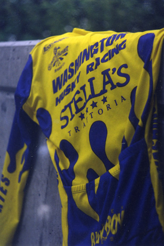
University of Washington Husky Racing jersey / 1997
There was never any question in my mind that I would go to college straight after high school. That said, I didn’t put a hell of a lot of thought into which college I should go to. I only applied to one: The University of Washington (UW).
I based this decision on some pretty loose criteria: It was a university (as opposed to an industrial or art school), it was in Washington (so I wouldn’t have to move from Seattle), it had a very good cycling team (national champions at the time), and I had a vague sense, gathered from various sources, that their graphic design program (termed Visual Communication Design, or just “VCD”) was pretty decent, too.
I was lucky that the VCD program turned out to be more than just decent, but I couldn’t get near it until I had taken care of at least a year-or-two’s-worth of prerequisites. I got into the Husky Racing program almost immediately, though. I had already been racing bikes for a few years in USCF (now USA Cycling) events as a member of commercially-sponsored teams. Specifically, I was on my third “trade” team, which I really liked at that point. I had heard so much talk about how amazing the collegiate racing experience was, though, that I was very excited about jumping into that world, as well… Read the rest of this entry »
Filed under Uniforms / Apparel
Permalink