Don’t Let Money Change Ya

Alright. You have a shade over $120 mil with which to hire one person on behalf of the world. Who’s it going to be? A boy-band-groomed pop star from the U.K. or a school teacher from Detroit? Seems like a pretty simple task, but, due to some mistake, they both got the millions at one point.

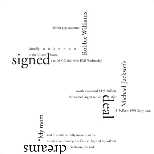
Robbie got his millions for probably singing us lessons of smooth, classic Garamond-y things like falling in love or getting his heart broken or falling in love again or just hooking up with lots of chicks.
jb_workshop_news_robbie_dpj

Robbie Williams Gets Millions in Record Deal typographic composition; 8 x 8in. / 2002

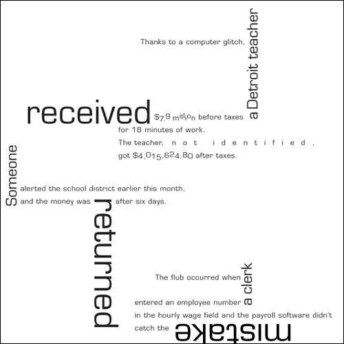
The teacher got his or her millions due to a Microgramma-tic computer glitch. Not for teaching square things like Mathematics or Wood Shop.
jb_workshop_news_teach_dpj

Anonymous Teacher Gets Millions due to Computer Glitch typographic composition; 8 x 8in. / 2002

One clue as to who should have made what can be found in the glaring disparity of said millions between their respective ledgers. Robbie, who was wildly popular in his home country but all-but-nothing in the U.S., got $125 million from his contract in 2002. The teacher, who may or may not have been popular in class—but completely anonymous to the world, received over $117 million less (before taxes). But the error is clear: The teacher should have received approximately $125 million less… Read the rest of this entry »

Filed under Print / Editorial, Type / Fonts

Comments (1)


VCD Phone Home

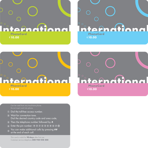
dpj_phone_card_set_a

phone card set; series of four fronts (top); one back (bottom); 3.4in. x 2.125in. each / 2002

It seems that there are (or were) two major markets for long distance phone cards.

One is (or was, I’m guessing) Europe, where long distance on a phone plan, in comparison to U.S. phone plans, would span relatively little actual distance, and wanderlust runs rampant. In the days before near-ubiquitous mobile phone proliferation, I imagine there was much use for a card that would get you in touch with another country, or back in touch with home when you got there, without costly service charges from one’s domestic carrier. Even with a mobile, a roamer could easily outbound their domestic plan with a quick clip on the TGV.

The other market I’ve seen for such cards is quite different, and still as vibrant as ever. Having lived in New York for several years now, I’ve been confronted by gangs of international phone cards, shouting at me from behind so many raised bodega counters, each garish explosion of bling and atrocious typography shouting louder than the next, like a traffic jam in the South Bronx. This city, it seems, has the requisite population of aliens without the means for a long distance plan (or even a phone, in many cases), needing to reach out and touch their homelands, such that the cacophony of prepaid, foil-stamped minutes is warranted.

But, having lived in Seattle almost my entire life as of 2002, with its relatively scant collection of migrant workers (or Europeans), I’m not sure I’d ever even seen a phone card until I designed my own. This project, another in the Advanced Typography class of the Visual Communication Design (VCD) program at the University of Washington, was the novel creation of our professor (fresh from an extended European vacation). Here, we were to design a series (or multiple series) of ten-Euro calling cards… Read the rest of this entry »

Filed under Identity / Systems, Industrial / Product, Type / Fonts

Comments (2)


Let Me Share My Feelings with You

After learning the intricacies of designing typefaces in the design program at the UW, we were led to the next typography class, where we first set out to see how compositions of type could communicate concepts, even without recognizable words. In these studies, we had only newspapers, scissors, glue and a photocopy machine to shape our expressions. I’m very excited to share them with you here!

dpj_typexpression_excited

Excited typographic expression study / 5.75 x 4in. / 2002

I’m confident that you’ll find them to be creative and engaging representations of the feelings I’m trying to express… Read the rest of this entry »

Filed under Type / Fonts

Comments (2)


Tall, Stark and Handsome

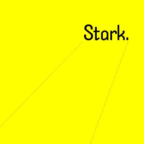
Stark typeface design by Daniel P. Johnston

Stark original typeface design / 2002

Ignore the Din and find a new Trade. Here comes another lean, monosyllabic hero of noir typography. He takes his briefcase locked, his drinks neat and his checks made out to “cash.” He takes wise guys to the cleaners and the birds take him just the way he is. He’s got a hardboiled manner and doesn’t care for idle banter, thank you, so you can keep the jibber-jabber to yourself. He’ll tell you what you need to know and nothing more. But he’s not just another working stiff. He’s got working class.

He’s got a cleft chin and a sordid past with which you need not concern yourself. All that matters is on the dotted lines. He stands tall but keeps a low profile. He’s sharp as nails and almost as kind. He doesn’t want to be your best friend but he’s probably the man you want on the case. He’s StarkRead the rest of this entry »

Filed under Naming / Words, Type / Fonts

Comments


Moontalking


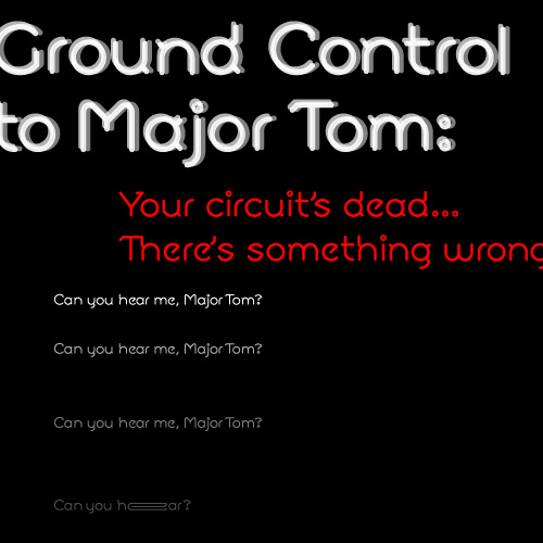
Moon typeface / 2002 (setting of lyrics excerpted from “Space Oddity” by David Bowie)

Spacey, technical, open and angular, functional close or far, and emotionally open, Moon is a typeface for the future. Or at least for writing about it. Although its geometry makes it modern and compelling in display setting, the strategically placed serif bits (technically, Moon would fall into the “semi-sans” category) flow together even dense columns of communiqué. Special touches and extras give this face an alluring Hal-like techno-emotional identity complex… Read the rest of this entry »

Filed under Naming / Words, Type / Fonts

Comments


The Logical Type


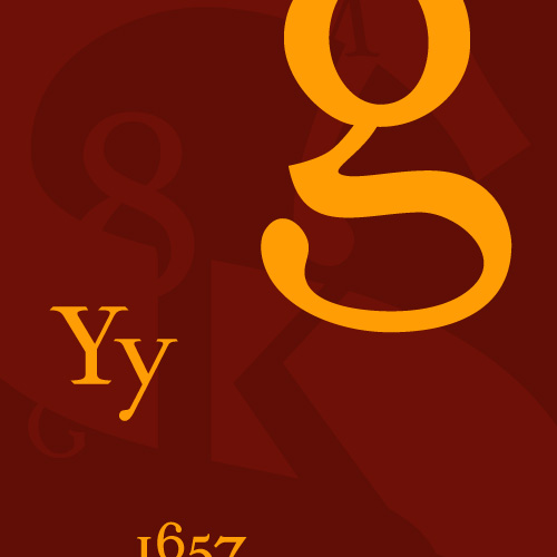
Sylloge typeface (promotional collage) / 2002

All type says something more than that which has been written. Some writing is logical. Therefore, some typefaces can make prose seem more logical than it actually is. This is an example of syllogistic reasoning. This is Sylloge, an original typeface design… Read the rest of this entry »

Filed under Naming / Words, Type / Fonts

Comments


Cracking the Code


one of two entrances to room 247—the Visual Communication Design major studio in the University of Washington School of Art—both are locked at all times / photo taken 2008

A terrible economy. Personal pride. Do or die time. A real studio environment. Some brilliant competition. Real work experience. Real failure experience. Real life experience. An utterly unforgiving professor. A strong sense of potential. Total commitment.

I’m not sure exactly what the most motivating factor was for me as I went through “206,” the second of two screening classes the University of Washington Visual Communication Design program, used to select who could complete the next two-and-a-half years of the VCD program in 2001/2002. Whatever it was, that class marked a tectonic shift in my approach to design work. It was the second time I had made it into 206, and, likely, my last chance to make the final cut into the VCD major. In contrast to the first attempt, I felt no self-satisfaction in the step—just an unflinching focus on the next… Read the rest of this entry »

Filed under Content / Architecture, Copy / Writing, Industrial / Product, Packaging / 3-Dimensional, Photography / Film, Print / Editorial

Comments


Razzle Dazzle ‘Em


Amy and Joel / 2001

I think I was first introduced to Joel Brazil when I was 15, on an open bike ride that was organized by a local shop. The shop sponsored one of the top teams in the region, and obliged some of its members to help corral whatever ragtag assemblage of customers and shop dudes decided to show up on warm summer Wednesdays. Joel was one of the best amateur racers in the country at the time, but I knew nothing about him because he never talked to me. This was primarily because he whiled away most of those miles in a perpetual, nauseating debate with Joe, another member of the team, in which they would each try to explain to each other how and why the other was not good at bike racing.

In the years that followed, I happened to work for that bike shop, attend the same university as Joel, race for the same team (and get sucked into similarly nauseating debates with Joe), do work for the same company and take on the same bitter arch nemesis (not Joe). I even ended up living in the very same room that Joel had rented before me in a house with a couple that counted as great friends to both him and I. Still, it was years and years from our initial meeting to when I actually began to get to know Joel, and, for quite a while, I couldn’t stand him.

As long as I knew or knew of Joel, he had been loud, brash, hyper-competitive, utterly exasperated by others’ life choices, inordinately concerned with material possessions, flakey, and schmoozey—ostensibly, an obnoxious, superficial, inconsiderate jerk. His nickname was “Razzle-Dazzle Brazil” (that rhymes), and he loved it. He wanted to write a column on my web site at one point, so I set up a section for him, which I titled Joell Report (a riff on the ultra-snobby Robb Report), and subtitled “Tales of the World’s Most Fortunate Malcontent” (he never actually wrote an article).

But, as more time went by, translations of Joel’s qualities became more lucid: He worked extremely hard to excel at life’s pursuits and was rewarded with the goods to prove it and the satisfaction with which to parade them. His derision of people’s decisions he deemed unwise was compensated for by his keen sense of their unique talent and fervent drive to tease out the potential thereof, at which he was actually quite gifted if given the opportunity.

Although Joell Report never came to fruition, I did get the opportunity to work with him on one very important project. Indeed, it was the materialization of two of his greatest loves: music and Amy, his then-fiancé. Amy+Joel, a soundtrack album of their wedding reception, would be the product… Read the rest of this entry »

Filed under Packaging / 3-Dimensional, Print / Editorial

Comments (2)


Back to School Time

University of Washington School of Art, main entrance

University of Washington School of Art, main entrance / photo taken 2008

Like most epiphanies, one of my most life-changing ideas came to me suddenly when I was in the bathroom. It was September 2nd, 2001. I had been working full-time as a designer since 1999. In July of that year, I had indulged in a very expensive but amazing vacation, following the Tour de France. Three days after my trip, I returned to work to rumors of massive layoffs. Within a week, tours of the company’s one-year-new building revealed empty desks that quickly multiplied into empty floors. By August 20th, it was clear that the in-house design department, too, was going dark. September 14th was going to be my last day. I had no idea what I was going to do, and then I did.

Two years and change earlier, I had made a rather precarious exit from the Visual Communication Design (VCD) program at the University of Washington. I was disheartened for a while, then embittered, then dismissive, then all-but-forgetful of the whole experience. And then, on that day in September, it came to me: I would go back and finish school. Or, rather, I would try to finish school. After all, I was going straight back to the horse that threw me, and, if anything, it was more fierce than ever (bad economies feed schools with lots of accomplished and motivated applicants). Any prior thoughts of repeating this wicked roulette were momentary lapses in sanity. But, upon my decision that day, my resolve was unshakable.

About a week and a half after my decision, I took one of my final vacation days. An hour or so after I woke up, I checked my personal email program, which showed news stories in one of the frames. The Twin Towers and half of the Pentagon had been obliterated within the span of a few hours. Luckily, I did not know anyone personally who was involved in these catastrophes but it seems strange to tell a story about that time without mentioning it. To be honest, it was all quite disaffecting considering the ever more improbable absurdity the country had been subjected to in the year or so leading up to the events. It was all just more impervious steel turned to dust. My decision was unmoved… Read the rest of this entry »

Filed under Identity / Systems, Print / Editorial, Type / Fonts

Comments (2)


There is No “Inc.” in “Team”


UBC monogram mark for Union Bay Cycling / 2001

A competitive cycling team, like all other kinds of teams, is a of a group of people with a similar interest; in this case, the team’s chief objective is to win bike races. The primary vehicle of a cycling team’s identity is the uniform that team members wear out racing and training. This identity is complicated, however, by the fact that competitive cycling is one of the very few sports in the world based on a sponsorship model, whereby commercial interests pay for some aspect of team operations in return for visible recognition on these uniforms. Almost invariably, this leads to a team’s identity being inextricably intertwined with the identity of their lead sponsors, which can change relatively frequently.

For example, most people would say that Lance Armstrong raced the last season of his career with the Discovery Channel team, and that, before that, he was on the U.S. Postal Service team for six years or so, even though these were, for all intents and purposes, the exact same team, managed by Tailwind Sports.

Union Bay Cycling (UBC) is a large Northwest cycling organization built around an elite-level team that races in local, regional, and national events at the pro/am level. UBC has been around, with the same leadership and core group of riders, for over a decade, but major sponsorship changes had made it seem like three or four disparate and relatively short-lived teams. For UBC, I worked with the team director to develop a long-term solution: a core identity system that accommodates prominent and unique recognition for lead sponsors, but embodies the unique heritage and dynamism of the team riders and stays consistent even with major sponsor changes.

I began with the UBC monogram mark (above) that would immediately identify all communication touchpoints of the team: stationery for proposals, press releases and other correspondence, the web site, T-shirts, gear bags, and so on, and, of course, the all-important team kit, including jerseys, shorts, socks, water bottles, gloves, helmet graphics, and several other tertiary clothing articles.


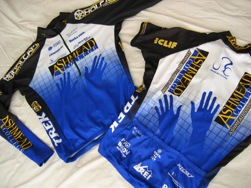
Union Bay Cycling jerseys (long-sleeve front | short-sleeve back) / 2003; I also happened to have designed the Holcam logo on the jersey shoulders (but not their web site) / 2001

The blue grid, an established device of the team, was reworked and became the foundation of this flexible system. The title sponsor was rewarded not only with the most prominent logo presence, but also with an expressive element emerging from the grid (in this case, the hands of Ashmead College, School of Massage), and other sponsors fit into pre-established hierarchical slots based on their respective levels of contribution…
Read the rest of this entry »

Filed under Content / Architecture, Copy / Writing, Identity / Systems, Interactive / Web, Packaging / 3-Dimensional, Print / Editorial, Uniforms / Apparel

Comments (2)


« Previous PageNext Page »