Posted: 05 Oct / 2010 at 8:53 pm

University of Washington School of Art, Sand Point studio door window sign concept; approx. 3.25 x 6n.; plotted output on foamcore / 2003
In my younger scholastic career, I often charged headfirst through the parametric walls of an assignment to ensure that my work would be noticed. In a drawing class I took early on at university, the professor told me that the way I worked was like writing an English paper in Russian. I chalked up experiences like this to standard-fare artist plight and soldiered on. Ironically, my head full of steam soon chugged me right on out of the School of Art. Upon my return some years later, I had a clearer head, but I also had a much keener sense of the power of boundaries. I understood that it was actually keeping the rules recognizable that revealed the cleverness of their kneading, pushing or rearranging.
As I was making my comeback into the University of Washington, the School of Art was pushing its own boundaries, acquiring gallery and studio space for select students and faculty in a building of the former Sand Point Naval Base in Seattle. Then edging myself toward the sharp end of the student body, I was commissioned to design a way-finding sign system for the building.
Sign systems are often droll affairs, so bound by their function that they are stiff and invisible. There are good reasons for not getting too editorial in this discipline, of course: you don’t want anyone to get lost in the cleverness of the sign before they find where they’re going, especially in emergency situations where one might need to know exactly how to get to the bathroom, or worse, get the hell out of the building.
Overseen by School of Art Director and Visual Communication Design Professor Chris Ozubko, I came up with a few concepts that I was pretty confident would get people into the restrooms and out of the building as necessary, but also expressed a bit of the unique personality of what was going on in the space while they could appreciate it… Read the rest of this entry »
Filed under Identity / Systems, Signage / Display
Permalink
Posted: 14 Sep / 2010 at 10:04 pm

No matter how long it lasts and what happens along the way, the most fascinating aspect of any relationship is almost always the beginning. When was the last time you met someone new? When was the last time you met someone that made you feel new? How did it go down? Can you believe it happened? A proper introduction isn’t just an exchange of information; it’s a chemically transformative event that forever changes the course of your life. In 2003, the heads of state at the University of Washington engaged our team at the Design+Innovation Lab to help them properly introduce the school to the world wide web.
As a great ad man (or woman—I’m not sure) once warned on behalf of a deodorant: “You never get a second chance to make a first impression.” Well, leading up to our project, more and more people were getting their first impression of the University of Washington from its web site and, frankly, it stank. The UW is an expansive, influential institution of over 50,000 students, faculty and staff that has been an established leader in many academic and athletic programs for well over a century, and it’s Seattle setting is one of the most beautiful cities in the world. It had the brains, the brawn, the experience and a pretty sweet place. But then was a transitional era in the understanding of communication and media, and web site design was oft-still an afterthought doled out to reluctant comp-sci geeks. As such, the UW’s site betrayed a persona that was uncharacteristically inscrutable, unsightly and unwelcoming; you probably would want to steer clear of interacting with this one.
By the end of this summer-long project, our team—comprising myself, then fellow Visual Communication Design (VCD) undergrad student Jim Nesbitt and then VCD grad student Jason Tselentis, and directed by Doug Wadden, then Chair of the UW Division of Design and now Executive Vice Provost of the entire University—had redesigned the UW web site; a not-inconsiderable feat. However, we initially were not charged with doing anything with the actual site; we were only supposed to design an introduction to it… Read the rest of this entry »
Filed under Content / Architecture, Copy / Writing, Interactive / Web
Permalink
Posted: 11 Apr / 2010 at 9:56 pm

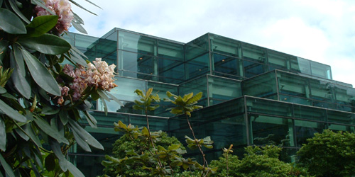
Washington State Convention and Trade Center building (back/garden) / photo taken 2003
Sometime in the 1940s or ’50s (I’m not sure of the exact year), the term “corporate identity” was coined by Lippincott & Margulies—one of the first major design firms in the world—to describe both the idea that even large businesses have inherent, relatable characteristics, not unlike human beings, and the practice that could express their character through a fitting, comprehensive and consistent design program. An organization’s identity is expressed in every way they communicate, from their name and logo to their brochures and web site, to the way they answer the phone—whether those “touchpoints” are designed by professionals or not—so this was an important “call-to-action” (to use another industry term) for organizations to pay attention to everything they were communicating, and, ideally, to pay top-notch professionals like L&M to help them make sure they were doing so effectively.
Sometime in the 1990s, the term “brand” began to take over as more formal business strategy was becoming more prominently integrated into large-scale identity design programs, and it quickly went from buzz word to industry category, on which uncounted firms jumped. I have always found this nomenclature shift ironic. “Branding,” literally translated, is the superficial process of stamping a logo on your property (livestock, originally); this superficial logo stamping is exactly the perception that the “new” practice of “branding” was supposed to be rising above. Meanwhile, the word “identity” could already encompass every aspect what an entity is, from what they do to how they express it. But like many P/C nomenclature shifts of late, whether rational or not, “branding” has taken hold, and “identity” (preceded by “corporate” or not), has been deprecated.
Whatever it’s called, my formal introduction to the process of figuring out what an organization stands for and expressing it in a fitting design program was in a class called Identity Systems in the Visual Communication Design program at the University of Washington, sometime in 2003. Like a few other courses in the program, this one was broken into collaborative group and individual phases. Three-person groups were assigned one of four or five major local entities and tasked with research and analysis of the entity, en-route to the creation of a strategic brand platform. Based on this platform, we were then set about designing a fitting logo and building a supporting visual identity system, individually… Read the rest of this entry »
Filed under Copy / Writing, Identity / Systems, Industrial / Product, Interactive / Web, Signage / Display
Permalink
Posted: 06 Mar / 2010 at 4:27 pm

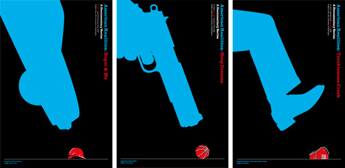
American Realities film series posters: Roger & Me | Hoop Dreams | Troublesome Creek; digital plot outputs; 24 x 36in. (each) / 2002
We Americans are conditioned to think that ours is the best country in the world—that this is the land of opportunity, and we can achieve anything here if we try hard enough. And, by all available evidence, there seem to be plenty of other countries in which people are a hell of a lot worse off than us. But life in the U.S. ain’t all sweet apple pie, and opportunities are easier to come by for some than others. Of course, you’d never know this by watching most film or television. With so much false “reality” pervading contemporary media, it is shockingly refreshing to see the true struggle of real life shown so eloquently in some powerful recent documentary films.
As one of three projects assigned in our Visualizations course in the Visual Communication Design program at the UW, we were to develop a theme around three movies of our choosing for a film festival of sorts, then design a corresponding promotional poster series. With American Realities, I thematically linked Roger & Me, Hoop Dreams and Troublesome Creek, as poignant revelations of Americans forced to work extraordinarily hard just to make ends meet, often against opposing forces of others’ opportunities.
By visually expressing the emotional tension of these stories, I aimed to generate awareness not only of these filmic case studies, but also of the true elusiveness of the American dream… Read the rest of this entry »
Filed under Advertising / Campaigns, Copy / Writing, Drawing / Illustration, Print / Editorial
Permalink
Posted: 27 Feb / 2010 at 10:34 am

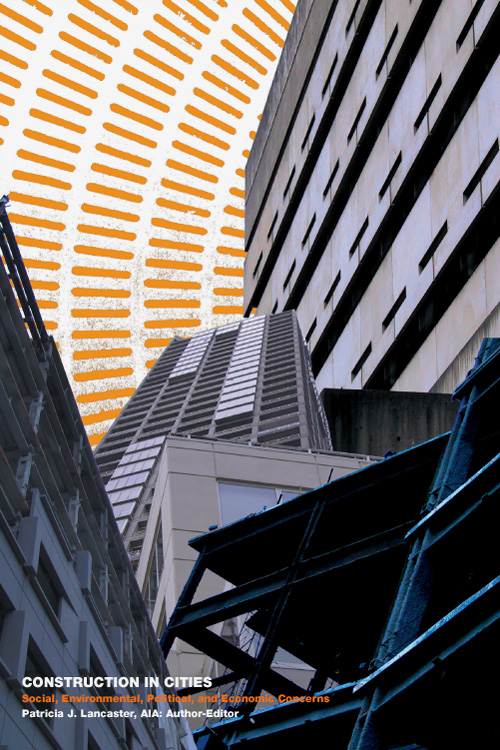
Construction in Cities; Social, Environmental, Political and Economic Concerns book cover (1 of 36); 6 x 9in. / 2002
There’s more than one way to skin a cat, as they say. They don’t seem to say who the desperate soul was that figured this out, or how many ways he or she came up with (though I imagine there must be at least nine). The question we were posed with in a university class project was: How many ways can you skin a book?
As part of the Visualizations course in the Visual Communication Design program at the University of Washington, this so-called “design marathon” charged us with creating not just one or even nine, but 36 different covers for the exact same book. Said book had to be a real, published work, and it had to have some variant of the word “city” in the title but, as long as it fit within those parameters, we could choose whatever one seemed to suit our fancy. We spent about a week focusing on getting a few covers started, then worked on developing the balance while concurrently working on a public service campaign project and another project creating a series of film posters (coming soon to a Graphic Language blog near you!). All three projects were done in the course of ten weeks.
The book I chose, “Construction in Cities; Social, Environmental, Political and Economic Concerns” by Patricia J. Lancaster, AIA, is no great work of literature. It is, however, a (seemingly) quite useful guide to overcoming various barriers in getting one’s plans built in the urban landscape. I took various perspectives in illustrating this on my covers (I had to!). As with all of the work I put up on this site, I really like some of it and find some of it pretty awful, but for you, I bear all. My first attempt is above. 35 others follow… Read the rest of this entry »
Filed under Photography / Film, Print / Editorial
Permalink
Posted: 15 Feb / 2010 at 9:31 pm

Rumpelstiltskin would approve. recycling awareness campaign postcard, showing PET bottles going into winter gloves; 7 x 5 in. / 2002
“Designer” is an ethereal thing to call oneself, fraught with misconception and expectation. When I describe myself as such, people I meet invariably respond with the exact same, ever-more-annoying, eight-word phrase: “Oh—that’s, like, with computers and stuff, right?” (I can only imagine that there was some 20/20 John Stossel exposé about the suspicious rise of the machines in the late ’80s—replete with footage of designers large in glasses and shoulder-padding huddled around a tiny Macintosh, working to draw pastel and black magic from it—that permanently ingrained this concept in society at large.) Moreover, most people assume I use my computers and stuff for advertising, where I spin everyday goods into objects of mythical lust… Read the rest of this entry »
Filed under Advertising / Campaigns, Copy / Writing, Photography / Film, Print / Editorial, Signage / Display
Permalink
Posted: 17 Jan / 2010 at 1:21 pm

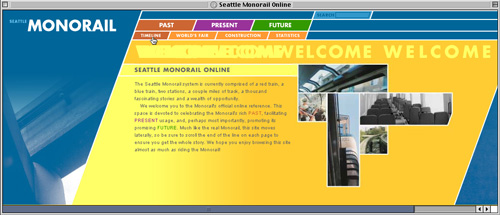
Seattle Monorail Online web site / Welcome page; 1020 x 440px. / 2002
Every time I visit Seattle (my hometown), which tends to happen more than once a year, I find it surprisingly different than I left it last. Startups become stalwarts, old favorites become new failures and areas of complete desolation become constructed destinations. But, until very recently, the ways to get to and from any of them had hardly changed a bit. Despite its squeaky-green image, Seattle has always been a car town, with a public transit system whose progress comes and goes in fits and starts but never seems to get anywhere useful by any reasonable timetable. As someone who grew up without a car and as a recalcitrant fan of progress (perhaps even Futurism, to some extent), one of the most personally frustrating examples of this city planning torpor is the Seattle Monorail.
As of 2002, when I decided to use it as it as my muse for a web site design class in the Visual Communication Design program at the University of Washington, the Seattle Monorail had been the beginning of something great for about forty years. Originally built in 1962 to shuttle visitors between downtown and the Seattle World’s Fair, the Monorail had since served as little more than an icon of the city’s once future-driven spirit, though there was a resurgent and concerted effort to evolve the system into something much more impressive. In fact, the wheels had been in motion, so to speak, for several years and, despite the work of some determinately opposed political factions, it looked as if the Monorail might actually realize its potential in the foreseeable future.
Even considering its terribly stunted scope of service at the time (it ran just over one mile, end-to-end—only about .1 mile longer than it had run in 1962), the Seattle Monorail was a fascinating entity, in that it was at once an historical landmark, a thriving attraction and the major source of inspiration for what possibly could have been the future of Seattle’s public transportation system. This web site was to celebrate the Monorail system’s rich heritage, facilitate its everyday usage and promote its promising future. As such, I architected the site accordingly, creating sections related to the system’s past, present and future, and built relevant content into each section… Read the rest of this entry »
Filed under Content / Architecture, Copy / Writing, Interactive / Web, Photography / Film
Permalink
Posted: 24 Oct / 2009 at 11:02 am

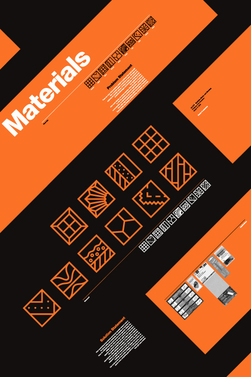
Materials symbol set promotional poster; 20 x 30in. / 2002
There is something very primal and essential about building things. Behind our most basic needs is the need to build something to facilitate it. Before we can put food on the table, someone has to put the table together. Before we can sleep under anyone’s roof, someone has to put that roof over our heads. And, in order to afford such things these days, most of us need to go to work, which, more than likely, is in a building.
But modern technology and evolving divisions of labor have rendered the notion of building even the most trifling gaff foreign and anxiety-filling to most. Hardware stores (big-box and corner-shop alike) are stocked floor to ceiling with too many confusing answers to even the most basic questions. For our Marks and Symbols class in the Visual Communication Design (VCD) program at the University of Washington, we were set out to develop a universal language of icons that would help de-mystify this environment and enable people to fulfill their basic need to put stuff together.
The class was divided into two phases: research and development. In the research phase, we worked in groups to look into issues facing the hardware customer, decide upon the problem we felt had the most potential for amelioration by a concise set of symbols (ten or so), and present our process and findings to the rest of the class. In the second phase, we each developed symbol sets on our own to respond to this problem.
Our research group, comprising mates Devon DeLapp, Jesse Graupmann, Narith Hoc, Sarah LaMont, Shaun Tungseth and myself, began by thinking of and assessing the potential (and drawbacks) of six possible options: A set of symbols for connectors, which could help people figure out what fit with what else (but seemed too broad to spawn a useful set of just ten symbols), electricity symbols, which could help people figure out the ins and outs of amps and volts (but we couldn’t figure out how to boil this subject down to ten symbols, either), how-to symbols, which could help people with standard tasks like building a deck or installing a light fixture (but, we quickly realized, would be nearly impossible to describe in mere icons), function/action symbols, which could help explain what a particular tool might do, such as “twist” or “strike” and might have made for a cool set of symbols (but seemed too basic a concept to actually be of any use to any adult not born on Mars—”a hammer is for hitting; fancy that!”), or warning symbols, which could help deter someone from doing stupid things with those tools—like strike themselves with a hammer (but had already been done to death, so to speak).
After much debate, we decided that materials had the most potential for new exploration of symbols that could enjoy real utility, potentially touching a range of applications within the context of hardware, such as way-finding (“Where is the wood?”), contents listing (“Is this made with wood?”), and proper use of tools (“Can I use this on wood?”)… Read the rest of this entry »
Filed under Copy / Writing, Identity / Systems, Packaging / 3-Dimensional, Photography / Film, Signage / Display
Permalink
Posted: 29 Sep / 2009 at 9:48 pm

Prosophobia promotional poster; 24 x 36in. / 2002
The most celebrated role of the designer has always been that of creator of positive change through innovation, but battling the public’s inclination to treasure the old and suspect the new has historically been tough going. The current of ominous world events (especially at the time of this project’s conception, painfully close to 9/11) only serves to shore up such public reservation. For many people, the comfort of the familiar is too valuable to risk on new ideas. This promotes a homogeneous, retro-centric design market in which the new is often merely another iteration of the old.
Prosophobia (“fear of progress”) was a concept for an international design conference that would explore why many of these constructs exist and how we as designers can continue to champion progress in this environment. Featured presentations were to be given by historians, behaviorists and economists, as well as a diverse range of design leaders successfully implementing progressive work, despite this prosophobic culture.
Being a design event (and a design school project, no less), a promotional / informational poster was a critical application, and set the visual theme for the balance of the comprehensive identification and communication suite. After several dramatic, antagonistic early concepts, including a God-like hand pushing down the sunrise, a Volkswagen “New Beetle” reversing into the viewer and even a revolver loaded with antiquities and ready to fire, an approach more considerate of both sides of the matter prevailed. The front presents the issue in a re-contextualized image reminiscent of the silent film era, showing a figure literally hanging onto the past for dear life, while the flip-side speaks to the present (signified by digital visual language) offering information on the voices on offer in the conference, and an invitation to participate in the future… Read the rest of this entry »
Filed under Content / Architecture, Copy / Writing, Identity / Systems, Industrial / Product, Interactive / Web, Naming / Words, Print / Editorial, Signage / Display
Permalink
Posted: 29 Aug / 2009 at 9:29 am

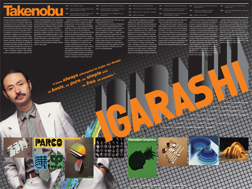
Takenobu Igarashi magazine spread retrospective; 24 x 18in. (spread) / 2002
A staple project of many university design programs is to create a poster or magazine spread or flyer or whatever that somehow highlights the work of a “famous” designer, and, for extra measure, to design it as they might have designed it. That is, to design the piece in said famous designer’s “style.” That we had this sort of a project in the VCD program at the University of Washington always struck me as very strange, as “style” was nearly as derided a word as “Hobo” in the UW VCD lexicon. After all, a good designer (let alone a “famous” one) shouldn’t have a style.
A good designer analyzes, digests and synthesizes various aspects of a particular project and distills from this process the most compelling way to communicate the intended message for that project. There is a not-so-subtle line to be drawn here, as using a particular vernacular can be very useful in communicating particular subject matter. For example, if designing a poster about how inner-city youth express their identity, using some element of graffiti might be a felicitous way to help illustrate this. However, if a designer used graffiti in every project, whether it be about inner-city youth or organic produce, then his approach no longer can be seen as appropriating a relevant style to communicate a message; he has now created his own “style” that is irrespective of the individual needs of particular projects. He is one-dimensional.
Though I only know what I know about Takenobu Igarashi, a “famous” designer in the 1980s and my assigned muse for this project, from books and magazines and perhaps an article or two posted on the Internet, it did seem fairly easy to pick up on his “style.” But the issue wasn’t that his projects were one-dimensional. The issue was that his projects were all three-dimensional. Igarashi, in fact, transitioned his focus toward product design and then architectural sculpture as his career progressed, and, one could imagine, this was really where he wanted to be the whole time… Read the rest of this entry »
Filed under Content / Architecture, Copy / Writing, Print / Editorial, Type / Fonts
Permalink


