Archive for Uniforms / Apparel

There is No “Inc.” in “Team”


UBC monogram mark for Union Bay Cycling / 2001

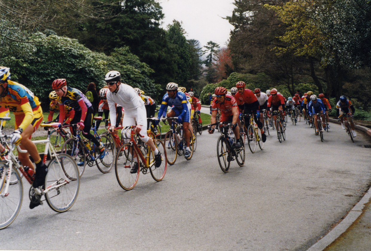
A competitive cycling team, like all other kinds of teams, is a of a group of people with a similar interest; in this case, the team’s chief objective is to win bike races. The primary vehicle of a cycling team’s identity is the uniform that team members wear out racing and training. This identity is complicated, however, by the fact that competitive cycling is one of the very few sports in the world based on a sponsorship model, whereby commercial interests pay for some aspect of team operations in return for visible recognition on these uniforms. Almost invariably, this leads to a team’s identity being inextricably intertwined with the identity of their lead sponsors, which can change relatively frequently.

For example, most people would say that Lance Armstrong raced the last season of his career with the Discovery Channel team, and that, before that, he was on the U.S. Postal Service team for six years or so, even though these were, for all intents and purposes, the exact same team, managed by Tailwind Sports.

Union Bay Cycling (UBC) is a large Northwest cycling organization built around an elite-level team that races in local, regional, and national events at the pro/am level. UBC has been around, with the same leadership and core group of riders, for over a decade, but major sponsorship changes had made it seem like three or four disparate and relatively short-lived teams. For UBC, I worked with the team director to develop a long-term solution: a core identity system that accommodates prominent and unique recognition for lead sponsors, but embodies the unique heritage and dynamism of the team riders and stays consistent even with major sponsor changes.

I began with the UBC monogram mark (above) that would immediately identify all communication touchpoints of the team: stationery for proposals, press releases and other correspondence, the web site, T-shirts, gear bags, and so on, and, of course, the all-important team kit, including jerseys, shorts, socks, water bottles, gloves, helmet graphics, and several other tertiary clothing articles.


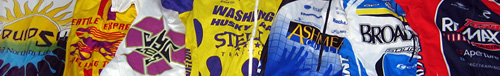
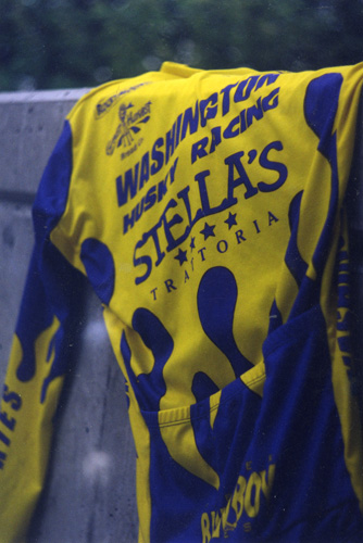
Union Bay Cycling jerseys (long-sleeve front | short-sleeve back) / 2003; I also happened to have designed the Holcam logo on the jersey shoulders (but not their web site) / 2001

The blue grid, an established device of the team, was reworked and became the foundation of this flexible system. The title sponsor was rewarded not only with the most prominent logo presence, but also with an expressive element emerging from the grid (in this case, the hands of Ashmead College, School of Massage), and other sponsors fit into pre-established hierarchical slots based on their respective levels of contribution…
Read the rest of this entry »

Filed under Content / Architecture, Copy / Writing, Identity / Systems, Interactive / Web, Packaging / 3-Dimensional, Print / Editorial, Uniforms / Apparel

Comments (2)


Fat and Invisible at the Same Time

FatPort logo (revised)

FatPort logo / 2001, 2008

Though the Internet has been around, in one form or another, for many decades, it had little public awareness until about twenty years ago. By the mid 1990s, the World Wide Web had been plotted by a smattering of amateur “home pages,” which generally consisted of some “lite” personal information about the site’s owner (or “webmaster”) and their hobbies (one of those invariably being “the Internet”). By the late 1990s, these folksy homes were being overwhelmed by the sprawl of “dot-coms” from corporate startups and stalwarts flocking to the new marketplace, and Internet tools like email were beginning to make their way into everyday practice. But, until the early 2000s, the only place in the whole wide world that one would likely experience these sites and services was from the office, or through their droolingly slow modem at home, which made anything but the most formal or mundane tasks a bit difficult for most folks.

Soon enough, though, many public establishments started offering wireless Internet service, enabling the populace to get out into the world and peruse the Web at office-like speeds from their own laptops at places that they already liked going, like coffee shops or bookstores. This service is often referred to casually as “Wi-Fi,” which is a contraction of ‘Wireless’… um…’Fidelity’??, a name created by those wacky kids over at Interbrand for an actual alliance supporting the “IEEE 802.11b Direct Sequence” specifications (I’m not making this stuff up).

Whatever the protocol may be named (or numbered, or whatever), one of the first Wi-Fi service providers primarily for consumer usage in public establishments was FatPort, a Vancouver, B.C. startup established by a few programmers, including my good friend Ingy, who hired me to help develop the venture’s visual identity (but left a relatively short time thereafter).

Before I was brought in, the name of this service had been established by the founders. A “fat port” is sort of programmer-slang for a good, wide-open connection. Ingy actually had the idea for a ‘fat’ radio tower mark, which I thought was good, so I basically just did it. I then set the type in “fat” and “open” weights to reinforce the idea in a distinctive word-mark. The strong, simple palette of red, white and black hints at the Canadian roots of the program and is highly versatile for any number of applications… Read the rest of this entry »

Filed under Identity / Systems, Print / Editorial, Signage / Display, Uniforms / Apparel

Comments (1)


Just What I’m Going Through / They Can’t Understand*

DPJ racing Volunteer Park Criterium

Here I am racing in “The Whites” at the Volunteer Park Criterium; Seattle / 1999 (photographer unknown)

In a lot of ways, 1999 was an awful year for our young Mr. Daniel P. Johnston. I had a steady job that I hated, basically because I had no idea what I was doing (this job will remain unnamed – it’s not on my résumé). My long-term girlfriend had left for another city. I had parted ways with the cycling team with which I had last raced, primarily because I felt that both my racing and managerial contributions had been under-appreciated. After quite a bit of initial work, I had lost a job to create the identity for a very prominent new bike company (to the client’s girlfriend – while I was on vacation). And, most unfathomably, I had dropped out of college after not being accepted to the Visual Communication Design major. I also got hit by a car (again).

About the only aspect of my life that hadn’t come crashing down on me (or into me) was my passion for bike racing. At this point, I was a precocious wheelman, racing in the top echelons of the northwest’s pro/am ranks, and I was getting faster by the minute – without hardly trying. The idea of going professional at some point even seemed possible to me. But I didn’t think any of the local teams could help me in this pursuit. Indeed, after taking such a hail of blows from so many different directions in such a short span of time, I felt like there was only one entity on which I could truly rely, and that was myself. So I set about creating my own team for the ’99 season, comprising just one member: me… Read the rest of this entry »

Filed under Identity / Systems, Uniforms / Apparel

Comments (1)


Team Player

the racing jerseys of Daniel P. Johnston

cycling teams I have been on, by jersey: Liquid Sun (Perpetual Motion) / 1994-1995 and again in 1996 | Seattle Express / half of 1996 | Recycled Cycles (this is the original jersey) / 1997-1999 | University of Washington (my collegiate team) / 1998 | Ashmead College (not a collegiate team – confusing, I know) / 2000-2003 | Broadmark / 2004 – all in Seattle | Re/Max / 2006-2007 – New York

In the span of about a dozen years racing bikes, I have been on a total of seven different teams (seems like a lot, now that I think of it). Each team had its benefits and drawbacks, but perhaps the coolest team I ever raced with was Recycled Cycles in the late ’90s.

The team represented the eponymous local used bike shop, whose two owners truly loved the sport, sponsoring the team almost entirely themselves, and quite generously so. While I was on the team, it was comprised of just five to ten members who were all working class heroes of the bike world in the Clark Kent hours; most of us were either messengers or mechanics, and some were both. But, for the most part, and to varying degrees, we were also talented racers, who cared deeply for our competitive image.

Perhaps the highest compliment one can pay an American bike racer is to refer to them as “Euro.” Although this is in reference to the still-dominant homeland of professional cycling, it is is much more a point of style than results. And that Recycled team was most certainly Euro (although the results weren’t bad, either). We were built for it – wiry but tough, with narrow, chiseled features and sunken chests. We acted it, too. We wore expensive couture eyeglasses out on the bike. We spent our bottom dollars on the latest gear for our pristinely-maintained machines, but uttered nary a word on the subject. Our pedal strokes flowed like an orchestra of harpists, and our smart, contemplative gazes never wavered, even in the deepest bouts of oxygen debt. I was one of the only riders that would ever wear a helmet out training; the rest didn’t want to risk their perfect cycling cap placement (I did wear my caps out on dates, though). We had philosophical discussions about the latest Euro-pro dispatches from Cycle Sport magazine (back when it was eight bucks an issue, specially-imported from the UK, and you could only find it at one boutique bookstore in the greater metro-area). Around this time, Cannondale, an all-American bike builder, was really embracing its recent entrance into the European peloton with brilliant advertising that showed its star riders from the Italian dream-team Saeco visiting the bike factory dressed in tailored three-piece suits in a gritty, black-and-white, documentary-style print campaign (way, way pre-Sopranos). We were so inspired that several members showered, groomed and dressed in formal-wear to travel to races… Read the rest of this entry »

Filed under Identity / Systems, Uniforms / Apparel

Comments (4)


The Old College Try

University of Washington Husky Racing jersey / 1998

University of Washington Husky Racing jersey / 1997

There was never any question in my mind that I would go to college straight after high school. That said, I didn’t put a hell of a lot of thought into which college I should go to. I only applied to one: The University of Washington (UW).

I based this decision on some pretty loose criteria: It was a university (as opposed to an industrial or art school), it was in Washington (so I wouldn’t have to move from Seattle), it had a very good cycling team (national champions at the time), and I had a vague sense, gathered from various sources, that their graphic design program (termed Visual Communication Design, or just “VCD”) was pretty decent, too.

I was lucky that the VCD program turned out to be more than just decent, but I couldn’t get near it until I had taken care of at least a year-or-two’s-worth of prerequisites. I got into the Husky Racing program almost immediately, though. I had already been racing bikes for a few years in USCF (now USA Cycling) events as a member of commercially-sponsored teams. Specifically, I was on my third “trade” team, which I really liked at that point. I had heard so much talk about how amazing the collegiate racing experience was, though, that I was very excited about jumping into that world, as well… Read the rest of this entry »

Filed under Uniforms / Apparel

Comments


Class of ’96

dpj_96_raiders

Nathan Hale Class of ’96 Raiders proposal for commemorative T-shirt design; pencil and pen on notebook paper; 8.5 x 11in. / 1996

In his song Life, Jeffrey Lewis, one of my favorite musical artists, relates each major defining factor of life (friends, love, global cultural differences, God, etc.) with a pithy verse each. The whole song is probably about two-and-a-half minutes long, and, even though it is sung of his own experience, it captures the entirety of modern life more eloquently than anything else I’ve ever heard or read at any word count. In his verse about school, he shares:

School is the place where I did my growing
They fill your brain to overflowing
They tell you this is all stuff you need to be knowing
School is the place where I did my growing
Just when I got to like it, it was time to be going

I could certainly see my entire scholastic experience in this light, but my high school days in particular are what this conjures most. Coming from middle school, which I only got to like when it was time never to have to come back, high school barely outperformed my then deflated expectations at the beginning. I was processed by generic classes and distracted teachers. The halls sucked me from one hour of it to the next until it was over for the day. The mile and a half commute passed under me each day until the week was over.

But as those weeks turned into months and and quarters, glimmers of hope began to energize my steps, and vice-versa. I was exposed to the potential of my experience, and I began to gain confidence and venture into it… Read the rest of this entry »

Filed under Identity / Systems, Type / Fonts, Uniforms / Apparel

Comments