Posted: 29 Jan / 2008 at 10:48 pm

My first full-time desk job. Can you sense my enthusiasm? / 2001 (photograph by Lisa Torrence)
In order to engage context in a quotidian discussion about the various caste systems of ancient cultures, a feisty grad student T.A. in one of the many requisite Art History courses I have taken challenged our class section to define the contemporary stamp: “middle class.” Immediately, salaries rang out, one range louder and more determined than the last, until crescendoing in discordant numerical jangle; income could not objectively define it. Quietus gave way to a chorus of key possessions: Cars, houses. Okay, but what if the car is a Maserati? What if the house is a shack? Scenarios of familial constructs similarly swelled and crashed. These lines of criteria could not strike a clear chord of class definition.
The T.A. sat back and let the class caterwaul and self-dismiss various notions before bringing the struggling group back to cue. Coyly, he then rested the discussion by quoting a friend of his, who had jokingly defined a member of the middle class as anyone who “has a job.” The point of this was that such class distinctions are laughably vague and infinitely subjective (a job is not a job is not a job), but the passion with which people attempt to define them proved how deeply invested we are in socio-economic ranking.
While I had technically had three jobs prior, my quest for a “real,” middle-class-making job began sometime late in the Spring of 1999. I thought I had it in a full-time, long-term temp position “working with computers” that I had taken up after finally quitting my four-year run as a bike mechanic. Unfortunately, it wasn’t long before I realized that I wasn’t all that great at “computers” (at least, not in that context), and I let my hours decline steadily, until they were almost zero, and then they were zero. At that point, I had no income.
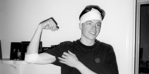
“Yo’ face is my case!” My head was barely scratched, but it did bleed a fair amount. Those scars on my arm are tire tracks, by the way. / 1999 (photograph by Ira Wamble)
As fortune would have it (if luck did not), I had been hit by a car that spring while riding my bike (two cars in the same accident, actually), which was an incredibly traumatic event that in turn paid me an agreeable insurance settlement. I ended up living on this modest reward, a tiny savings, and not much else for quite some time as my job search became more and more frenzied. By November, I paid rent by scrambling together the entirety of my bank account, the cash in my pockets, and loose change I had collected in a jar (seriously). The promise of middle class never tasted so sweet or came with such timely appreciation as when I was offered a job as an in-house “Junior Designer” at Sierra On-Line, Inc., just before Thanksgiving, 1999… Read the rest of this entry »
Filed under Interactive / Web, Packaging / 3-Dimensional, Print / Editorial, Type / Fonts
Permalink
Posted: 18 Dec / 2007 at 11:21 pm
Sometime between the day I decided that I needed to get a real design job and the day that that happened, I realized that I should probably build some kind of portfolio. I picked up just about any project I could get my hands on and basically hoped for the best, since my relative inexperience denied any assurance of success (or financial compensation)… Read the rest of this entry »
Filed under Identity / Systems, Interactive / Web, Signage / Display, Type / Fonts
Permalink
Posted: 31 Oct / 2007 at 11:12 pm
Going to college straight out of high school is something that you’re either supposed to do or not supposed to do, depending on who you ask. Most high school counselors want their charges to apply to every extant school they can think of and get one—any one—locked-down well before graduation, lest the youngsters dizzy themselves at their flying mortarboards, wander off, and never find their way back on track. Everyone else with an opinion says that high school grads should travel the world. (It’s always “travel,” and always “the world.” Never mind traveling to just one place, or just somewhere one isn’t from, even if it’s in the same country. And don’t even think of getting a job or building a boat – it’s travel, son.)
But I’ve only gained these insights secondhand or after the fact, because I never asked anyone in my time. I just went – 25 minutes away from my house – to the University of Washington.
I think I was too close to my new school cartographically to be so far away cognitively; it was a neurological short-circuit: How could I ride my bike straight through an intersection I only three months before had used to turn left and, eight minutes later, land on another planet? I began to dislike my UW experience very shortly after it started. It felt big, cold, and impersonal, and, while I could at least appreciate the esteem of the faculty (from afar), I was surprised at how unimpressive my classmates seemed to be. Most of my friends from high school had indeed either gone to some obscure university, or some obscure country, or they had completely lost their way. My only extracurricular activity was a disappointment. My brain and my mind were at odds with each other. These were the first two years of my college experience.
It wasn’t until I finally began the screening classes for the Visual Communication Design major (VCD) that I really began to see the potential of the school. These classes, used to fish out the top-20-or-so design candidates from a pool of 150 – 200 applicants every year, were brutally competitive but highly intriguing. They were a window into how the program would be (if one made it in), and the view looked pretty interesting. The major, established decades before “design” fell simplistically into the lexicon of quotidian banter, was a pioneering force that had created a self-perpetuating standard of excellence. The faculty were not only esteemed, they were uncompromising, and the best students were no less than inspiring… Read the rest of this entry »
Filed under Identity / Systems, Print / Editorial, Type / Fonts
Permalink
Posted: 15 Oct / 2007 at 8:37 pm

Nathan Hale Class of ’96 Raiders proposal for commemorative T-shirt design; pencil and pen on notebook paper; 8.5 x 11in. / 1996
In his song Life, Jeffrey Lewis, one of my favorite musical artists, relates each major defining factor of life (friends, love, global cultural differences, God, etc.) with a pithy verse each. The whole song is probably about two-and-a-half minutes long, and, even though it is sung of his own experience, it captures the entirety of modern life more eloquently than anything else I’ve ever heard or read at any word count. In his verse about school, he shares:
School is the place where I did my growing
They fill your brain to overflowing
They tell you this is all stuff you need to be knowing
School is the place where I did my growing
Just when I got to like it, it was time to be going
I could certainly see my entire scholastic experience in this light, but my high school days in particular are what this conjures most. Coming from middle school, which I only got to like when it was time never to have to come back, high school barely outperformed my then deflated expectations at the beginning. I was processed by generic classes and distracted teachers. The halls sucked me from one hour of it to the next until it was over for the day. The mile and a half commute passed under me each day until the week was over.
But as those weeks turned into months and and quarters, glimmers of hope began to energize my steps, and vice-versa. I was exposed to the potential of my experience, and I began to gain confidence and venture into it… Read the rest of this entry »
Filed under Identity / Systems, Type / Fonts, Uniforms / Apparel
Permalink
Posted: 14 Oct / 2007 at 7:36 pm
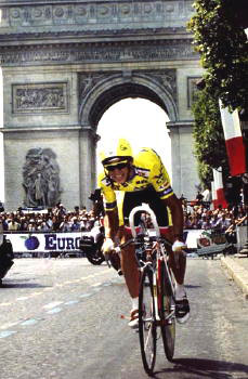
The ultimate inspiration: Greg LeMond (here on his way to winning the 1989 Tour de France). photo by Cor Vos
I’ve always been interested in cycling to some extent. I always rode bikes, and even before my teens, I watched big races like the Tour de France when they were on TV, and I spent my fair share of time staring at the top shelves of local bike shops and fogging up their display cases. This—unlike most—was an interest that grew steadily stronger with age. But it was an ironic turn of events that launched me into a full-blown obsession with cycling: I got hit by a car while riding my bike.
I was commuting to high school sophomore year on my Specialized CrossRoads Cruz hybrid bike (about $250 new, then) and, as I rode across a busy intersection, I was struck by a Volkswagen Scirocco (one of my favorite cars at the time), whose driver had run a red light in the rush of the hour. The impact instantly broke both of the bones in my lower left leg (although I didn’t realize this until I tried—and failed—to walk away from the scene). It’s said that people can’t recall the actual sensation of pain, but I can say with absolute certainty that having to move my broken leg into several different positions on the X-Ray table later that day was the most excruciatingly painful experience of my life. The breaks also ran perilously close to the bones’ growth plates and, if they had been damaged, this situation would have been even worse, as I still had a good six or seven inches to grow. This was not the last time that I would get hit by a car, and it’s not an experience that I would recommend to anyone, but there is usually one considerable upside: the insurance settlement. On top of paying for all of my medical bills, the sum allowed for the purchase of my first bona-fide road-racing bike: a Cannondale R900 (about $1,800 new, then).
Since they are so expensive and complex (especially compared to, say, a basketball), just getting a good bike can be a hurdle high enough to trip up a considerable percentage of potential racers and enthusiasts. Clearing this hurdle allowed me to start racing, and it was also a huge factor in the procurement of my job at a prominent local bike shop. By the time I hit senior year, I was in cycling up to my eyeballs. I rode everywhere, all the time; I was on a team; I raced as often as possible (about 50 – 60 races per year); I worked on bikes with other racers and cycling aficionados at the shop; I read every magazine and brochure cover-to-cover; I watched video tapes of every European road race fit to be filmed; I went to bike shows and bike parties… Cycling had basically permeated every aspect of my life. It didn’t take me long, then, to figure out what I was going to do for my high school Senior Project.
The parameters of this assignment were relatively broad and simple: write something, do some community service, or create some kind of artwork. The project was to take at least 40 hours (all outside of school), and it would count for approximately half of that year’s grade for my two most important classes. The goal was equally simple and daunting, as laid out by my professor—a quite scholarly Scott who had been a quadruple-major university graduate, among many other improbable accomplishments: “Impress me.” I figured that there was no way I was going to impress anyone without at least impressing myself, and the most impressive thing I could think of was to build a bike… Read the rest of this entry »
Filed under Identity / Systems, Industrial / Product, Type / Fonts
Permalink
Posted: 22 Sep / 2007 at 8:53 pm
There are certain figures who are determined to have an impact on one’s life: Their parents, their teachers, their coach, their camp counselor; these are all people who essentially signed up to help shape a young person’s future—for better or worse—and their influence is usually quite compelling. But often, it seems the ones who just happen to be in a certain place at a certain time figure most in the development of another. This is the ground of peers: classmates, neighbors, friends. The most hallowed of this ground, of course, is that of the best friend.
My best friend growing up was a kid my age named Charley. We happened to go to the same (very good) inner-city elementary school, where we were not much more than acquaintances. But we also happened to go to the same (very mediocre) rich-yuppie middle school on the hill, which turned out to be a friendship-making fluke. Of course, we also happened to have a few similar interests and philosophies on the most important issues of our time (you can imagine what those might have been in seventh grade).
More than anything else, Charley was cool. He looked cool: tall and stately from the day he was born. He had cool clothes. He had cool things. He listened to cool music. He lived in a cool house in a cool neighborhood. He even had cool parents: His dad was a real, long-haired, tattooed biker who built and rode his own choppers, and his mom seemed straight out of a hip family TV show. He was funny and sharp, and he had cool stories that he knew exactly how to tell. Charley also seemed to do the coolest things. And, though I hardly noticed it at the time, these were an enormous influence on my life… Read the rest of this entry »
Filed under Identity / Systems, Type / Fonts
Permalink
Posted: 20 Sep / 2007 at 10:20 pm
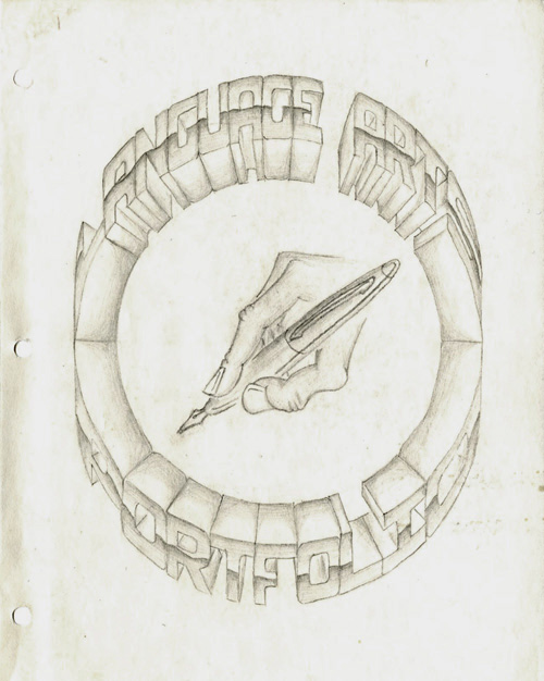
Language Arts Portfolio cover; pencil on paper; 8.5 x 11 in. / 1994
The importance of the portfolio, for any designer cannot be stressed enough. It is, quite seriously, proof of one’s worthiness in the craft. Design is one of the few professions where samples of work you have done in the past are supposed to speak for you.
Unless you have an “in,” many top design firms demand that you “drop off” your portfolio so they can take a look through it to see if they want to actually talk to you. I have never “dropped off” a portfolio anywhere (I understand the utility of the practice, but I find it superficial and demeaning). However, I have been in situations where an interviewer wanted nothing more than to just flip through “my book” without any interference from myself. Portfolios are like candy, and it’s hard for anyone not to just devour them. But if the candy isn’t balanced by the meat of the designer’s intelligence, personality, and presence, it can turn into a rather sickening experience. I’ve tried, with varying degrees of success, to break the predilection of portfolio interviews, but the bottom line is that the portfolio really must, as much as possible, speak for itself, and for the designer, too.
I have made several portfolios in my life in various formats, but I think this was the first thing I ever made that actually was called a portfolio. As you can probably tell by the title, this isn’t a collection of graphic design samples but, rather, a collection of writing and so on for a “Language Arts” class in high school. I drew everything on this sheet of paper by hand (with the help of a compass and a ruler), and flourished the mechanically rational, hyper-dimensional letterforms with a dash of chrome. It probably took me about three days or so to do it, and this was my only copy… Read the rest of this entry »
Filed under Print / Editorial, Type / Fonts
Permalink