Posted: 13 Feb / 2011 at 10:49 pm

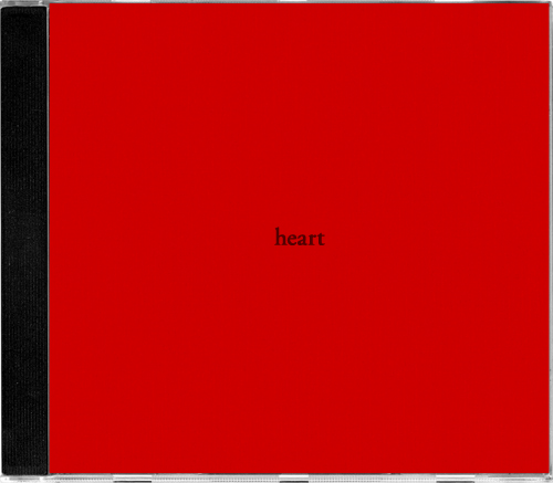
heart CD jewel case cover; type printed on red paper, removable double-stick-taped to album jewel case / 2004
Because it’s always on, and only on, February 14th, no matter what, Valentines Day can be particularly stressful for young relationships. Bleary-eyed cherubs come out of their 364-day slumber, all jacked up on chocolate truffles and sweethearts, and just shotgun cloud-loads of heart darts into the crowd, their mercenary instincts leaving accuracy second to volume when considering targets. If you are as neurotic about these sorts of things as am I, it’s crucial to position yourself properly so you don’t fall prey to misfires.
The problem is, there are only a few kinds of arrows in the cherub’s standard arsenal, and they’re pretty blunt: “I think you’re hot,” “I love you,” or, “(Believe it or not) I still love you.” If you don’t happen to be feeling—and comfortable expressing—one of those three sentiments, you better be ready to scramble come 2/14. Valentines Day can be rugged terrain for “We’ve only been out twice and I don’t know your last name,” “You’re kind of crazy but maybe I’ll get used to it,” or “We’re doing OK, right?”
Come 2/14/2004, I was actually about three months into a relationship that was going much more than just OK. Indeed, it was going better than I had imagined it could and better than any relationship before had gone by that point. But I tend to err on the side of caution when it comes to communicating feelings and the fact that I did feel deeply for her made me even more nervous about getting too vocal about it… Read the rest of this entry »
Filed under Copy / Writing, Industrial / Product, Type / Fonts
Permalink
Posted: 11 Nov / 2010 at 2:29 pm

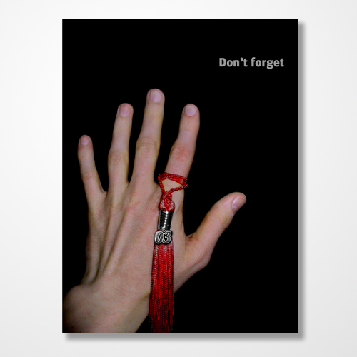
2003 law school graduation party invitation (side A); 4.5 x 6in. / 2003
In studying the prevailing American mindset on the subject of career success, perhaps the most insightful text on the matter is the collected works of TV Guide. Skim past the prologue of red-eyed shills, the hazy caffeine of morning droll and other timefill of pandering feel-good talk, geriatric game shows and irrelevant local news, and and start taking notes at prime time. Discounting the relatively recent, unfathomable minefield of “reality” as desperate scatter-shot, you are left with memes so powerful and enduring as to have riddled prime slots snowy and black and white all the way through 3DHD: Doctors and lawyers. Television’s ethereal blue glow has taught us to revere these two professions more than any other, and, in the interest of the court, I was guilty as any.
This TV-fed fascination with doctors and lawyers comes not from their contribution to society, but on their sheer entertainment value. Prime time has served up their appeal on silver platters. We see doctors tussle with human life, which is kind of like what God is all about; the appeal is obvious. Lawyers are the cunning oral marksmen, toggling between cool recitation of obscure precedent and impassioned appeals for basic decency. Each have their own brand of exotic diction that elevates them from the rest of the bread and butter world, leaving us to assume their impenetrable turns of phrase are ingenious shows of mental strength. Moreover, both are assumed to make boatloads of money… Read the rest of this entry »
Filed under Copy / Writing, Photography / Film, Print / Editorial, Type / Fonts
Permalink
Posted: 29 Aug / 2009 at 9:29 am

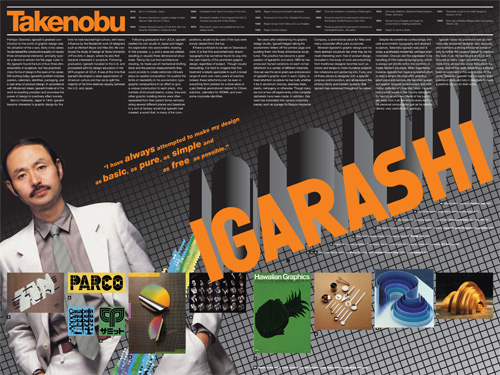
Takenobu Igarashi magazine spread retrospective; 24 x 18in. (spread) / 2002
A staple project of many university design programs is to create a poster or magazine spread or flyer or whatever that somehow highlights the work of a “famous” designer, and, for extra measure, to design it as they might have designed it. That is, to design the piece in said famous designer’s “style.” That we had this sort of a project in the VCD program at the University of Washington always struck me as very strange, as “style” was nearly as derided a word as “Hobo” in the UW VCD lexicon. After all, a good designer (let alone a “famous” one) shouldn’t have a style.
A good designer analyzes, digests and synthesizes various aspects of a particular project and distills from this process the most compelling way to communicate the intended message for that project. There is a not-so-subtle line to be drawn here, as using a particular vernacular can be very useful in communicating particular subject matter. For example, if designing a poster about how inner-city youth express their identity, using some element of graffiti might be a felicitous way to help illustrate this. However, if a designer used graffiti in every project, whether it be about inner-city youth or organic produce, then his approach no longer can be seen as appropriating a relevant style to communicate a message; he has now created his own “style” that is irrespective of the individual needs of particular projects. He is one-dimensional.
Though I only know what I know about Takenobu Igarashi, a “famous” designer in the 1980s and my assigned muse for this project, from books and magazines and perhaps an article or two posted on the Internet, it did seem fairly easy to pick up on his “style.” But the issue wasn’t that his projects were one-dimensional. The issue was that his projects were all three-dimensional. Igarashi, in fact, transitioned his focus toward product design and then architectural sculpture as his career progressed, and, one could imagine, this was really where he wanted to be the whole time… Read the rest of this entry »
Filed under Content / Architecture, Copy / Writing, Print / Editorial, Type / Fonts
Permalink
Posted: 12 Aug / 2009 at 9:02 pm
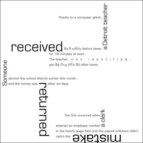
Alright. You have a shade over $120 mil with which to hire one person on behalf of the world. Who’s it going to be? A boy-band-groomed pop star from the U.K. or a school teacher from Detroit? Seems like a pretty simple task, but, due to some mistake, they both got the millions at one point.
Robbie got his millions for probably singing us lessons of smooth, classic Garamond-y things like falling in love or getting his heart broken or falling in love again or just hooking up with lots of chicks.

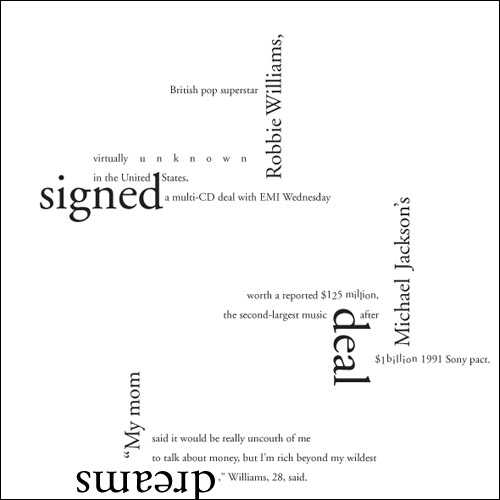
Robbie Williams Gets Millions in Record Deal typographic composition; 8 x 8in. / 2002
The teacher got his or her millions due to a Microgramma-tic computer glitch. Not for teaching square things like Mathematics or Wood Shop.

Anonymous Teacher Gets Millions due to Computer Glitch typographic composition; 8 x 8in. / 2002
One clue as to who should have made what can be found in the glaring disparity of said millions between their respective ledgers. Robbie, who was wildly popular in his home country but all-but-nothing in the U.S., got $125 million from his contract in 2002. The teacher, who may or may not have been popular in class—but completely anonymous to the world, received over $117 million less (before taxes). But the error is clear: The teacher should have received approximately $125 million less… Read the rest of this entry »
Filed under Print / Editorial, Type / Fonts
Permalink
Posted: 30 Apr / 2009 at 7:34 pm

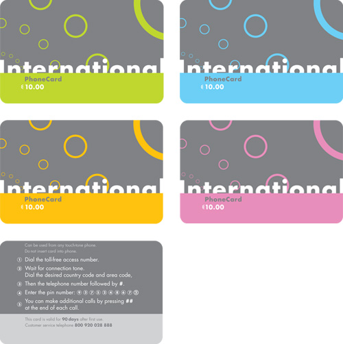
phone card set; series of four fronts (top); one back (bottom); 3.4in. x 2.125in. each / 2002
It seems that there are (or were) two major markets for long distance phone cards.
One is (or was, I’m guessing) Europe, where long distance on a phone plan, in comparison to U.S. phone plans, would span relatively little actual distance, and wanderlust runs rampant. In the days before near-ubiquitous mobile phone proliferation, I imagine there was much use for a card that would get you in touch with another country, or back in touch with home when you got there, without costly service charges from one’s domestic carrier. Even with a mobile, a roamer could easily outbound their domestic plan with a quick clip on the TGV.
The other market I’ve seen for such cards is quite different, and still as vibrant as ever. Having lived in New York for several years now, I’ve been confronted by gangs of international phone cards, shouting at me from behind so many raised bodega counters, each garish explosion of bling and atrocious typography shouting louder than the next, like a traffic jam in the South Bronx. This city, it seems, has the requisite population of aliens without the means for a long distance plan (or even a phone, in many cases), needing to reach out and touch their homelands, such that the cacophony of prepaid, foil-stamped minutes is warranted.
But, having lived in Seattle almost my entire life as of 2002, with its relatively scant collection of migrant workers (or Europeans), I’m not sure I’d ever even seen a phone card until I designed my own. This project, another in the Advanced Typography class of the Visual Communication Design (VCD) program at the University of Washington, was the novel creation of our professor (fresh from an extended European vacation). Here, we were to design a series (or multiple series) of ten-Euro calling cards… Read the rest of this entry »
Filed under Identity / Systems, Industrial / Product, Type / Fonts
Permalink
Posted: 08 Mar / 2009 at 12:34 pm
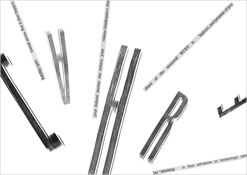
After learning the intricacies of designing typefaces in the design program at the UW, we were led to the next typography class, where we first set out to see how compositions of type could communicate concepts, even without recognizable words. In these studies, we had only newspapers, scissors, glue and a photocopy machine to shape our expressions. I’m very excited to share them with you here!

Excited typographic expression study / 5.75 x 4in. / 2002
I’m confident that you’ll find them to be creative and engaging representations of the feelings I’m trying to express… Read the rest of this entry »
Filed under Type / Fonts
Permalink
Posted: 29 Jan / 2009 at 10:19 pm

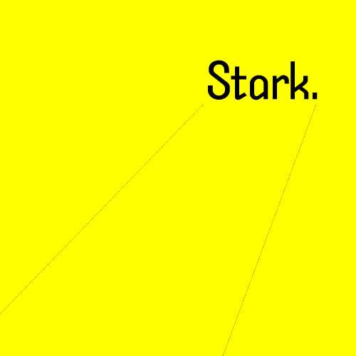
Stark original typeface design / 2002
Ignore the Din and find a new Trade. Here comes another lean, monosyllabic hero of noir typography. He takes his briefcase locked, his drinks neat and his checks made out to “cash.” He takes wise guys to the cleaners and the birds take him just the way he is. He’s got a hardboiled manner and doesn’t care for idle banter, thank you, so you can keep the jibber-jabber to yourself. He’ll tell you what you need to know and nothing more. But he’s not just another working stiff. He’s got working class.
He’s got a cleft chin and a sordid past with which you need not concern yourself. All that matters is on the dotted lines. He stands tall but keeps a low profile. He’s sharp as nails and almost as kind. He doesn’t want to be your best friend but he’s probably the man you want on the case. He’s Stark… Read the rest of this entry »
Filed under Naming / Words, Type / Fonts
Permalink
Posted: 28 Dec / 2008 at 9:20 pm

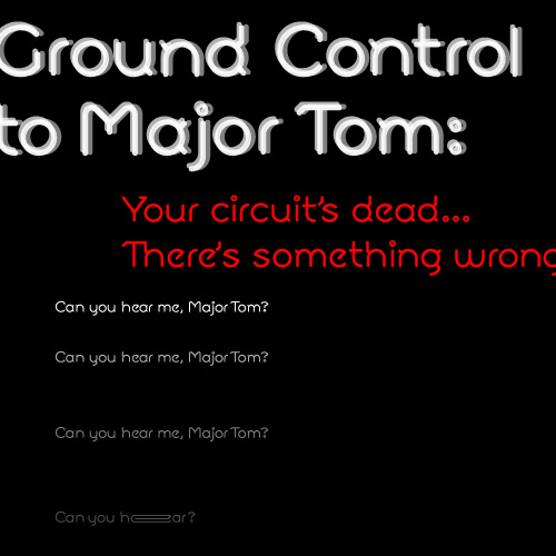
Moon typeface / 2002 (setting of lyrics excerpted from “Space Oddity” by David Bowie)
Spacey, technical, open and angular, functional close or far, and emotionally open, Moon is a typeface for the future. Or at least for writing about it. Although its geometry makes it modern and compelling in display setting, the strategically placed serif bits (technically, Moon would fall into the “semi-sans” category) flow together even dense columns of communiqué. Special touches and extras give this face an alluring Hal-like techno-emotional identity complex… Read the rest of this entry »
Filed under Naming / Words, Type / Fonts
Permalink
Posted: 04 Dec / 2008 at 11:33 pm

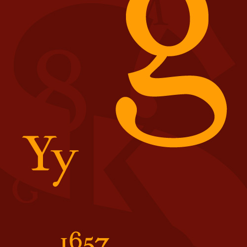
Sylloge typeface (promotional collage) / 2002
All type says something more than that which has been written. Some writing is logical. Therefore, some typefaces can make prose seem more logical than it actually is. This is an example of syllogistic reasoning. This is Sylloge, an original typeface design… Read the rest of this entry »
Filed under Naming / Words, Type / Fonts
Permalink
Posted: 14 Sep / 2008 at 1:27 pm

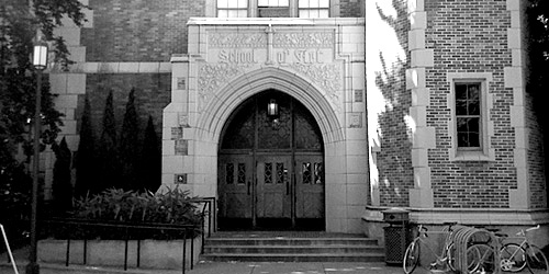
University of Washington School of Art, main entrance / photo taken 2008
Like most epiphanies, one of my most life-changing ideas came to me suddenly when I was in the bathroom. It was September 2nd, 2001. I had been working full-time as a designer since 1999. In July of that year, I had indulged in a very expensive but amazing vacation, following the Tour de France. Three days after my trip, I returned to work to rumors of massive layoffs. Within a week, tours of the company’s one-year-new building revealed empty desks that quickly multiplied into empty floors. By August 20th, it was clear that the in-house design department, too, was going dark. September 14th was going to be my last day. I had no idea what I was going to do, and then I did.
Two years and change earlier, I had made a rather precarious exit from the Visual Communication Design (VCD) program at the University of Washington. I was disheartened for a while, then embittered, then dismissive, then all-but-forgetful of the whole experience. And then, on that day in September, it came to me: I would go back and finish school. Or, rather, I would try to finish school. After all, I was going straight back to the horse that threw me, and, if anything, it was more fierce than ever (bad economies feed schools with lots of accomplished and motivated applicants). Any prior thoughts of repeating this wicked roulette were momentary lapses in sanity. But, upon my decision that day, my resolve was unshakable.
About a week and a half after my decision, I took one of my final vacation days. An hour or so after I woke up, I checked my personal email program, which showed news stories in one of the frames. The Twin Towers and half of the Pentagon had been obliterated within the span of a few hours. Luckily, I did not know anyone personally who was involved in these catastrophes but it seems strange to tell a story about that time without mentioning it. To be honest, it was all quite disaffecting considering the ever more improbable absurdity the country had been subjected to in the year or so leading up to the events. It was all just more impervious steel turned to dust. My decision was unmoved… Read the rest of this entry »
Filed under Identity / Systems, Print / Editorial, Type / Fonts
Permalink
