Posted: 05 Oct / 2010 at 8:53 pm

University of Washington School of Art, Sand Point studio door window sign concept; approx. 3.25 x 6n.; plotted output on foamcore / 2003
In my younger scholastic career, I often charged headfirst through the parametric walls of an assignment to ensure that my work would be noticed. In a drawing class I took early on at university, the professor told me that the way I worked was like writing an English paper in Russian. I chalked up experiences like this to standard-fare artist plight and soldiered on. Ironically, my head full of steam soon chugged me right on out of the School of Art. Upon my return some years later, I had a clearer head, but I also had a much keener sense of the power of boundaries. I understood that it was actually keeping the rules recognizable that revealed the cleverness of their kneading, pushing or rearranging.
As I was making my comeback into the University of Washington, the School of Art was pushing its own boundaries, acquiring gallery and studio space for select students and faculty in a building of the former Sand Point Naval Base in Seattle. Then edging myself toward the sharp end of the student body, I was commissioned to design a way-finding sign system for the building.
Sign systems are often droll affairs, so bound by their function that they are stiff and invisible. There are good reasons for not getting too editorial in this discipline, of course: you don’t want anyone to get lost in the cleverness of the sign before they find where they’re going, especially in emergency situations where one might need to know exactly how to get to the bathroom, or worse, get the hell out of the building.
Overseen by School of Art Director and Visual Communication Design Professor Chris Ozubko, I came up with a few concepts that I was pretty confident would get people into the restrooms and out of the building as necessary, but also expressed a bit of the unique personality of what was going on in the space while they could appreciate it… Read the rest of this entry »
Filed under Identity / Systems, Signage / Display
Permalink
Posted: 11 Apr / 2010 at 9:56 pm

Washington State Convention and Trade Center building (back/garden) / photo taken 2003
Sometime in the 1940s or ’50s (I’m not sure of the exact year), the term “corporate identity” was coined by Lippincott & Margulies—one of the first major design firms in the world—to describe both the idea that even large businesses have inherent, relatable characteristics, not unlike human beings, and the practice that could express their character through a fitting, comprehensive and consistent design program. An organization’s identity is expressed in every way they communicate, from their name and logo to their brochures and web site, to the way they answer the phone—whether those “touchpoints” are designed by professionals or not—so this was an important “call-to-action” (to use another industry term) for organizations to pay attention to everything they were communicating, and, ideally, to pay top-notch professionals like L&M to help them make sure they were doing so effectively.
Sometime in the 1990s, the term “brand” began to take over as more formal business strategy was becoming more prominently integrated into large-scale identity design programs, and it quickly went from buzz word to industry category, on which uncounted firms jumped. I have always found this nomenclature shift ironic. “Branding,” literally translated, is the superficial process of stamping a logo on your property (livestock, originally); this superficial logo stamping is exactly the perception that the “new” practice of “branding” was supposed to be rising above. Meanwhile, the word “identity” could already encompass every aspect what an entity is, from what they do to how they express it. But like many P/C nomenclature shifts of late, whether rational or not, “branding” has taken hold, and “identity” (preceded by “corporate” or not), has been deprecated.
Whatever it’s called, my formal introduction to the process of figuring out what an organization stands for and expressing it in a fitting design program was in a class called Identity Systems in the Visual Communication Design program at the University of Washington, sometime in 2003. Like a few other courses in the program, this one was broken into collaborative group and individual phases. Three-person groups were assigned one of four or five major local entities and tasked with research and analysis of the entity, en-route to the creation of a strategic brand platform. Based on this platform, we were then set about designing a fitting logo and building a supporting visual identity system, individually… Read the rest of this entry »
Filed under Copy / Writing, Identity / Systems, Industrial / Product, Interactive / Web, Signage / Display
Permalink
Posted: 15 Feb / 2010 at 9:31 pm

Rumpelstiltskin would approve. recycling awareness campaign postcard, showing PET bottles going into winter gloves; 7 x 5 in. / 2002
“Designer” is an ethereal thing to call oneself, fraught with misconception and expectation. When I describe myself as such, people I meet invariably respond with the exact same, ever-more-annoying, eight-word phrase: “Oh—that’s, like, with computers and stuff, right?” (I can only imagine that there was some 20/20 John Stossel exposé about the suspicious rise of the machines in the late ’80s—replete with footage of designers large in glasses and shoulder-padding huddled around a tiny Macintosh, working to draw pastel and black magic from it—that permanently ingrained this concept in society at large.) Moreover, most people assume I use my computers and stuff for advertising, where I spin everyday goods into objects of mythical lust… Read the rest of this entry »
Filed under Advertising / Campaigns, Copy / Writing, Photography / Film, Print / Editorial, Signage / Display
Permalink
Posted: 24 Oct / 2009 at 11:02 am

Materials symbol set promotional poster; 20 x 30in. / 2002
There is something very primal and essential about building things. Behind our most basic needs is the need to build something to facilitate it. Before we can put food on the table, someone has to put the table together. Before we can sleep under anyone’s roof, someone has to put that roof over our heads. And, in order to afford such things these days, most of us need to go to work, which, more than likely, is in a building.
But modern technology and evolving divisions of labor have rendered the notion of building even the most trifling gaff foreign and anxiety-filling to most. Hardware stores (big-box and corner-shop alike) are stocked floor to ceiling with too many confusing answers to even the most basic questions. For our Marks and Symbols class in the Visual Communication Design (VCD) program at the University of Washington, we were set out to develop a universal language of icons that would help de-mystify this environment and enable people to fulfill their basic need to put stuff together.
The class was divided into two phases: research and development. In the research phase, we worked in groups to look into issues facing the hardware customer, decide upon the problem we felt had the most potential for amelioration by a concise set of symbols (ten or so), and present our process and findings to the rest of the class. In the second phase, we each developed symbol sets on our own to respond to this problem.
Our research group, comprising mates Devon DeLapp, Jesse Graupmann, Narith Hoc, Sarah LaMont, Shaun Tungseth and myself, began by thinking of and assessing the potential (and drawbacks) of six possible options: A set of symbols for connectors, which could help people figure out what fit with what else (but seemed too broad to spawn a useful set of just ten symbols), electricity symbols, which could help people figure out the ins and outs of amps and volts (but we couldn’t figure out how to boil this subject down to ten symbols, either), how-to symbols, which could help people with standard tasks like building a deck or installing a light fixture (but, we quickly realized, would be nearly impossible to describe in mere icons), function/action symbols, which could help explain what a particular tool might do, such as “twist” or “strike” and might have made for a cool set of symbols (but seemed too basic a concept to actually be of any use to any adult not born on Mars—”a hammer is for hitting; fancy that!”), or warning symbols, which could help deter someone from doing stupid things with those tools—like strike themselves with a hammer (but had already been done to death, so to speak).
After much debate, we decided that materials had the most potential for new exploration of symbols that could enjoy real utility, potentially touching a range of applications within the context of hardware, such as way-finding (“Where is the wood?”), contents listing (“Is this made with wood?”), and proper use of tools (“Can I use this on wood?”)… Read the rest of this entry »
Filed under Copy / Writing, Identity / Systems, Packaging / 3-Dimensional, Photography / Film, Signage / Display
Permalink
Posted: 29 Sep / 2009 at 9:48 pm

Prosophobia promotional poster; 24 x 36in. / 2002
The most celebrated role of the designer has always been that of creator of positive change through innovation, but battling the public’s inclination to treasure the old and suspect the new has historically been tough going. The current of ominous world events (especially at the time of this project’s conception, painfully close to 9/11) only serves to shore up such public reservation. For many people, the comfort of the familiar is too valuable to risk on new ideas. This promotes a homogeneous, retro-centric design market in which the new is often merely another iteration of the old.
Prosophobia (“fear of progress”) was a concept for an international design conference that would explore why many of these constructs exist and how we as designers can continue to champion progress in this environment. Featured presentations were to be given by historians, behaviorists and economists, as well as a diverse range of design leaders successfully implementing progressive work, despite this prosophobic culture.
Being a design event (and a design school project, no less), a promotional / informational poster was a critical application, and set the visual theme for the balance of the comprehensive identification and communication suite. After several dramatic, antagonistic early concepts, including a God-like hand pushing down the sunrise, a Volkswagen “New Beetle” reversing into the viewer and even a revolver loaded with antiquities and ready to fire, an approach more considerate of both sides of the matter prevailed. The front presents the issue in a re-contextualized image reminiscent of the silent film era, showing a figure literally hanging onto the past for dear life, while the flip-side speaks to the present (signified by digital visual language) offering information on the voices on offer in the conference, and an invitation to participate in the future… Read the rest of this entry »
Filed under Content / Architecture, Copy / Writing, Identity / Systems, Industrial / Product, Interactive / Web, Naming / Words, Print / Editorial, Signage / Display
Permalink
Posted: 08 Jun / 2008 at 3:12 pm
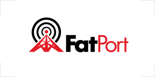
FatPort logo / 2001, 2008
Though the Internet has been around, in one form or another, for many decades, it had little public awareness until about twenty years ago. By the mid 1990s, the World Wide Web had been plotted by a smattering of amateur “home pages,” which generally consisted of some “lite” personal information about the site’s owner (or “webmaster”) and their hobbies (one of those invariably being “the Internet”). By the late 1990s, these folksy homes were being overwhelmed by the sprawl of “dot-coms” from corporate startups and stalwarts flocking to the new marketplace, and Internet tools like email were beginning to make their way into everyday practice. But, until the early 2000s, the only place in the whole wide world that one would likely experience these sites and services was from the office, or through their droolingly slow modem at home, which made anything but the most formal or mundane tasks a bit difficult for most folks.
Soon enough, though, many public establishments started offering wireless Internet service, enabling the populace to get out into the world and peruse the Web at office-like speeds from their own laptops at places that they already liked going, like coffee shops or bookstores. This service is often referred to casually as “Wi-Fi,” which is a contraction of ‘Wireless’… um…’Fidelity’??, a name created by those wacky kids over at Interbrand for an actual alliance supporting the “IEEE 802.11b Direct Sequence” specifications (I’m not making this stuff up).
Whatever the protocol may be named (or numbered, or whatever), one of the first Wi-Fi service providers primarily for consumer usage in public establishments was FatPort, a Vancouver, B.C. startup established by a few programmers, including my good friend Ingy, who hired me to help develop the venture’s visual identity (but left a relatively short time thereafter).
Before I was brought in, the name of this service had been established by the founders. A “fat port” is sort of programmer-slang for a good, wide-open connection. Ingy actually had the idea for a ‘fat’ radio tower mark, which I thought was good, so I basically just did it. I then set the type in “fat” and “open” weights to reinforce the idea in a distinctive word-mark. The strong, simple palette of red, white and black hints at the Canadian roots of the program and is highly versatile for any number of applications… Read the rest of this entry »
Filed under Identity / Systems, Print / Editorial, Signage / Display, Uniforms / Apparel
Permalink
Posted: 18 Dec / 2007 at 11:21 pm
Sometime between the day I decided that I needed to get a real design job and the day that that happened, I realized that I should probably build some kind of portfolio. I picked up just about any project I could get my hands on and basically hoped for the best, since my relative inexperience denied any assurance of success (or financial compensation)… Read the rest of this entry »
Filed under Identity / Systems, Interactive / Web, Signage / Display, Type / Fonts
Permalink
Posted: 10 Oct / 2007 at 2:13 pm

Nathan Hale (NH) High School Swim Team logo; spray paint stenciled on paper / 1994
When I got to high school, it wasn’t a very good scene: I was short, fat, slow, uncoordinated and keenly aware of all of these things. I was also overwhelmed by boredom with my classes and mates and hid myself as well as possible so as not to be dragged into the morass of class discussion. So, how does a chunky, nonathletic, awkward guy with an invisible personality play his cards in high school? That’s right, he straps on a Speedo and joins the swim team. I still remember those first steps out of the locker room onto the pool deck as some of the more terrifying of my life.
Somehow, though, over the next few years, I would get in deep with the team. Aside from the year my leg was broken, I swam in every single practice and every meet. I got into incredibly good physical condition (I grew about eight inches from freshman to senior year, but my body weight remained almost the exactly same throughout). I was even voted captain two years in a row, which probably said more about my personality than my swimming prowess, which was okay, but no match for the purebreds.
All this engendered in me a strange new feeling: school pride. Nathan Hale was home to the Raiders and, somewhere along the way, I actually considered myself as such. But if I was a Raider, I wasn’t one of those red-white-and-blue caricatures in skinny pants, piano coats and a funny hats, reduced to hokey cartoons in the halls. That scene was so far removed from the times that a teenager could barely imagine how or why it happened, not to mention understand what it meant. In a way, it seemed that it must have just been a tale meant to fulfill the requisite mascot needs of high schools around the country 200-some years later… Read the rest of this entry »
Filed under Identity / Systems, Signage / Display
Permalink