Posted: 23 Dec / 2011 at 3:24 pm

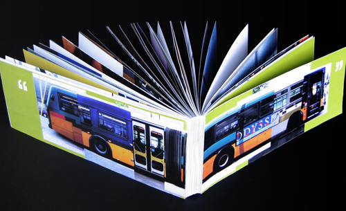
If These Wheels Could Talk book; 34 x 6.5in. (spread), 116ppg. / 2004
Soon after the dot-com and 9/11 crashes, my design job also crashed. I set about looking for another, through other firms, recruiters, friends, friends of friends, and so on. All unable to take on the frivolous weight of an underdeveloped type and image manipulator, I broadened my search criteria: assistant… receptionist… data enterer… Anything that would have me back in the office environs to which I had grown so entitled. But there was nothing to be had. Facing the loss of everything, the idealization of pre-crash innocence struck me. I printed out a few standard government forms, borrowed a friend’s car and found myself driving southward to the King County Metro headquarters. I was on my way to becoming a bus driver.
Public transportation is one of the great noble causes of our time, and the bus embodies the struggle most colossally: angling through bourgeois car traffic to transport the proletariat affordably to their destination. Having grown up without a car, I had developed a keen appreciation for the bus’s role, and, as the false hopes of cubicle walls crumbled, to give my hands to one of their great helms all of a sudden seemed right. But, for all my idealization, I also knew the motley reality of what goes on above the turning wheels: The bus riding masses are an odd bunch, particularly in a city where almost everyone who can drives a car instead… Read the rest of this entry »
Filed under Content / Architecture, Copy / Writing, Information / Mapping, Naming / Words, Photography / Film, Print / Editorial
Permalink
Posted: 18 Dec / 2010 at 7:26 pm

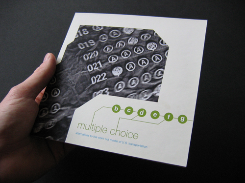
Multiple Choice, Alternatives to the Worn Out Model of U.S. Transportation booklet; front cover; 4.5 x 4.5in.; 28ppg. / 2003
Teen angst is a powerful force not often harnessed for forward progress. At the same time, many of today’s most overwhelming transportation problems are fueled by inertia. There is one predominantly accepted model that most people of driving age accept as given and therefore perpetuate. If there’s one thing kids hate, it’s being told that they have to do something a certain way. Multiple Choice plays between both of these phenomena.
This book, one of a few projects undertaken for the Publications course in the UW Visual Communication Design program, was designed as a thought leadership piece that might be put out by a major car maker to mark an openness to new ideas, sparking productive discourse on the future of transportation… Read the rest of this entry »
Filed under Content / Architecture, Copy / Writing, Drawing / Illustration, Naming / Words, Photography / Film, Print / Editorial
Permalink
Posted: 11 Nov / 2010 at 2:29 pm

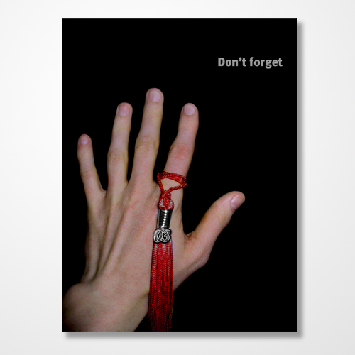
2003 law school graduation party invitation (side A); 4.5 x 6in. / 2003
In studying the prevailing American mindset on the subject of career success, perhaps the most insightful text on the matter is the collected works of TV Guide. Skim past the prologue of red-eyed shills, the hazy caffeine of morning droll and other timefill of pandering feel-good talk, geriatric game shows and irrelevant local news, and and start taking notes at prime time. Discounting the relatively recent, unfathomable minefield of “reality” as desperate scatter-shot, you are left with memes so powerful and enduring as to have riddled prime slots snowy and black and white all the way through 3DHD: Doctors and lawyers. Television’s ethereal blue glow has taught us to revere these two professions more than any other, and, in the interest of the court, I was guilty as any.
This TV-fed fascination with doctors and lawyers comes not from their contribution to society, but on their sheer entertainment value. Prime time has served up their appeal on silver platters. We see doctors tussle with human life, which is kind of like what God is all about; the appeal is obvious. Lawyers are the cunning oral marksmen, toggling between cool recitation of obscure precedent and impassioned appeals for basic decency. Each have their own brand of exotic diction that elevates them from the rest of the bread and butter world, leaving us to assume their impenetrable turns of phrase are ingenious shows of mental strength. Moreover, both are assumed to make boatloads of money… Read the rest of this entry »
Filed under Copy / Writing, Photography / Film, Print / Editorial, Type / Fonts
Permalink
Posted: 27 Feb / 2010 at 10:34 am

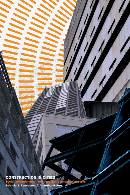
Construction in Cities; Social, Environmental, Political and Economic Concerns book cover (1 of 36); 6 x 9in. / 2002
There’s more than one way to skin a cat, as they say. They don’t seem to say who the desperate soul was that figured this out, or how many ways he or she came up with (though I imagine there must be at least nine). The question we were posed with in a university class project was: How many ways can you skin a book?
As part of the Visualizations course in the Visual Communication Design program at the University of Washington, this so-called “design marathon” charged us with creating not just one or even nine, but 36 different covers for the exact same book. Said book had to be a real, published work, and it had to have some variant of the word “city” in the title but, as long as it fit within those parameters, we could choose whatever one seemed to suit our fancy. We spent about a week focusing on getting a few covers started, then worked on developing the balance while concurrently working on a public service campaign project and another project creating a series of film posters (coming soon to a Graphic Language blog near you!). All three projects were done in the course of ten weeks.
The book I chose, “Construction in Cities; Social, Environmental, Political and Economic Concerns” by Patricia J. Lancaster, AIA, is no great work of literature. It is, however, a (seemingly) quite useful guide to overcoming various barriers in getting one’s plans built in the urban landscape. I took various perspectives in illustrating this on my covers (I had to!). As with all of the work I put up on this site, I really like some of it and find some of it pretty awful, but for you, I bear all. My first attempt is above. 35 others follow… Read the rest of this entry »
Filed under Photography / Film, Print / Editorial
Permalink
Posted: 15 Feb / 2010 at 9:31 pm

Rumpelstiltskin would approve. recycling awareness campaign postcard, showing PET bottles going into winter gloves; 7 x 5 in. / 2002
“Designer” is an ethereal thing to call oneself, fraught with misconception and expectation. When I describe myself as such, people I meet invariably respond with the exact same, ever-more-annoying, eight-word phrase: “Oh—that’s, like, with computers and stuff, right?” (I can only imagine that there was some 20/20 John Stossel exposé about the suspicious rise of the machines in the late ’80s—replete with footage of designers large in glasses and shoulder-padding huddled around a tiny Macintosh, working to draw pastel and black magic from it—that permanently ingrained this concept in society at large.) Moreover, most people assume I use my computers and stuff for advertising, where I spin everyday goods into objects of mythical lust… Read the rest of this entry »
Filed under Advertising / Campaigns, Copy / Writing, Photography / Film, Print / Editorial, Signage / Display
Permalink
Posted: 17 Jan / 2010 at 1:21 pm

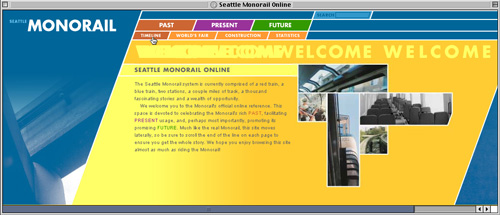
Seattle Monorail Online web site / Welcome page; 1020 x 440px. / 2002
Every time I visit Seattle (my hometown), which tends to happen more than once a year, I find it surprisingly different than I left it last. Startups become stalwarts, old favorites become new failures and areas of complete desolation become constructed destinations. But, until very recently, the ways to get to and from any of them had hardly changed a bit. Despite its squeaky-green image, Seattle has always been a car town, with a public transit system whose progress comes and goes in fits and starts but never seems to get anywhere useful by any reasonable timetable. As someone who grew up without a car and as a recalcitrant fan of progress (perhaps even Futurism, to some extent), one of the most personally frustrating examples of this city planning torpor is the Seattle Monorail.
As of 2002, when I decided to use it as it as my muse for a web site design class in the Visual Communication Design program at the University of Washington, the Seattle Monorail had been the beginning of something great for about forty years. Originally built in 1962 to shuttle visitors between downtown and the Seattle World’s Fair, the Monorail had since served as little more than an icon of the city’s once future-driven spirit, though there was a resurgent and concerted effort to evolve the system into something much more impressive. In fact, the wheels had been in motion, so to speak, for several years and, despite the work of some determinately opposed political factions, it looked as if the Monorail might actually realize its potential in the foreseeable future.
Even considering its terribly stunted scope of service at the time (it ran just over one mile, end-to-end—only about .1 mile longer than it had run in 1962), the Seattle Monorail was a fascinating entity, in that it was at once an historical landmark, a thriving attraction and the major source of inspiration for what possibly could have been the future of Seattle’s public transportation system. This web site was to celebrate the Monorail system’s rich heritage, facilitate its everyday usage and promote its promising future. As such, I architected the site accordingly, creating sections related to the system’s past, present and future, and built relevant content into each section… Read the rest of this entry »
Filed under Content / Architecture, Copy / Writing, Interactive / Web, Photography / Film
Permalink
Posted: 24 Oct / 2009 at 11:02 am

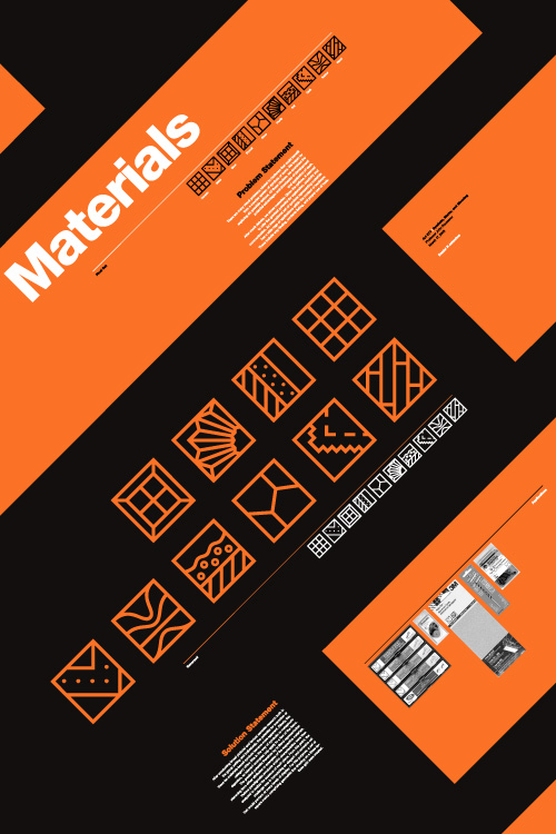
Materials symbol set promotional poster; 20 x 30in. / 2002
There is something very primal and essential about building things. Behind our most basic needs is the need to build something to facilitate it. Before we can put food on the table, someone has to put the table together. Before we can sleep under anyone’s roof, someone has to put that roof over our heads. And, in order to afford such things these days, most of us need to go to work, which, more than likely, is in a building.
But modern technology and evolving divisions of labor have rendered the notion of building even the most trifling gaff foreign and anxiety-filling to most. Hardware stores (big-box and corner-shop alike) are stocked floor to ceiling with too many confusing answers to even the most basic questions. For our Marks and Symbols class in the Visual Communication Design (VCD) program at the University of Washington, we were set out to develop a universal language of icons that would help de-mystify this environment and enable people to fulfill their basic need to put stuff together.
The class was divided into two phases: research and development. In the research phase, we worked in groups to look into issues facing the hardware customer, decide upon the problem we felt had the most potential for amelioration by a concise set of symbols (ten or so), and present our process and findings to the rest of the class. In the second phase, we each developed symbol sets on our own to respond to this problem.
Our research group, comprising mates Devon DeLapp, Jesse Graupmann, Narith Hoc, Sarah LaMont, Shaun Tungseth and myself, began by thinking of and assessing the potential (and drawbacks) of six possible options: A set of symbols for connectors, which could help people figure out what fit with what else (but seemed too broad to spawn a useful set of just ten symbols), electricity symbols, which could help people figure out the ins and outs of amps and volts (but we couldn’t figure out how to boil this subject down to ten symbols, either), how-to symbols, which could help people with standard tasks like building a deck or installing a light fixture (but, we quickly realized, would be nearly impossible to describe in mere icons), function/action symbols, which could help explain what a particular tool might do, such as “twist” or “strike” and might have made for a cool set of symbols (but seemed too basic a concept to actually be of any use to any adult not born on Mars—”a hammer is for hitting; fancy that!”), or warning symbols, which could help deter someone from doing stupid things with those tools—like strike themselves with a hammer (but had already been done to death, so to speak).
After much debate, we decided that materials had the most potential for new exploration of symbols that could enjoy real utility, potentially touching a range of applications within the context of hardware, such as way-finding (“Where is the wood?”), contents listing (“Is this made with wood?”), and proper use of tools (“Can I use this on wood?”)… Read the rest of this entry »
Filed under Copy / Writing, Identity / Systems, Packaging / 3-Dimensional, Photography / Film, Signage / Display
Permalink
Posted: 22 Nov / 2008 at 2:00 pm

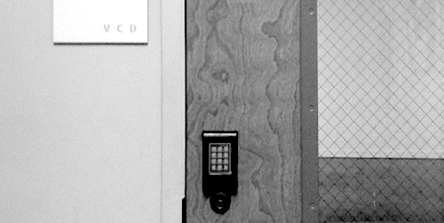
one of two entrances to room 247—the Visual Communication Design major studio in the University of Washington School of Art—both are locked at all times / photo taken 2008
A terrible economy. Personal pride. Do or die time. A real studio environment. Some brilliant competition. Real work experience. Real failure experience. Real life experience. An utterly unforgiving professor. A strong sense of potential. Total commitment.
I’m not sure exactly what the most motivating factor was for me as I went through “206,” the second of two screening classes the University of Washington Visual Communication Design program, used to select who could complete the next two-and-a-half years of the VCD program in 2001/2002. Whatever it was, that class marked a tectonic shift in my approach to design work. It was the second time I had made it into 206, and, likely, my last chance to make the final cut into the VCD major. In contrast to the first attempt, I felt no self-satisfaction in the step—just an unflinching focus on the next… Read the rest of this entry »
Filed under Content / Architecture, Copy / Writing, Industrial / Product, Packaging / 3-Dimensional, Photography / Film, Print / Editorial
Permalink
