Posted: 23 Dec / 2011 at 3:24 pm

If These Wheels Could Talk book; 34 x 6.5in. (spread), 116ppg. / 2004
Soon after the dot-com and 9/11 crashes, my design job also crashed. I set about looking for another, through other firms, recruiters, friends, friends of friends, and so on. All unable to take on the frivolous weight of an underdeveloped type and image manipulator, I broadened my search criteria: assistant… receptionist… data enterer… Anything that would have me back in the office environs to which I had grown so entitled. But there was nothing to be had. Facing the loss of everything, the idealization of pre-crash innocence struck me. I printed out a few standard government forms, borrowed a friend’s car and found myself driving southward to the King County Metro headquarters. I was on my way to becoming a bus driver.
Public transportation is one of the great noble causes of our time, and the bus embodies the struggle most colossally: angling through bourgeois car traffic to transport the proletariat affordably to their destination. Having grown up without a car, I had developed a keen appreciation for the bus’s role, and, as the false hopes of cubicle walls crumbled, to give my hands to one of their great helms all of a sudden seemed right. But, for all my idealization, I also knew the motley reality of what goes on above the turning wheels: The bus riding masses are an odd bunch, particularly in a city where almost everyone who can drives a car instead… Read the rest of this entry »
Filed under Content / Architecture, Copy / Writing, Information / Mapping, Naming / Words, Photography / Film, Print / Editorial
Permalink
Posted: 18 Apr / 2011 at 9:18 pm
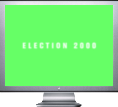
Election 2000 introductory screen; Flash interactive interface; 1024 x 768px. / 2004
All U.S. citizens are deeply affected—for better or worse—by the president in office. However, very few people know the intricacies of the presidential election process. This is not surprising, as it is super freakin’ complicated. The problem is that most are too jaded to care, even when their country is on the line.
For Interaction Design, one of the Senior year courses in the University of Washington Visual Communication Design program, we were given the task to explain the unexplainable to your average ignorant know-it-all who doesn’t want to be explained to. The aim of this project was to create an interactive interface to help inform the average high-school or university student about the United States presidential election process. As with several classes before, the project was divided into two distinct phases: In the first, we worked in groups to research the process and the various forces involved and brainstormed different interpretations thereof. In the second phase, we set off individually to define and create interactive Flash-based demonstrations of our particular concepts.
I had the good fortune of having three brilliant brains with whom to storm in phase one: Stephanie Cooper, Luke Jung and Tim Turner. As part of our comprehensive research process, we developed various interpretations of how the presidential election could be understood. We first set out to describe the components, both legal and otherwise influential…
[roll over images to enlarge]
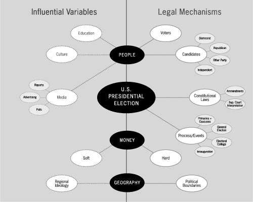
U.S. presidential election variables, influential and legal; digital output; 11 x 8.5in. / 2004
We then divided the country (as elections do so well) to figure out how the importance of different factors were distributed geographically… Read the rest of this entry »
Filed under Content / Architecture, Copy / Writing, Information / Mapping, Interactive / Web, Naming / Words
Permalink
Posted: 18 Dec / 2010 at 7:26 pm

Multiple Choice, Alternatives to the Worn Out Model of U.S. Transportation booklet; front cover; 4.5 x 4.5in.; 28ppg. / 2003
Teen angst is a powerful force not often harnessed for forward progress. At the same time, many of today’s most overwhelming transportation problems are fueled by inertia. There is one predominantly accepted model that most people of driving age accept as given and therefore perpetuate. If there’s one thing kids hate, it’s being told that they have to do something a certain way. Multiple Choice plays between both of these phenomena.
This book, one of a few projects undertaken for the Publications course in the UW Visual Communication Design program, was designed as a thought leadership piece that might be put out by a major car maker to mark an openness to new ideas, sparking productive discourse on the future of transportation… Read the rest of this entry »
Filed under Content / Architecture, Copy / Writing, Drawing / Illustration, Naming / Words, Photography / Film, Print / Editorial
Permalink
Posted: 29 Sep / 2009 at 9:48 pm

Prosophobia promotional poster; 24 x 36in. / 2002
The most celebrated role of the designer has always been that of creator of positive change through innovation, but battling the public’s inclination to treasure the old and suspect the new has historically been tough going. The current of ominous world events (especially at the time of this project’s conception, painfully close to 9/11) only serves to shore up such public reservation. For many people, the comfort of the familiar is too valuable to risk on new ideas. This promotes a homogeneous, retro-centric design market in which the new is often merely another iteration of the old.
Prosophobia (“fear of progress”) was a concept for an international design conference that would explore why many of these constructs exist and how we as designers can continue to champion progress in this environment. Featured presentations were to be given by historians, behaviorists and economists, as well as a diverse range of design leaders successfully implementing progressive work, despite this prosophobic culture.
Being a design event (and a design school project, no less), a promotional / informational poster was a critical application, and set the visual theme for the balance of the comprehensive identification and communication suite. After several dramatic, antagonistic early concepts, including a God-like hand pushing down the sunrise, a Volkswagen “New Beetle” reversing into the viewer and even a revolver loaded with antiquities and ready to fire, an approach more considerate of both sides of the matter prevailed. The front presents the issue in a re-contextualized image reminiscent of the silent film era, showing a figure literally hanging onto the past for dear life, while the flip-side speaks to the present (signified by digital visual language) offering information on the voices on offer in the conference, and an invitation to participate in the future… Read the rest of this entry »
Filed under Content / Architecture, Copy / Writing, Identity / Systems, Industrial / Product, Interactive / Web, Naming / Words, Print / Editorial, Signage / Display
Permalink
Posted: 29 Jan / 2009 at 10:19 pm

Stark original typeface design / 2002
Ignore the Din and find a new Trade. Here comes another lean, monosyllabic hero of noir typography. He takes his briefcase locked, his drinks neat and his checks made out to “cash.” He takes wise guys to the cleaners and the birds take him just the way he is. He’s got a hardboiled manner and doesn’t care for idle banter, thank you, so you can keep the jibber-jabber to yourself. He’ll tell you what you need to know and nothing more. But he’s not just another working stiff. He’s got working class.
He’s got a cleft chin and a sordid past with which you need not concern yourself. All that matters is on the dotted lines. He stands tall but keeps a low profile. He’s sharp as nails and almost as kind. He doesn’t want to be your best friend but he’s probably the man you want on the case. He’s Stark… Read the rest of this entry »
Filed under Naming / Words, Type / Fonts
Permalink
Posted: 28 Dec / 2008 at 9:20 pm

Moon typeface / 2002 (setting of lyrics excerpted from “Space Oddity” by David Bowie)
Spacey, technical, open and angular, functional close or far, and emotionally open, Moon is a typeface for the future. Or at least for writing about it. Although its geometry makes it modern and compelling in display setting, the strategically placed serif bits (technically, Moon would fall into the “semi-sans” category) flow together even dense columns of communiqué. Special touches and extras give this face an alluring Hal-like techno-emotional identity complex… Read the rest of this entry »
Filed under Naming / Words, Type / Fonts
Permalink
Posted: 04 Dec / 2008 at 11:33 pm

Sylloge typeface (promotional collage) / 2002
All type says something more than that which has been written. Some writing is logical. Therefore, some typefaces can make prose seem more logical than it actually is. This is an example of syllogistic reasoning. This is Sylloge, an original typeface design… Read the rest of this entry »
Filed under Naming / Words, Type / Fonts
Permalink

