Posted: 19 Nov / 2007 at 11:41 pm
I felt pretty proud of myself as I took my seat at the table of Art 206, the second of two screening classes for the Visual Communication Design major at the University of Washington. I was still cagey and wary of my new competitors—er, classmates—but my confidence was at the apex of an upswing after a final-project rally in 205 had put me on the list of 40-or-so students chosen to continue the screening process (from around 150 initial applicants in the previous class).
Art 206 was set up very similarly to Art 205, in that there were three consecutive projects, each having their own deadlines and a final submission requirement, and that the exact same three projects had been assigned for many, many years prior. The only ostensible difference between this class and its predecessor was that we were allowed to use computers for our projects if we so chose (which, as any designer or educator knows – even today – is more often a curse than a blessing).
The projects for 206 were also more complex than those of 205. The first, in the tradition of great European civic programs, was a postage stamp that was to showcase some aspect of an assigned state of the U.S. The second project delved into the third dimension, as we were to create a unique packaging solution for 24 Berol colored pencils. The third was to be a poster / informational mailer for the Burke Museum, conveniently located right on the UW campus… Read the rest of this entry »
Filed under Industrial / Product, Print / Editorial
Permalink
Posted: 31 Oct / 2007 at 11:12 pm
Going to college straight out of high school is something that you’re either supposed to do or not supposed to do, depending on who you ask. Most high school counselors want their charges to apply to every extant school they can think of and get one—any one—locked-down well before graduation, lest the youngsters dizzy themselves at their flying mortarboards, wander off, and never find their way back on track. Everyone else with an opinion says that high school grads should travel the world. (It’s always “travel,” and always “the world.” Never mind traveling to just one place, or just somewhere one isn’t from, even if it’s in the same country. And don’t even think of getting a job or building a boat – it’s travel, son.)
But I’ve only gained these insights secondhand or after the fact, because I never asked anyone in my time. I just went – 25 minutes away from my house – to the University of Washington.
I think I was too close to my new school cartographically to be so far away cognitively; it was a neurological short-circuit: How could I ride my bike straight through an intersection I only three months before had used to turn left and, eight minutes later, land on another planet? I began to dislike my UW experience very shortly after it started. It felt big, cold, and impersonal, and, while I could at least appreciate the esteem of the faculty (from afar), I was surprised at how unimpressive my classmates seemed to be. Most of my friends from high school had indeed either gone to some obscure university, or some obscure country, or they had completely lost their way. My only extracurricular activity was a disappointment. My brain and my mind were at odds with each other. These were the first two years of my college experience.
It wasn’t until I finally began the screening classes for the Visual Communication Design major (VCD) that I really began to see the potential of the school. These classes, used to fish out the top-20-or-so design candidates from a pool of 150 – 200 applicants every year, were brutally competitive but highly intriguing. They were a window into how the program would be (if one made it in), and the view looked pretty interesting. The major, established decades before “design” fell simplistically into the lexicon of quotidian banter, was a pioneering force that had created a self-perpetuating standard of excellence. The faculty were not only esteemed, they were uncompromising, and the best students were no less than inspiring… Read the rest of this entry »
Filed under Identity / Systems, Print / Editorial, Type / Fonts
Permalink
Posted: 30 Sep / 2007 at 10:24 pm

This man is a professional athlete.
Let me just say this right off the bat (so to speak): I don’t much like baseball. I find it boring. For a professional sport, there are a disproportionate number of noticeably overweight players, and it’s not surprising why: it’s clearly not very challenging in terms of cardiovascular fitness requirements. In case you aren’t familiar with the game, here’s a snapshot of a typical play (one man on first, one on deck):
The batter walks casually to the plate.
The catcher and the umpire crouch down.
The batter takes a few very slow, deliberate practice swings, seemingly showing the pitcher exactly where he wants the ball to be thrown.
The catcher makes some hand signals in his crotch.
The pitcher watches these signals and very subtly shakes his head several times.
The catcher makes more hand signals in his crotch.
The pitcher very subtly nods his head.
The pitcher starts his windup.
The pitcher turns to his left and tosses the ball ever so gently to the first-baseman as the base-runner, who had been about six steps away from said base returns to his position actually on the base before the ball gets there.
The first baseman tosses the ball back to the pitcher.
The base runner resumes the exact same position six steps away from first base.
The pitcher returns his attention to the catcher.
The catcher makes more crotch signals.
The pitcher again refuses the vast majority of these signals, but finally lowers his head to confirm his intent to actually… pitch.
The pitcher winds up and throws the ball to the batter.
The batter does nothing.
This is an actual play! How can people watch this?!!
Depending on if and how the batter hits the ball during the rest of his “at-bat,” this basic process can literally go on forever (there is no limit to the number of mis-hits, or “balls,” allotted to the hitter). Multiply this play by whatever number you want (there is also no limit on how many runs can be scored in an inning) and then multiply that by at least nine innings – per team (but there is no limit on those, either, so if the game is tied, it can go 12 or 13 innings, easy).
However loooong the game ends up being, there are really only two or three players out of at least 10 on the field that are ever doing any kind of activity at the same time, and it’s very brief when it happens. The rest of them are just standing around. If the guy who hits the ball isn’t very good at running, it’s no problem; they just get a “pinch” runner to run for him. If the pitcher gets tired or starts pitching badly, they just bring in another one (no limit on those, either). And almost every position on the field has a specific “coach” in the game to consult on what a player should do there, so strategic thinking isn’t a necessary skill, either.
Let’s just get to the point: This has got to be the laziest sport in the world. How did this become our national pastime? Have any of these national pastime people ever seen a game of basketball? Or table tennis? Pac-Man? Anything?
Luckily, I once had an opportunity to turn my frustration for Major League Baseball into one of my favorite design projects… Read the rest of this entry »
Filed under Drawing / Illustration, Print / Editorial
Permalink
Posted: 20 Sep / 2007 at 10:20 pm
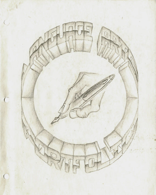
Language Arts Portfolio cover; pencil on paper; 8.5 x 11 in. / 1994
The importance of the portfolio, for any designer cannot be stressed enough. It is, quite seriously, proof of one’s worthiness in the craft. Design is one of the few professions where samples of work you have done in the past are supposed to speak for you.
Unless you have an “in,” many top design firms demand that you “drop off” your portfolio so they can take a look through it to see if they want to actually talk to you. I have never “dropped off” a portfolio anywhere (I understand the utility of the practice, but I find it superficial and demeaning). However, I have been in situations where an interviewer wanted nothing more than to just flip through “my book” without any interference from myself. Portfolios are like candy, and it’s hard for anyone not to just devour them. But if the candy isn’t balanced by the meat of the designer’s intelligence, personality, and presence, it can turn into a rather sickening experience. I’ve tried, with varying degrees of success, to break the predilection of portfolio interviews, but the bottom line is that the portfolio really must, as much as possible, speak for itself, and for the designer, too.
I have made several portfolios in my life in various formats, but I think this was the first thing I ever made that actually was called a portfolio. As you can probably tell by the title, this isn’t a collection of graphic design samples but, rather, a collection of writing and so on for a “Language Arts” class in high school. I drew everything on this sheet of paper by hand (with the help of a compass and a ruler), and flourished the mechanically rational, hyper-dimensional letterforms with a dash of chrome. It probably took me about three days or so to do it, and this was my only copy… Read the rest of this entry »
Filed under Print / Editorial, Type / Fonts
Permalink