Archive for Print / Editorial

Prosophobia

dpj_prosophobia_poster_front

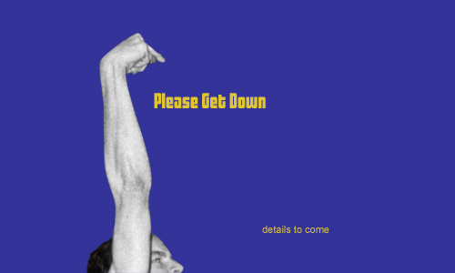
Prosophobia promotional poster; 24 x 36in. / 2002

The most celebrated role of the designer has always been that of creator of positive change through innovation, but battling the public’s inclination to treasure the old and suspect the new has historically been tough going. The current of ominous world events (especially at the time of this project’s conception, painfully close to 9/11) only serves to shore up such public reservation. For many people, the comfort of the familiar is too valuable to risk on new ideas. This promotes a homogeneous, retro-centric design market in which the new is often merely another iteration of the old.

Prosophobia (“fear of progress”) was a concept for an international design conference that would explore why many of these constructs exist and how we as designers can continue to champion progress in this environment. Featured presentations were to be given by historians, behaviorists and economists, as well as a diverse range of design leaders successfully implementing progressive work, despite this prosophobic culture.

Being a design event (and a design school project, no less), a promotional / informational poster was a critical application, and set the visual theme for the balance of the comprehensive identification and communication suite. After several dramatic, antagonistic early concepts, including a God-like hand pushing down the sunrise, a Volkswagen “New Beetle” reversing into the viewer and even a revolver loaded with antiquities and ready to fire, an approach more considerate of both sides of the matter prevailed. The front presents the issue in a re-contextualized image reminiscent of the silent film era, showing a figure literally hanging onto the past for dear life, while the flip-side speaks to the present (signified by digital visual language) offering information on the voices on offer in the conference, and an invitation to participate in the future… Read the rest of this entry »

Filed under Content / Architecture, Copy / Writing, Identity / Systems, Industrial / Product, Interactive / Web, Naming / Words, Print / Editorial, Signage / Display

Comments


A Matter of Dimension

dpj_igarashi_poster

Takenobu Igarashi magazine spread retrospective; 24 x 18in. (spread) / 2002

A staple project of many university design programs is to create a poster or magazine spread or flyer or whatever that somehow highlights the work of a “famous” designer, and, for extra measure, to design it as they might have designed it. That is, to design the piece in said famous designer’s “style.” That we had this sort of a project in the VCD program at the University of Washington always struck me as very strange, as “style” was nearly as derided a word as “Hobo” in the UW VCD lexicon. After all, a good designer (let alone a “famous” one) shouldn’t have a style.

A good designer analyzes, digests and synthesizes various aspects of a particular project and distills from this process the most compelling way to communicate the intended message for that project. There is a not-so-subtle line to be drawn here, as using a particular vernacular can be very useful in communicating particular subject matter. For example, if designing a poster about how inner-city youth express their identity, using some element of graffiti might be a felicitous way to help illustrate this. However, if a designer used graffiti in every project, whether it be about inner-city youth or organic produce, then his approach no longer can be seen as appropriating a relevant style to communicate a message; he has now created his own “style” that is irrespective of the individual needs of particular projects. He is one-dimensional.

Though I only know what I know about Takenobu Igarashi, a “famous” designer in the 1980s and my assigned muse for this project, from books and magazines and perhaps an article or two posted on the Internet, it did seem fairly easy to pick up on his “style.” But the issue wasn’t that his projects were one-dimensional. The issue was that his projects were all three-dimensional. Igarashi, in fact, transitioned his focus toward product design and then architectural sculpture as his career progressed, and, one could imagine, this was really where he wanted to be the whole time… Read the rest of this entry »

Filed under Content / Architecture, Copy / Writing, Print / Editorial, Type / Fonts

Comments (4)


Don’t Let Money Change Ya

Alright. You have a shade over $120 mil with which to hire one person on behalf of the world. Who’s it going to be? A boy-band-groomed pop star from the U.K. or a school teacher from Detroit? Seems like a pretty simple task, but, due to some mistake, they both got the millions at one point.

Robbie got his millions for probably singing us lessons of smooth, classic Garamond-y things like falling in love or getting his heart broken or falling in love again or just hooking up with lots of chicks.

jb_workshop_news_robbie_dpj

Robbie Williams Gets Millions in Record Deal typographic composition; 8 x 8in. / 2002

The teacher got his or her millions due to a Microgramma-tic computer glitch. Not for teaching square things like Mathematics or Wood Shop.

jb_workshop_news_teach_dpj

Anonymous Teacher Gets Millions due to Computer Glitch typographic composition; 8 x 8in. / 2002

One clue as to who should have made what can be found in the glaring disparity of said millions between their respective ledgers. Robbie, who was wildly popular in his home country but all-but-nothing in the U.S., got $125 million from his contract in 2002. The teacher, who may or may not have been popular in class—but completely anonymous to the world, received over $117 million less (before taxes). But the error is clear: The teacher should have received approximately $125 million less… Read the rest of this entry »

Filed under Print / Editorial, Type / Fonts

Comments (1)


Cracking the Code


one of two entrances to room 247—the Visual Communication Design major studio in the University of Washington School of Art—both are locked at all times / photo taken 2008

A terrible economy. Personal pride. Do or die time. A real studio environment. Some brilliant competition. Real work experience. Real failure experience. Real life experience. An utterly unforgiving professor. A strong sense of potential. Total commitment.

I’m not sure exactly what the most motivating factor was for me as I went through “206,” the second of two screening classes the University of Washington Visual Communication Design program, used to select who could complete the next two-and-a-half years of the VCD program in 2001/2002. Whatever it was, that class marked a tectonic shift in my approach to design work. It was the second time I had made it into 206, and, likely, my last chance to make the final cut into the VCD major. In contrast to the first attempt, I felt no self-satisfaction in the step—just an unflinching focus on the next… Read the rest of this entry »

Filed under Content / Architecture, Copy / Writing, Industrial / Product, Packaging / 3-Dimensional, Photography / Film, Print / Editorial

Comments


Razzle Dazzle ‘Em


Amy and Joel / 2001

I think I was first introduced to Joel Brazil when I was 15, on an open bike ride that was organized by a local shop. The shop sponsored one of the top teams in the region, and obliged some of its members to help corral whatever ragtag assemblage of customers and shop dudes decided to show up on warm summer Wednesdays. Joel was one of the best amateur racers in the country at the time, but I knew nothing about him because he never talked to me. This was primarily because he whiled away most of those miles in a perpetual, nauseating debate with Joe, another member of the team, in which they would each try to explain to each other how and why the other was not good at bike racing.

In the years that followed, I happened to work for that bike shop, attend the same university as Joel, race for the same team (and get sucked into similarly nauseating debates with Joe), do work for the same company and take on the same bitter arch nemesis (not Joe). I even ended up living in the very same room that Joel had rented before me in a house with a couple that counted as great friends to both him and I. Still, it was years and years from our initial meeting to when I actually began to get to know Joel, and, for quite a while, I couldn’t stand him.

As long as I knew or knew of Joel, he had been loud, brash, hyper-competitive, utterly exasperated by others’ life choices, inordinately concerned with material possessions, flakey, and schmoozey—ostensibly, an obnoxious, superficial, inconsiderate jerk. His nickname was “Razzle-Dazzle Brazil” (that rhymes), and he loved it. He wanted to write a column on my web site at one point, so I set up a section for him, which I titled Joell Report (a riff on the ultra-snobby Robb Report), and subtitled “Tales of the World’s Most Fortunate Malcontent” (he never actually wrote an article).

But, as more time went by, translations of Joel’s qualities became more lucid: He worked extremely hard to excel at life’s pursuits and was rewarded with the goods to prove it and the satisfaction with which to parade them. His derision of people’s decisions he deemed unwise was compensated for by his keen sense of their unique talent and fervent drive to tease out the potential thereof, at which he was actually quite gifted if given the opportunity.

Although Joell Report never came to fruition, I did get the opportunity to work with him on one very important project. Indeed, it was the materialization of two of his greatest loves: music and Amy, his then-fiancé. Amy+Joel, a soundtrack album of their wedding reception, would be the product… Read the rest of this entry »

Filed under Packaging / 3-Dimensional, Print / Editorial

Comments (2)


Back to School Time

University of Washington School of Art, main entrance

University of Washington School of Art, main entrance / photo taken 2008

Like most epiphanies, one of my most life-changing ideas came to me suddenly when I was in the bathroom. It was September 2nd, 2001. I had been working full-time as a designer since 1999. In July of that year, I had indulged in a very expensive but amazing vacation, following the Tour de France. Three days after my trip, I returned to work to rumors of massive layoffs. Within a week, tours of the company’s one-year-new building revealed empty desks that quickly multiplied into empty floors. By August 20th, it was clear that the in-house design department, too, was going dark. September 14th was going to be my last day. I had no idea what I was going to do, and then I did.

Two years and change earlier, I had made a rather precarious exit from the Visual Communication Design (VCD) program at the University of Washington. I was disheartened for a while, then embittered, then dismissive, then all-but-forgetful of the whole experience. And then, on that day in September, it came to me: I would go back and finish school. Or, rather, I would try to finish school. After all, I was going straight back to the horse that threw me, and, if anything, it was more fierce than ever (bad economies feed schools with lots of accomplished and motivated applicants). Any prior thoughts of repeating this wicked roulette were momentary lapses in sanity. But, upon my decision that day, my resolve was unshakable.

About a week and a half after my decision, I took one of my final vacation days. An hour or so after I woke up, I checked my personal email program, which showed news stories in one of the frames. The Twin Towers and half of the Pentagon had been obliterated within the span of a few hours. Luckily, I did not know anyone personally who was involved in these catastrophes but it seems strange to tell a story about that time without mentioning it. To be honest, it was all quite disaffecting considering the ever more improbable absurdity the country had been subjected to in the year or so leading up to the events. It was all just more impervious steel turned to dust. My decision was unmoved… Read the rest of this entry »

Filed under Identity / Systems, Print / Editorial, Type / Fonts

Comments (2)


There is No “Inc.” in “Team”


UBC monogram mark for Union Bay Cycling / 2001

A competitive cycling team, like all other kinds of teams, is a of a group of people with a similar interest; in this case, the team’s chief objective is to win bike races. The primary vehicle of a cycling team’s identity is the uniform that team members wear out racing and training. This identity is complicated, however, by the fact that competitive cycling is one of the very few sports in the world based on a sponsorship model, whereby commercial interests pay for some aspect of team operations in return for visible recognition on these uniforms. Almost invariably, this leads to a team’s identity being inextricably intertwined with the identity of their lead sponsors, which can change relatively frequently.

For example, most people would say that Lance Armstrong raced the last season of his career with the Discovery Channel team, and that, before that, he was on the U.S. Postal Service team for six years or so, even though these were, for all intents and purposes, the exact same team, managed by Tailwind Sports.

Union Bay Cycling (UBC) is a large Northwest cycling organization built around an elite-level team that races in local, regional, and national events at the pro/am level. UBC has been around, with the same leadership and core group of riders, for over a decade, but major sponsorship changes had made it seem like three or four disparate and relatively short-lived teams. For UBC, I worked with the team director to develop a long-term solution: a core identity system that accommodates prominent and unique recognition for lead sponsors, but embodies the unique heritage and dynamism of the team riders and stays consistent even with major sponsor changes.

I began with the UBC monogram mark (above) that would immediately identify all communication touchpoints of the team: stationery for proposals, press releases and other correspondence, the web site, T-shirts, gear bags, and so on, and, of course, the all-important team kit, including jerseys, shorts, socks, water bottles, gloves, helmet graphics, and several other tertiary clothing articles.


Union Bay Cycling jerseys (long-sleeve front | short-sleeve back) / 2003; I also happened to have designed the Holcam logo on the jersey shoulders (but not their web site) / 2001

The blue grid, an established device of the team, was reworked and became the foundation of this flexible system. The title sponsor was rewarded not only with the most prominent logo presence, but also with an expressive element emerging from the grid (in this case, the hands of Ashmead College, School of Massage), and other sponsors fit into pre-established hierarchical slots based on their respective levels of contribution…
Read the rest of this entry »

Filed under Content / Architecture, Copy / Writing, Identity / Systems, Interactive / Web, Packaging / 3-Dimensional, Print / Editorial, Uniforms / Apparel

Comments (2)


Fat and Invisible at the Same Time

FatPort logo (revised)

FatPort logo / 2001, 2008

Though the Internet has been around, in one form or another, for many decades, it had little public awareness until about twenty years ago. By the mid 1990s, the World Wide Web had been plotted by a smattering of amateur “home pages,” which generally consisted of some “lite” personal information about the site’s owner (or “webmaster”) and their hobbies (one of those invariably being “the Internet”). By the late 1990s, these folksy homes were being overwhelmed by the sprawl of “dot-coms” from corporate startups and stalwarts flocking to the new marketplace, and Internet tools like email were beginning to make their way into everyday practice. But, until the early 2000s, the only place in the whole wide world that one would likely experience these sites and services was from the office, or through their droolingly slow modem at home, which made anything but the most formal or mundane tasks a bit difficult for most folks.

Soon enough, though, many public establishments started offering wireless Internet service, enabling the populace to get out into the world and peruse the Web at office-like speeds from their own laptops at places that they already liked going, like coffee shops or bookstores. This service is often referred to casually as “Wi-Fi,” which is a contraction of ‘Wireless’… um…’Fidelity’??, a name created by those wacky kids over at Interbrand for an actual alliance supporting the “IEEE 802.11b Direct Sequence” specifications (I’m not making this stuff up).

Whatever the protocol may be named (or numbered, or whatever), one of the first Wi-Fi service providers primarily for consumer usage in public establishments was FatPort, a Vancouver, B.C. startup established by a few programmers, including my good friend Ingy, who hired me to help develop the venture’s visual identity (but left a relatively short time thereafter).

Before I was brought in, the name of this service had been established by the founders. A “fat port” is sort of programmer-slang for a good, wide-open connection. Ingy actually had the idea for a ‘fat’ radio tower mark, which I thought was good, so I basically just did it. I then set the type in “fat” and “open” weights to reinforce the idea in a distinctive word-mark. The strong, simple palette of red, white and black hints at the Canadian roots of the program and is highly versatile for any number of applications… Read the rest of this entry »

Filed under Identity / Systems, Print / Editorial, Signage / Display, Uniforms / Apparel

Comments (1)


Please Get Down

I turned twenty-something once. Actually, I have turned twenty-something several times now. On some of these occasions, I have had parties (or get-togethers, as I like to call them). But once, I turned twenty-something and I had a get together and I decided to make kind of a big deal of it.

To build awareness of my upcoming event, I developed a whole campaign of advertisements that I ran on my web site (then eurodan.net), beginning about three weeks before the soirée, and sent “email-blasts” to all invitees with every new publishing. Seen below is the bulk of the series. (You can click on the images to see how they appeared on my site originally.)

I started with a very oblique teaser:

dpj_please_get_down_teaser.jpg

Please Get Down party announcement / teaser. (original photograph by Matt Johnson / 1995); I lifted the term “Please get down” from the most exasperated, impassioned plea in the jam-out-session of “Jolene,” probably the best song ever written/performed by Cake. | web site; 500 x 300px.+ / 2001

Read the rest of this entry »

Filed under Interactive / Web, Print / Editorial

Comments (4)


Stuck in the Middle

desk job

My first full-time desk job. Can you sense my enthusiasm? / 2001 (photograph by Lisa Torrence)

In order to engage context in a quotidian discussion about the various caste systems of ancient cultures, a feisty grad student T.A. in one of the many requisite Art History courses I have taken challenged our class section to define the contemporary stamp: “middle class.” Immediately, salaries rang out, one range louder and more determined than the last, until crescendoing in discordant numerical jangle; income could not objectively define it. Quietus gave way to a chorus of key possessions: Cars, houses. Okay, but what if the car is a Maserati? What if the house is a shack? Scenarios of familial constructs similarly swelled and crashed. These lines of criteria could not strike a clear chord of class definition.

The T.A. sat back and let the class caterwaul and self-dismiss various notions before bringing the struggling group back to cue. Coyly, he then rested the discussion by quoting a friend of his, who had jokingly defined a member of the middle class as anyone who “has a job.” The point of this was that such class distinctions are laughably vague and infinitely subjective (a job is not a job is not a job), but the passion with which people attempt to define them proved how deeply invested we are in socio-economic ranking.

While I had technically had three jobs prior, my quest for a “real,” middle-class-making job began sometime late in the Spring of 1999. I thought I had it in a full-time, long-term temp position “working with computers” that I had taken up after finally quitting my four-year run as a bike mechanic. Unfortunately, it wasn’t long before I realized that I wasn’t all that great at “computers” (at least, not in that context), and I let my hours decline steadily, until they were almost zero, and then they were zero. At that point, I had no income.

dpj_crash_results_1999.jpg

“Yo’ face is my case!” My head was barely scratched, but it did bleed a fair amount. Those scars on my arm are tire tracks, by the way. / 1999 (photograph by Ira Wamble)

As fortune would have it (if luck did not), I had been hit by a car that spring while riding my bike (two cars in the same accident, actually), which was an incredibly traumatic event that in turn paid me an agreeable insurance settlement. I ended up living on this modest reward, a tiny savings, and not much else for quite some time as my job search became more and more frenzied. By November, I paid rent by scrambling together the entirety of my bank account, the cash in my pockets, and loose change I had collected in a jar (seriously). The promise of middle class never tasted so sweet or came with such timely appreciation as when I was offered a job as an in-house “Junior Designer” at Sierra On-Line, Inc., just before Thanksgiving, 1999… Read the rest of this entry »

Filed under Interactive / Web, Packaging / 3-Dimensional, Print / Editorial, Type / Fonts

Comments (1)


« Previous PageNext Page »