Archive for Print / Editorial

If These Wheels Could Talk


If These Wheels Could Talk

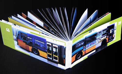
If These Wheels Could Talk book; 34 x 6.5in. (spread), 116ppg. / 2004

Soon after the dot-com and 9/11 crashes, my design job also crashed. I set about looking for another, through other firms, recruiters, friends, friends of friends, and so on. All unable to take on the frivolous weight of an underdeveloped type and image manipulator, I broadened my search criteria: assistant… receptionist… data enterer… Anything that would have me back in the office environs to which I had grown so entitled. But there was nothing to be had. Facing the loss of everything, the idealization of pre-crash innocence struck me. I printed out a few standard government forms, borrowed a friend’s car and found myself driving southward to the King County Metro headquarters. I was on my way to becoming a bus driver.

Public transportation is one of the great noble causes of our time, and the bus embodies the struggle most colossally: angling through bourgeois car traffic to transport the proletariat affordably to their destination. Having grown up without a car, I had developed a keen appreciation for the bus’s role, and, as the false hopes of cubicle walls crumbled, to give my hands to one of their great helms all of a sudden seemed right. But, for all my idealization, I also knew the motley reality of what goes on above the turning wheels: The bus riding masses are an odd bunch, particularly in a city where almost everyone who can drives a car instead… Read the rest of this entry »

Filed under Content / Architecture, Copy / Writing, Information / Mapping, Naming / Words, Photography / Film, Print / Editorial

Comments


A Killer Project

lives being lost to Cardiovascular Disease (shown in real time; multiply by 25,000 for annual number) animated illustration for presentation; source: 2000 U.S. Census; originally 10 x 7ft. (projected) / 2004

Data is boring. It’s just facts and figures; numbers on a page. There’s no life in it: No blood, sweat or tears, not to mention sex. But actually, there almost always is. Nearly all data is merely classified results of the choices people make. If someone didn’t make enough money to pay their phone bill. If someone trained hard enough to win an Olympic bronze medal. If someone was found 30 stories below a penthouse balcony. There is data that can tell us all about these things. Unfortunately, it’s too often left flat, or worse, twisted up in knots, suffocated and sputtering in it’s own purple ink. It is in the mindful extrication, marrying and expression of data that its ones and zeroes may come to life, breathe in our faces and tell us to pay attention for a minute because it’s going to help us understand the beautiful and the terrifying things we’ve done. This is information design.

Nothing should teach us more about ourselves than adversity, and that’s what we were faced with in Information Design, one of the most sweat-worthy courses in the decidedly rigorous Visual Communication Design program at the University of Washington. Indeed, the subjects of our designs were nothing short of catastrophic: groups were assigned strains of natural disasters or epidemics to seek out, research and present based on their potential merit to inform through design. After this, we were to design at least three magazine spreads of narrated information graphics individually.

Our research team, comprised of Jesse Graupmann, Jim Nesbitt and myself came upon Cardiovascular Disease (CVD), by far the United States’ most prolific killer. In terms of deaths and monetary expenditures, raw data makes it clear that CVD, which encompasses Heart Attack, Stroke, and various other arterial conditions, is a significantly larger problem than any other known phenomenon.

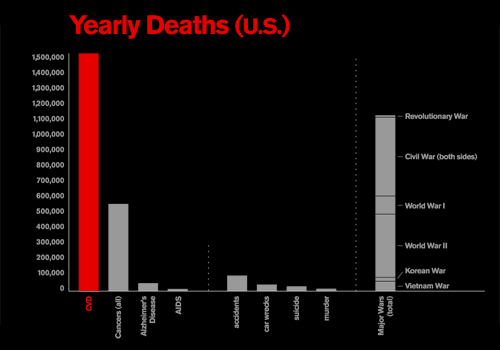
comparison of annual deaths between Cardiovascular Disease, Cancer, Alzheimer's Disease and AIDS, as well as annual deaths by accident, automobile collisions, suicide and murder, and the total deaths accrued in all significant U.S. wars

comparison of annual deaths between Cardiovascular Disease, and other notable causes of death, as well as the total deaths accrued in all significant U.S. wars; (roll over to enlarge) [sources: American Heart Association, 2003; Centers for Disease Control 2003; U.S. Pentagon, 2000]; originally 10 x 7ft. (projected) / 2004

Currently, on average, CVD kills about 1.5 million people per year in the U.S. or one every 33 seconds, accounting for 39.4% or one of every 2.5 deaths in the year 2000. Even all forms of cancer combined don’t kill as many people as does Coronary Heart Disease alone, just one of several types of Cardiovascular Disease. This is not to mention non-disease related deaths such as murders or accidents, which also pale in comparison to CVD. Perhaps most shocking is that more people die of Cardiovascular Disease each year than were killed in every major U.S. war, combined.

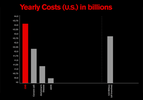
comparison of annual costs between Cardiovascular Disease, Cancer, Alzheimer's Disease and AIDS, as well the combined annual budget for the U.S. military

comparison of annual costs between Cardiovascular Disease, Cancer, Alzheimer’s Disease and AIDS, as well the combined annual budget for the U.S. military (roll over to enlarge) [sources: American Heart Association, 2003; Centers for Disease Control 2003; U.S. Pentagon, 2000]; originally 10 x 7ft. (projected) / 2004

In our presentation to the class, we introduced these and other such daunting facts with the animated chart at the top of this post projected behind us, illustrating deaths occurring due to the disease even as we were making the presentation. We made a pretty good case, and we were off on our own to dive in and make those facts dance their deadly dance in the pages of our own magazine articles.

But having the undisputed king of killers wasn’t enough for me. I was thirsty for more blood. I suppose I wanted more sex in it, too. Based the numbers above, Cardiovascular Disease sounds pretty bad, but how could it be worse than HIV and AIDS? I set out to answer this question by comparing the two based on five critical factors… Read the rest of this entry »
Filed under Content / Architecture, Copy / Writing, Drawing / Illustration, Information / Mapping, Print / Editorial

Comments


I Have Something Important to Tell You


holiday card; front cover; 5 x 4in. (folded) / 2003

Read the rest of this entry »

Filed under Copy / Writing, Print / Editorial

Comments


Multiple Choice


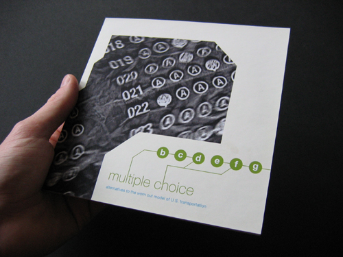
Multiple Choice, Alternatives to the Worn Out Model of U.S. Transportation booklet; front cover; 4.5 x 4.5in.; 28ppg. / 2003

Teen angst is a powerful force not often harnessed for forward progress. At the same time, many of today’s most overwhelming transportation problems are fueled by inertia. There is one predominantly accepted model that most people of driving age accept as given and therefore perpetuate. If there’s one thing kids hate, it’s being told that they have to do something a certain way. Multiple Choice plays between both of these phenomena.

This book, one of a few projects undertaken for the Publications course in the UW Visual Communication Design program, was designed as a thought leadership piece that might be put out by a major car maker to mark an openness to new ideas, sparking productive discourse on the future of transportation… Read the rest of this entry »
Filed under Content / Architecture, Copy / Writing, Drawing / Illustration, Naming / Words, Photography / Film, Print / Editorial

Comments


Working with Nature


National Park Service Research Opportunities promotional brochure; front cover; 5 x 8.5in.; accordion fold / 2003

Because I am into competitive cycling and ride outside all the time, many people assume that I am one with nature, which is actually pretty far from the truth. It’s not that I dislike the great outdoors, but the thought of being in the woods doesn’t give me any kind of rush. However, there’s a big difference between knowing nature is there and being on a mountain. There are some points of our environment that are undeniably awesome, and I got to experience many firsthand in a project for the National Park Service.

Our design team at the Design + Innovation Lab, including myself, Jim Nesbitt and Jason Tselentis, and directed by Doug Wadden, worked with The National Park Service to create an informational brochure and comprehensive web reference for their collaborative research program, dubbed simply “Research Opportunities.” This program invites public, private and academic researchers to conduct their studies in seven Pacific Northwest parks. This symbiotic relationship allows researchers access to some of the greatest ecological resources in the Northwest, while the Park Service gains additional relevance by being linked to significant scientific research and discovery in prominent publication… Read the rest of this entry »
Filed under Content / Architecture, Copy / Writing, Interactive / Web, Print / Editorial

Comments


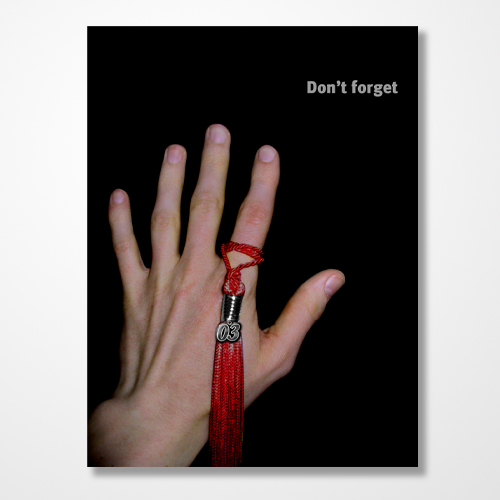
Don’t Forget… You’re Invited


2003 law school graduation party invitation (side A); 4.5 x 6in. / 2003

In studying the prevailing American mindset on the subject of career success, perhaps the most insightful text on the matter is the collected works of TV Guide. Skim past the prologue of red-eyed shills, the hazy caffeine of morning droll and other timefill of pandering feel-good talk, geriatric game shows and irrelevant local news, and and start taking notes at prime time. Discounting the relatively recent, unfathomable minefield of “reality” as desperate scatter-shot, you are left with memes so powerful and enduring as to have riddled prime slots snowy and black and white all the way through 3DHD: Doctors and lawyers. Television’s ethereal blue glow has taught us to revere these two professions more than any other, and, in the interest of the court, I was guilty as any.

This TV-fed fascination with doctors and lawyers comes not from their contribution to society, but on their sheer entertainment value. Prime time has served up their appeal on silver platters. We see doctors tussle with human life, which is kind of like what God is all about; the appeal is obvious. Lawyers are the cunning oral marksmen, toggling between cool recitation of obscure precedent and impassioned appeals for basic decency. Each have their own brand of exotic diction that elevates them from the rest of the bread and butter world, leaving us to assume their impenetrable turns of phrase are ingenious shows of mental strength. Moreover, both are assumed to make boatloads of money… Read the rest of this entry »
Filed under Copy / Writing, Photography / Film, Print / Editorial, Type / Fonts

Comments


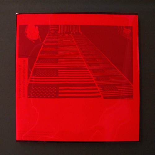
Manufacturing Consent


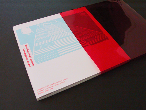
Manufacturing Consent, A Propaganda Model book in acetate slipcase; 9.5 x 9.5in., 28ppg. / 2003

What is the role of American mainstream media? This book visualizes Noam Chomsky’s and Edward S. Herman’s message that a few powerful individuals and corporations mask their own deceit and corruption through their control of the mass media. As the writers urge, the reader must take an active role in looking beneath the messages “filtered” by these entities in order to understand the real content.

In this piece—a project undertaken for the Publications course in the University of Washington Visual Communication Design program, in which we were to interpret an excerpt of this seminal work—expressions of manufactured mass media content are printed in light cyan blue while the Chomsky / Herman text is printed in red on white paper. Red acetate “filters” sharpen contrast of the cyan while obscuring the copy.

The first action the reader must take is to remove the book from its masking slipcase. Once removed, the subject’s title becomes immediately visible, while the mass production of American perception recedes.


Manufacturing Consent, A Propaganda Model book drawn from acetate slipcase; 9.5 x 9.5in., 28ppg. / 2003

Read the rest of this entry »
Filed under Content / Architecture, Packaging / 3-Dimensional, Print / Editorial

Comments


American Realities


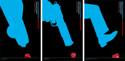
American Realities film series posters: Roger & Me | Hoop Dreams | Troublesome Creek; digital plot outputs; 24 x 36in. (each) / 2002

We Americans are conditioned to think that ours is the best country in the world—that this is the land of opportunity, and we can achieve anything here if we try hard enough. And, by all available evidence, there seem to be plenty of other countries in which people are a hell of a lot worse off than us. But life in the U.S. ain’t all sweet apple pie, and opportunities are easier to come by for some than others. Of course, you’d never know this by watching most film or television. With so much false “reality” pervading contemporary media, it is shockingly refreshing to see the true struggle of real life shown so eloquently in some powerful recent documentary films.

As one of three projects assigned in our Visualizations course in the Visual Communication Design program at the UW, we were to develop a theme around three movies of our choosing for a film festival of sorts, then design a corresponding promotional poster series. With American Realities, I thematically linked Roger & Me, Hoop Dreams and Troublesome Creek, as poignant revelations of Americans forced to work extraordinarily hard just to make ends meet, often against opposing forces of others’ opportunities.

By visually expressing the emotional tension of these stories, I aimed to generate awareness not only of these filmic case studies, but also of the true elusiveness of the American dream… Read the rest of this entry »

Filed under Advertising / Campaigns, Copy / Writing, Drawing / Illustration, Print / Editorial

Comments


Construction in Cities; A Design Marathon


Construction in Cities; Social, Environmental, Political and Economic Concerns book cover (1 of 36); 6 x 9in. / 2002

There’s more than one way to skin a cat, as they say. They don’t seem to say who the desperate soul was that figured this out, or how many ways he or she came up with (though I imagine there must be at least nine). The question we were posed with in a university class project was: How many ways can you skin a book?

As part of the Visualizations course in the Visual Communication Design program at the University of Washington, this so-called “design marathon” charged us with creating not just one or even nine, but 36 different covers for the exact same book. Said book had to be a real, published work, and it had to have some variant of the word “city” in the title but, as long as it fit within those parameters, we could choose whatever one seemed to suit our fancy. We spent about a week focusing on getting a few covers started, then worked on developing the balance while concurrently working on a public service campaign project and another project creating a series of film posters (coming soon to a Graphic Language blog near you!). All three projects were done in the course of ten weeks.

The book I chose, “Construction in Cities; Social, Environmental, Political and Economic Concerns” by Patricia J. Lancaster, AIA, is no great work of literature. It is, however, a (seemingly) quite useful guide to overcoming various barriers in getting one’s plans built in the urban landscape. I took various perspectives in illustrating this on my covers (I had to!). As with all of the work I put up on this site, I really like some of it and find some of it pretty awful, but for you, I bear all. My first attempt is above. 35 others follow… Read the rest of this entry »

Filed under Photography / Film, Print / Editorial

Comments


What Do You Call Someone Who…


Rumpelstiltskin would approve. recycling awareness campaign postcard, showing PET bottles going into winter gloves; 7 x 5 in. / 2002

“Designer” is an ethereal thing to call oneself, fraught with misconception and expectation. When I describe myself as such, people I meet invariably respond with the exact same, ever-more-annoying, eight-word phrase: “Oh—that’s, like, with computers and stuff, right?” (I can only imagine that there was some 20/20 John Stossel exposé about the suspicious rise of the machines in the late ’80s—replete with footage of designers large in glasses and shoulder-padding huddled around a tiny Macintosh, working to draw pastel and black magic from it—that permanently ingrained this concept in society at large.) Moreover, most people assume I use my computers and stuff for advertising, where I spin everyday goods into objects of mythical lust… Read the rest of this entry »

Filed under Advertising / Campaigns, Copy / Writing, Photography / Film, Print / Editorial, Signage / Display

Comments


Next Page »