Archive for Packaging / 3-Dimensional

Manufacturing Consent
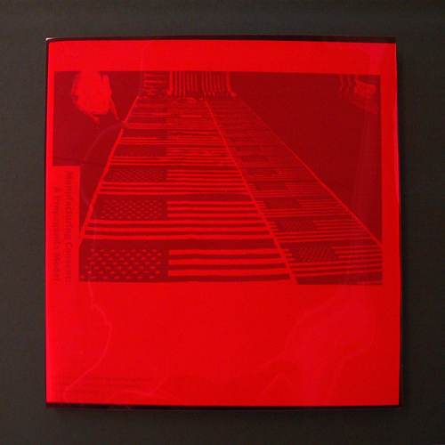

Manufacturing Consent, A Propaganda Model book in acetate slipcase; 9.5 x 9.5in., 28ppg. / 2003

What is the role of American mainstream media? This book visualizes Noam Chomsky’s and Edward S. Herman’s message that a few powerful individuals and corporations mask their own deceit and corruption through their control of the mass media. As the writers urge, the reader must take an active role in looking beneath the messages “filtered” by these entities in order to understand the real content.

In this piece—a project undertaken for the Publications course in the University of Washington Visual Communication Design program, in which we were to interpret an excerpt of this seminal work—expressions of manufactured mass media content are printed in light cyan blue while the Chomsky / Herman text is printed in red on white paper. Red acetate “filters” sharpen contrast of the cyan while obscuring the copy.

The first action the reader must take is to remove the book from its masking slipcase. Once removed, the subject’s title becomes immediately visible, while the mass production of American perception recedes.
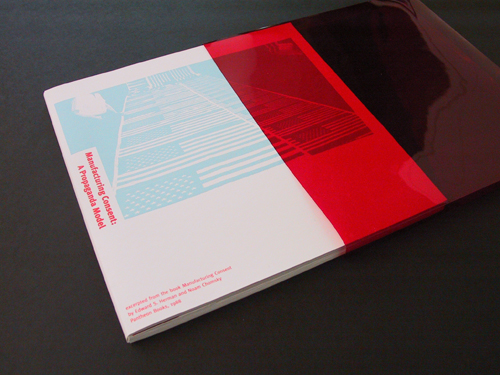

Manufacturing Consent, A Propaganda Model book drawn from acetate slipcase; 9.5 x 9.5in., 28ppg. / 2003

Read the rest of this entry »

Filed under Content / Architecture, Packaging / 3-Dimensional, Print / Editorial

Comments


Wanna Make Something of It?

dpj_materials_poster

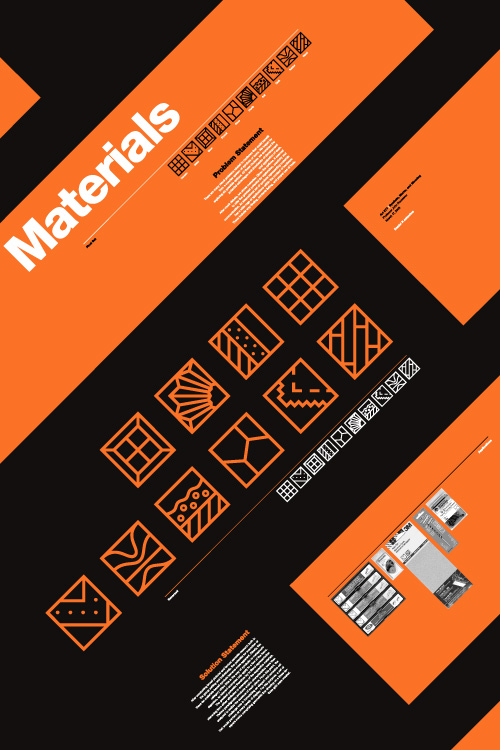
Materials symbol set promotional poster; 20 x 30in. / 2002

There is something very primal and essential about building things. Behind our most basic needs is the need to build something to facilitate it. Before we can put food on the table, someone has to put the table together. Before we can sleep under anyone’s roof, someone has to put that roof over our heads. And, in order to afford such things these days, most of us need to go to work, which, more than likely, is in a building.

But modern technology and evolving divisions of labor have rendered the notion of building even the most trifling gaff foreign and anxiety-filling to most. Hardware stores (big-box and corner-shop alike) are stocked floor to ceiling with too many confusing answers to even the most basic questions. For our Marks and Symbols class in the Visual Communication Design (VCD) program at the University of Washington, we were set out to develop a universal language of icons that would help de-mystify this environment and enable people to fulfill their basic need to put stuff together.

The class was divided into two phases: research and development. In the research phase, we worked in groups to look into issues facing the hardware customer, decide upon the problem we felt had the most potential for amelioration by a concise set of symbols (ten or so), and present our process and findings to the rest of the class. In the second phase, we each developed symbol sets on our own to respond to this problem.

Our research group, comprising mates Devon DeLapp, Jesse Graupmann, Narith Hoc, Sarah LaMont, Shaun Tungseth and myself, began by thinking of and assessing the potential (and drawbacks) of six possible options: A set of symbols for connectors, which could help people figure out what fit with what else (but seemed too broad to spawn a useful set of just ten symbols), electricity symbols, which could help people figure out the ins and outs of amps and volts (but we couldn’t figure out how to boil this subject down to ten symbols, either), how-to symbols, which could help people with standard tasks like building a deck or installing a light fixture (but, we quickly realized, would be nearly impossible to describe in mere icons), function/action symbols, which could help explain what a particular tool might do, such as “twist” or “strike” and might have made for a cool set of symbols (but seemed too basic a concept to actually be of any use to any adult not born on Mars—”a hammer is for hitting; fancy that!”), or warning symbols, which could help deter someone from doing stupid things with those tools—like strike themselves with a hammer (but had already been done to death, so to speak).

After much debate, we decided that materials had the most potential for new exploration of symbols that could enjoy real utility, potentially touching a range of applications within the context of hardware, such as way-finding (“Where is the wood?”), contents listing (“Is this made with wood?”), and proper use of tools (“Can I use this on wood?”)… Read the rest of this entry »

Filed under Copy / Writing, Identity / Systems, Packaging / 3-Dimensional, Photography / Film, Signage / Display

Comments (2)


Cracking the Code


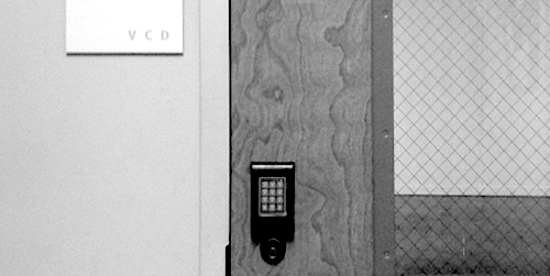
one of two entrances to room 247—the Visual Communication Design major studio in the University of Washington School of Art—both are locked at all times / photo taken 2008

A terrible economy. Personal pride. Do or die time. A real studio environment. Some brilliant competition. Real work experience. Real failure experience. Real life experience. An utterly unforgiving professor. A strong sense of potential. Total commitment.

I’m not sure exactly what the most motivating factor was for me as I went through “206,” the second of two screening classes the University of Washington Visual Communication Design program, used to select who could complete the next two-and-a-half years of the VCD program in 2001/2002. Whatever it was, that class marked a tectonic shift in my approach to design work. It was the second time I had made it into 206, and, likely, my last chance to make the final cut into the VCD major. In contrast to the first attempt, I felt no self-satisfaction in the step—just an unflinching focus on the next… Read the rest of this entry »

Filed under Content / Architecture, Copy / Writing, Industrial / Product, Packaging / 3-Dimensional, Photography / Film, Print / Editorial

Comments


Razzle Dazzle ‘Em


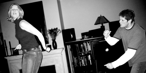
Amy and Joel / 2001

I think I was first introduced to Joel Brazil when I was 15, on an open bike ride that was organized by a local shop. The shop sponsored one of the top teams in the region, and obliged some of its members to help corral whatever ragtag assemblage of customers and shop dudes decided to show up on warm summer Wednesdays. Joel was one of the best amateur racers in the country at the time, but I knew nothing about him because he never talked to me. This was primarily because he whiled away most of those miles in a perpetual, nauseating debate with Joe, another member of the team, in which they would each try to explain to each other how and why the other was not good at bike racing.

In the years that followed, I happened to work for that bike shop, attend the same university as Joel, race for the same team (and get sucked into similarly nauseating debates with Joe), do work for the same company and take on the same bitter arch nemesis (not Joe). I even ended up living in the very same room that Joel had rented before me in a house with a couple that counted as great friends to both him and I. Still, it was years and years from our initial meeting to when I actually began to get to know Joel, and, for quite a while, I couldn’t stand him.

As long as I knew or knew of Joel, he had been loud, brash, hyper-competitive, utterly exasperated by others’ life choices, inordinately concerned with material possessions, flakey, and schmoozey—ostensibly, an obnoxious, superficial, inconsiderate jerk. His nickname was “Razzle-Dazzle Brazil” (that rhymes), and he loved it. He wanted to write a column on my web site at one point, so I set up a section for him, which I titled Joell Report (a riff on the ultra-snobby Robb Report), and subtitled “Tales of the World’s Most Fortunate Malcontent” (he never actually wrote an article).

But, as more time went by, translations of Joel’s qualities became more lucid: He worked extremely hard to excel at life’s pursuits and was rewarded with the goods to prove it and the satisfaction with which to parade them. His derision of people’s decisions he deemed unwise was compensated for by his keen sense of their unique talent and fervent drive to tease out the potential thereof, at which he was actually quite gifted if given the opportunity.

Although Joell Report never came to fruition, I did get the opportunity to work with him on one very important project. Indeed, it was the materialization of two of his greatest loves: music and Amy, his then-fiancé. Amy+Joel, a soundtrack album of their wedding reception, would be the product… Read the rest of this entry »

Filed under Packaging / 3-Dimensional, Print / Editorial

Comments (2)


There is No “Inc.” in “Team”


UBC monogram mark for Union Bay Cycling / 2001

A competitive cycling team, like all other kinds of teams, is a of a group of people with a similar interest; in this case, the team’s chief objective is to win bike races. The primary vehicle of a cycling team’s identity is the uniform that team members wear out racing and training. This identity is complicated, however, by the fact that competitive cycling is one of the very few sports in the world based on a sponsorship model, whereby commercial interests pay for some aspect of team operations in return for visible recognition on these uniforms. Almost invariably, this leads to a team’s identity being inextricably intertwined with the identity of their lead sponsors, which can change relatively frequently.

For example, most people would say that Lance Armstrong raced the last season of his career with the Discovery Channel team, and that, before that, he was on the U.S. Postal Service team for six years or so, even though these were, for all intents and purposes, the exact same team, managed by Tailwind Sports.

Union Bay Cycling (UBC) is a large Northwest cycling organization built around an elite-level team that races in local, regional, and national events at the pro/am level. UBC has been around, with the same leadership and core group of riders, for over a decade, but major sponsorship changes had made it seem like three or four disparate and relatively short-lived teams. For UBC, I worked with the team director to develop a long-term solution: a core identity system that accommodates prominent and unique recognition for lead sponsors, but embodies the unique heritage and dynamism of the team riders and stays consistent even with major sponsor changes.

I began with the UBC monogram mark (above) that would immediately identify all communication touchpoints of the team: stationery for proposals, press releases and other correspondence, the web site, T-shirts, gear bags, and so on, and, of course, the all-important team kit, including jerseys, shorts, socks, water bottles, gloves, helmet graphics, and several other tertiary clothing articles.


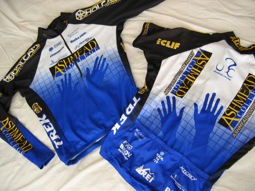
Union Bay Cycling jerseys (long-sleeve front | short-sleeve back) / 2003; I also happened to have designed the Holcam logo on the jersey shoulders (but not their web site) / 2001

The blue grid, an established device of the team, was reworked and became the foundation of this flexible system. The title sponsor was rewarded not only with the most prominent logo presence, but also with an expressive element emerging from the grid (in this case, the hands of Ashmead College, School of Massage), and other sponsors fit into pre-established hierarchical slots based on their respective levels of contribution…
Read the rest of this entry »

Filed under Content / Architecture, Copy / Writing, Identity / Systems, Interactive / Web, Packaging / 3-Dimensional, Print / Editorial, Uniforms / Apparel

Comments (2)


Stuck in the Middle

desk job

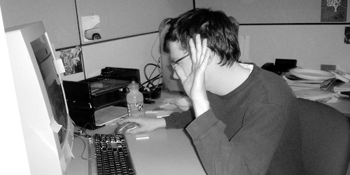
My first full-time desk job. Can you sense my enthusiasm? / 2001 (photograph by Lisa Torrence)

In order to engage context in a quotidian discussion about the various caste systems of ancient cultures, a feisty grad student T.A. in one of the many requisite Art History courses I have taken challenged our class section to define the contemporary stamp: “middle class.” Immediately, salaries rang out, one range louder and more determined than the last, until crescendoing in discordant numerical jangle; income could not objectively define it. Quietus gave way to a chorus of key possessions: Cars, houses. Okay, but what if the car is a Maserati? What if the house is a shack? Scenarios of familial constructs similarly swelled and crashed. These lines of criteria could not strike a clear chord of class definition.

The T.A. sat back and let the class caterwaul and self-dismiss various notions before bringing the struggling group back to cue. Coyly, he then rested the discussion by quoting a friend of his, who had jokingly defined a member of the middle class as anyone who “has a job.” The point of this was that such class distinctions are laughably vague and infinitely subjective (a job is not a job is not a job), but the passion with which people attempt to define them proved how deeply invested we are in socio-economic ranking.

While I had technically had three jobs prior, my quest for a “real,” middle-class-making job began sometime late in the Spring of 1999. I thought I had it in a full-time, long-term temp position “working with computers” that I had taken up after finally quitting my four-year run as a bike mechanic. Unfortunately, it wasn’t long before I realized that I wasn’t all that great at “computers” (at least, not in that context), and I let my hours decline steadily, until they were almost zero, and then they were zero. At that point, I had no income.

dpj_crash_results_1999.jpg

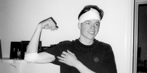
“Yo’ face is my case!” My head was barely scratched, but it did bleed a fair amount. Those scars on my arm are tire tracks, by the way. / 1999 (photograph by Ira Wamble)

As fortune would have it (if luck did not), I had been hit by a car that spring while riding my bike (two cars in the same accident, actually), which was an incredibly traumatic event that in turn paid me an agreeable insurance settlement. I ended up living on this modest reward, a tiny savings, and not much else for quite some time as my job search became more and more frenzied. By November, I paid rent by scrambling together the entirety of my bank account, the cash in my pockets, and loose change I had collected in a jar (seriously). The promise of middle class never tasted so sweet or came with such timely appreciation as when I was offered a job as an in-house “Junior Designer” at Sierra On-Line, Inc., just before Thanksgiving, 1999… Read the rest of this entry »

Filed under Interactive / Web, Packaging / 3-Dimensional, Print / Editorial, Type / Fonts

Comments (1)