Posted: 13 Feb / 2011 at 10:49 pm

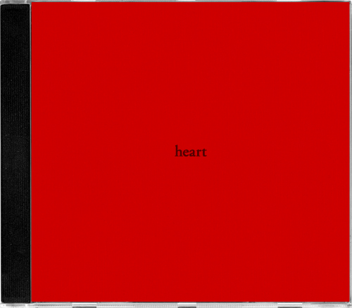
heart CD jewel case cover; type printed on red paper, removable double-stick-taped to album jewel case / 2004
Because it’s always on, and only on, February 14th, no matter what, Valentines Day can be particularly stressful for young relationships. Bleary-eyed cherubs come out of their 364-day slumber, all jacked up on chocolate truffles and sweethearts, and just shotgun cloud-loads of heart darts into the crowd, their mercenary instincts leaving accuracy second to volume when considering targets. If you are as neurotic about these sorts of things as am I, it’s crucial to position yourself properly so you don’t fall prey to misfires.
The problem is, there are only a few kinds of arrows in the cherub’s standard arsenal, and they’re pretty blunt: “I think you’re hot,” “I love you,” or, “(Believe it or not) I still love you.” If you don’t happen to be feeling—and comfortable expressing—one of those three sentiments, you better be ready to scramble come 2/14. Valentines Day can be rugged terrain for “We’ve only been out twice and I don’t know your last name,” “You’re kind of crazy but maybe I’ll get used to it,” or “We’re doing OK, right?”
Come 2/14/2004, I was actually about three months into a relationship that was going much more than just OK. Indeed, it was going better than I had imagined it could and better than any relationship before had gone by that point. But I tend to err on the side of caution when it comes to communicating feelings and the fact that I did feel deeply for her made me even more nervous about getting too vocal about it… Read the rest of this entry »
Filed under Copy / Writing, Industrial / Product, Type / Fonts
Permalink
Posted: 11 Apr / 2010 at 9:56 pm

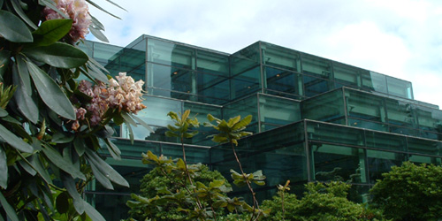
Washington State Convention and Trade Center building (back/garden) / photo taken 2003
Sometime in the 1940s or ’50s (I’m not sure of the exact year), the term “corporate identity” was coined by Lippincott & Margulies—one of the first major design firms in the world—to describe both the idea that even large businesses have inherent, relatable characteristics, not unlike human beings, and the practice that could express their character through a fitting, comprehensive and consistent design program. An organization’s identity is expressed in every way they communicate, from their name and logo to their brochures and web site, to the way they answer the phone—whether those “touchpoints” are designed by professionals or not—so this was an important “call-to-action” (to use another industry term) for organizations to pay attention to everything they were communicating, and, ideally, to pay top-notch professionals like L&M to help them make sure they were doing so effectively.
Sometime in the 1990s, the term “brand” began to take over as more formal business strategy was becoming more prominently integrated into large-scale identity design programs, and it quickly went from buzz word to industry category, on which uncounted firms jumped. I have always found this nomenclature shift ironic. “Branding,” literally translated, is the superficial process of stamping a logo on your property (livestock, originally); this superficial logo stamping is exactly the perception that the “new” practice of “branding” was supposed to be rising above. Meanwhile, the word “identity” could already encompass every aspect what an entity is, from what they do to how they express it. But like many P/C nomenclature shifts of late, whether rational or not, “branding” has taken hold, and “identity” (preceded by “corporate” or not), has been deprecated.
Whatever it’s called, my formal introduction to the process of figuring out what an organization stands for and expressing it in a fitting design program was in a class called Identity Systems in the Visual Communication Design program at the University of Washington, sometime in 2003. Like a few other courses in the program, this one was broken into collaborative group and individual phases. Three-person groups were assigned one of four or five major local entities and tasked with research and analysis of the entity, en-route to the creation of a strategic brand platform. Based on this platform, we were then set about designing a fitting logo and building a supporting visual identity system, individually… Read the rest of this entry »
Filed under Copy / Writing, Identity / Systems, Industrial / Product, Interactive / Web, Signage / Display
Permalink
Posted: 29 Sep / 2009 at 9:48 pm

Prosophobia promotional poster; 24 x 36in. / 2002
The most celebrated role of the designer has always been that of creator of positive change through innovation, but battling the public’s inclination to treasure the old and suspect the new has historically been tough going. The current of ominous world events (especially at the time of this project’s conception, painfully close to 9/11) only serves to shore up such public reservation. For many people, the comfort of the familiar is too valuable to risk on new ideas. This promotes a homogeneous, retro-centric design market in which the new is often merely another iteration of the old.
Prosophobia (“fear of progress”) was a concept for an international design conference that would explore why many of these constructs exist and how we as designers can continue to champion progress in this environment. Featured presentations were to be given by historians, behaviorists and economists, as well as a diverse range of design leaders successfully implementing progressive work, despite this prosophobic culture.
Being a design event (and a design school project, no less), a promotional / informational poster was a critical application, and set the visual theme for the balance of the comprehensive identification and communication suite. After several dramatic, antagonistic early concepts, including a God-like hand pushing down the sunrise, a Volkswagen “New Beetle” reversing into the viewer and even a revolver loaded with antiquities and ready to fire, an approach more considerate of both sides of the matter prevailed. The front presents the issue in a re-contextualized image reminiscent of the silent film era, showing a figure literally hanging onto the past for dear life, while the flip-side speaks to the present (signified by digital visual language) offering information on the voices on offer in the conference, and an invitation to participate in the future… Read the rest of this entry »
Filed under Content / Architecture, Copy / Writing, Identity / Systems, Industrial / Product, Interactive / Web, Naming / Words, Print / Editorial, Signage / Display
Permalink
Posted: 30 Apr / 2009 at 7:34 pm

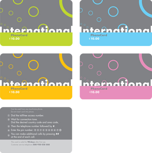
phone card set; series of four fronts (top); one back (bottom); 3.4in. x 2.125in. each / 2002
It seems that there are (or were) two major markets for long distance phone cards.
One is (or was, I’m guessing) Europe, where long distance on a phone plan, in comparison to U.S. phone plans, would span relatively little actual distance, and wanderlust runs rampant. In the days before near-ubiquitous mobile phone proliferation, I imagine there was much use for a card that would get you in touch with another country, or back in touch with home when you got there, without costly service charges from one’s domestic carrier. Even with a mobile, a roamer could easily outbound their domestic plan with a quick clip on the TGV.
The other market I’ve seen for such cards is quite different, and still as vibrant as ever. Having lived in New York for several years now, I’ve been confronted by gangs of international phone cards, shouting at me from behind so many raised bodega counters, each garish explosion of bling and atrocious typography shouting louder than the next, like a traffic jam in the South Bronx. This city, it seems, has the requisite population of aliens without the means for a long distance plan (or even a phone, in many cases), needing to reach out and touch their homelands, such that the cacophony of prepaid, foil-stamped minutes is warranted.
But, having lived in Seattle almost my entire life as of 2002, with its relatively scant collection of migrant workers (or Europeans), I’m not sure I’d ever even seen a phone card until I designed my own. This project, another in the Advanced Typography class of the Visual Communication Design (VCD) program at the University of Washington, was the novel creation of our professor (fresh from an extended European vacation). Here, we were to design a series (or multiple series) of ten-Euro calling cards… Read the rest of this entry »
Filed under Identity / Systems, Industrial / Product, Type / Fonts
Permalink
Posted: 22 Nov / 2008 at 2:00 pm

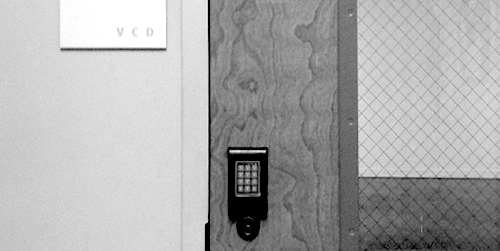
one of two entrances to room 247—the Visual Communication Design major studio in the University of Washington School of Art—both are locked at all times / photo taken 2008
A terrible economy. Personal pride. Do or die time. A real studio environment. Some brilliant competition. Real work experience. Real failure experience. Real life experience. An utterly unforgiving professor. A strong sense of potential. Total commitment.
I’m not sure exactly what the most motivating factor was for me as I went through “206,” the second of two screening classes the University of Washington Visual Communication Design program, used to select who could complete the next two-and-a-half years of the VCD program in 2001/2002. Whatever it was, that class marked a tectonic shift in my approach to design work. It was the second time I had made it into 206, and, likely, my last chance to make the final cut into the VCD major. In contrast to the first attempt, I felt no self-satisfaction in the step—just an unflinching focus on the next… Read the rest of this entry »
Filed under Content / Architecture, Copy / Writing, Industrial / Product, Packaging / 3-Dimensional, Photography / Film, Print / Editorial
Permalink
Posted: 02 Mar / 2008 at 1:57 pm

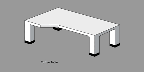
Coffee Table anticipatory web announcement; 500px. x 250px. + / 2001 (Click to see the announcement as it appeared on my web site.)
In my entire life, I have had the equivalent of about one cup of coffee, all before I was in high school. Lured by the sheer “adultness” of it, I wrapped paws around a few of those thick ceramic handles but my young palette was far too immature to appreciate the bittersweet complexity of the fabled bean and never did I finish a pour. I also have an annoyingly low tolerance for burning my mouth on hot things, which basically sealed that deal. When I was older and more likely to enjoy it (“coffee” had easily become my favorite flavor for anything that named it), I refrained from the temptation, prophesizing that it could become an unwieldy daily expense, and boy, would I have been right.
Nevertheless, there is something so damn cool about coffee that I could never deny. Luckily for me, it has very little to do with the drink, itself. Coffee’s transcendence from mere beverage to cultural phenomenon is perhaps superseded only by that of alcohol, but coffee’s affect (and effect) bears a decidedly more conscious flavor: an enduring symbol of learned European Modernity, a catalyst for artists and philosophers exchanging roles in Bohemian cultural movements, an enabler of late-night epiphanies and an antidote for the mornings after. A solitary indulgence or a shared experience for the aware.
The objective devotions to the ritual of coffee are as deliberate and rich as the blends. Enormous, industrial machines used to whistle down the most potent formulae at a preciously drizzling pace, sculptural carafes of glass, aluminum and plastic, and of course the myriad cups. But the piece most concretely symbolic of the dedication to all that coffee represents is its forum: the coffee table… Read the rest of this entry »
Filed under Industrial / Product
Permalink
Posted: 19 Nov / 2007 at 11:41 pm
I felt pretty proud of myself as I took my seat at the table of Art 206, the second of two screening classes for the Visual Communication Design major at the University of Washington. I was still cagey and wary of my new competitors—er, classmates—but my confidence was at the apex of an upswing after a final-project rally in 205 had put me on the list of 40-or-so students chosen to continue the screening process (from around 150 initial applicants in the previous class).
Art 206 was set up very similarly to Art 205, in that there were three consecutive projects, each having their own deadlines and a final submission requirement, and that the exact same three projects had been assigned for many, many years prior. The only ostensible difference between this class and its predecessor was that we were allowed to use computers for our projects if we so chose (which, as any designer or educator knows – even today – is more often a curse than a blessing).
The projects for 206 were also more complex than those of 205. The first, in the tradition of great European civic programs, was a postage stamp that was to showcase some aspect of an assigned state of the U.S. The second project delved into the third dimension, as we were to create a unique packaging solution for 24 Berol colored pencils. The third was to be a poster / informational mailer for the Burke Museum, conveniently located right on the UW campus… Read the rest of this entry »
Filed under Industrial / Product, Print / Editorial
Permalink
Posted: 14 Oct / 2007 at 7:36 pm

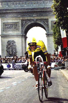
The ultimate inspiration: Greg LeMond (here on his way to winning the 1989 Tour de France). photo by Cor Vos
I’ve always been interested in cycling to some extent. I always rode bikes, and even before my teens, I watched big races like the Tour de France when they were on TV, and I spent my fair share of time staring at the top shelves of local bike shops and fogging up their display cases. This—unlike most—was an interest that grew steadily stronger with age. But it was an ironic turn of events that launched me into a full-blown obsession with cycling: I got hit by a car while riding my bike.
I was commuting to high school sophomore year on my Specialized CrossRoads Cruz hybrid bike (about $250 new, then) and, as I rode across a busy intersection, I was struck by a Volkswagen Scirocco (one of my favorite cars at the time), whose driver had run a red light in the rush of the hour. The impact instantly broke both of the bones in my lower left leg (although I didn’t realize this until I tried—and failed—to walk away from the scene). It’s said that people can’t recall the actual sensation of pain, but I can say with absolute certainty that having to move my broken leg into several different positions on the X-Ray table later that day was the most excruciatingly painful experience of my life. The breaks also ran perilously close to the bones’ growth plates and, if they had been damaged, this situation would have been even worse, as I still had a good six or seven inches to grow. This was not the last time that I would get hit by a car, and it’s not an experience that I would recommend to anyone, but there is usually one considerable upside: the insurance settlement. On top of paying for all of my medical bills, the sum allowed for the purchase of my first bona-fide road-racing bike: a Cannondale R900 (about $1,800 new, then).
Since they are so expensive and complex (especially compared to, say, a basketball), just getting a good bike can be a hurdle high enough to trip up a considerable percentage of potential racers and enthusiasts. Clearing this hurdle allowed me to start racing, and it was also a huge factor in the procurement of my job at a prominent local bike shop. By the time I hit senior year, I was in cycling up to my eyeballs. I rode everywhere, all the time; I was on a team; I raced as often as possible (about 50 – 60 races per year); I worked on bikes with other racers and cycling aficionados at the shop; I read every magazine and brochure cover-to-cover; I watched video tapes of every European road race fit to be filmed; I went to bike shows and bike parties… Cycling had basically permeated every aspect of my life. It didn’t take me long, then, to figure out what I was going to do for my high school Senior Project.
The parameters of this assignment were relatively broad and simple: write something, do some community service, or create some kind of artwork. The project was to take at least 40 hours (all outside of school), and it would count for approximately half of that year’s grade for my two most important classes. The goal was equally simple and daunting, as laid out by my professor—a quite scholarly Scott who had been a quadruple-major university graduate, among many other improbable accomplishments: “Impress me.” I figured that there was no way I was going to impress anyone without at least impressing myself, and the most impressive thing I could think of was to build a bike… Read the rest of this entry »
Filed under Identity / Systems, Industrial / Product, Type / Fonts
Permalink
Posted: 15 Sep / 2007 at 8:33 pm

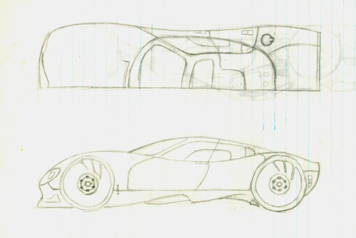
one of my later car drawings: a four-door sports car; half-top and side views; pencil on notebook paper / drawn age 12 or 13
I always knew that I was destined to be a designer, but not necessarily a graphic designer. In fact, I didn’t even know that graphic design was a “thing,” let alone a profession, until I was well into high school. My first love was with cars, and my dream job from as far back in life as I can remember – and for a very long time – was be the man behind their beautiful bodies.
There was no shortage of car-related excitement around my household growing up to keep me interested: There were all kinds of magazines about cars in the family room, meticulously-crafted plastic model cars on the mantle piece, the most important car races and movies about car races on the TV, posters of cars all over my room, radio-controlled cars that I drove out in the street or in the backyard, and spirited conversation about the latest car trends at the dining room table… Read the rest of this entry »
Filed under Industrial / Product
Permalink
