Archive for Content / Architecture

A Matter of Dimension
dpj_igarashi_poster

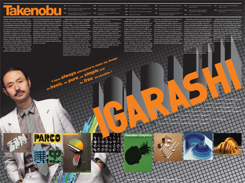
Takenobu Igarashi magazine spread retrospective; 24 x 18in. (spread) / 2002

A staple project of many university design programs is to create a poster or magazine spread or flyer or whatever that somehow highlights the work of a “famous” designer, and, for extra measure, to design it as they might have designed it. That is, to design the piece in said famous designer’s “style.” That we had this sort of a project in the VCD program at the University of Washington always struck me as very strange, as “style” was nearly as derided a word as “Hobo” in the UW VCD lexicon. After all, a good designer (let alone a “famous” one) shouldn’t have a style.

A good designer analyzes, digests and synthesizes various aspects of a particular project and distills from this process the most compelling way to communicate the intended message for that project. There is a not-so-subtle line to be drawn here, as using a particular vernacular can be very useful in communicating particular subject matter. For example, if designing a poster about how inner-city youth express their identity, using some element of graffiti might be a felicitous way to help illustrate this. However, if a designer used graffiti in every project, whether it be about inner-city youth or organic produce, then his approach no longer can be seen as appropriating a relevant style to communicate a message; he has now created his own “style” that is irrespective of the individual needs of particular projects. He is one-dimensional.

Though I only know what I know about Takenobu Igarashi, a “famous” designer in the 1980s and my assigned muse for this project, from books and magazines and perhaps an article or two posted on the Internet, it did seem fairly easy to pick up on his “style.” But the issue wasn’t that his projects were one-dimensional. The issue was that his projects were all three-dimensional. Igarashi, in fact, transitioned his focus toward product design and then architectural sculpture as his career progressed, and, one could imagine, this was really where he wanted to be the whole time… Read the rest of this entry »

Filed under Content / Architecture, Copy / Writing, Print / Editorial, Type / Fonts

Comments (4)


Cracking the Code


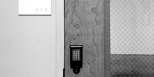
one of two entrances to room 247—the Visual Communication Design major studio in the University of Washington School of Art—both are locked at all times / photo taken 2008

A terrible economy. Personal pride. Do or die time. A real studio environment. Some brilliant competition. Real work experience. Real failure experience. Real life experience. An utterly unforgiving professor. A strong sense of potential. Total commitment.

I’m not sure exactly what the most motivating factor was for me as I went through “206,” the second of two screening classes the University of Washington Visual Communication Design program, used to select who could complete the next two-and-a-half years of the VCD program in 2001/2002. Whatever it was, that class marked a tectonic shift in my approach to design work. It was the second time I had made it into 206, and, likely, my last chance to make the final cut into the VCD major. In contrast to the first attempt, I felt no self-satisfaction in the step—just an unflinching focus on the next… Read the rest of this entry »

Filed under Content / Architecture, Copy / Writing, Industrial / Product, Packaging / 3-Dimensional, Photography / Film, Print / Editorial

Comments


There is No “Inc.” in “Team”


UBC monogram mark for Union Bay Cycling / 2001

A competitive cycling team, like all other kinds of teams, is a of a group of people with a similar interest; in this case, the team’s chief objective is to win bike races. The primary vehicle of a cycling team’s identity is the uniform that team members wear out racing and training. This identity is complicated, however, by the fact that competitive cycling is one of the very few sports in the world based on a sponsorship model, whereby commercial interests pay for some aspect of team operations in return for visible recognition on these uniforms. Almost invariably, this leads to a team’s identity being inextricably intertwined with the identity of their lead sponsors, which can change relatively frequently.

For example, most people would say that Lance Armstrong raced the last season of his career with the Discovery Channel team, and that, before that, he was on the U.S. Postal Service team for six years or so, even though these were, for all intents and purposes, the exact same team, managed by Tailwind Sports.

Union Bay Cycling (UBC) is a large Northwest cycling organization built around an elite-level team that races in local, regional, and national events at the pro/am level. UBC has been around, with the same leadership and core group of riders, for over a decade, but major sponsorship changes had made it seem like three or four disparate and relatively short-lived teams. For UBC, I worked with the team director to develop a long-term solution: a core identity system that accommodates prominent and unique recognition for lead sponsors, but embodies the unique heritage and dynamism of the team riders and stays consistent even with major sponsor changes.

I began with the UBC monogram mark (above) that would immediately identify all communication touchpoints of the team: stationery for proposals, press releases and other correspondence, the web site, T-shirts, gear bags, and so on, and, of course, the all-important team kit, including jerseys, shorts, socks, water bottles, gloves, helmet graphics, and several other tertiary clothing articles.


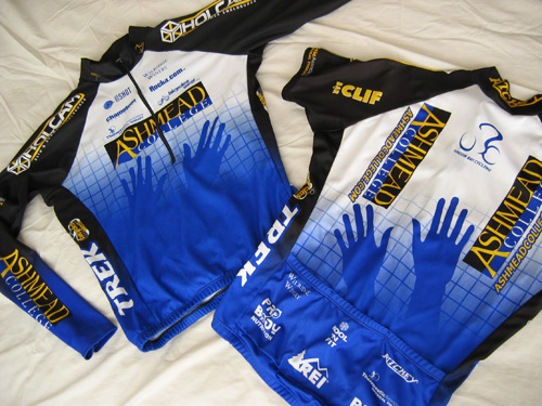
Union Bay Cycling jerseys (long-sleeve front | short-sleeve back) / 2003; I also happened to have designed the Holcam logo on the jersey shoulders (but not their web site) / 2001

The blue grid, an established device of the team, was reworked and became the foundation of this flexible system. The title sponsor was rewarded not only with the most prominent logo presence, but also with an expressive element emerging from the grid (in this case, the hands of Ashmead College, School of Massage), and other sponsors fit into pre-established hierarchical slots based on their respective levels of contribution…
Read the rest of this entry »

Filed under Content / Architecture, Copy / Writing, Identity / Systems, Interactive / Web, Packaging / 3-Dimensional, Print / Editorial, Uniforms / Apparel

Comments (2)


« Previous Page