On Words
August 28, 2011 at 5:19 pm · Filed under Content / Architecture, Interactive / Web

Is all this really necessary? For everyone? All the time? Microsoft Word 2003 window, new document; shown approx. 50% actual size
For something with such a simple purpose, and an even simpler name, Microsoft Word sure does seem complicated. From the moment a user opens a new document until they finish—a three-word note or a three-thousand page novel—they are surrounded by an acerbic cadre of mismatched toolbars, icons and menu options. The vast majority of these are never used. Many of these never should be used. Most people using Word don’t need to do complex math equations or manage mail-merge settings, they don’t need hundreds of oddly-colored warped lettering options and they don’t need to create a web page; they need to write a paper.
As part of a cooperative workshop one of the Visual Communication Design professors at the University of Washington set up with one of Microsoft’s design leaders, the few of us who chose to participate were asked, “What should Word be like?”
DPJ Word interface mockup, new document; 1024 x 768px + / 2004
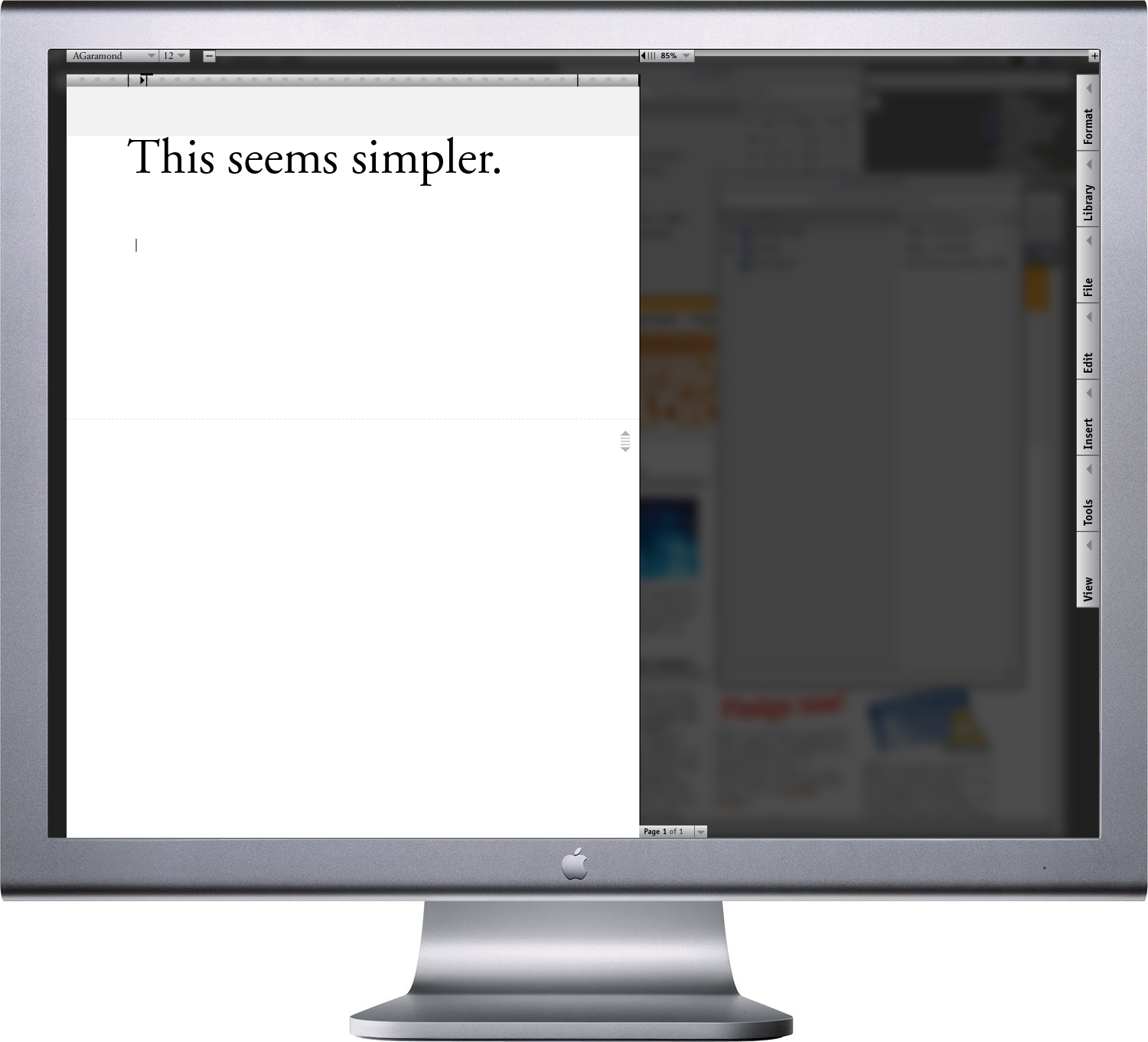
Writing often requires intense focus. The primary goal of my prototype was to provide the least distracting, most intuitive and flexible interface for paper writing, editing and reading, while integrating simpler navigation of documents large and small…
In this prototype, every element has been made to recede from the page. There are is no complex application background. Rather, the page, itself, rests on the user’s desktop, which has been unfocused behind a dark screen. From the top menu, The user can select type style and size and page margins and tabs from the top menu when they start their draft, and that’s pretty much it.
One obnoxious aspect of typing in Word (or virtually any other computer program) is its awkward page scrolling in response to adding content: You have to follow your type all the way to the bottom of the page, then the page jumps to reveal the very last line at the bottom of the page from there on out. To further enhance the writer’s focus in this prototype, a translucent screen could be set to the height at which the line being written or read is always positioned and the pages would scroll smoothly behind this line as one types (similar to how one would interact with a typewriter). As one types well into their first page, it scrolls up and over the top font and type size menu (since that is probably no longer needed) and the next page comes up below it.
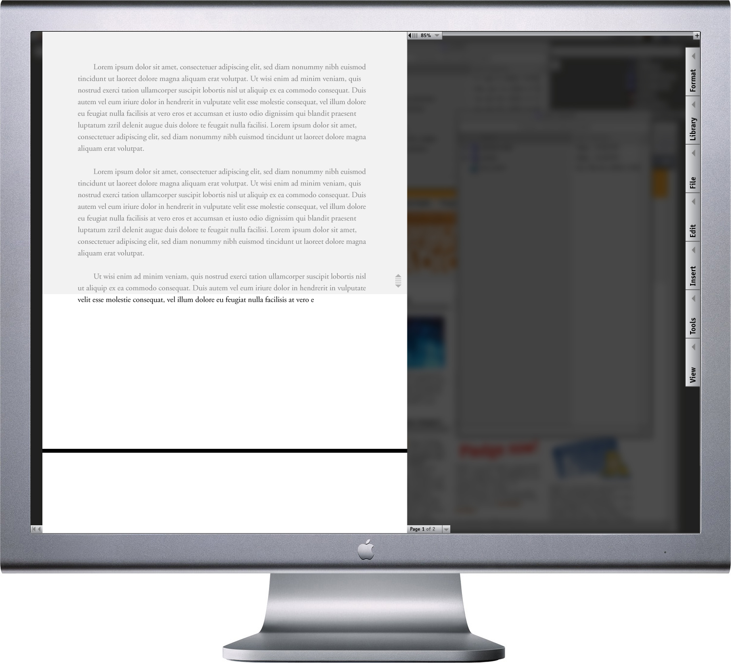
DPJ Word interface mockup, page 1 of 2 in document, focus screen set to reveal one line of type in the middle of the page; 1024 x 768px + / 2004
As multiple pages of content are written, they would be added behind the focus page in virtual space, so the user would always have a general idea of how long their work is.
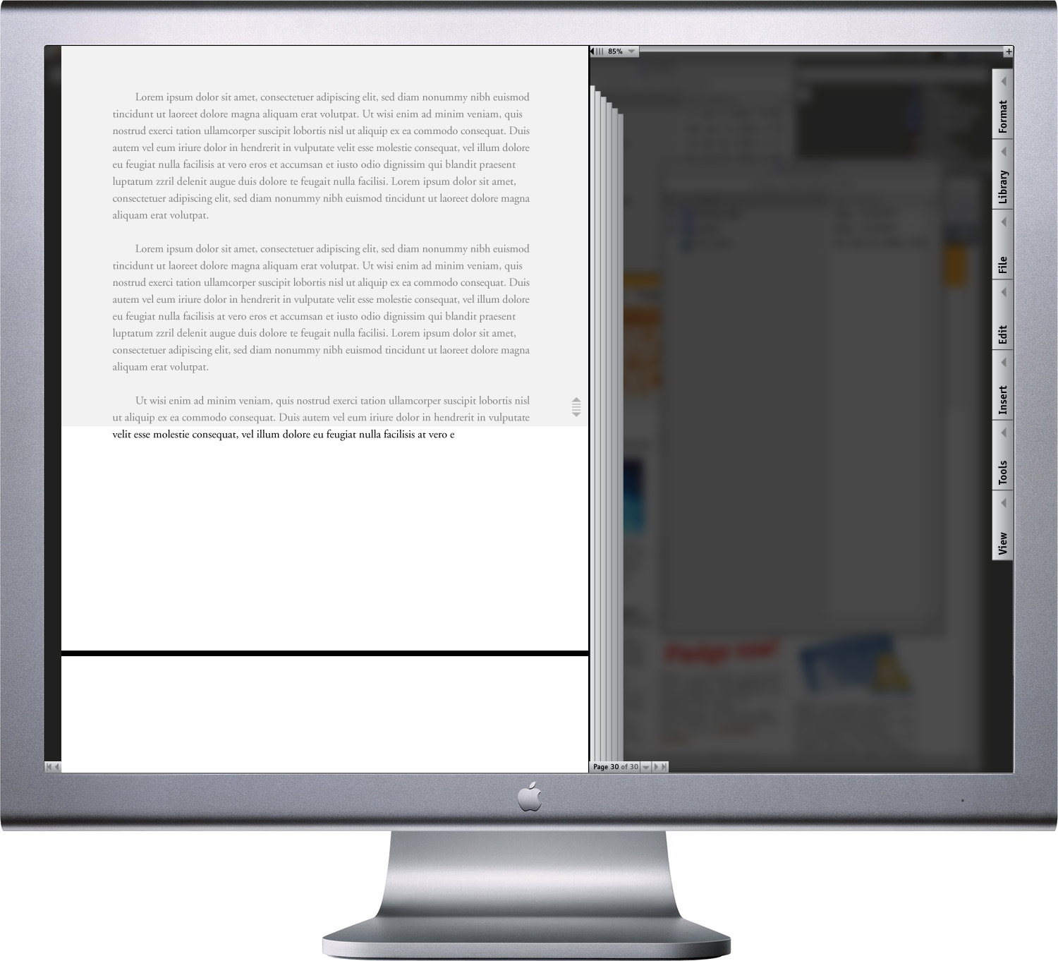
DPJ Word interface mockup, multiple-page document, focus screen set to reveal one line of type in the middle of the page; 1024 x 768px + / 2004
Now, just because there are very few options at the top of the page, that doesn’t mean the added functionality of Word would be eliminated. In fact, there could be more—or at least more useful—tools available. These more advanced functions have just been moved into vertical tool “drawers” to the right of the screen to maximize vertical real estate for the page. These drawers could be pulled out independently to view the full list of related capability.
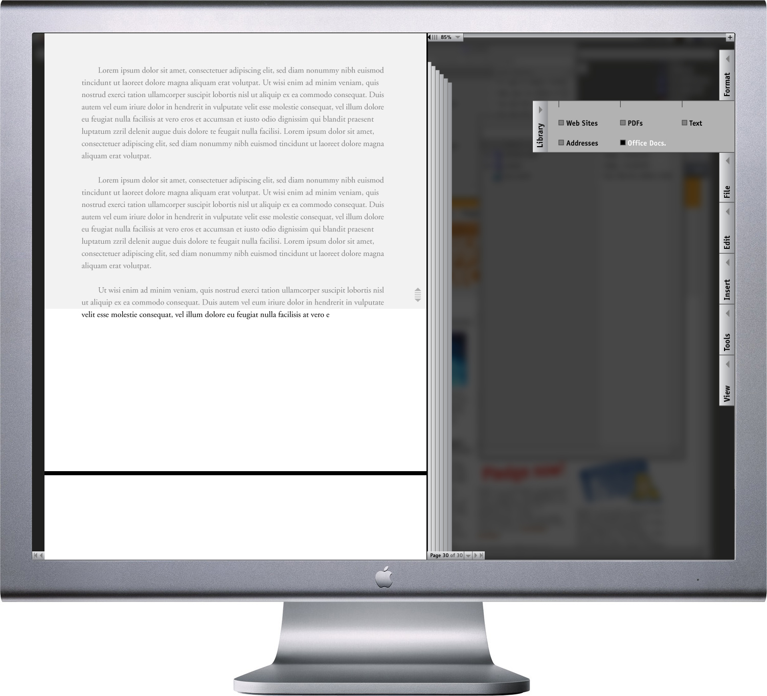
DPJ Word interface mockup, multiple-page document, focus screen set to reveal one line of type in the middle of the page, “Library” tool drawer pulled out; 1024 x 768px + / 2004
One or more tool sets could be clicked open to be viewable at all times, or drawers could be pulled out completely and positioned organically in the work area.
DPJ Word interface mockup, multiple-page document, focus screen set to reveal one line of type in the middle of the page, “Library” tool drawer detached and placed in work area; 1024 x 768px + / 2004
If a user wanted to reference another source of content for their document, they could click on the option from the “Library” tool set and the page and menus would slide off and the background screen would dissolve, so the source could be searched for in the actual desktop environment, instead of by an abstracted dialogue menu (if desired—the standard menu placement interface could also be used).
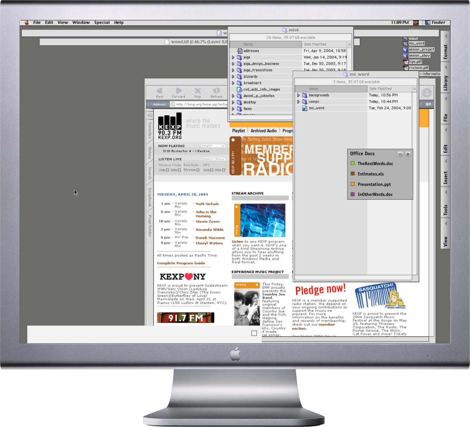
DPJ Word interface mockup, desktop Library search mode; 1024 x 768px + / 2004
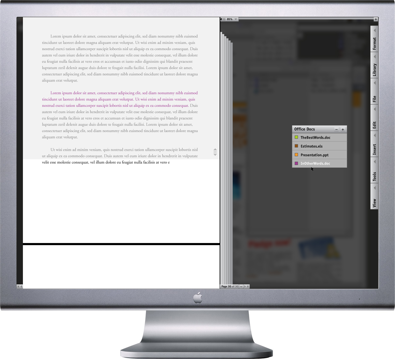
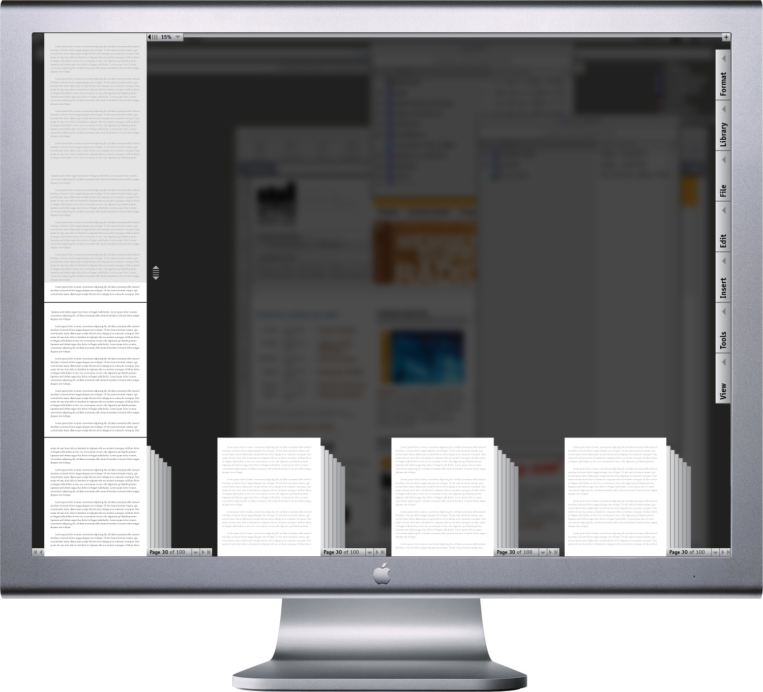
As a user went through a larger document, they would be able to tag words, passages or pages with notes to themself, their editor, vice-verse, and so on, so they could call attention to a particular point, further research a topic or at least avoid repeating themselves.
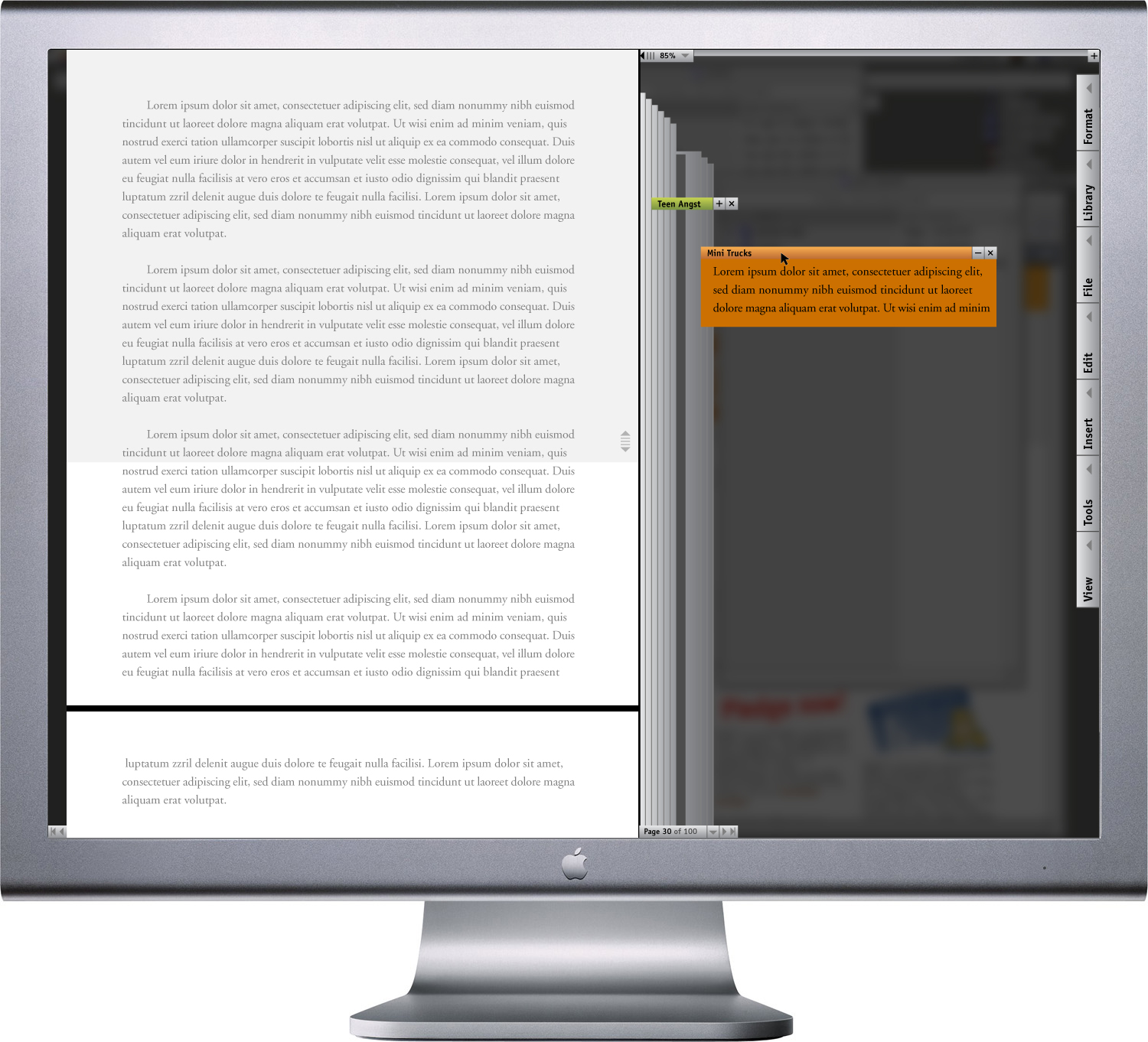
DPJ Word interface mockup, page 30 of 100, note flags visible with one clicked open
; 1024 x 768px + / 2004
Though much of my efforts were trained on removing unnecessary tools, I did make one very notable addition: the magnification slider. At the top of the screen is a track with a positioner that aligns to the right edge of the page. Sliding the positioner right or left—either manually or by keying in the desired percentage—would increase or decrease the magnification of the document, making the interface is equally ideal for writing, editing or reading a one-page report…
DPJ Word interface mockup, one page document, focus screen set to reveal one line of type in the middle of the page, magnification positioner slid all the way to the right for maximum magnification; 1024 x 768px + / 2004
… or a 500 page novel. Sliding the left would allow quick jumps between pages or even chapters. Tapping a page would bring that up to the default magnification for writing or editing.
DPJ Word interface mockup, multi-page document, focus screen set to reveal all lines of type below the middle of the page, magnification positioner slid all the way to the left to view long document in “chapter” sets for quick navigation across hundreds of pages; 1024 x 768px + / 2004
Side note:
It is interesting to see that MS Word (and PowerPoint) now feature magnification sliders that will allow you to see multiple pages in your document when you zoom out (this feature did not exist in 2004 when I designed my prototype):
Microsoft Word 2011:mac interface, multi-page document, magnification positioner slid out to “84%” / 2011
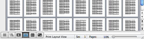
Microsoft Word 2011:mac interface, multi-page document, magnification positioner slid in to “10%” / 2011
However, since Microsoft’s slider’s correlation to the page display is so abstracted (it’s a short track in a separate toolbar, not aligned to the page in any way), its use is clumsy and unintuitive. And, without clear labeling or grouping of pages, or the ability to zoom back in on a page in the zoomed out view by just clicking on it, the potential for faster broad-jump navigation is all-but-lost.
Now, back to my story…
The essential idea of a much more simple interface drove my design from the beginning. But there were a few variations on the theme I explored along the way that would make for an experience more familiar in the context of physical reality or further abstracted and function-focused.
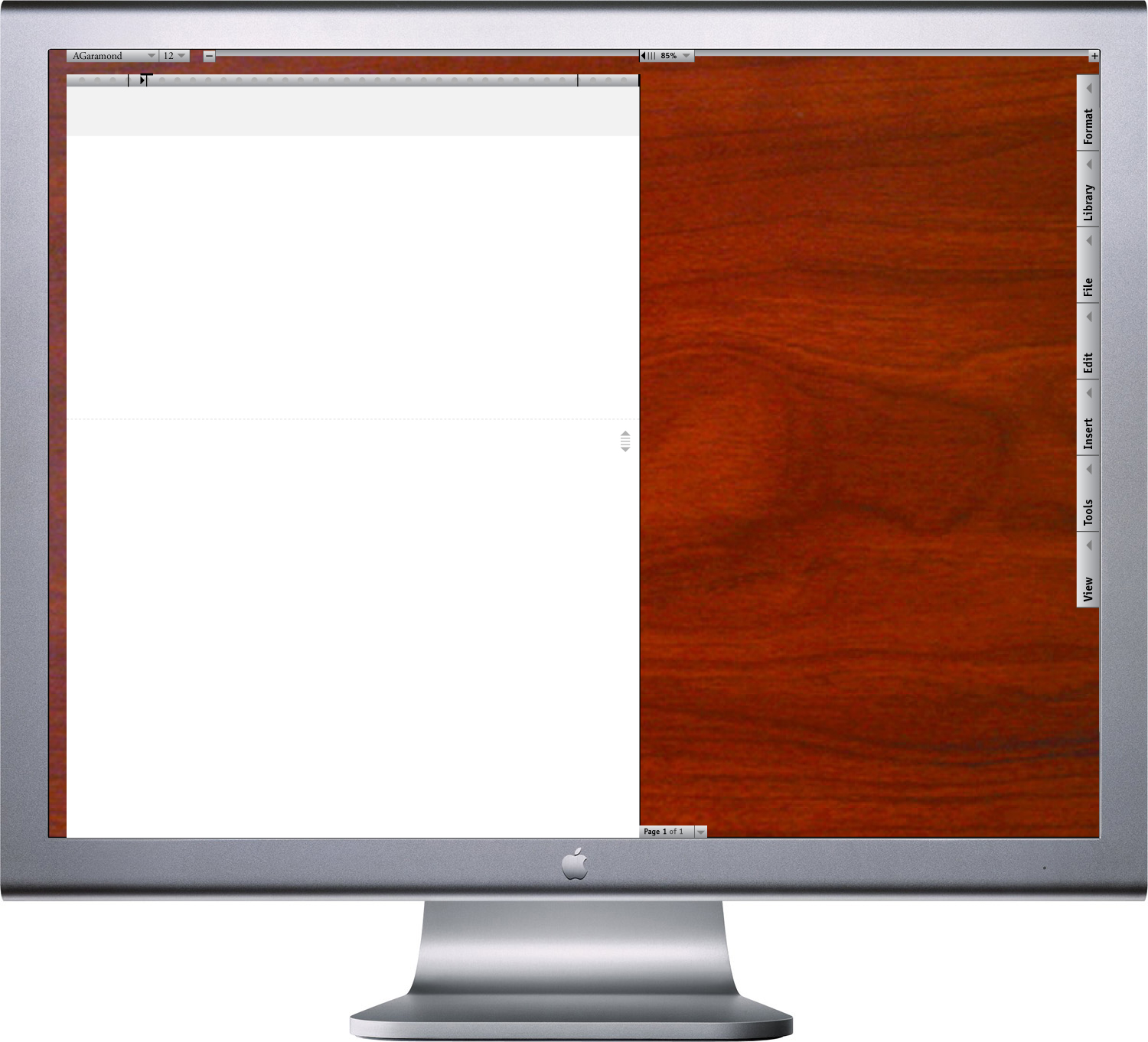
DPJ Word interface mockup, new document, cherry wood desktop / metal work area setup; 1024 x 768px + / 2004
Originally, I envisioned the most intuitive interface known for writing or editing a paper: actual paper, on a desk. A cherry wood desk would be nice. I imagine that this sort of background could be one in a library of preferences.
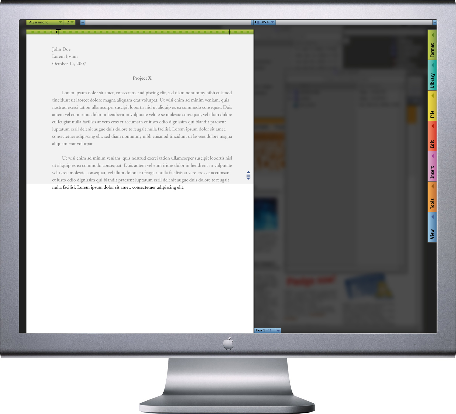
DPJ Word interface mockup, new document, colored interface tool work area setup; 1024 x 768px + / 2004
On the other end of the spectrum of preferences could be a version almost completely detached from reality. In this setup, tools are highlighted for maximum contrast between the document and the interface.
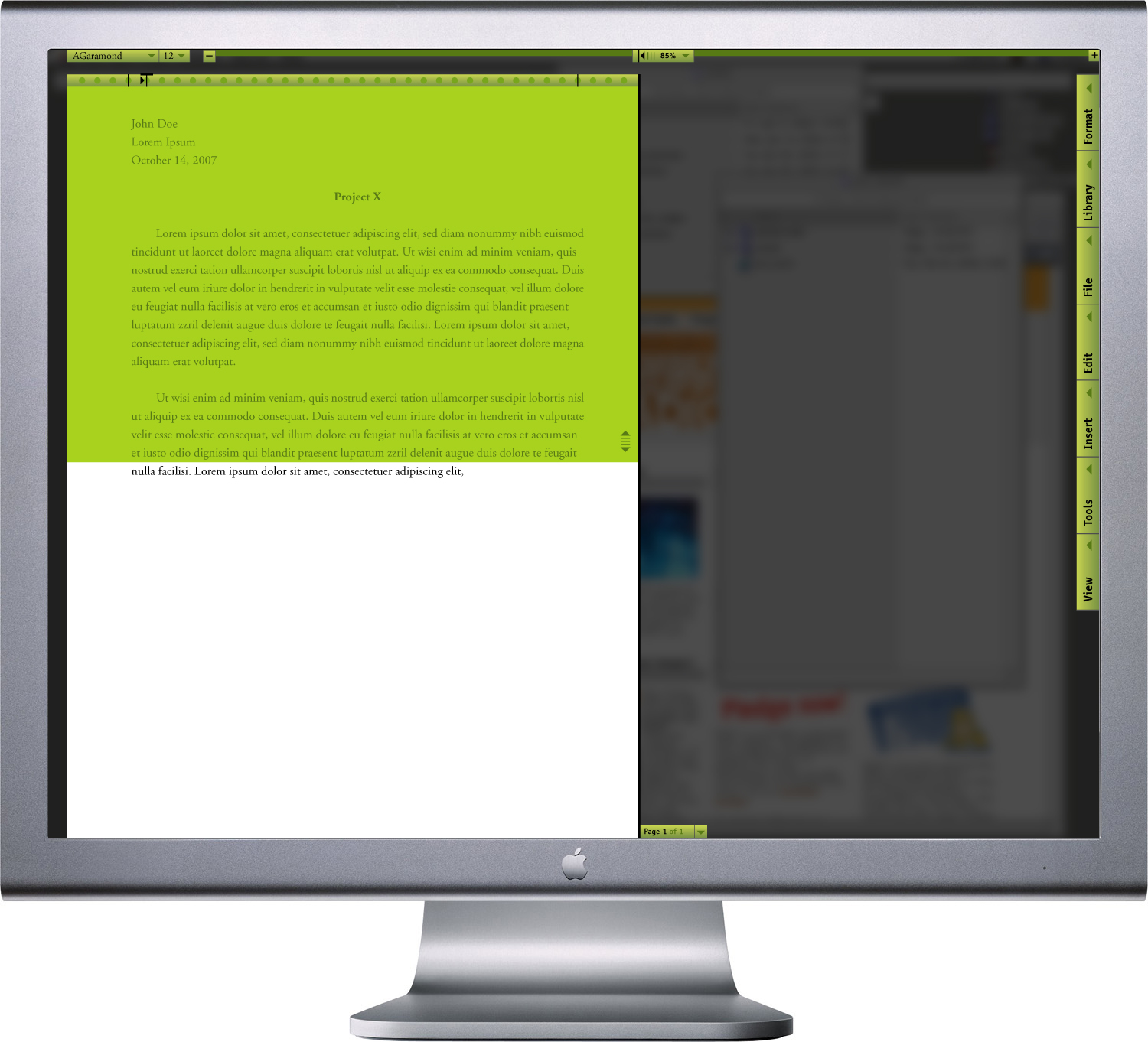
DPJ Word interface mockup, new document, color-coded interface tool work area setup; 1024 x 768px + / 2004
Or, the user could choose to differentiate between different types of tools through color-coding. So, interface elements that related to Format would all be coded in green, view options in green, and so on.
As of 2011, Microsoft’s default Word interface is still a clunky, overbearing mess, even if the general aesthetic is slightly less caustic and the organization of toolbars has begun to become… organized.
More interesting to me are features Microsoft has added to Word that happen to swing dangerously close to the experience I proposed in 2004, if not quite landing a serious punch as yet.
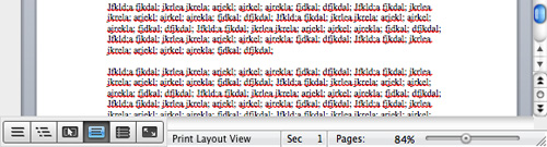
Aside from the new page magnification slider, there is now a “full screen” mode that hides all but the most basic formatting options, allows for notes on the side and takes into account both writing and reading. Sound familiar? But, like the slider issue, this, too, seems disconnected: You enter into a claustrophobic other-world, shut out from the rest of your computer, in which only those few tools are available. The pages are immobile and isolated; there’s no simple visual cue as to how many one has written, past two.

Microsoft Word 2011:mac interface, full-screen mode, 137 page document / 2011
In some way, Microsoft’s new features seem to signal change for the better. On the other hand, it’s really just more of the same “more is more” approach that has plagued user experience since the beginning of time, and in many of Microsoft’s efforts. By just adding yet more, mutually exclusive options and not committing to a single, seamless user experience, the new view modes just seem like novelties. People who have to write a paper don’t need to think about how to use novelties. They need to think about what they’re going to write.
