What Happenned?!!
April 18, 2011 at 9:18 pm · Filed under Content / Architecture, Copy / Writing, Information / Mapping, Interactive / Web, Naming / Words
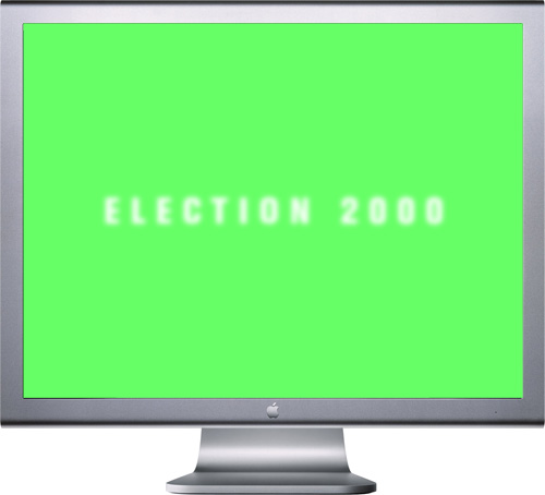
Election 2000 introductory screen; Flash interactive interface; 1024 x 768px. / 2004
All U.S. citizens are deeply affected—for better or worse—by the president in office. However, very few people know the intricacies of the presidential election process. This is not surprising, as it is super freakin’ complicated. The problem is that most are too jaded to care, even when their country is on the line.
For Interaction Design, one of the Senior year courses in the University of Washington Visual Communication Design program, we were given the task to explain the unexplainable to your average ignorant know-it-all who doesn’t want to be explained to. The aim of this project was to create an interactive interface to help inform the average high-school or university student about the United States presidential election process. As with several classes before, the project was divided into two distinct phases: In the first, we worked in groups to research the process and the various forces involved and brainstormed different interpretations thereof. In the second phase, we set off individually to define and create interactive Flash-based demonstrations of our particular concepts.
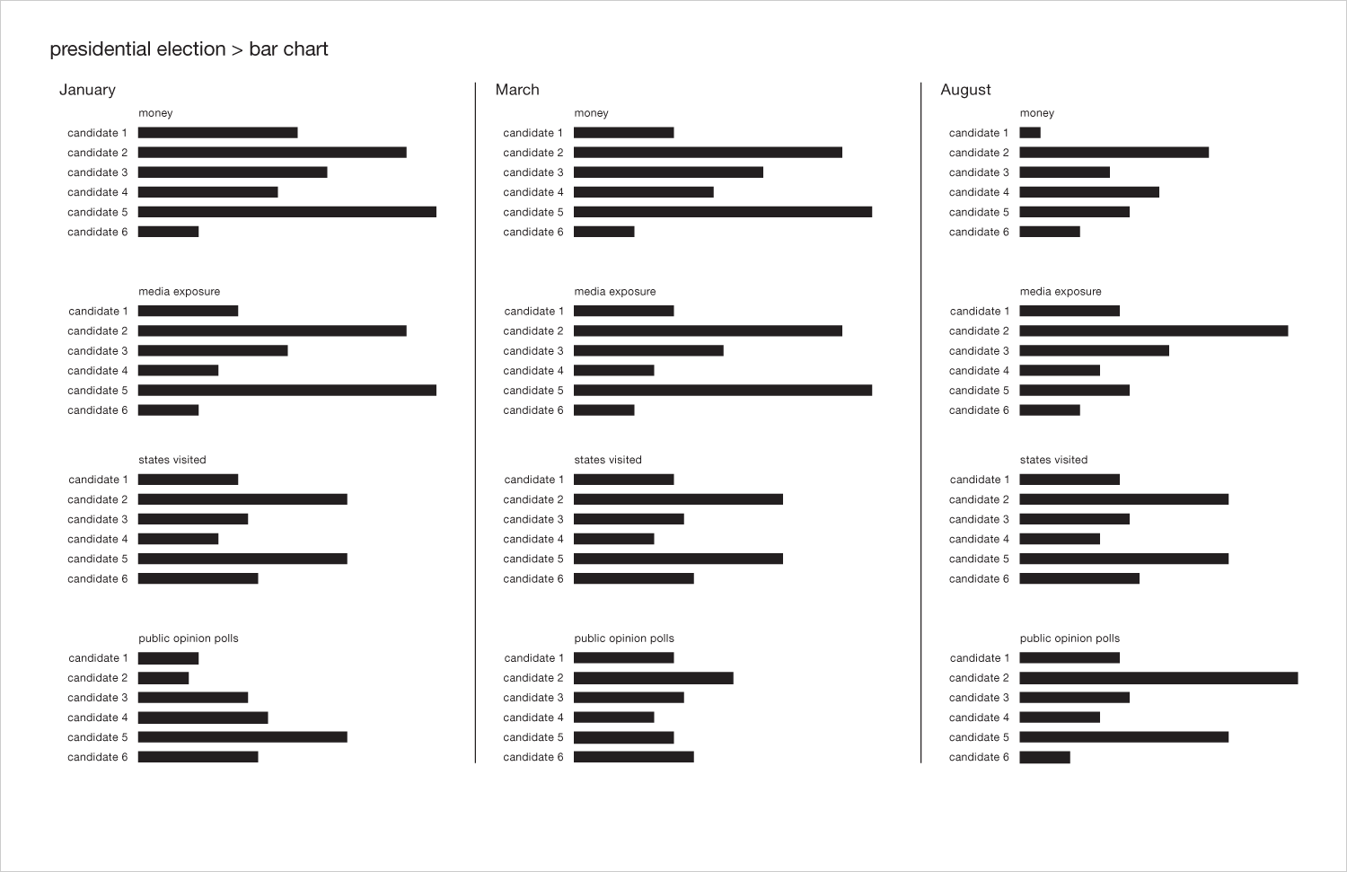
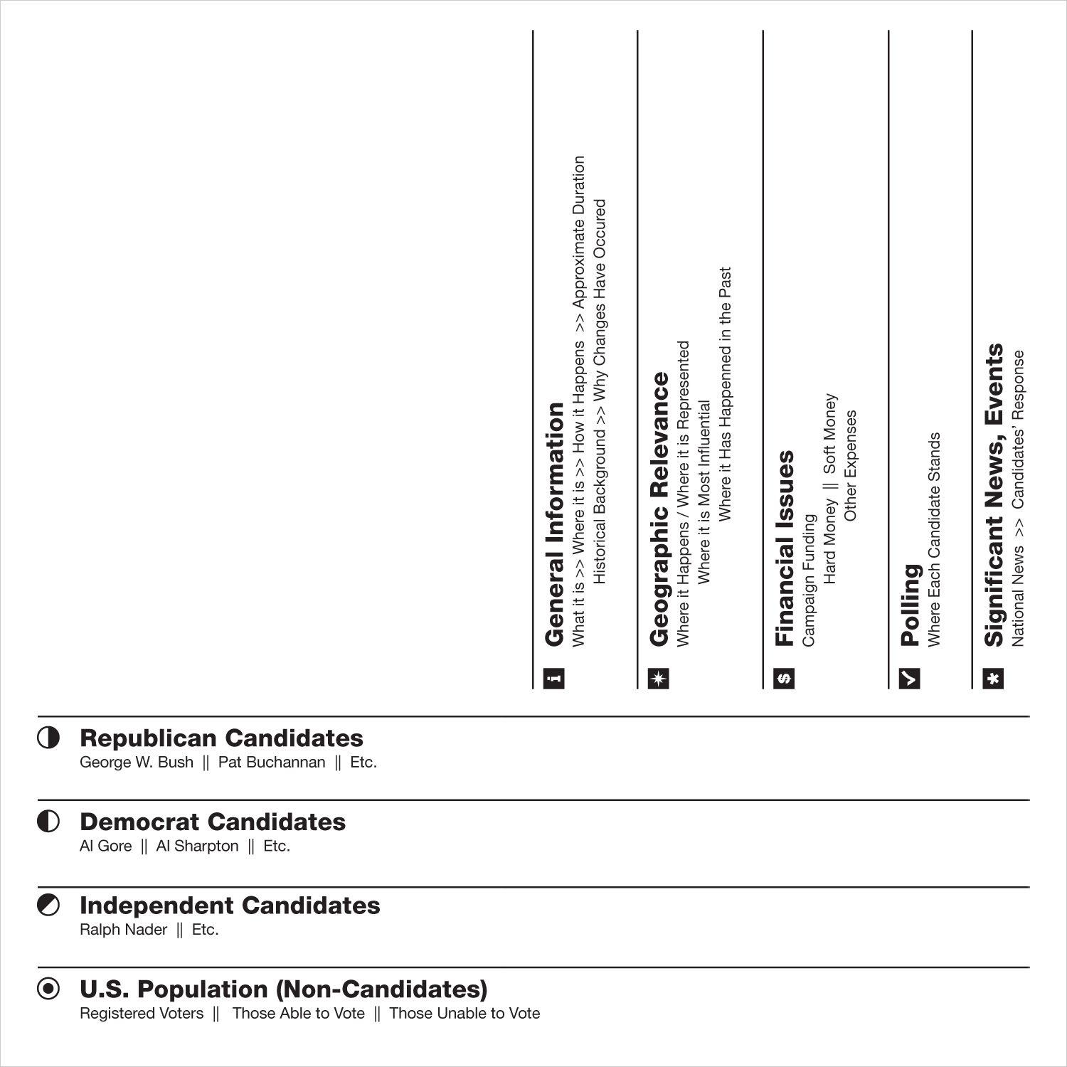
I had the good fortune of having three brilliant brains with whom to storm in phase one: Stephanie Cooper, Luke Jung and Tim Turner. As part of our comprehensive research process, we developed various interpretations of how the presidential election could be understood. We first set out to describe the components, both legal and otherwise influential…
[roll over images to enlarge]
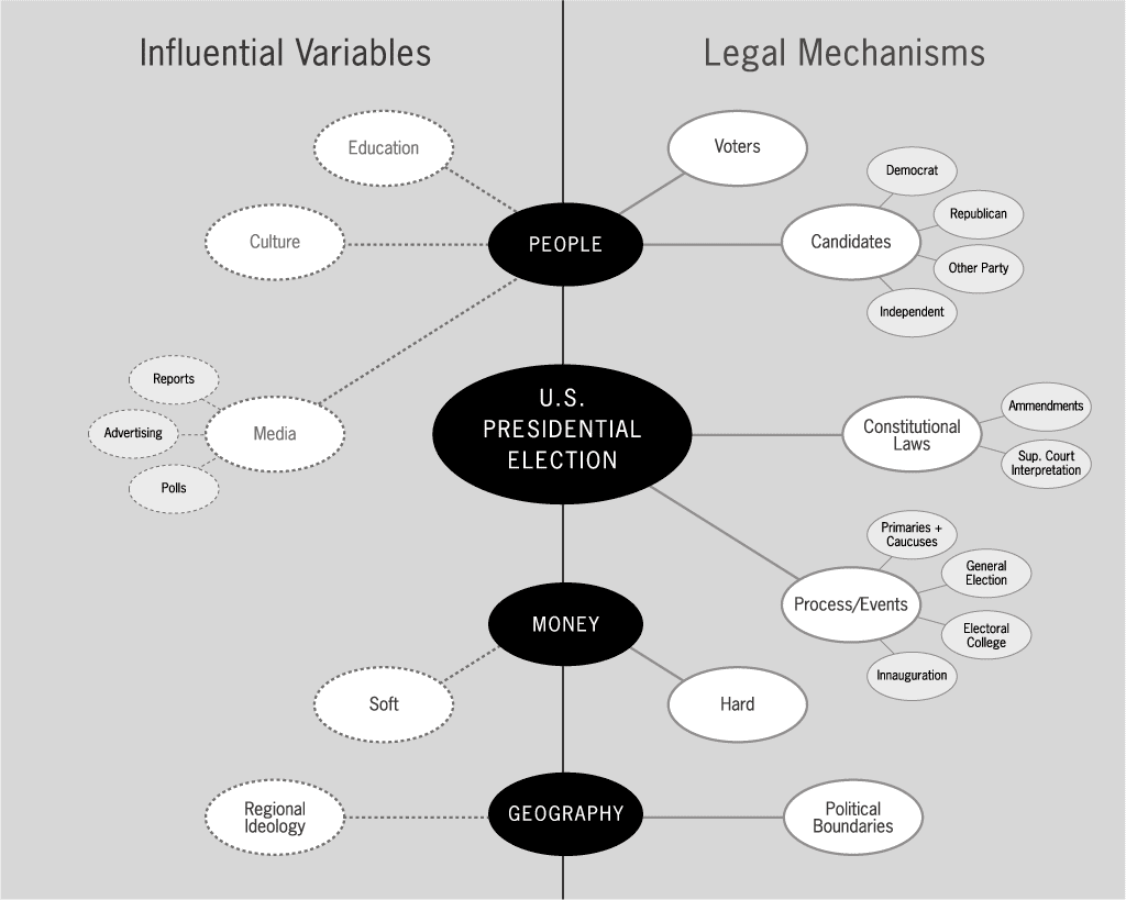
U.S. presidential election variables, influential and legal; digital output; 11 x 8.5in. / 2004
We then divided the country (as elections do so well) to figure out how the importance of different factors were distributed geographically…
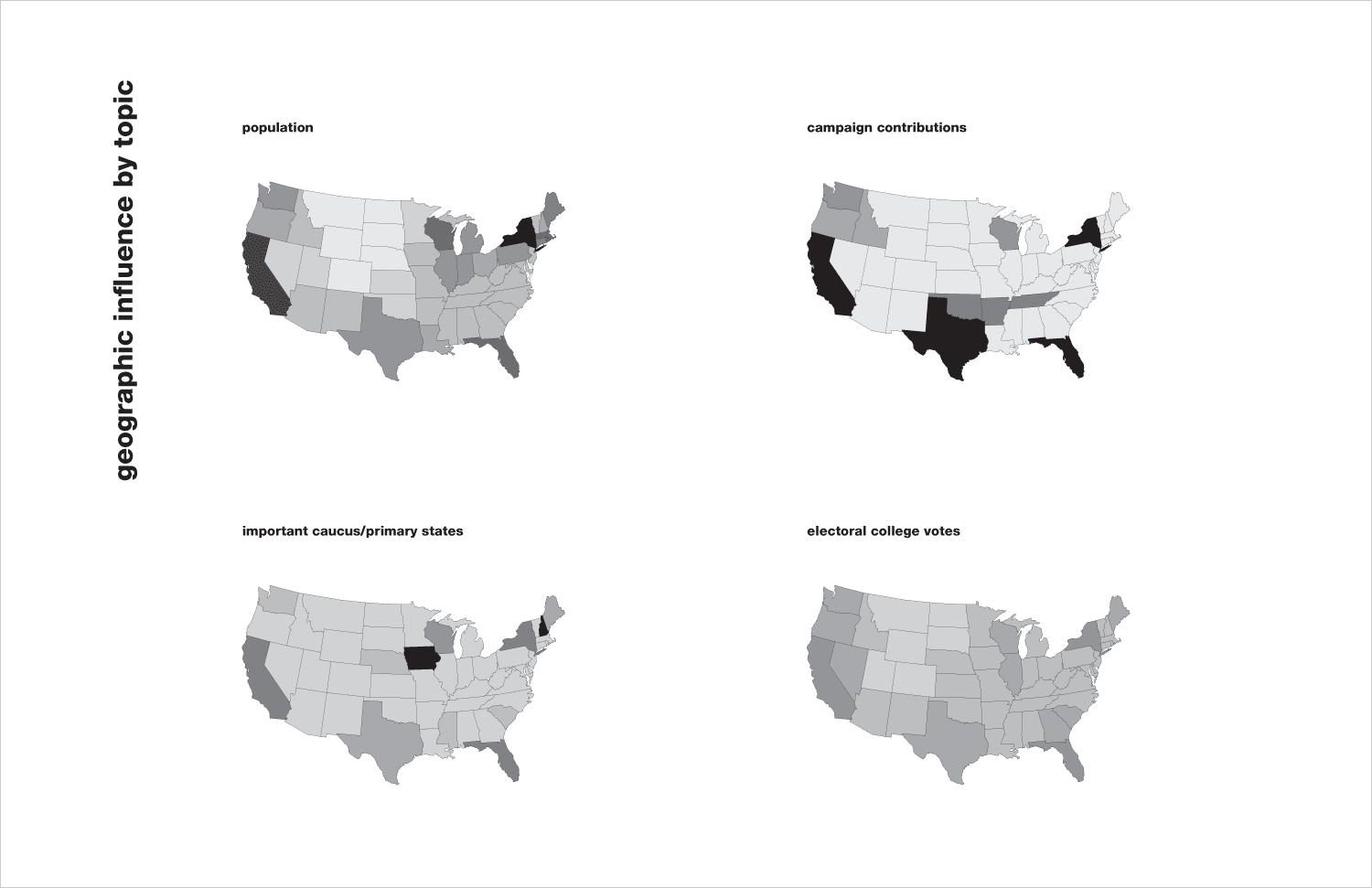
U.S. presidential election influence by geography; digital output; 17 x 11in. / 2004
We thought about how different issues become important and unimportant to constituents as days months and years turn into eras…
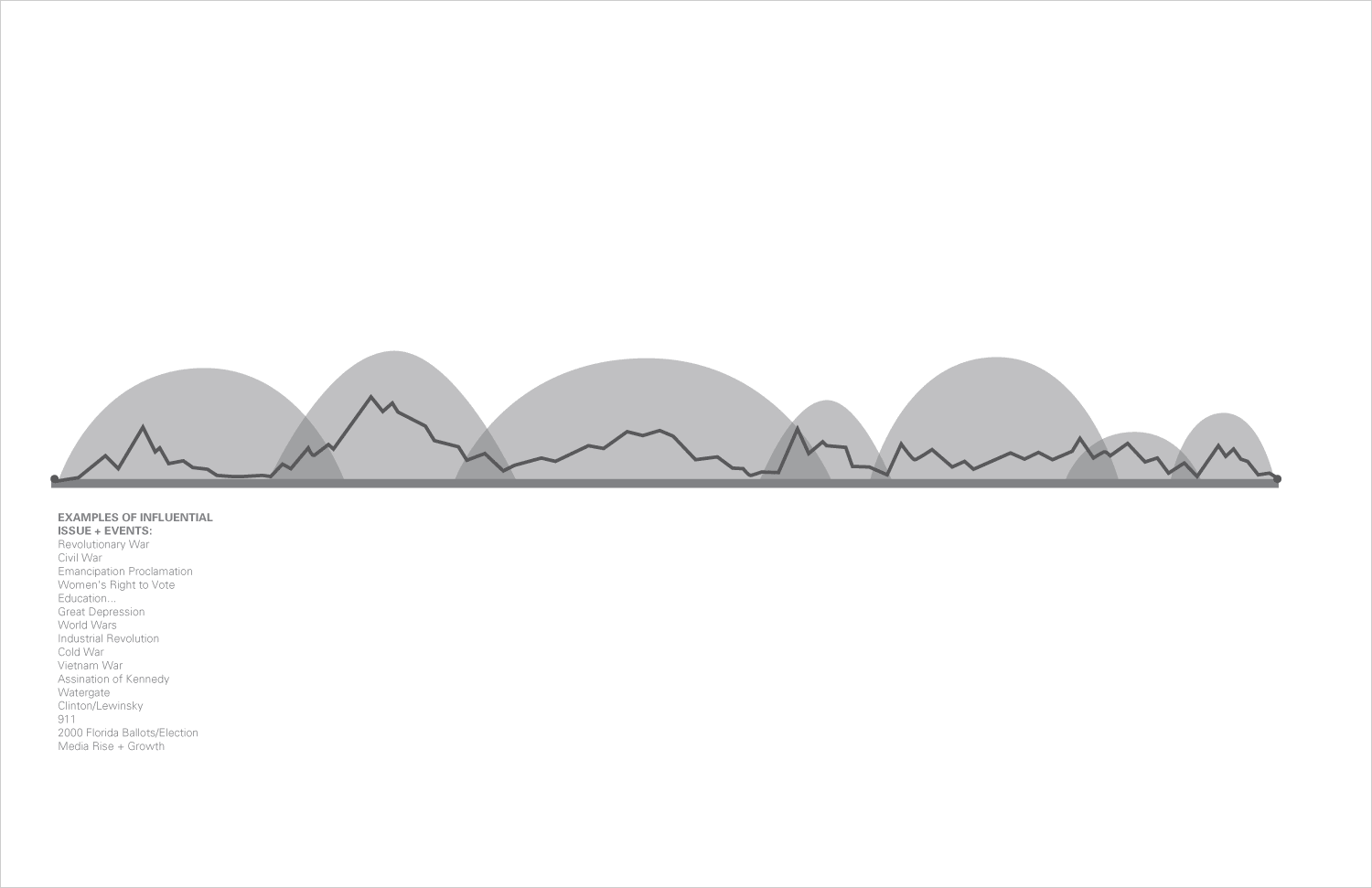
the evolution of important issues in U.S. presidential politics; digital output; 17 x 11in. / 2004
And how dramatically the face of a candidacy can change through just a few months of an intense campaign season, and thought about how shifts in different variables or combinations thereof could affect the big picture…
influential factors of the U.S. election process over time; digital output; 17 x 11in. / 2004
But we also noted that the face of the winning candidate hadn’t really changed at all in decades (as of 2004)…
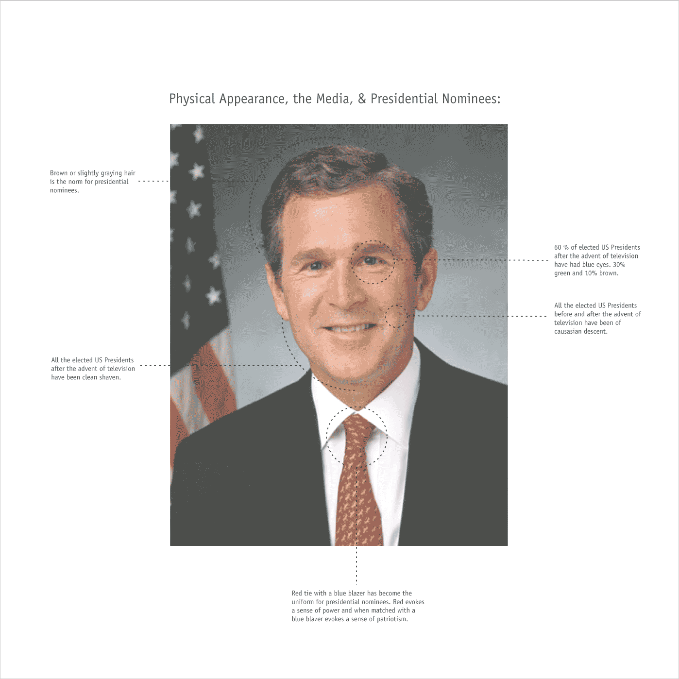
physical appearance trends among recent presidents; digital output; 8.5 x 8.5in. / 2004
We thought about the thing in the back of people’s minds as they cast their votes (consciously or not)…
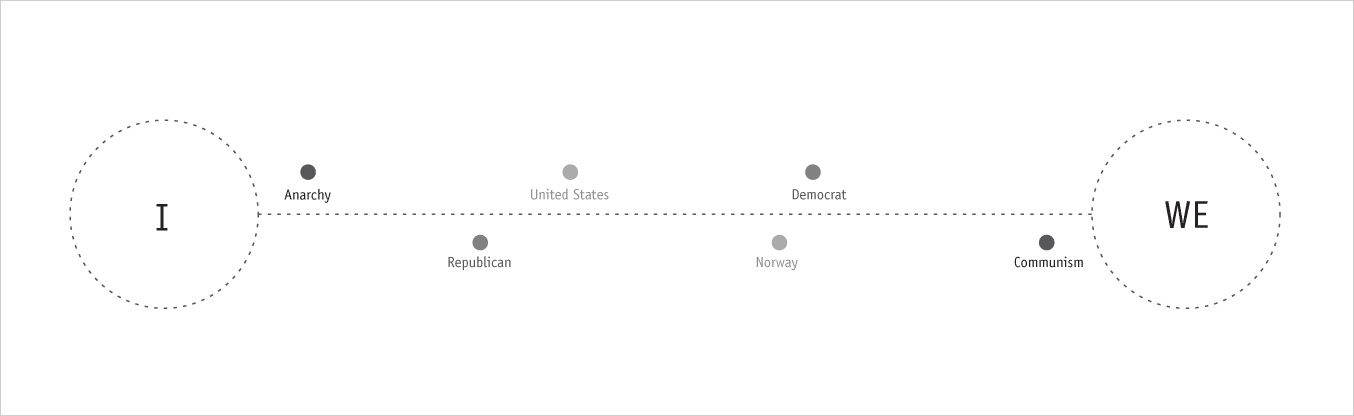
government ideology, between “I” and “we”; digital output; 11 x 3.5in. / 2004
And we analogized candidates’ tendancy toward ideological extremes in the beginning—to establish that they are “different” and true—followed inevitably by significantly tempering their platform as the process goes on in efforts—to broaden their support base. Once they get in, there is often another shift that many don’t anticipate.
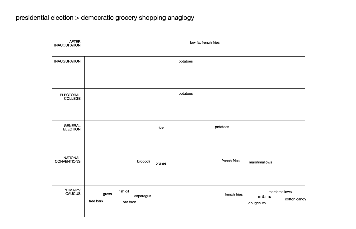
comparing the U.S. presidential election process to grocery shopping; digital output; 17 x 11in. / 2004
With all this drama, we wondered what would motivate a registered voter to actually vote.
what motivates people to act; digital output; 11 x 11in. / 2004
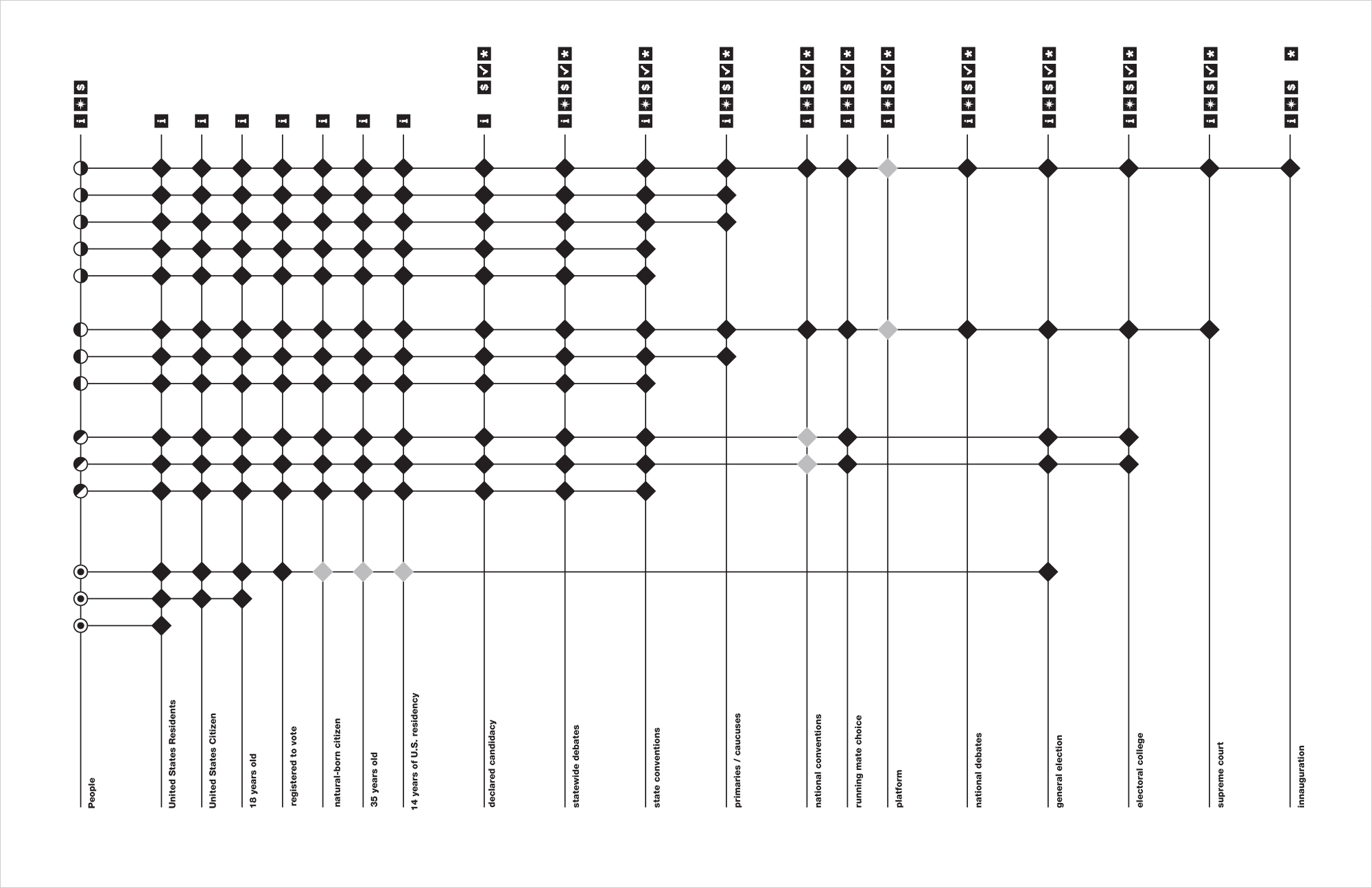
All the while, we had been digging into the real, legal parameters of the U.S. election process to try to make sense of it all. After distilling, simplifying and paring down as much as possible, then using the smallest type sizes that would still be legible, we were able to fit it all onto a page. A page that is about four feet long and two feet high…
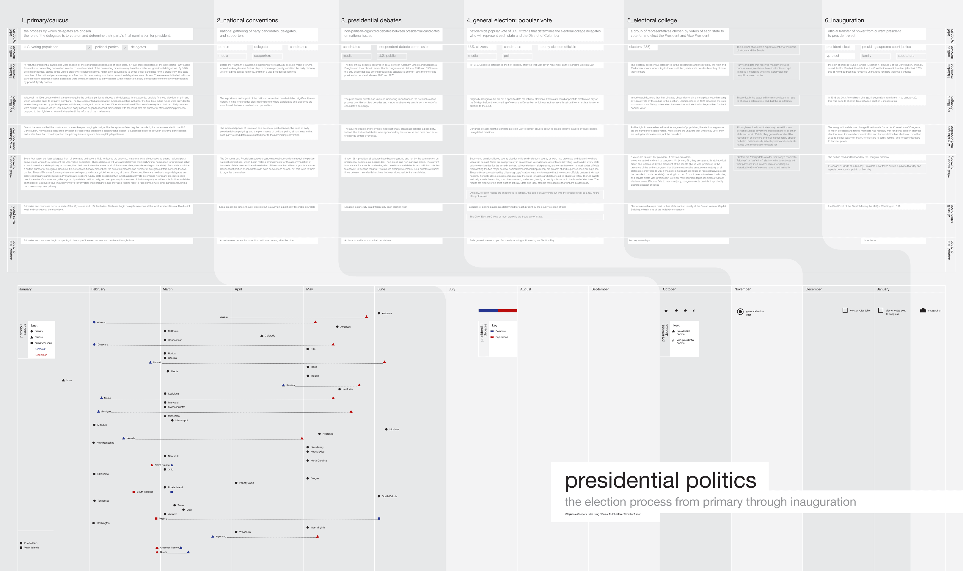
Presidential Politics poster; digital plot output; 45 x 26.5in. / 2004
From here, it was off to the races, so to speak. We each took our foundation and built our own concepts. My idea was to focus on the 2000 election as a case study. My thought was that, by focusing on such a recent election (at the time), users would be able to learn more about certain events that should still be fresh in their minds, and correlate them to the legal aspects of a standard election process. Moreover, by focusing on such an odd, controversial election, users would have the opportunity to learn about the most obscure of contingencies and contemplate just how valuable their individual contribution to the process can be, even if it is just in a single vote.
The first task was to design a concept map of our intended experience. I thought the relative power of different categories of the population as different factors came into play through the campaign and election process would be an interesting construct on which to build my user path, so I first set out the parties and the variables…
2000 election interactive educational experience concept map (key); digital printout; 8.5 x 8.5in. / 2004
…and then laid out their interactions over the course of the process. The one who got the farthest, won.

2000 election interactive educational experience concept map; digital printout; 17 x 8.5in. / 2004
As an entry point into the design phase, we were tasked with “wireframing” intended user paths through a few pages. Wireframes are almost always done as black and white schematics, roughly in the proportion of the screen being designed to, with just plain text and boxes arranged in a manner intended to convey relative hierarchy rather than prescribe composition.
In this phase, I figured the main artery of the experience would be through the sequence of campaign events leading up to the inauguration, but that one could jump to any significant day in the process (be it noted for an official event, a press release or scandal emergence or other happening). Once users clicked into one of these events there would be a comparison of What it is, the official explanation of what is legally prescribed for such an event and What happened, a description of the way the event actually transpired in 2000. Additionally, users could learn more about and compare the candidates who ran in another realm of the experience.
My original title for this interactive experience was What Happened??!!, which spoke both to the nature of discovery inherent in learning about such a fundamental rite of citizenship, as well as to the sheer outrage that people should have—but mostly didn’t—feel about how incredibly poorly the 2000 presidential election was handled.
This was all well and good, but I ended up roadblocking myself soon thereafter. Wireframing can be a handy transitional exercise, but, if you’re not careful, those black and white boxes just get filled in with color and nice looking typography and, before you know it, you have a very schematic looking design. This is exactly what happened to me.
I wasn’t concerned initially, as I thought my case study/comparison idea (and that funny title) was enough to buy me a willing audience, and that I just needed to build an interface around it that was intuitive to navigate. I started off with a sort of a Mac-OSX-columns-plus-transit-map-ish design that was fine in terms of navigating different types of information but just wasn’t that interesting, visually. Moreover, it did nothing to help express any sort of idea or editorial perspective that might interest and engage someone enough to actually spend time with and, hopefully, learn from the experience.
What Happened?!! sequence/events/legal-political screen; Flash interactive interface; 1024 x 768px. / 2004
What Happened?!! event detail; 1024 x 768px. / 2004
Luckily, I was fortunate enough to have a professor that wasn’t going to let me get away with this. To put it more accurately, he called bullshit on my simplistic pseudo-Modernist UX mashup. He urged me to think about how the public engaged with the 2000 election, and how I could translate this graphically and interactively.
I personally counted the 2000 election as a criminal act, and it still makes me mad. Perhaps the most serious decision that would be made in shaping our country for the following four years turned into farce. Fraught with deceit, scandal-mongering, secret handshakes and incompetence, all hidden in plain sight, the whole process was a fraud, but the most annoying thing to me was that nobody seemed to get how ridiculous it was, let alone care.
So, I came back to class with three new concepts that highlighted this perspective in one way or another…
The first, an interface based on the vernacular of the drugstore tabloid, was the most visceral and perhaps the least sophisticated in terms of taking advantage of the medium (though I never explored much further than the cover screen). The greatest value in this was its dramatic counterpoint to the clinical wireframe-y stuff I had been doing, and it was an effective lighting rod for putting more of myself on the line. In this, the primary navigation would be through the scandalous final throes of the 2000 election and the process and candidates would have their features on the back pages of the experience.
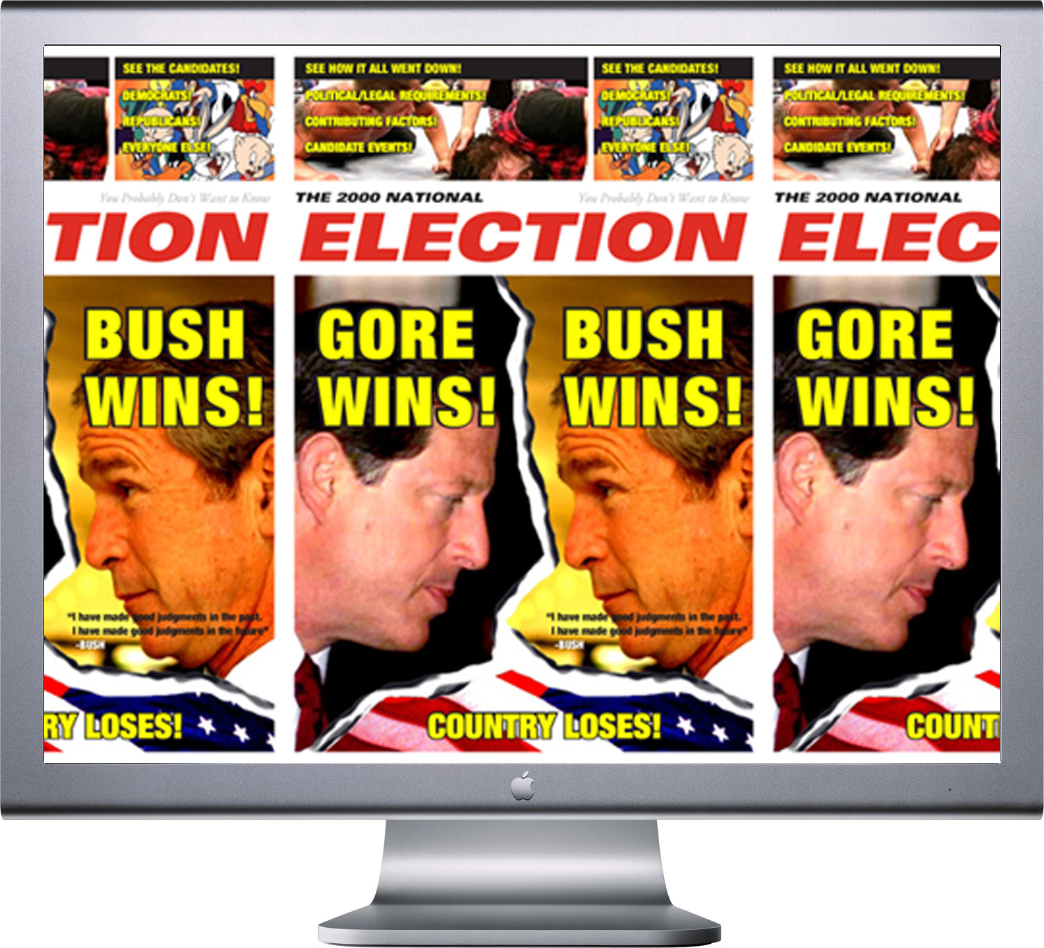
The 2000 National Election interactive educational experience interface; 1024 x 768px. / 2004
The next concept was based on the infamous butterfly ballot, a 35+ year-old relic whose grossly unintuitive layout had untold scads of voters accidentally casting for right wing conservative extremist Pat Buchannan instead of mainstream Democrat Al Gore. This standard tally-taker in Palm Beach then had the re-counters steaming over dimpled and/or hanging chads until the Supreme Court told them to go home before they even finished. In this meta-experience, users would be forced to use this exceedingly poor design to navigate through the site. It is likely that they would end up quite irritated by frequent unexpected results (and at least some point would be made in that).
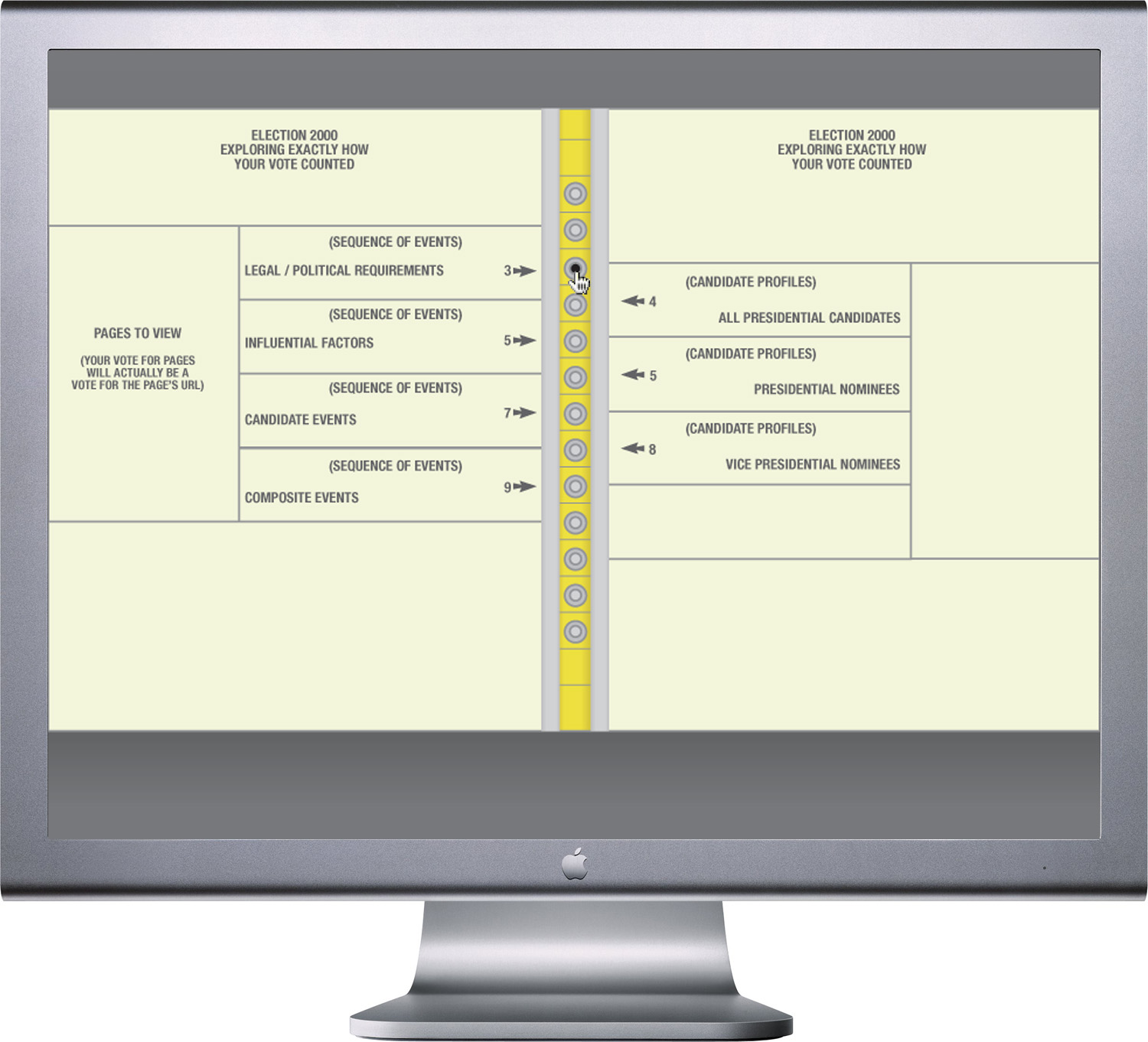
Election 2000, Exploring Exactly How Your Vote Counted interactive educational experience interface; 1024 x 768px. / 2004
The third concept went beyond vernacular reference to physical artifacts and abstracted the experience to evocative communication. This was least obvious but perhaps the most sophisticated interpretation of the idea, in that the interaction itself was expressive of my editorial perspective without unduly satirizing or hindering access to the information.
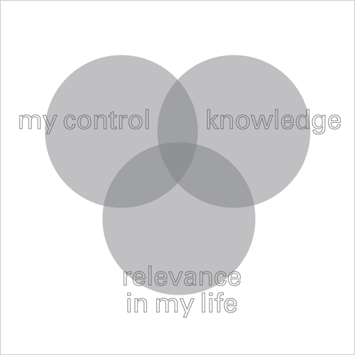
The premise was simple. The entire election process is there for anyone to learn more about, but its shown how most Americans viewed it: kind of blurry, veiled in an acidic haze that was difficult to understand but superficially unobtrusive.
However, if the user puts a modicum of effort into investigation of the events, information becomes perfectly sharp in a big gray area.
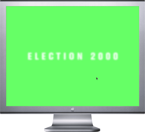
Election 2000 interactive educational experience; introductory screen (default and rollover state); Flash interface / 2004
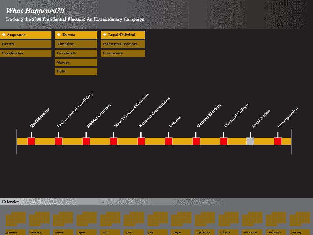
Once a user clicks in, the default screen shows a sequence of legal/political requirements, from primaries and caususes through conventions, debates, the general election, the particular legal contingencies that arose thereafter in 2000, the electoral college and, finally, inauguration. Users can navigate the events by name as they are listed vertically in the main area, timeline—a segmented bar graph that shows the relative length of each event, or by specific date in the calendar blocks at the bottom, and all are correlated.
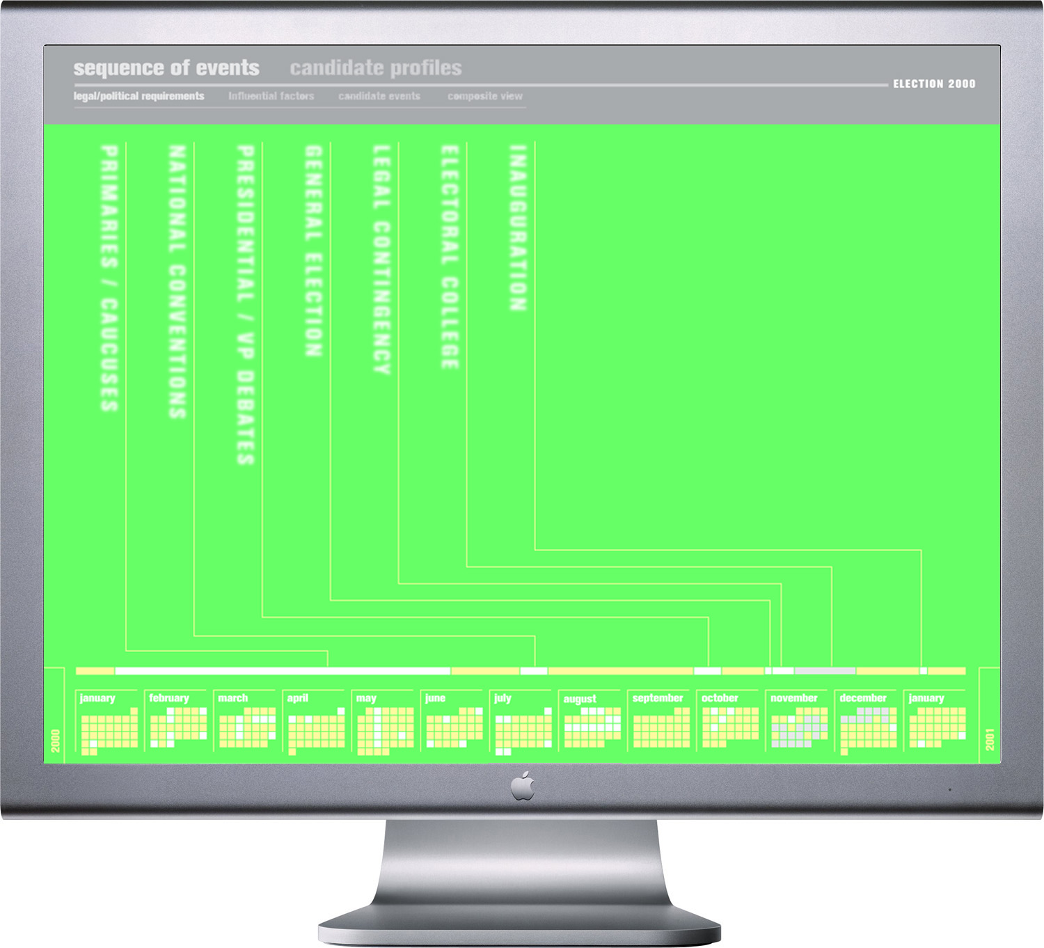
Election 2000 interactive educational experience; default sequence of events screen; Flash interface; 1024 x 768px. / 2004
Again, rolling over any of these entry-points (e.g., the time bar for National Conventions) breaks a clear, sharp edged path through the different entry points.
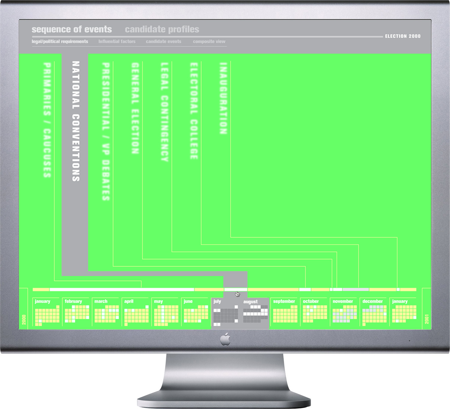
Election 2000 interactive educational experience; default sequence of events screen (national convention time bar rolled over); Flash interface; 1024 x 768px. / 2004
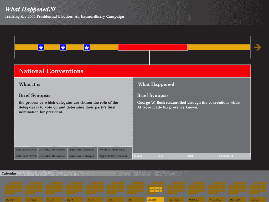
Clicking an event further breaks through the screen and presents two frames of reference: What it is and What Happened. Within each event, there are four sub-navigation options: Overview, Involvement, Location, and Duration of the event. The viewer can then learn about the official process (what was supposed to happen) and the 2000 election (what actually happened) by noting their similarities and differences.
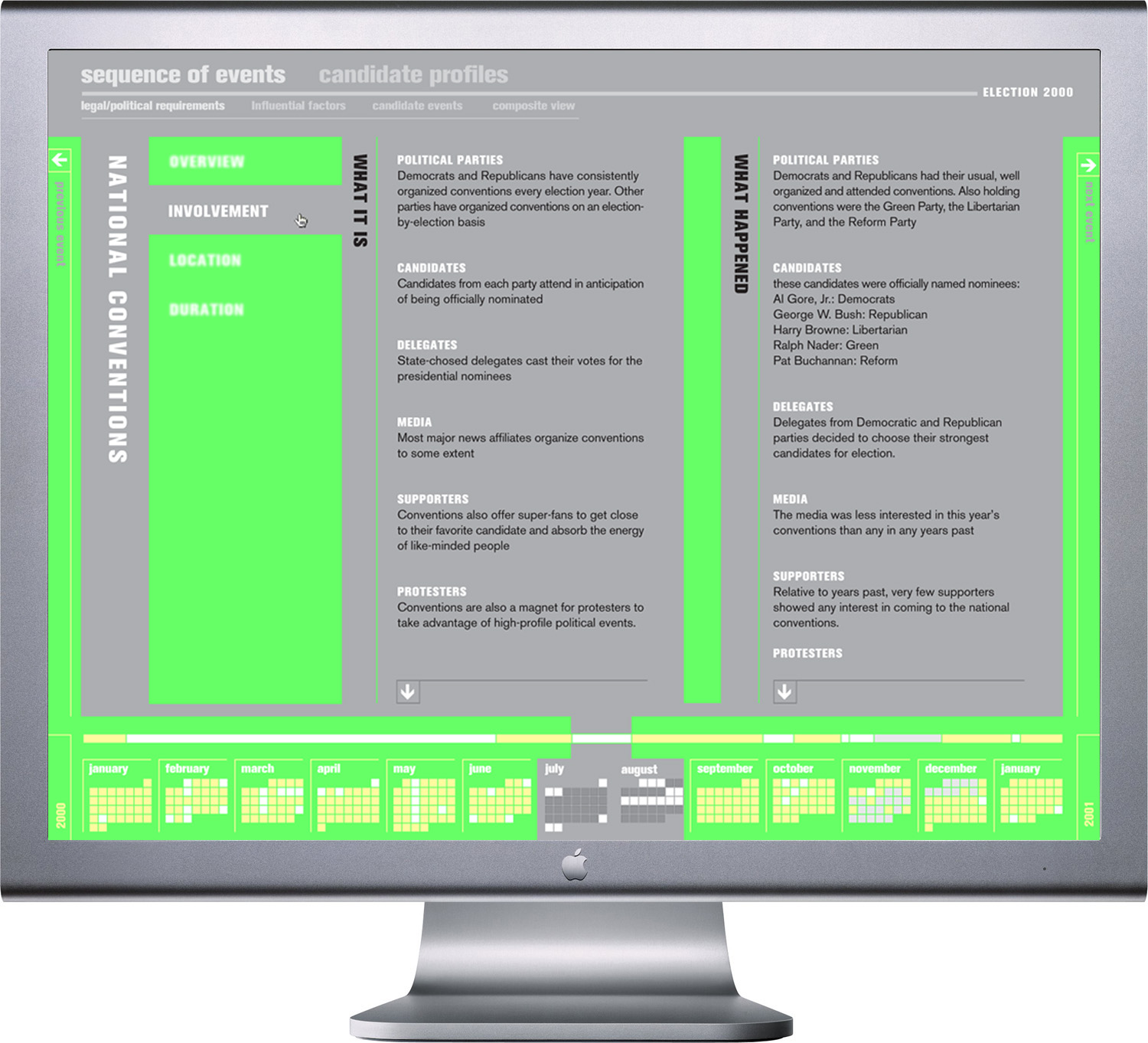
Election 2000 interactive educational experience; national conventions – involvement – what it it vs. what happened screen state; Flash interface; 1024 x 768px. / 2004
When viewing the timeline by event, the dates are keyed on the relative timeline with pink (Republican), baby blue (Democrat) or purple (others). Clicking into one of these breaks open a detailed look, like this transcript of Gore’s email to Bush Jr. upon their respective party nominations, in which he encourages the Republican to join him in changing the way campaigns are run (done!) and restore voters’ faith in the electoral process (hm… not quite).
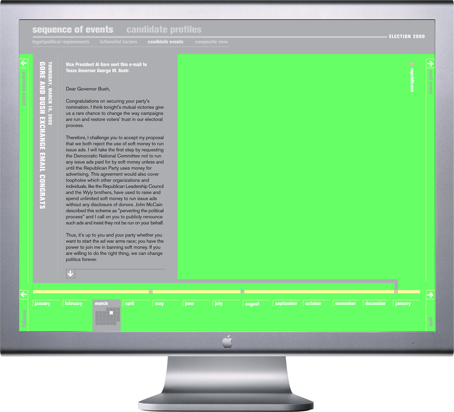
Election 2000 interactive educational experience; event detail screen; Flash interface; 1024 x 768px. / 2004
If users wanted to learn more about these crazy characters, they could check out the Candidate Profiles section, which presents them with three columns of runners, again color-coded by party. The default setting would show a Democratic column on the left, a Republican column in the center (perhaps it should have been on the right) and an Other Parties column after that. Clicking a blurry name cuts gray information into the soft veneer.
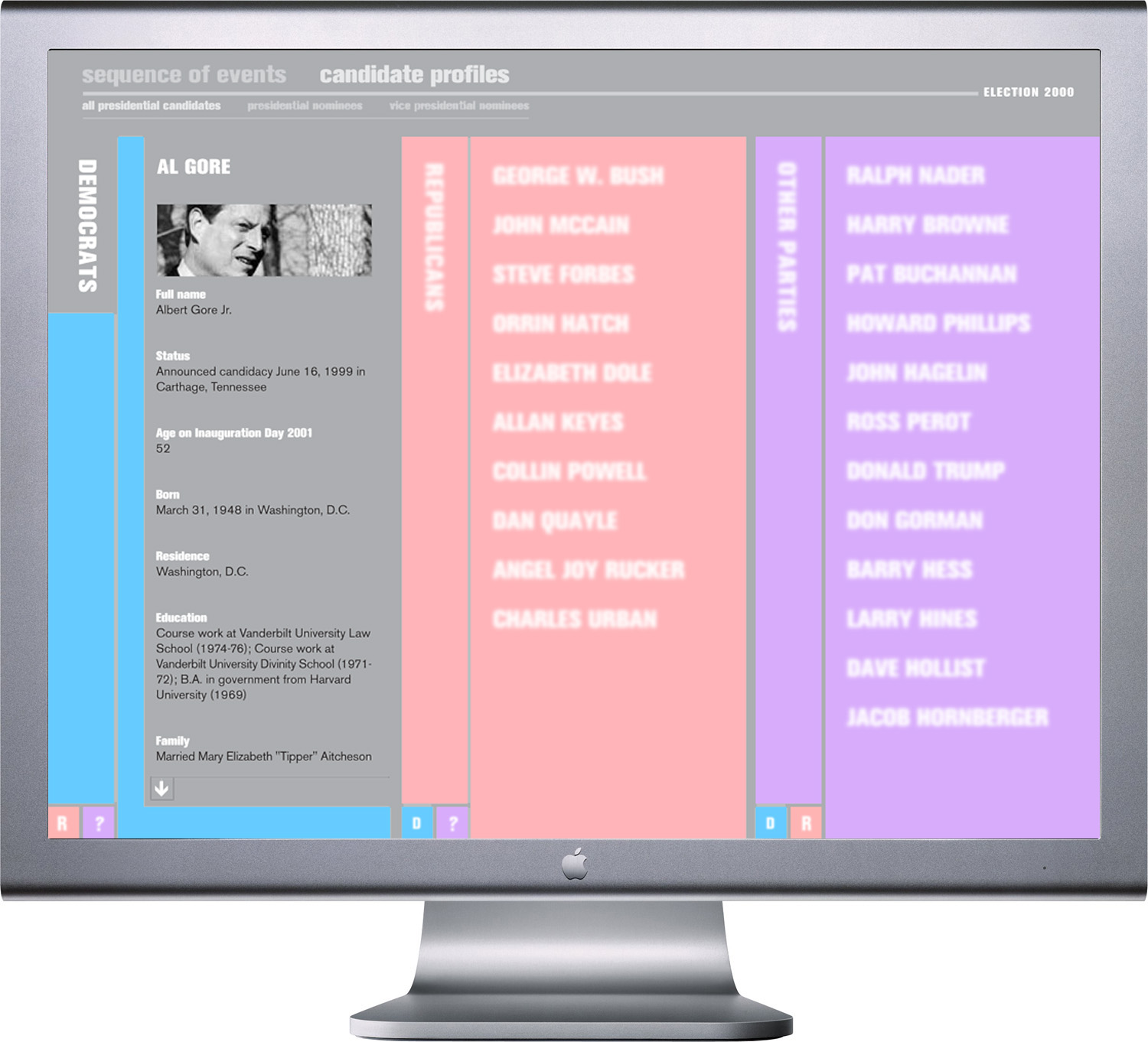
Election 2000 interactive educational experience; Candidate Profiles default column set (Al Gore clicked into); Flash interface; 1024 x 768px. / 2004
But buttons at the bottom of each column allow users to toggle column party assignments, so the user could potentially compare any two candidates (e.g., two Democrats and a Republican, or three Independents, etc.), Like here, where we can see Gore compared to Harry Browne (who??) and the ever-too-present party-crasher, Ralph Nader.
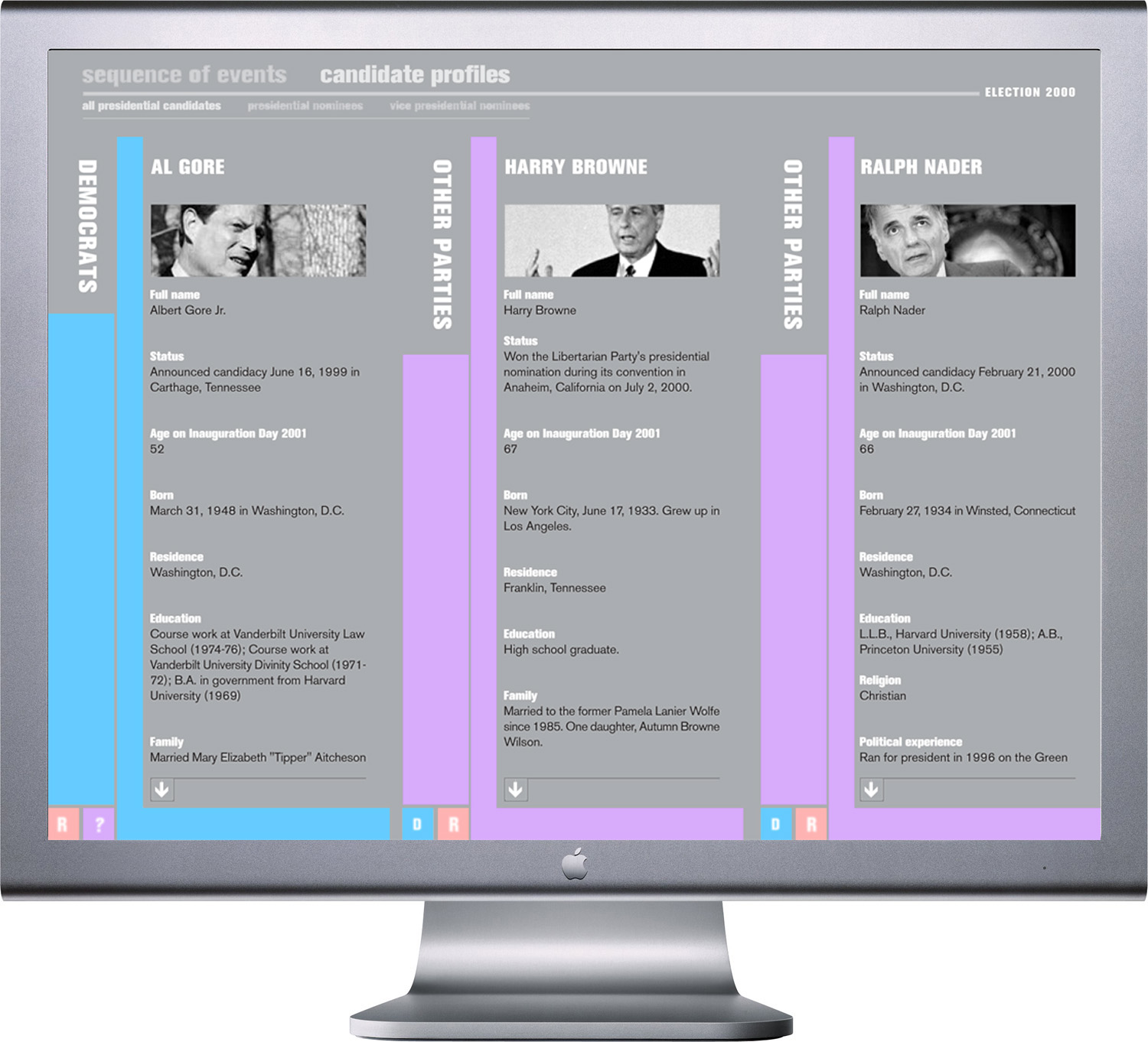
Election 2000 interactive educational experience; Candidate Profiles Democrat / Independent / Independent column set comparing Al Gore, Harry Browne and Ralph Nader; Flash interface; 1024 x 768px. / 2004
I don’t know if widespread implementation of this interactive experience would have gotten the American population to care enough to learn from the disastrous mistakes of 2000, but they certainly didn’t learn much on their own. Voter turnout did increase in 2004, but the dirtiest politics in decades again won out over clear thinking. Four years after that, and people finally decided for change, but not really, as it turns out. If only there was a way to vote on the average American…