Posted: 25 Oct / 2010 at 8:54 pm

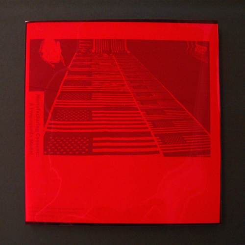
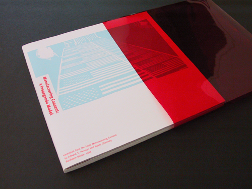
Manufacturing Consent, A Propaganda Model book in acetate slipcase; 9.5 x 9.5in., 28ppg. / 2003
What is the role of American mainstream media? This book visualizes Noam Chomsky’s and Edward S. Herman’s message that a few powerful individuals and corporations mask their own deceit and corruption through their control of the mass media. As the writers urge, the reader must take an active role in looking beneath the messages “filtered†by these entities in order to understand the real content.
In this piece—a project undertaken for the Publications course in the University of Washington Visual Communication Design program, in which we were to interpret an excerpt of this seminal work—expressions of manufactured mass media content are printed in light cyan blue while the Chomsky / Herman text is printed in red on white paper. Red acetate “filters” sharpen contrast of the cyan while obscuring the copy.
The first action the reader must take is to remove the book from its masking slipcase. Once removed, the subject’s title becomes immediately visible, while the mass production of American perception recedes.

Manufacturing Consent, A Propaganda Model book drawn from acetate slipcase; 9.5 x 9.5in., 28ppg. / 2003
Read the rest of this entry »
Filed under Content / Architecture, Packaging / 3-Dimensional, Print / Editorial
Permalink
Posted: 05 Oct / 2010 at 8:53 pm

University of Washington School of Art, Sand Point studio door window sign concept; approx. 3.25 x 6n.; plotted output on foamcore / 2003
In my younger scholastic career, I often charged headfirst through the parametric walls of an assignment to ensure that my work would be noticed. In a drawing class I took early on at university, the professor told me that the way I worked was like writing an English paper in Russian. I chalked up experiences like this to standard-fare artist plight and soldiered on. Ironically, my head full of steam soon chugged me right on out of the School of Art. Upon my return some years later, I had a clearer head, but I also had a much keener sense of the power of boundaries. I understood that it was actually keeping the rules recognizable that revealed the cleverness of their kneading, pushing or rearranging.
As I was making my comeback into the University of Washington, the School of Art was pushing its own boundaries, acquiring gallery and studio space for select students and faculty in a building of the former Sand Point Naval Base in Seattle. Then edging myself toward the sharp end of the student body, I was commissioned to design a way-finding sign system for the building.
Sign systems are often droll affairs, so bound by their function that they are stiff and invisible. There are good reasons for not getting too editorial in this discipline, of course: you don’t want anyone to get lost in the cleverness of the sign before they find where they’re going, especially in emergency situations where one might need to know exactly how to get to the bathroom, or worse, get the hell out of the building.
Overseen by School of Art Director and Visual Communication Design Professor Chris Ozubko, I came up with a few concepts that I was pretty confident would get people into the restrooms and out of the building as necessary, but also expressed a bit of the unique personality of what was going on in the space while they could appreciate it… Read the rest of this entry »
Filed under Identity / Systems, Signage / Display
Permalink


