A Matter of Dimension
August 29, 2009 at 9:29 am · Filed under Content / Architecture, Copy / Writing, Print / Editorial, Type / Fonts
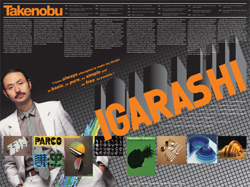
Takenobu Igarashi magazine spread retrospective; 24 x 18in. (spread) / 2002
A staple project of many university design programs is to create a poster or magazine spread or flyer or whatever that somehow highlights the work of a “famous” designer, and, for extra measure, to design it as they might have designed it. That is, to design the piece in said famous designer’s “style.” That we had this sort of a project in the VCD program at the University of Washington always struck me as very strange, as “style” was nearly as derided a word as “Hobo” in the UW VCD lexicon. After all, a good designer (let alone a “famous” one) shouldn’t have a style.
A good designer analyzes, digests and synthesizes various aspects of a particular project and distills from this process the most compelling way to communicate the intended message for that project. There is a not-so-subtle line to be drawn here, as using a particular vernacular can be very useful in communicating particular subject matter. For example, if designing a poster about how inner-city youth express their identity, using some element of graffiti might be a felicitous way to help illustrate this. However, if a designer used graffiti in every project, whether it be about inner-city youth or organic produce, then his approach no longer can be seen as appropriating a relevant style to communicate a message; he has now created his own “style” that is irrespective of the individual needs of particular projects. He is one-dimensional.
Though I only know what I know about Takenobu Igarashi, a “famous” designer in the 1980s and my assigned muse for this project, from books and magazines and perhaps an article or two posted on the Internet, it did seem fairly easy to pick up on his “style.” But the issue wasn’t that his projects were one-dimensional. The issue was that his projects were all three-dimensional. Igarashi, in fact, transitioned his focus toward product design and then architectural sculpture as his career progressed, and, one could imagine, this was really where he wanted to be the whole time…
Indeed, Igarashi’s sculpture is quite fetching, and, more interestingly, quite varied. Aside from an early, sharp bent toward the geometric, his three dimensional portfolio has moved the air and light around it in immeasurably varied currents. Monolithic, provincial, heavy, grounded, sharp, useful, clever, whimsical, delicate, charming, airy, diaphanous, breathtaking; it’s all there, in as many materials as you can imagine.
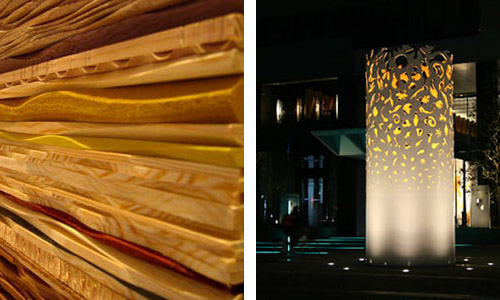
Redwood Forest: a relief of various kinds of layered woods carved and partly colored with acrylic paint / 2005; and Komorebi: a sculpture with 1800 images cut out on a hollow, steel column / 2007; both designed by Takenobu Igarashi
Between Igarashi’s graphic design and his more abstract sculpture lies what may be his most sagacious work: that of product design. Included in this portfolio is everything from traditional designer favorites such as clocks and lamps to more pedestrian subjects like notebooks and gardening kits. Every one of these pieces is designed with a specific purpose and inventive spirit, and all represent the striking clarity and modern austerity that Igarashi has espoused throughout his career.
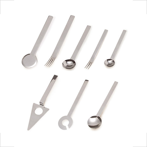
cutlery set; designed by Takenobu Igarashi / early 1990s
In his graphic design material, however, he was famous for an interesting but quickly dimming shtick of hyper-complex, axonometrically drawn type constructions, grounded in International-Style content structure.
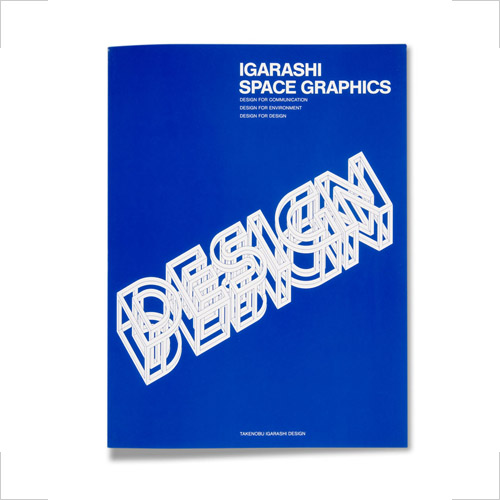
Design, Igarashi Space Graphics book; designed by Takenobu Igarashi / late 1980s
For our project, there were a number of things we had to design off the list: the designer’s name, a timeline of their career, a written biography, images of the designer’s work with captions, and, of course, a picture of the man (or Paula Scher, if you got her). To seal the deal, we had to find a quote from the designer that epitomized their approach, their personality, their work. I could hardly believe I found this one; I just had to use it:
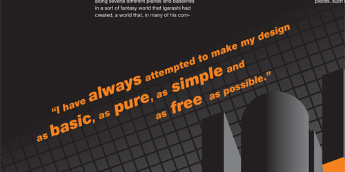
Takenobu Igarashi magazine spread retrospective; 24 x 18in. spread (detail) / 2002
That is a charming statement, but is he really serious? He couldn’t even keep his own portrait simple (the digital slash is all him, not me). More to the point, can anyone even read those words he made? They are stunning feats of geometry—really quite impressive, even beautiful at times—but completely incomprehensible. And, how is this shtick appropriate for an international Expo, a calendar, a shoe store and jazz and dance performances?
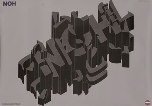
UCLA Asian Performing Arts Institute 1981; designed by Takenobu Igarashi; 40.5 x 28.7in. (103 x 73 cm) / 1981. I find this poster quite interesting, but I only know what it says because of the title set in Helvetica in the upper left corner, and I still have no idea what it means.
Despite his sometimes confoundingly intricate axonometric typography and abstract sculpture, Takenobu Igarashi was and is today a professed Modernist, perhaps even minimalist. Igarashi has made a concerted effort to lead a simple life even after attaining great status and success. He has often spoken out against rampant consumerism and information pollution of cities like Tokyo. He even had a small house in the country (designed for him by an architect friend of his) just to get away from it all. He selects every item for his personal consumption just as he selects clients: very carefully and sparingly.
Igarashi’s current web site actually seems to harmonize with his professed philosophy. I find the synthesis impressive and satisfying. He shows a gorgeous variety of sculpture, set in a calm, austere gallery. And, there’s not a hint of his graphic design work anywhere.
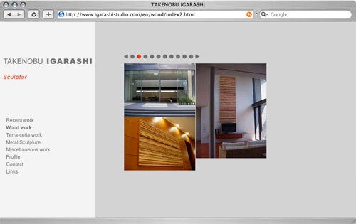
Takenobu Igarashi’s current web site; note his self-proclaimed title (in red italics)

Randy Nichols said,
August 29, 2009 at 9:37 am
Where did you get your blog layout from? I’d like to get one like it for my blog.
Daniel P. Johnston said,
August 30, 2009 at 8:48 pm
Hi Randy (if that is really you; my comment filter seems to think your note may be spam, but it sounds like a reasonable question)… This layout was originally based on one of the zillion user-submitted WordPress templates, but I’ve hacked it so extensively that it no longer bears any resemblance to said template whatsoever.
KMahoney said,
November 16, 2010 at 4:11 pm
Love the blog. I actually found it because I am writing a paper about Igarashi. I have looked at his site and a few various places online, but I can not find a difinitive place that has a decent biography about him. Do you have any suggestions? Or maybe any help as to where you were able to find information about him?
Daniel P. Johnston said,
November 16, 2010 at 10:44 pm
Hey KM,
Thanks for the good words! I did this piece in 2002, so the details of the process are a little fuzzy, but I did it while I was at the University of Washington and I seem to think and got most of my material from books in the School of Art Library there. There were a couple that were that were particularly informative… I think these may have been them:
Takenobu Igarashi (by Igarashi, himself)
— http://amzn.to/aF6zgc
Igarashi alphabets: From graphics to sculptures
— http://amzn.to/98amb4
Good luck!