Don’t Let Money Change Ya
August 12, 2009 at 9:02 pm · Filed under Print / Editorial, Type / Fonts
Alright. You have a shade over $120 mil with which to hire one person on behalf of the world. Who’s it going to be? A boy-band-groomed pop star from the U.K. or a school teacher from Detroit? Seems like a pretty simple task, but, due to some mistake, they both got the millions at one point.
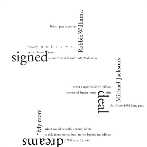
Robbie got his millions for probably singing us lessons of smooth, classic Garamond-y things like falling in love or getting his heart broken or falling in love again or just hooking up with lots of chicks.

Robbie Williams Gets Millions in Record Deal typographic composition; 8 x 8in. / 2002
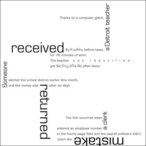
The teacher got his or her millions due to a Microgramma-tic computer glitch. Not for teaching square things like Mathematics or Wood Shop.

Anonymous Teacher Gets Millions due to Computer Glitch typographic composition; 8 x 8in. / 2002
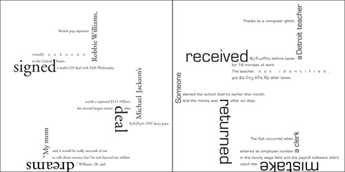
One clue as to who should have made what can be found in the glaring disparity of said millions between their respective ledgers. Robbie, who was wildly popular in his home country but all-but-nothing in the U.S., got $125 million from his contract in 2002. The teacher, who may or may not have been popular in class—but completely anonymous to the world, received over $117 million less (before taxes). But the error is clear: The teacher should have received approximately $125 million less…

Money for Something typographic juxtaposition; 16 x 8in. / 2002
This typographic editorial juxtaposition project, given by guest lecturer Jean Benoit Lévy as one of several Advanced Typography projects in the design program at the University of Washington, was instrumental in teaching me the value of a good, honest typeface.

10 Interesting Typography Compositions | Flash, Design, Vector, Photoshop, Adobe Tutorials | GraphicMania.net said,
December 8, 2010 at 11:26 am
[…] This typography composition is very complicated, too, running lines of text in every direction and at multiple angles. Alone, the words aren’t very interesting, but Johnston used typography to make them exciting. […]