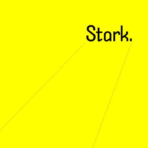
Tall, Stark and Handsome

Stark original typeface design / 2002
Ignore the Din and find a new Trade. Here comes another lean, monosyllabic hero of noir typography. He takes his briefcase locked, his drinks neat and his checks made out to “cash.” He takes wise guys to the cleaners and the birds take him just the way he is. He’s got a hardboiled manner and doesn’t care for idle banter, thank you, so you can keep the jibber-jabber to yourself. He’ll tell you what you need to know and nothing more. But he’s not just another working stiff. He’s got working class.
He’s got a cleft chin and a sordid past with which you need not concern yourself. All that matters is on the dotted lines. He stands tall but keeps a low profile. He’s sharp as nails and almost as kind. He doesn’t want to be your best friend but he’s probably the man you want on the case. He’s Stark… Read the rest of this entry »
Filed under Naming / Words, Type / Fonts
Permalink
Comments