There is No “Inc.” in “Team”

UBC monogram mark for Union Bay Cycling / 2001
A competitive cycling team, like all other kinds of teams, is a of a group of people with a similar interest; in this case, the team’s chief objective is to win bike races. The primary vehicle of a cycling team’s identity is the uniform that team members wear out racing and training. This identity is complicated, however, by the fact that competitive cycling is one of the very few sports in the world based on a sponsorship model, whereby commercial interests pay for some aspect of team operations in return for visible recognition on these uniforms. Almost invariably, this leads to a team’s identity being inextricably intertwined with the identity of their lead sponsors, which can change relatively frequently.
For example, most people would say that Lance Armstrong raced the last season of his career with the Discovery Channel team, and that, before that, he was on the U.S. Postal Service team for six years or so, even though these were, for all intents and purposes, the exact same team, managed by Tailwind Sports.
Union Bay Cycling (UBC) is a large Northwest cycling organization built around an elite-level team that races in local, regional, and national events at the pro/am level. UBC has been around, with the same leadership and core group of riders, for over a decade, but major sponsorship changes had made it seem like three or four disparate and relatively short-lived teams. For UBC, I worked with the team director to develop a long-term solution: a core identity system that accommodates prominent and unique recognition for lead sponsors, but embodies the unique heritage and dynamism of the team riders and stays consistent even with major sponsor changes.
I began with the UBC monogram mark (above) that would immediately identify all communication touchpoints of the team: stationery for proposals, press releases and other correspondence, the web site, T-shirts, gear bags, and so on, and, of course, the all-important team kit, including jerseys, shorts, socks, water bottles, gloves, helmet graphics, and several other tertiary clothing articles.

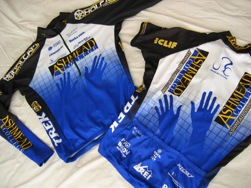
Union Bay Cycling jerseys (long-sleeve front | short-sleeve back) / 2003; I also happened to have designed the Holcam logo on the jersey shoulders (but not their web site) / 2001
The blue grid, an established device of the team, was reworked and became the foundation of this flexible system. The title sponsor was rewarded not only with the most prominent logo presence, but also with an expressive element emerging from the grid (in this case, the hands of Ashmead College, School of Massage), and other sponsors fit into pre-established hierarchical slots based on their respective levels of contribution…
Read the rest of this entry »
Filed under Content / Architecture, Copy / Writing, Identity / Systems, Interactive / Web, Packaging / 3-Dimensional, Print / Editorial, Uniforms / Apparel
Permalink
Comments (2)