Stuck in the Middle
January 29, 2008 at 10:48 pm · Filed under Interactive / Web, Packaging / 3-Dimensional, Print / Editorial, Type / Fonts

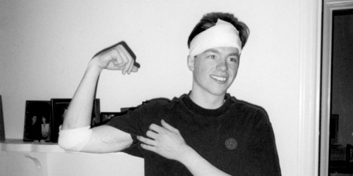
My first full-time desk job. Can you sense my enthusiasm? / 2001 (photograph by Lisa Torrence)
In order to engage context in a quotidian discussion about the various caste systems of ancient cultures, a feisty grad student T.A. in one of the many requisite Art History courses I have taken challenged our class section to define the contemporary stamp: “middle class.” Immediately, salaries rang out, one range louder and more determined than the last, until crescendoing in discordant numerical jangle; income could not objectively define it. Quietus gave way to a chorus of key possessions: Cars, houses. Okay, but what if the car is a Maserati? What if the house is a shack? Scenarios of familial constructs similarly swelled and crashed. These lines of criteria could not strike a clear chord of class definition.
The T.A. sat back and let the class caterwaul and self-dismiss various notions before bringing the struggling group back to cue. Coyly, he then rested the discussion by quoting a friend of his, who had jokingly defined a member of the middle class as anyone who “has a job.” The point of this was that such class distinctions are laughably vague and infinitely subjective (a job is not a job is not a job), but the passion with which people attempt to define them proved how deeply invested we are in socio-economic ranking.
While I had technically had three jobs prior, my quest for a “real,” middle-class-making job began sometime late in the Spring of 1999. I thought I had it in a full-time, long-term temp position “working with computers” that I had taken up after finally quitting my four-year run as a bike mechanic. Unfortunately, it wasn’t long before I realized that I wasn’t all that great at “computers” (at least, not in that context), and I let my hours decline steadily, until they were almost zero, and then they were zero. At that point, I had no income.
“Yo’ face is my case!” My head was barely scratched, but it did bleed a fair amount. Those scars on my arm are tire tracks, by the way. / 1999 (photograph by Ira Wamble)
As fortune would have it (if luck did not), I had been hit by a car that spring while riding my bike (two cars in the same accident, actually), which was an incredibly traumatic event that in turn paid me an agreeable insurance settlement. I ended up living on this modest reward, a tiny savings, and not much else for quite some time as my job search became more and more frenzied. By November, I paid rent by scrambling together the entirety of my bank account, the cash in my pockets, and loose change I had collected in a jar (seriously). The promise of middle class never tasted so sweet or came with such timely appreciation as when I was offered a job as an in-house “Junior Designer” at Sierra On-Line, Inc., just before Thanksgiving, 1999…
I was so anxious to get “a job” that I had neglected to figure out what Sierra On-Line, Inc. actually did. It wasn’t until about the end of my first week that I realized that they were in the video game business. Moreover, they were quite hot at the time. Their “first-person-shooter” game, Half-Life, was a blockbuster on the cutting edge of social networking, the mercury of a feverish rash of global online tournaments. This star was orbited by a constellation of other shining titles (so, obviously, I was not a “gamer”). Somewhat strangely, they also made similarly successful home-improvement and family-oriented software under the Sierra Home banner (so, obviously, I was not a dad, either).
It was another week or so before I figured out what I was doing there. I had started designing within my first hour, but I was in a bit of disbelief that I was actually getting paid for my tasks. My very first project was to create a two-inch round sticker for a software package that said something like “15% Off When You Buy Two!” with a long line of legal copy run around the perimeter. Talk about sticker-shock! Had I really gone from taking weeks to conceptualize, design, and produce posters for famous architects and such to churning out impulse-buy marketing decals (technically referred to as “violators”)?! Well, yes, but there was more to it than just that. For one thing, someone had to make those stickers, I guess, so why not me? (I needed the money, after all). And I would get my chances with more diverse, complex, and important pieces down the line. And for all of my cockiness, I still used a stupid typeface and didn’t kern the 1 and the 5 properly until my creative director told me so.
After getting a good handle on rebate stickers, online banner ads were added to my repertoire. The primary challenge for these was to get as many frames, colors, images, flashing lights, and whatever else into some really awkward standardized proportion in a final file that was under 12 kilobytes. From what I remember, most of the ones I did had great “click-through” rates. I think that there was a 98% correlation between these statistics and how obnoxious they were:

SWAT 3, Elite Edition online banner ad; 468px. x 60px. / 2000
This was obviously before 9/11.

Print Artist online banner ad; 468px. x 60px. / 2000
Print Artist was Sierra’s graphic design program. Somehow, Adobe survived.

Modern Bride wedding planning software banner ad; 130px. x 90px. / 2000
Discouraged? Frustrated? Then you probably shouldn’t be getting married.
As time went by, I got more involved in the actual packaging of games and Home software. Sierra, like most software companies, made huge, cereal-box-sized packages for their wares. These made great canvases for what were often incredibly elaborate illustrations, featuring all kinds of special production touches like extra fluorescent or metallic inks, spot varnishes, sculpted embossing, foil stamping, cover flaps, dollar bills, candy bars, live puppies, winning lottery tickets, dancing girls, and so on. The software box was an incredibly important point of sale, invested in heavily and appropriately impressive. But the only thing of any real value inside the box was a CD-ROM or two (or maybe three), which took up approximately 1/20th of the package volume. A frequent task of mine was to create the artwork for these CD-ROMs. This was usually some very banal, two-color translation of the box artwork, but occasionally I had opportunities to make a more conceptual interpretation of the content:
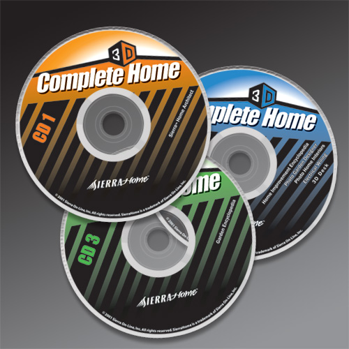
Sierra Home Complete Home 3D software suite; standard CD-ROM format / 2001
The diagonal stripes are in reference to all the construction that users of this software would be doing to their homes.

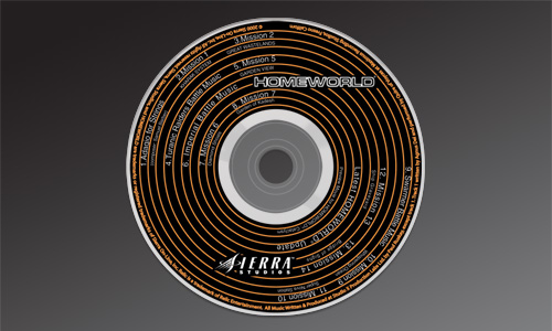
Homeworld soundtrack; standard CD format / 2000
This was actually a soundtrack that went along with the game Homeworld, so I tried making it look like a record and/or a speaker driver. The game had something to do with outer space, so the rings could also be read as orbits.
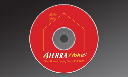
Sierra Home Looping Demo, Fall 2000 DVD; standard DVD format / 2000
This was a demo DVD of Home software that retailers would play in-store. Since no customers would ever see it, nobody at Sierra really cared what it looked like, so I had pretty free reign over the design. The linear element was an abstract house with a chimney constructed out of legal copy, or an even more abstract arrow, for “play.”
As far as I remember, I only worked on the design of one actual game box while I was at Sierra, the Family Fun Collection, a rag-tag bundling of aging titles in need of a last-ditch effort to flee the warehouse for good. The cover design simply showed the box covers of said old titles (very meta, ya’ dig?) and a big, swoopy masthead:
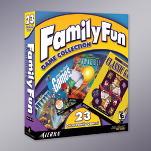
Family Fun Game Collection software package (front); 8in. x 10in. x 2in. / 2000
Designed by a guy named Mark Vongunten (whose design prowess far outshines what this particular package might suggest)
But, actually, I didn’t even design the cover (Those of you who read the caption may have figured that out already). I designed the back (and the sides, I think):
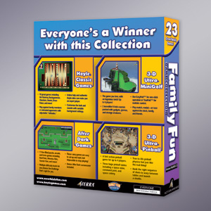
Family Fun Game Collection software package (back); 8in. x 10in. x 2in. / 2000
Pretty exciting stuff. Hopefully, some family had fun.
At some point, our in-house design crew made a push to gain more respect from our own company, as many of the more prominent titles’ packaging were being farmed out to independent design firms. Part of our initiative was to create an identity system for our group, so we would look more like a design firm, too, I guess. We had something of a charrette to design the logo. My submissions generally centered around the idea that the most important thing we created were boxes:
![]()
The Creative Group (at Sierra) logo proposal / 2001
![]()
The Creative Group (at Sierra) logo proposal (type is custom drawn) / 2001
I did not design the logo that was actually adopted, a much more broad interpretation of our strengths, created by one of the Senior Designers:
![]()
The Creative Group (at Sierra) logo; designed by Tom Saffle / 2001
Flash animation of The Creative Group (at Sierra) logo; designed by me / 2001
I did design a Flash animation for the logo, however, which you can see by clicking on it or here. For one reason or another, doing this animation was one of the few things I felt compelled to do on my own, without anyone asking me. And, as such, nobody ever used it.
One thing that I actually designed from start to finish was the 2001 Sierra Studios Catalog, a showcase of Sierra’s prime new offerings in a 16-page glossy, to be shipped with every Sierra game. I created the S-form device (based on the exact curve of the Sierra master logo’s S) as a unique framing device for the action-packed illustrations and a container for titling and information.

2001 Sierra Studios Catalog (cover); 9in. x 12in.; 16ppg. + cover, saddle-stitched.
I still didn’t quite get the whole “kerning” thing by this point.
I had a lot invested in this project. Just in terms of time, this thing took forever to build. I had developed a number of concepts and nailed down the final format within a week, but, like many projects at Sierra, I created the working files for the entire layout of each page / spread in Photoshop. For those of you who have been on Pluto for the last ten to fifteen years and haven’t heard the buzz about Photoshop, it’s the whiz-bang fake-it-all-and-then-some miracle-worker, hailed as the essential design program by hacks and soccer-moms worldwide. Don’t get me wrong; Photoshop is a perfectly useful program for certain things (like, say, working on photos), but it should probably never be used to create any kind of comprehensive print mechanical. One reason for this is that the way it works with images creates immensely huge files that require almost as much processor power to work on as a Microsoft Word document (that’s a joke for all my friends over there in Redmond). Creating these massive, print-resolution files so taxed my then-state-of-the-art Mac G3 that I could—and did—put my feet up on my desk and read through bike magazine articles while the program whirred away at things like moving a block of type over three points.

2001 Sierra Studios Catalog (inside spread for Arcanum); 9in. x 12in.; 16ppg. + cover, saddle-stitched / 2000
On inside spreads, drawers of screen shots slid out from the “S” device.
Despite questionable file preparation and iffy work ethic, I had created what was potentially one of the most valuable communication pieces for the company, on time and on budget. I was pretty happy with how the brochure shaped up, and so were the rest of the involved parties. Anyone familiar with my general approach and sensibility about design may be a little surprised that I ever did anything like this, but I still think that it was a very appropriate solution and the target audience would have eaten it up with a spoon.
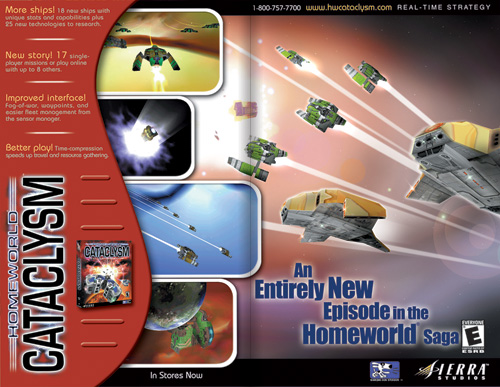
2001 Sierra Studios Catalog (inside spread for Homeworld Cataclysm); 9in. x 12in., 16ppg. + cover, saddle-stitched / 2000
I say “would have” because the target audience never saw the brochure. Just after I had handed over final files to be printed, it came to light that there were two groups within the company that were involved in commissioning the piece and each thought it was coming out of the other group’s budget. Neither group actually had the money, so the project was killed.
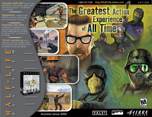
2001 Sierra Studios Catalog (inside spread for Half-Life Platinum); 9in. x 12in.; 16ppg. + cover, saddle-stitched / 2000
Half-Life, indeed.
Many of my colleagues were passionate about their positions, and it showed in their work. After all, it was a bona-fide “dream job” (you were required to play video games at the office for crying out loud). And of course I gained much from the experience. At the base level, my income range was, while nothing to sing about, decent; I was able to buy a car and live in a house (not my own, but I paid my fair share every month). Technically, I learned a ton about efficient organization and production—and a little bit about design. I got to work and hang out with a lot of really talented people (who also knew how to have a good time outside the office) that I never would have met otherwise. And, despite the “fun” industry, I still got a taste of how the middle class squeezes into offices every day, with all of its bizarre socio-hierarchical walling, necessary rung-jockeying and inevitable line-crossing—a strange but valuable experience for any young pro.
But it was never my dream. Without the paper or the real proof of education and with my slim portfolio, I was lucky to have a position in such a prominent organization, and I did my work fairly well. But the subject matter barely interested me at all, and any personal investment I made never seemed to pay much dividend. I didn’t have the sense that I could fulfill my potential, and I didn’t have a real zest for what I was doing. But I did have a job.
Chris Stallings said,
September 12, 2014 at 5:32 pm
Ira, get in touch with me :)