Posted: 30 Sep / 2007 at 10:24 pm

This man is a professional athlete.
Let me just say this right off the bat (so to speak): I don’t much like baseball. I find it boring. For a professional sport, there are a disproportionate number of noticeably overweight players, and it’s not surprising why: it’s clearly not very challenging in terms of cardiovascular fitness requirements. In case you aren’t familiar with the game, here’s a snapshot of a typical play (one man on first, one on deck):
The batter walks casually to the plate.
The catcher and the umpire crouch down.
The batter takes a few very slow, deliberate practice swings, seemingly showing the pitcher exactly where he wants the ball to be thrown.
The catcher makes some hand signals in his crotch.
The pitcher watches these signals and very subtly shakes his head several times.
The catcher makes more hand signals in his crotch.
The pitcher very subtly nods his head.
The pitcher starts his windup.
The pitcher turns to his left and tosses the ball ever so gently to the first-baseman as the base-runner, who had been about six steps away from said base returns to his position actually on the base before the ball gets there.
The first baseman tosses the ball back to the pitcher.
The base runner resumes the exact same position six steps away from first base.
The pitcher returns his attention to the catcher.
The catcher makes more crotch signals.
The pitcher again refuses the vast majority of these signals, but finally lowers his head to confirm his intent to actually… pitch.
The pitcher winds up and throws the ball to the batter.
The batter does nothing.
This is an actual play! How can people watch this?!!
Depending on if and how the batter hits the ball during the rest of his “at-bat,” this basic process can literally go on forever (there is no limit to the number of mis-hits, or “balls,” allotted to the hitter). Multiply this play by whatever number you want (there is also no limit on how many runs can be scored in an inning) and then multiply that by at least nine innings – per team (but there is no limit on those, either, so if the game is tied, it can go 12 or 13 innings, easy).
However loooong the game ends up being, there are really only two or three players out of at least 10 on the field that are ever doing any kind of activity at the same time, and it’s very brief when it happens. The rest of them are just standing around. If the guy who hits the ball isn’t very good at running, it’s no problem; they just get a “pinch” runner to run for him. If the pitcher gets tired or starts pitching badly, they just bring in another one (no limit on those, either). And almost every position on the field has a specific “coach” in the game to consult on what a player should do there, so strategic thinking isn’t a necessary skill, either.
Let’s just get to the point: This has got to be the laziest sport in the world. How did this become our national pastime? Have any of these national pastime people ever seen a game of basketball? Or table tennis? Pac-Man? Anything?
Luckily, I once had an opportunity to turn my frustration for Major League Baseball into one of my favorite design projects… Read the rest of this entry »
Filed under Drawing / Illustration, Print / Editorial
Permalink
Posted: 22 Sep / 2007 at 8:53 pm
There are certain figures who are determined to have an impact on one’s life: Their parents, their teachers, their coach, their camp counselor; these are all people who essentially signed up to help shape a young person’s future—for better or worse—and their influence is usually quite compelling. But often, it seems the ones who just happen to be in a certain place at a certain time figure most in the development of another. This is the ground of peers: classmates, neighbors, friends. The most hallowed of this ground, of course, is that of the best friend.
My best friend growing up was a kid my age named Charley. We happened to go to the same (very good) inner-city elementary school, where we were not much more than acquaintances. But we also happened to go to the same (very mediocre) rich-yuppie middle school on the hill, which turned out to be a friendship-making fluke. Of course, we also happened to have a few similar interests and philosophies on the most important issues of our time (you can imagine what those might have been in seventh grade).
More than anything else, Charley was cool. He looked cool: tall and stately from the day he was born. He had cool clothes. He had cool things. He listened to cool music. He lived in a cool house in a cool neighborhood. He even had cool parents: His dad was a real, long-haired, tattooed biker who built and rode his own choppers, and his mom seemed straight out of a hip family TV show. He was funny and sharp, and he had cool stories that he knew exactly how to tell. Charley also seemed to do the coolest things. And, though I hardly noticed it at the time, these were an enormous influence on my life… Read the rest of this entry »
Filed under Identity / Systems, Type / Fonts
Permalink
Posted: 20 Sep / 2007 at 10:20 pm
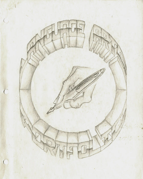
Language Arts Portfolio cover; pencil on paper; 8.5 x 11 in. / 1994
The importance of the portfolio, for any designer cannot be stressed enough. It is, quite seriously, proof of one’s worthiness in the craft. Design is one of the few professions where samples of work you have done in the past are supposed to speak for you.
Unless you have an “in,” many top design firms demand that you “drop off” your portfolio so they can take a look through it to see if they want to actually talk to you. I have never “dropped off” a portfolio anywhere (I understand the utility of the practice, but I find it superficial and demeaning). However, I have been in situations where an interviewer wanted nothing more than to just flip through “my book” without any interference from myself. Portfolios are like candy, and it’s hard for anyone not to just devour them. But if the candy isn’t balanced by the meat of the designer’s intelligence, personality, and presence, it can turn into a rather sickening experience. I’ve tried, with varying degrees of success, to break the predilection of portfolio interviews, but the bottom line is that the portfolio really must, as much as possible, speak for itself, and for the designer, too.
I have made several portfolios in my life in various formats, but I think this was the first thing I ever made that actually was called a portfolio. As you can probably tell by the title, this isn’t a collection of graphic design samples but, rather, a collection of writing and so on for a “Language Arts” class in high school. I drew everything on this sheet of paper by hand (with the help of a compass and a ruler), and flourished the mechanically rational, hyper-dimensional letterforms with a dash of chrome. It probably took me about three days or so to do it, and this was my only copy… Read the rest of this entry »
Filed under Print / Editorial, Type / Fonts
Permalink
Posted: 15 Sep / 2007 at 8:33 pm
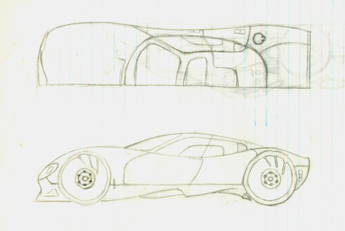
one of my later car drawings: a four-door sports car; half-top and side views; pencil on notebook paper / drawn age 12 or 13
I always knew that I was destined to be a designer, but not necessarily a graphic designer. In fact, I didn’t even know that graphic design was a “thing,” let alone a profession, until I was well into high school. My first love was with cars, and my dream job from as far back in life as I can remember – and for a very long time – was be the man behind their beautiful bodies.
There was no shortage of car-related excitement around my household growing up to keep me interested: There were all kinds of magazines about cars in the family room, meticulously-crafted plastic model cars on the mantle piece, the most important car races and movies about car races on the TV, posters of cars all over my room, radio-controlled cars that I drove out in the street or in the backyard, and spirited conversation about the latest car trends at the dining room table… Read the rest of this entry »
Filed under Industrial / Product
Permalink